Ferris Wheel Press Evelyn Charger Set
/
Ferris Wheel Press does a great job at separating their collections into charger sets-3 x 5ml ink vials. The Evelyn charger set contains 3 inks from the Spring 2021 collection. Thanks to Phidon Pens for sending this set over for review!
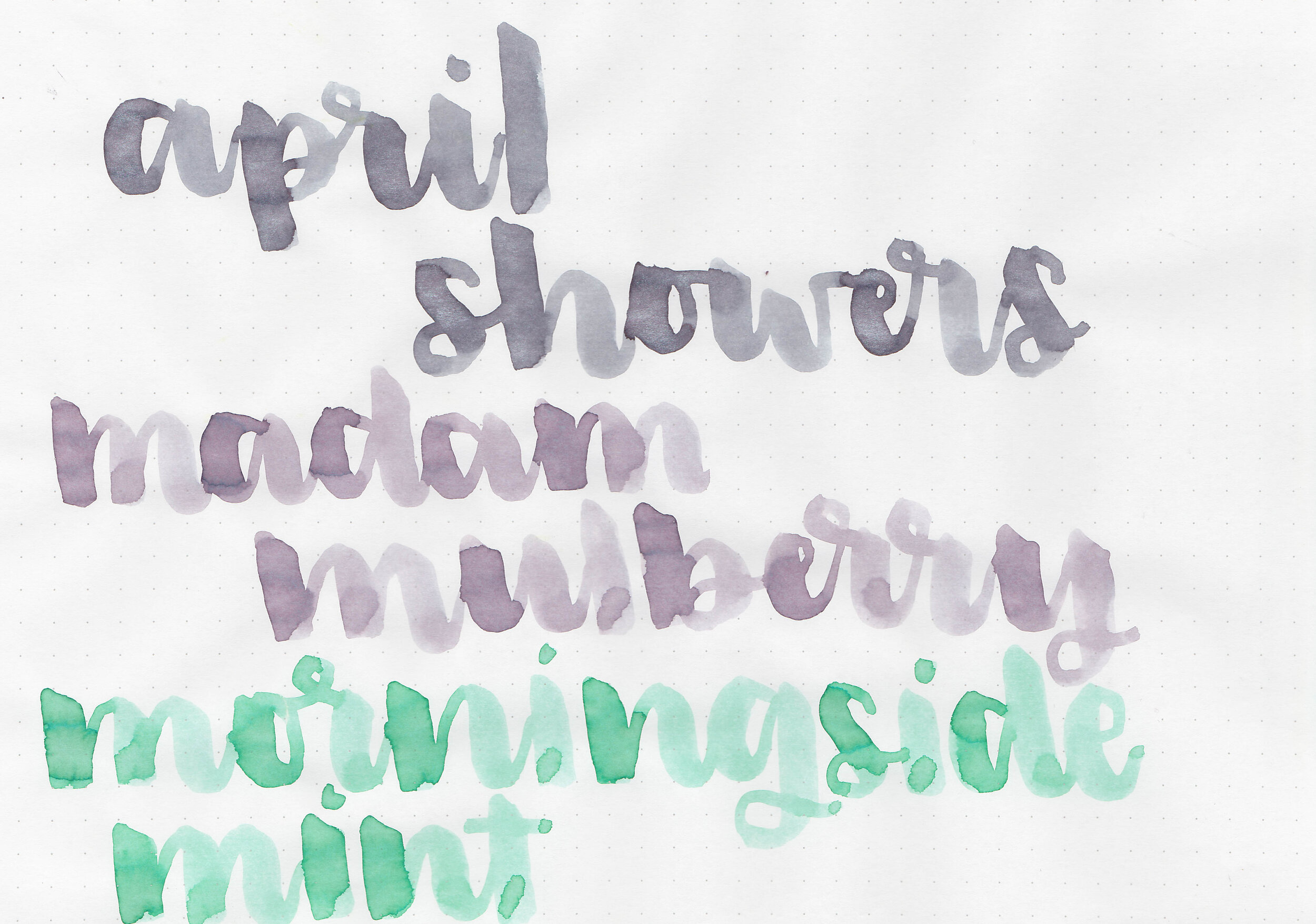
Swabs:
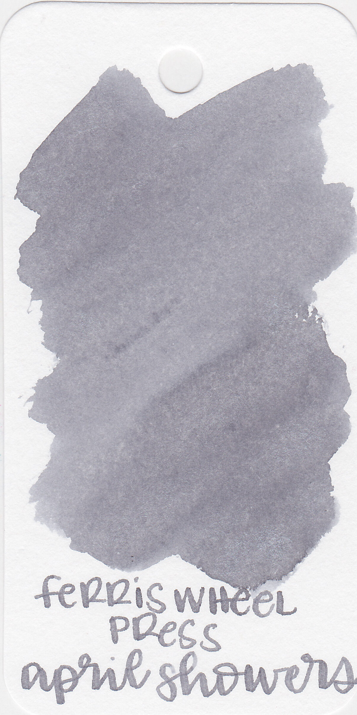
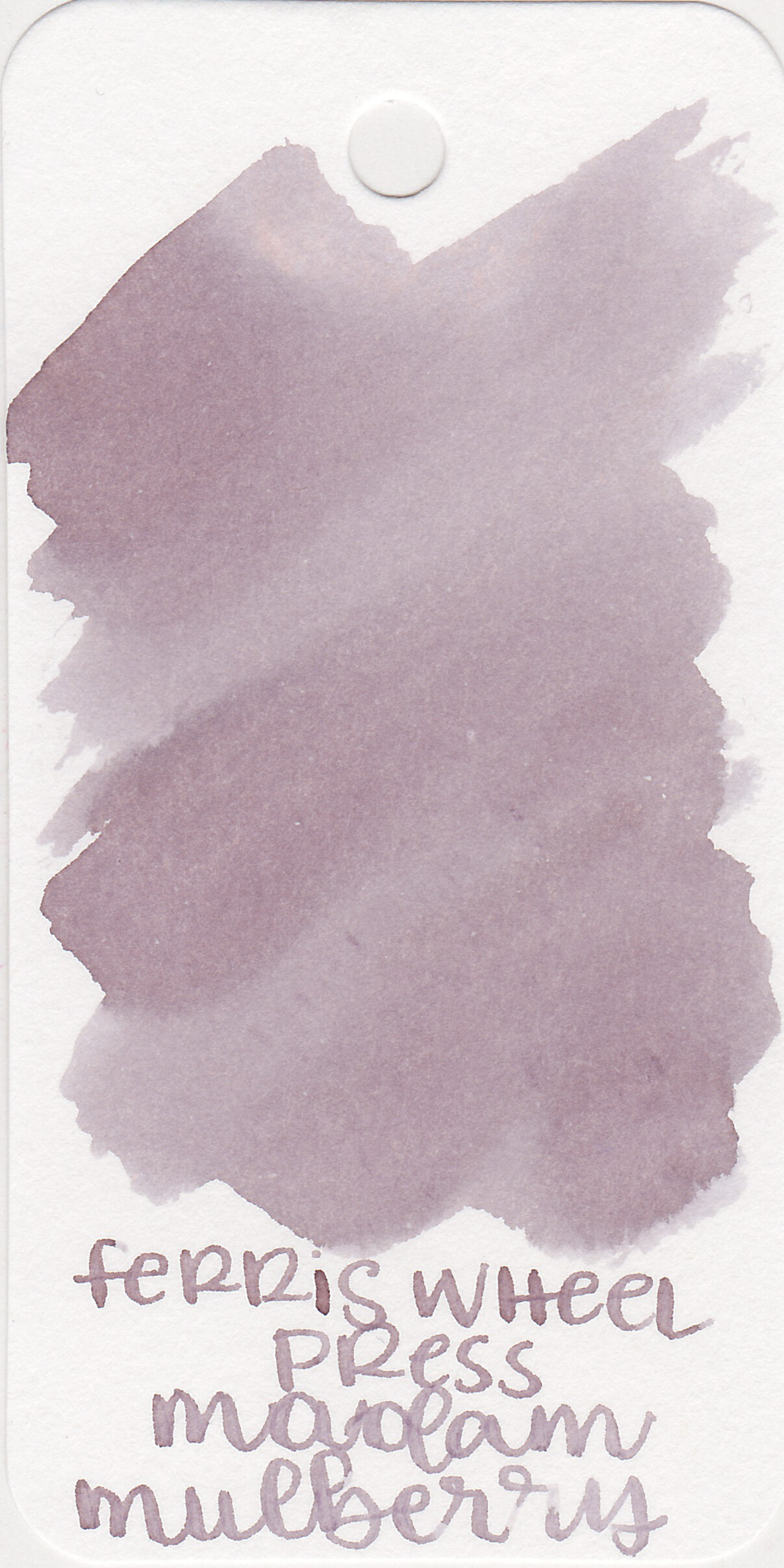
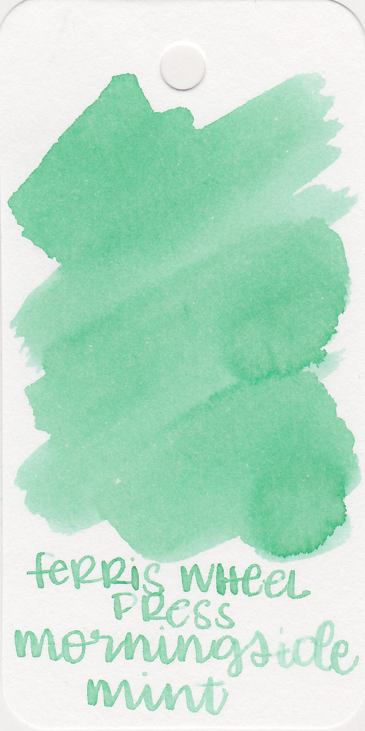
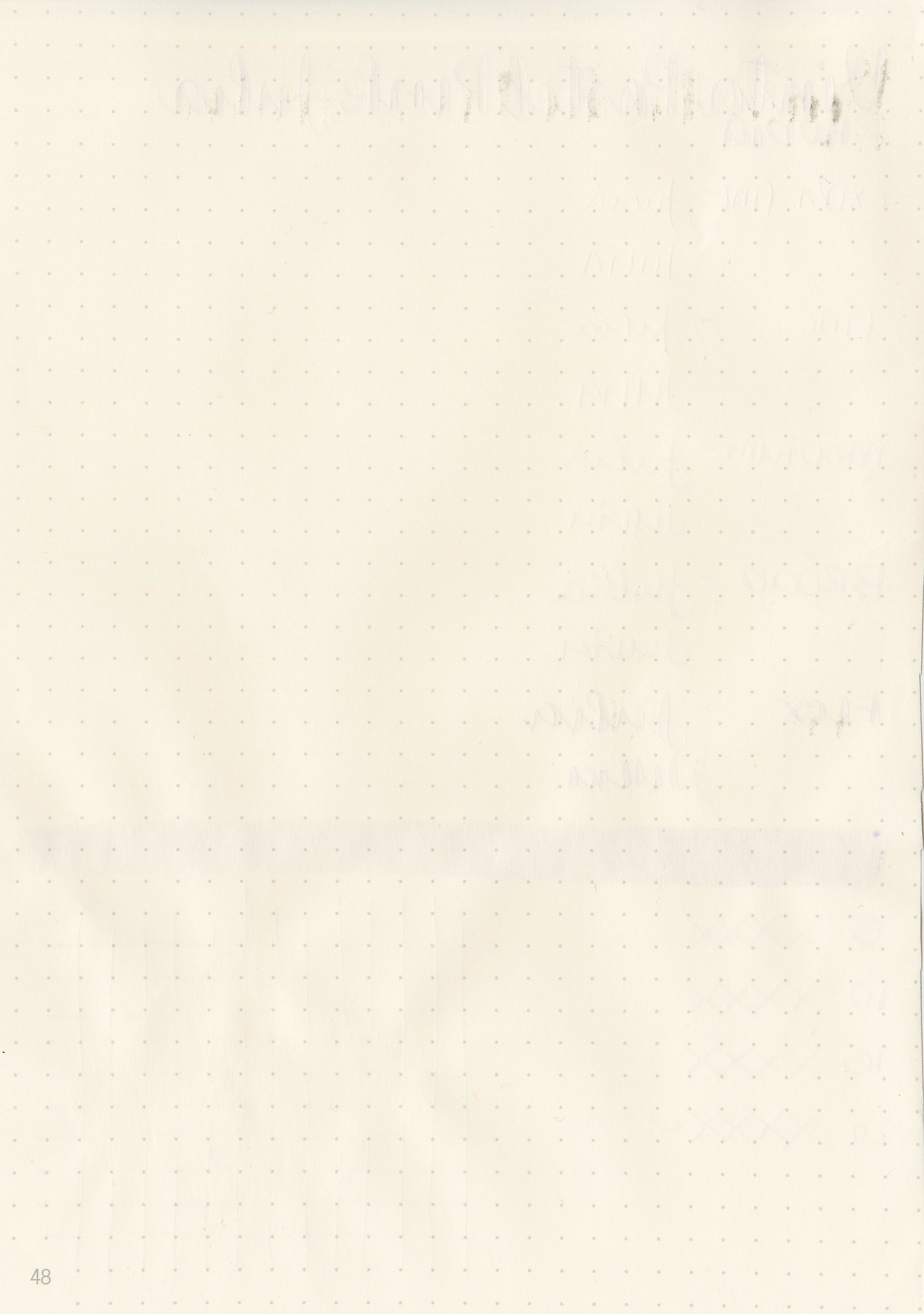
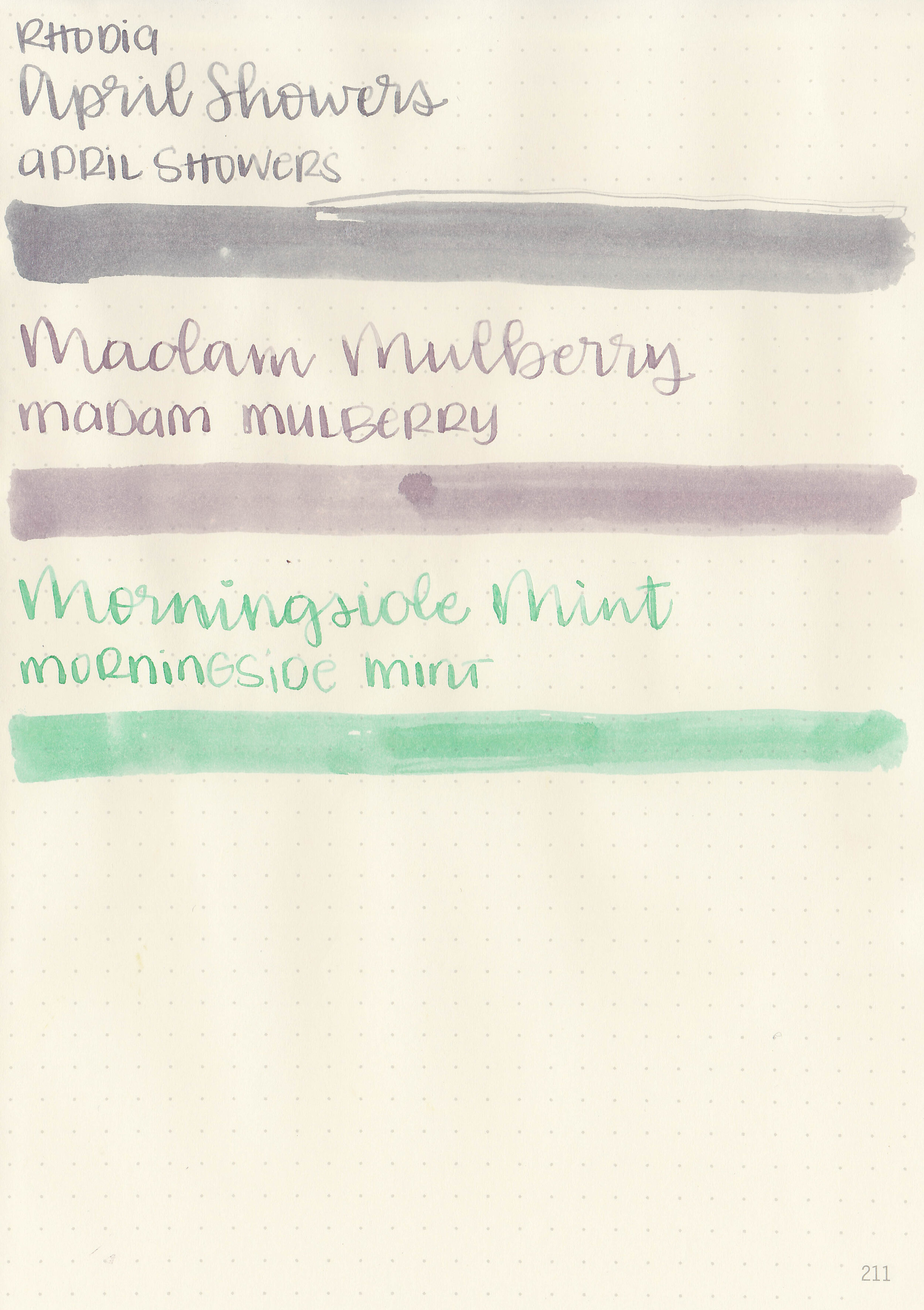
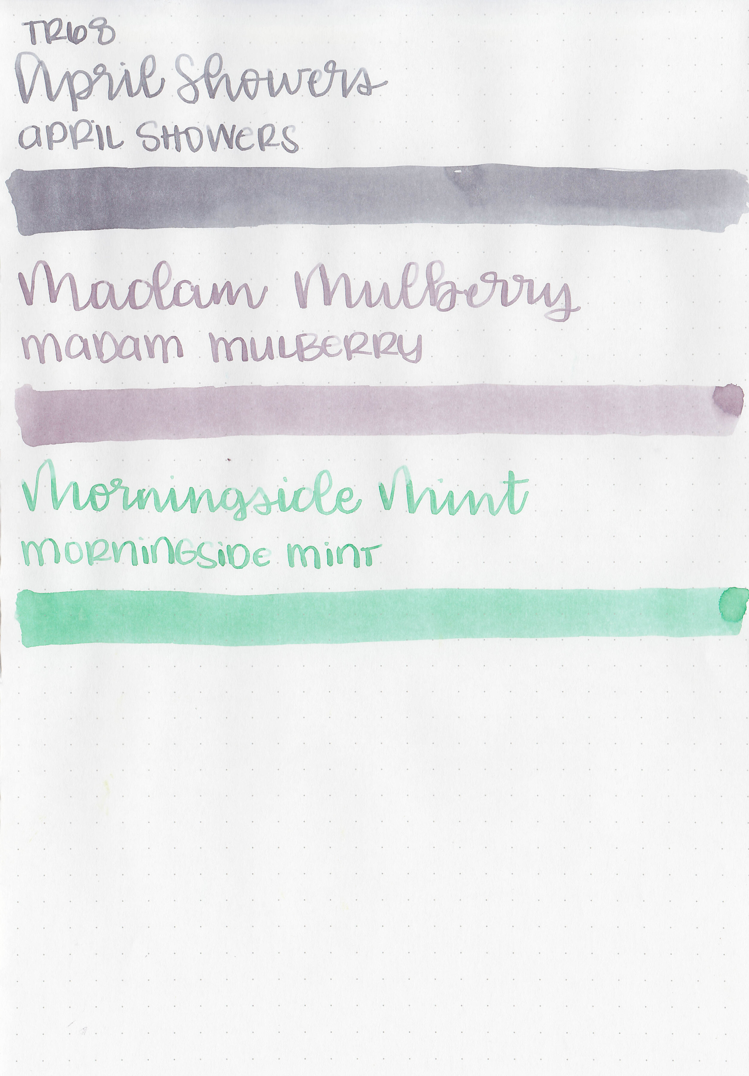
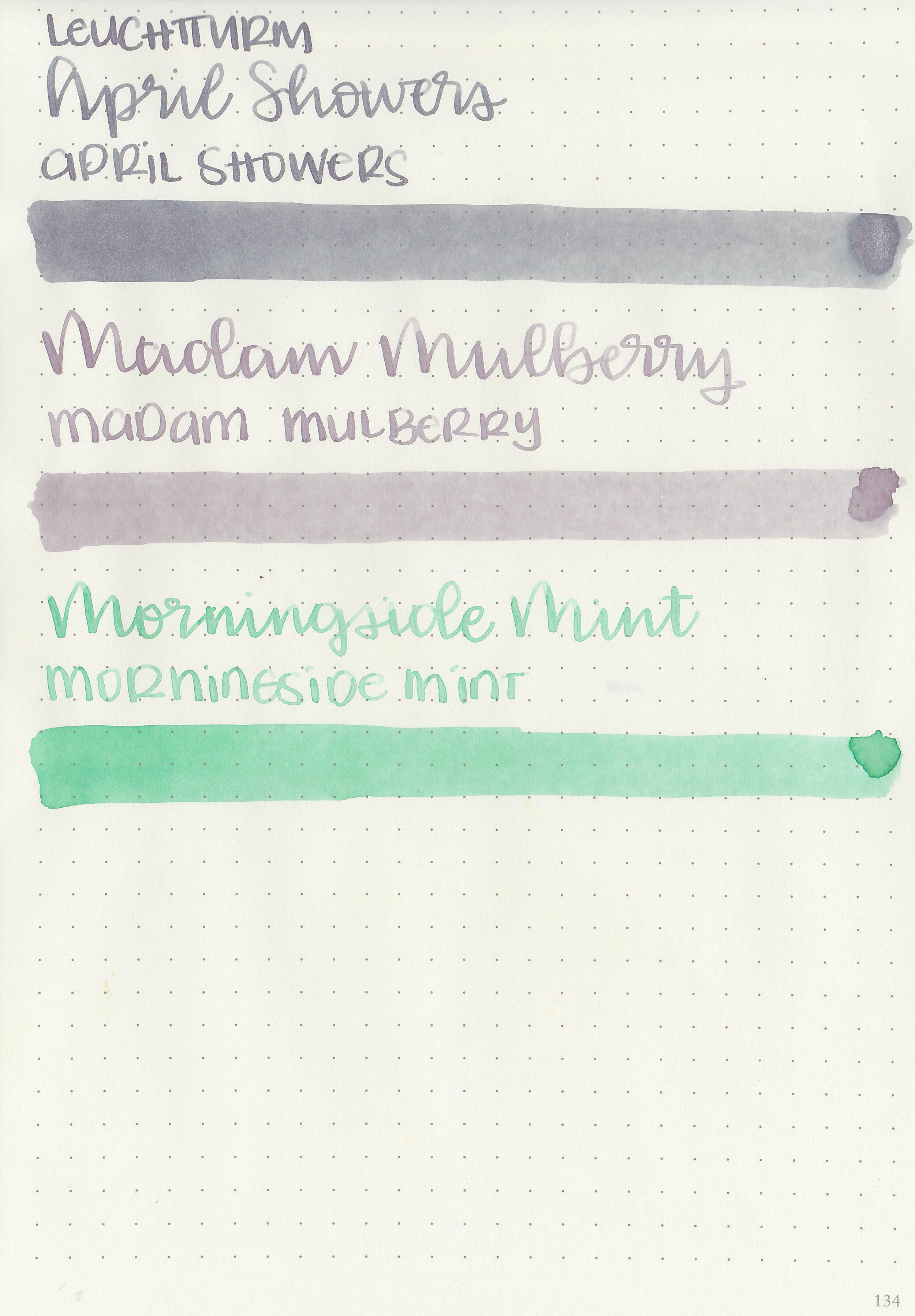
Left to right: April Showers, Madam Mulberry and Morningside Mint.
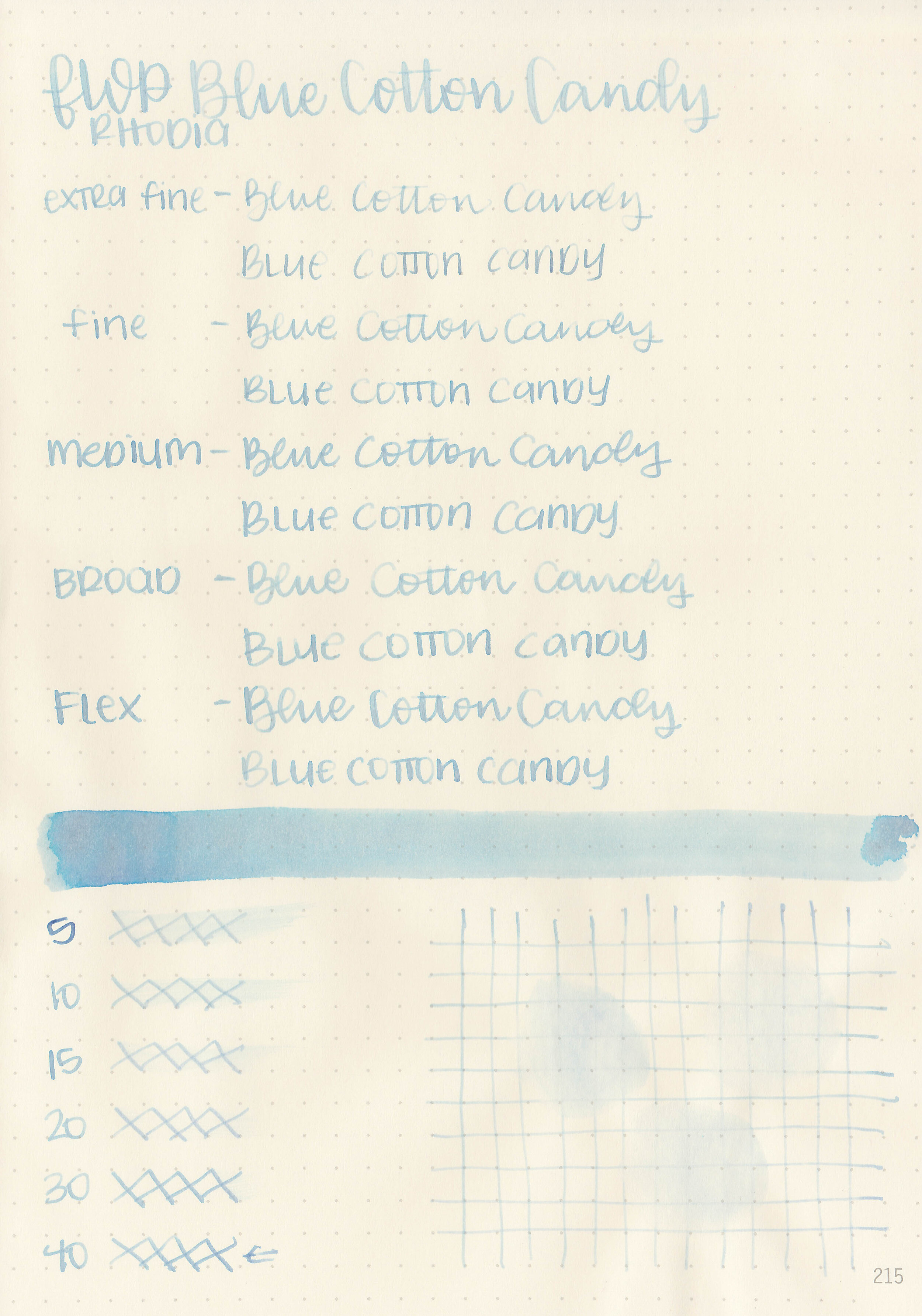
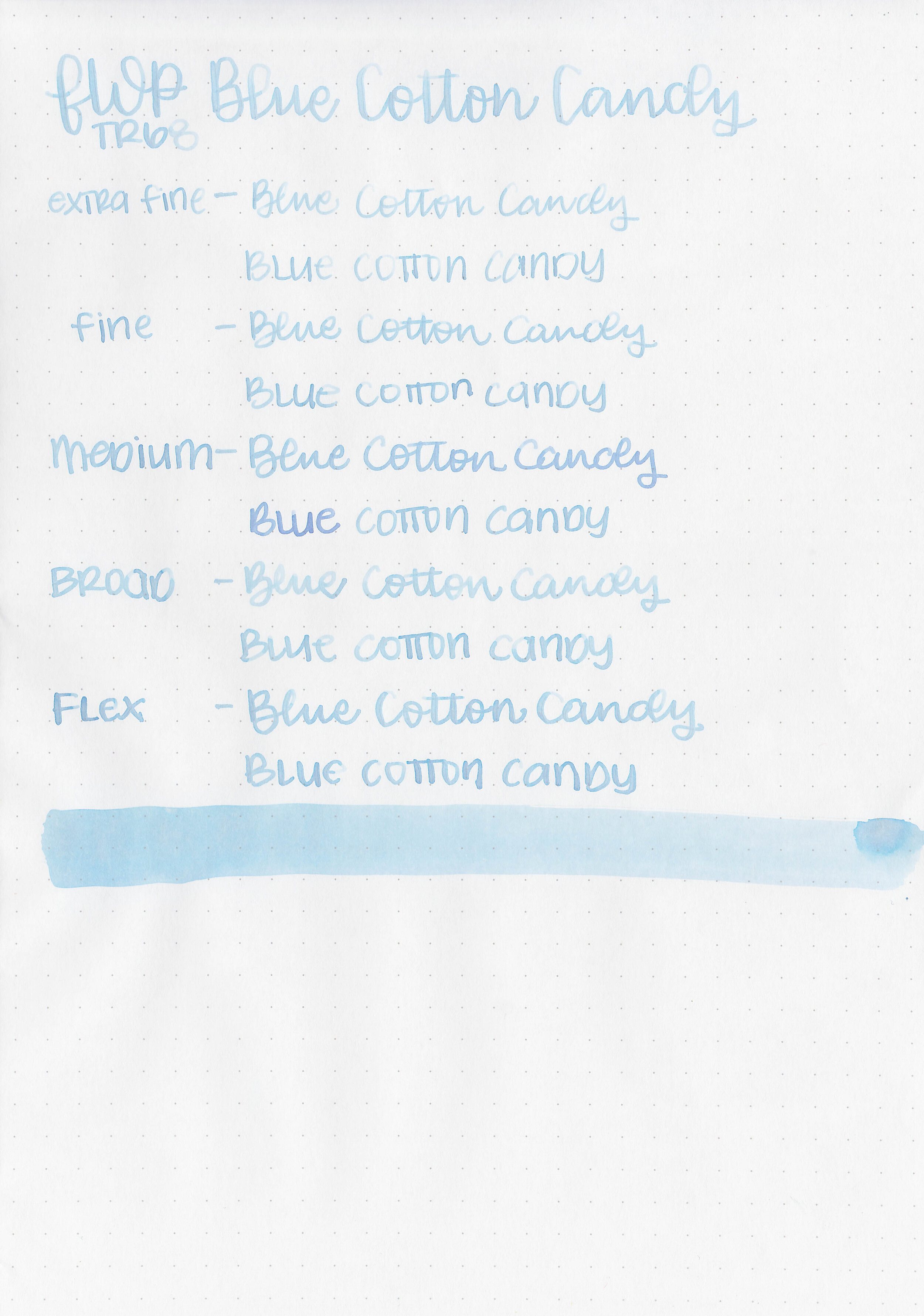
Writing samples:
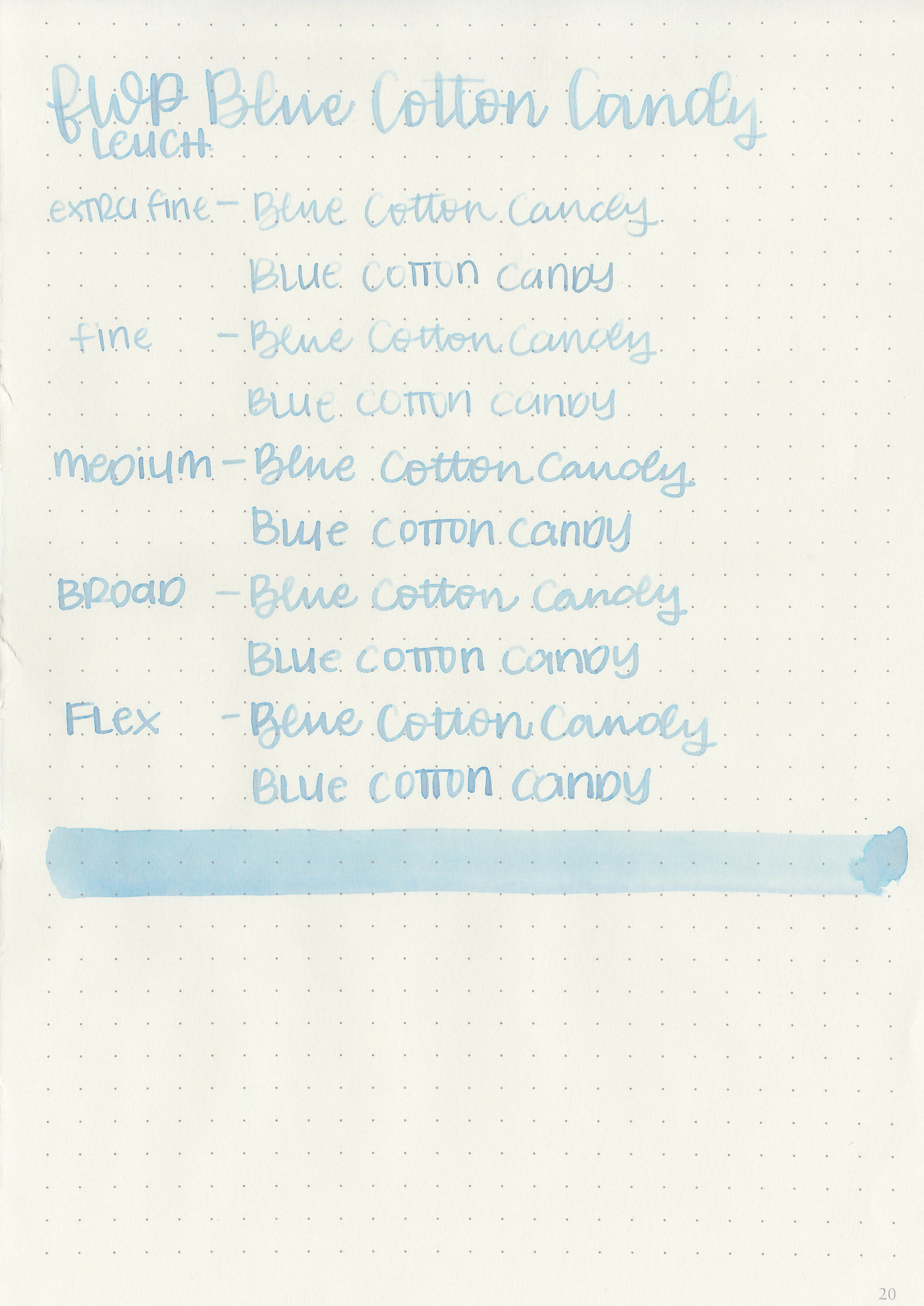
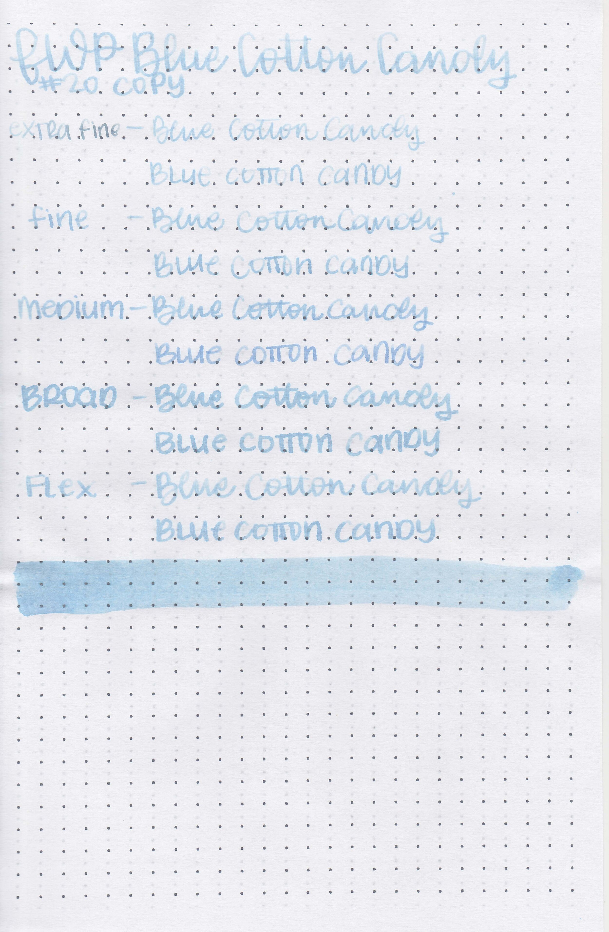
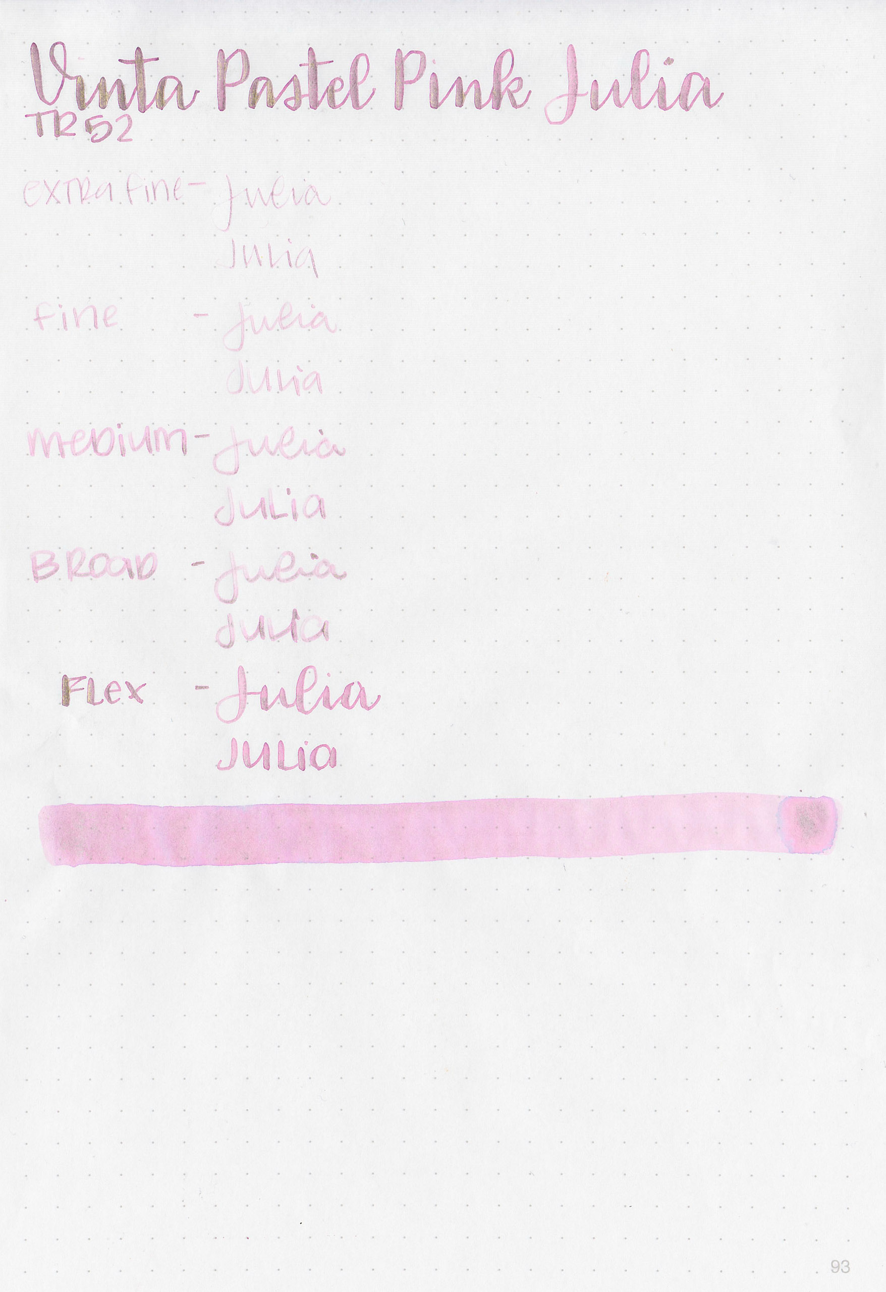
Let's take a look at how the ink behaves on fountain pen friendly papers: Rhodia, Tomoe River, and Leuchtturm.
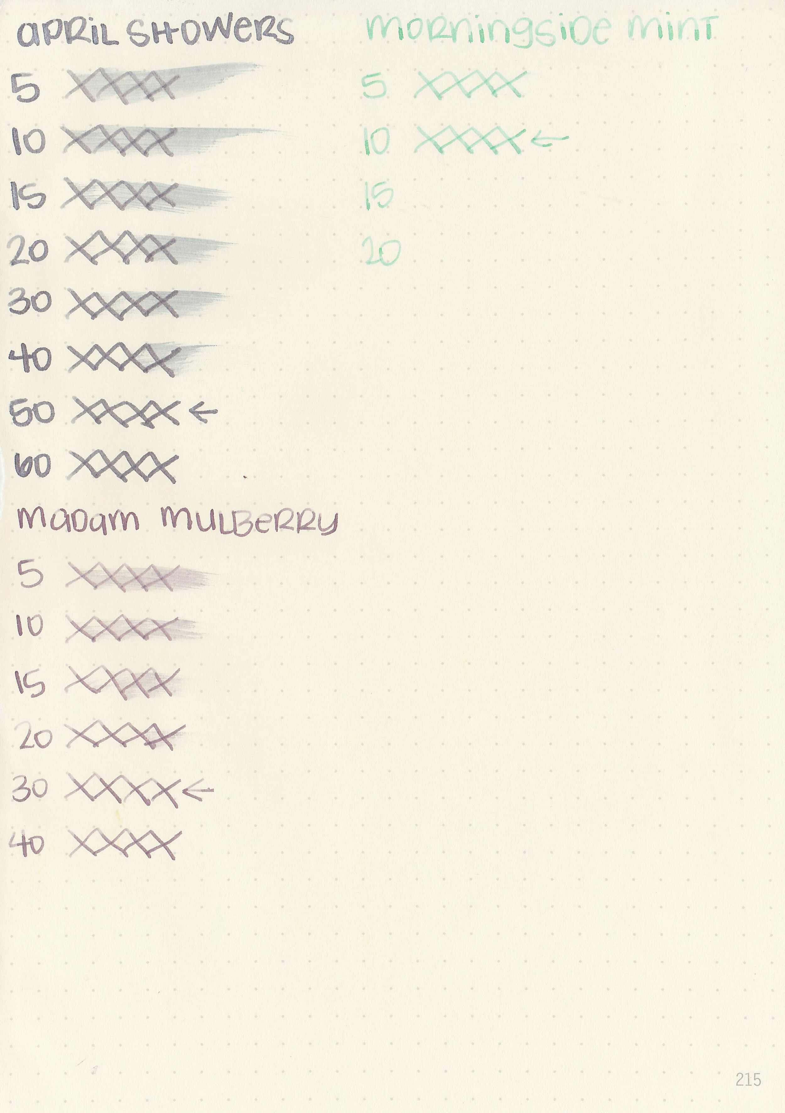
Dry Time: 10-50 seconds
Water Resistance: Low-Medium

Feathering: None

Show through: Medium

Bleeding: None
Other properties: medium-high shading (high shading on Morningside Mint), no sheen and silver shimmer (April Showers).
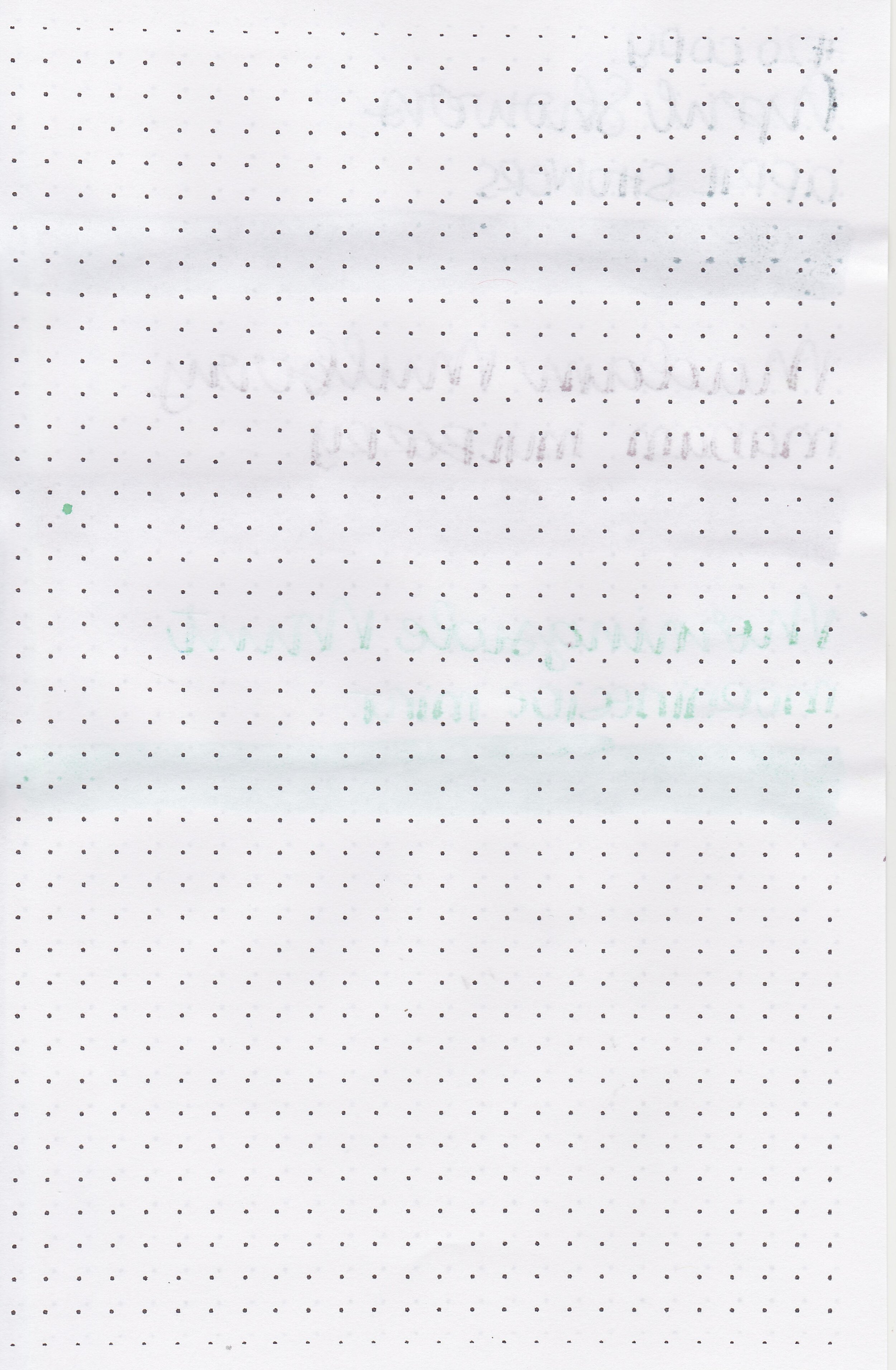
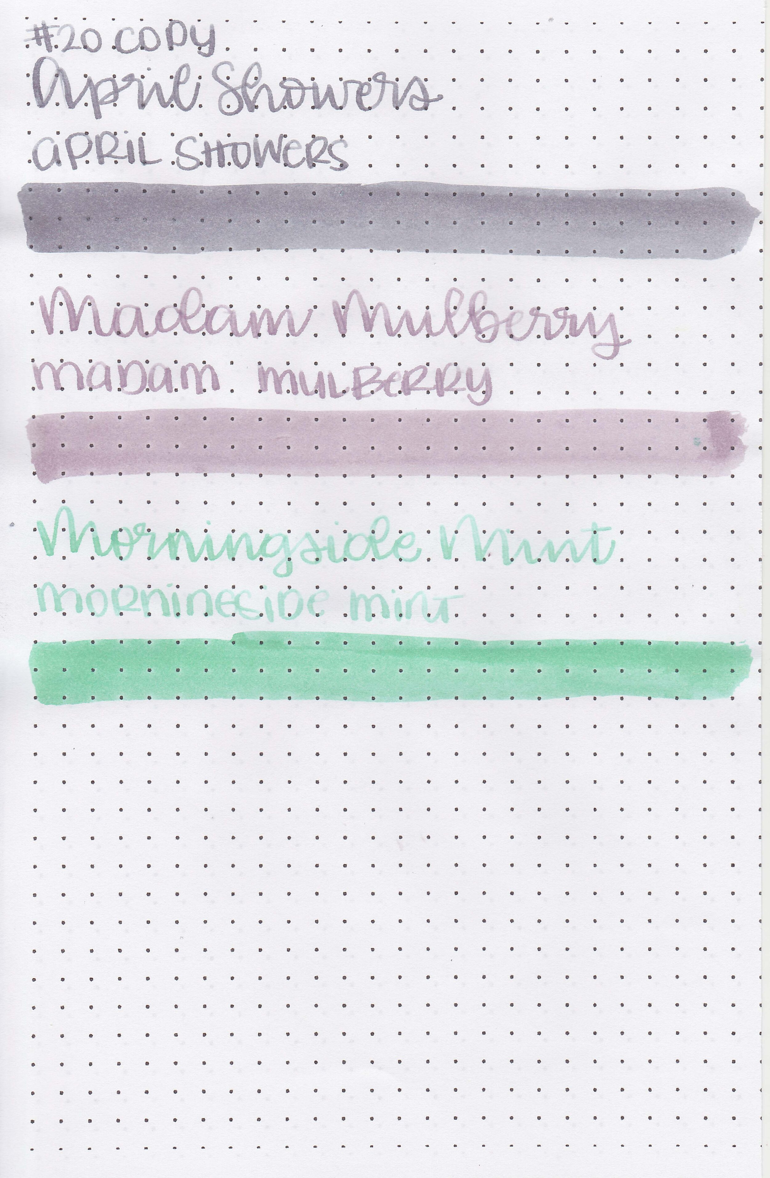
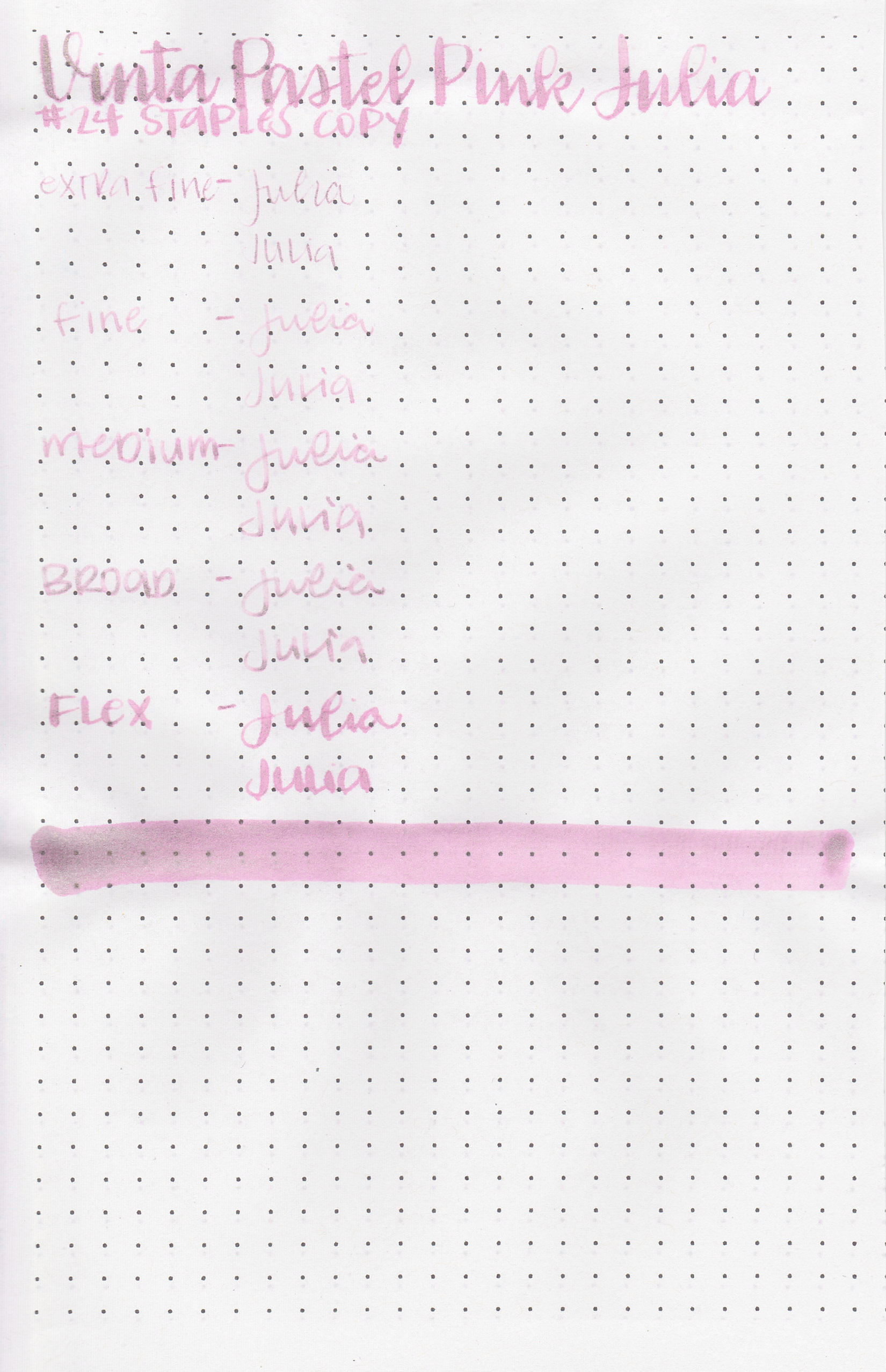
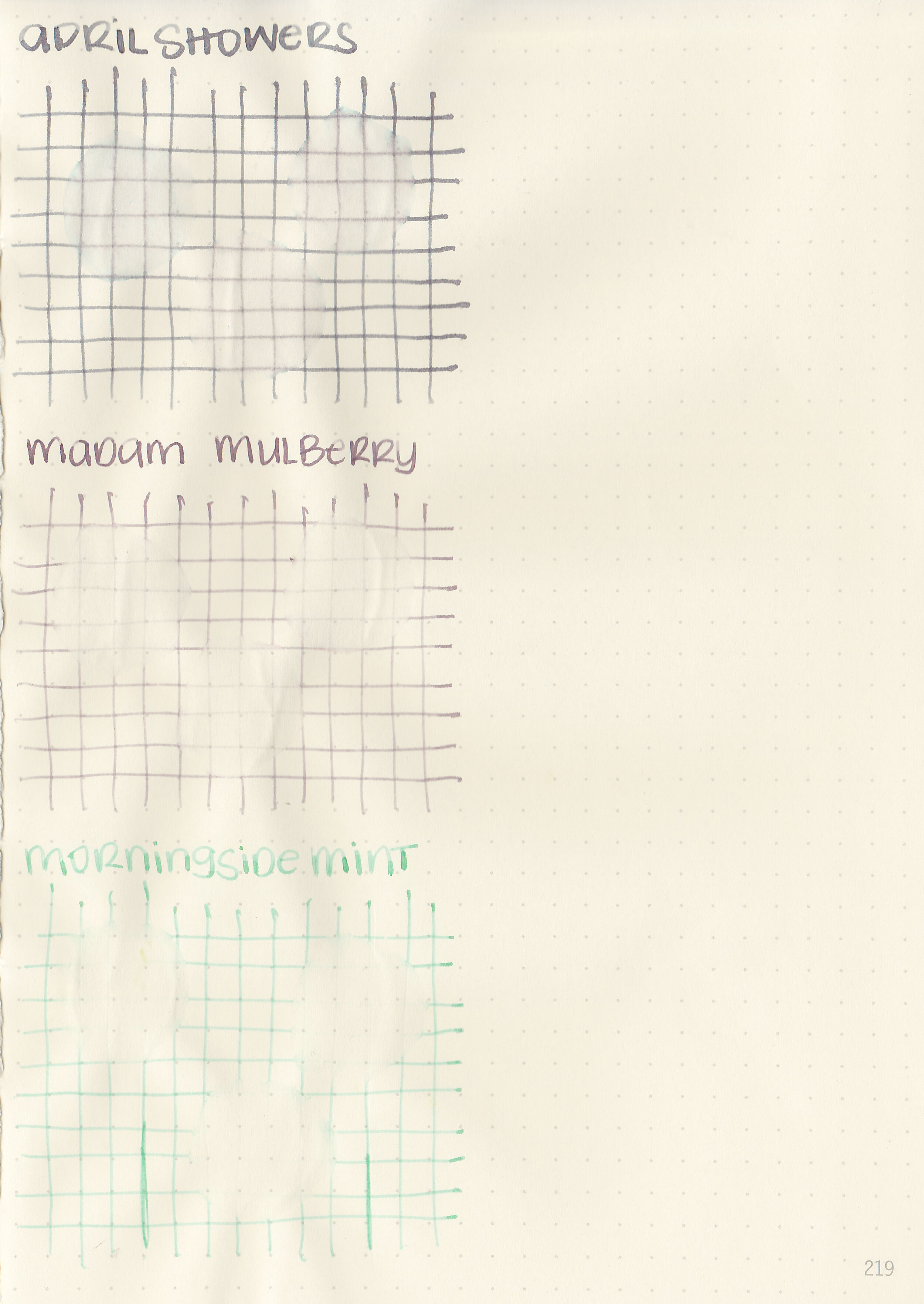
On Staples 24 lb copy paper there was lots of feathering in every nib size as well as some bleeding.
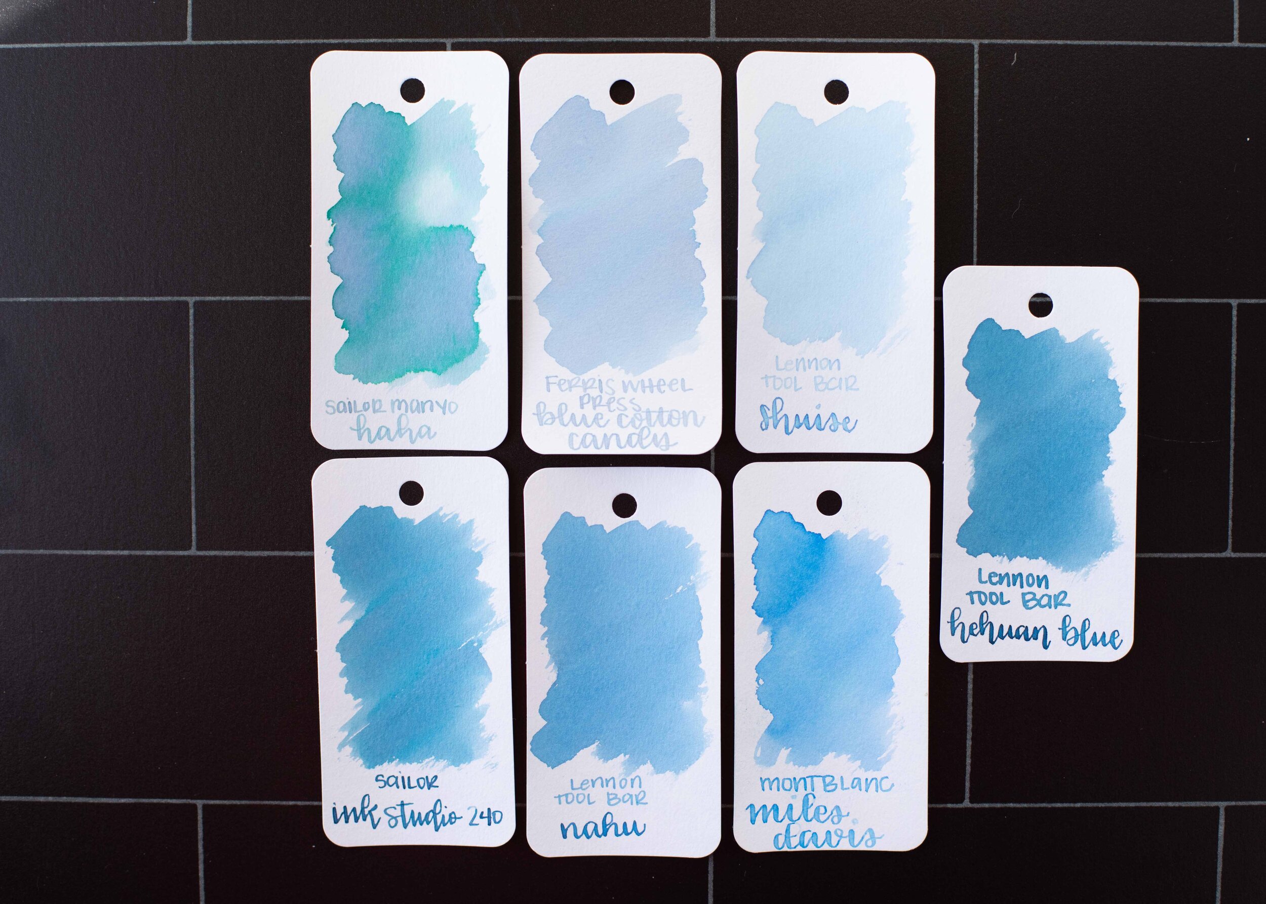
Comparison Swabs:

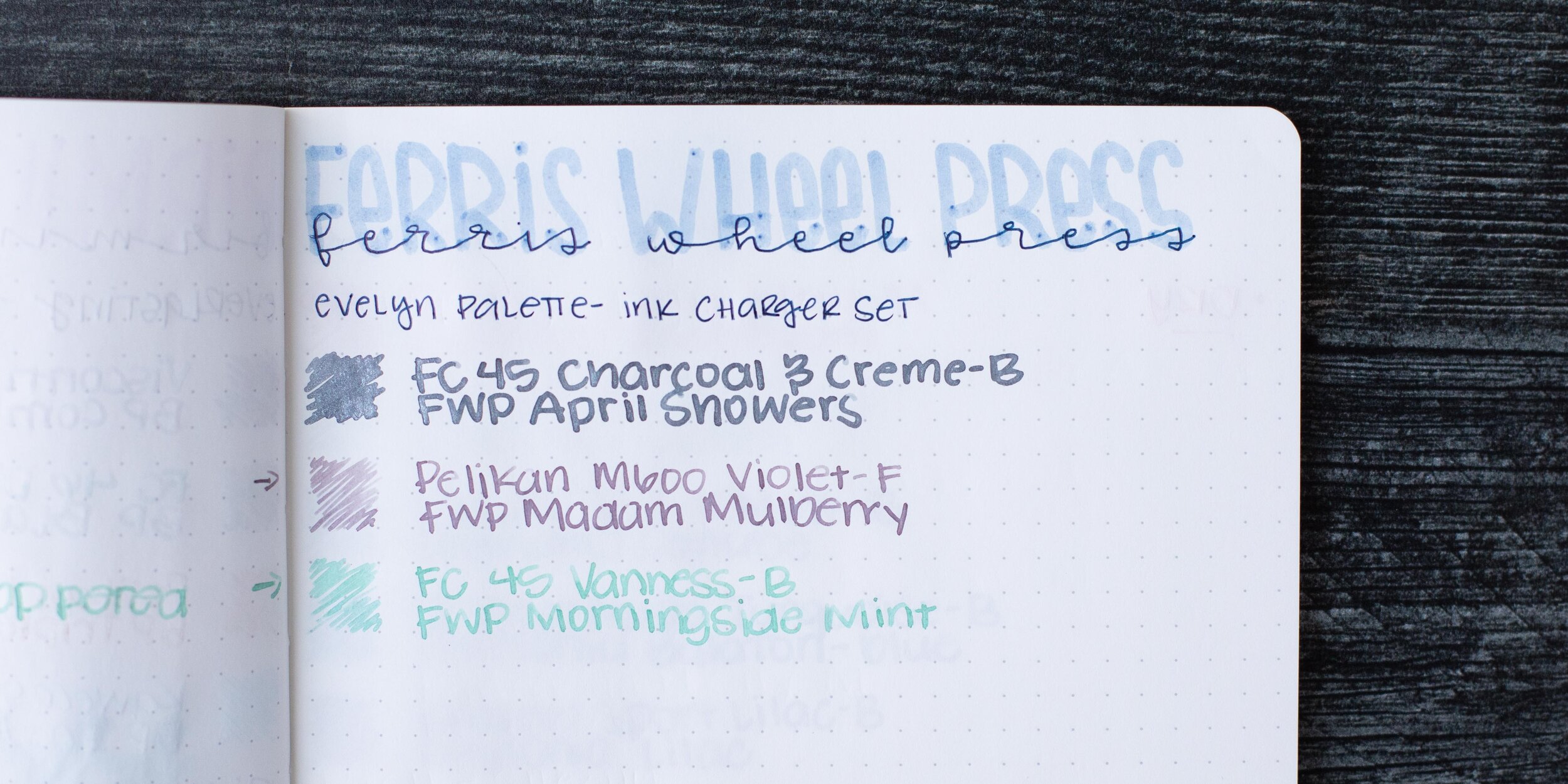
April Showers is closest to Diamine Moon Dust.
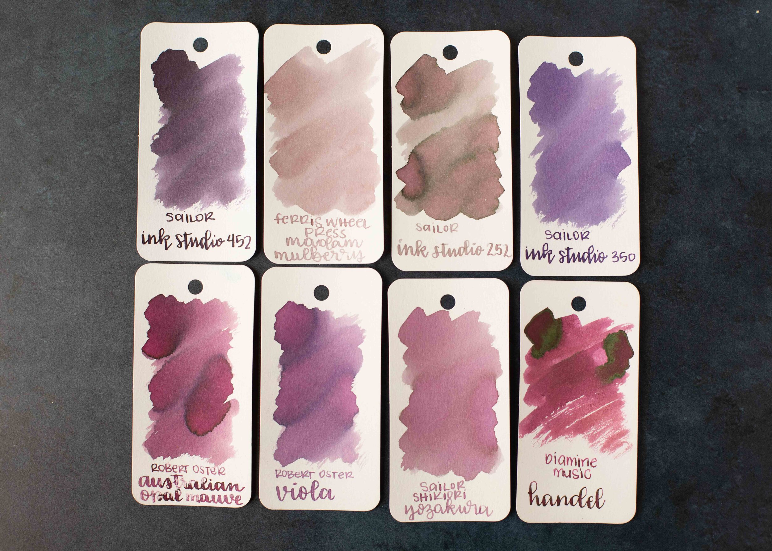
Madam Mulberry is similar to Sailor Ink Studio 252.
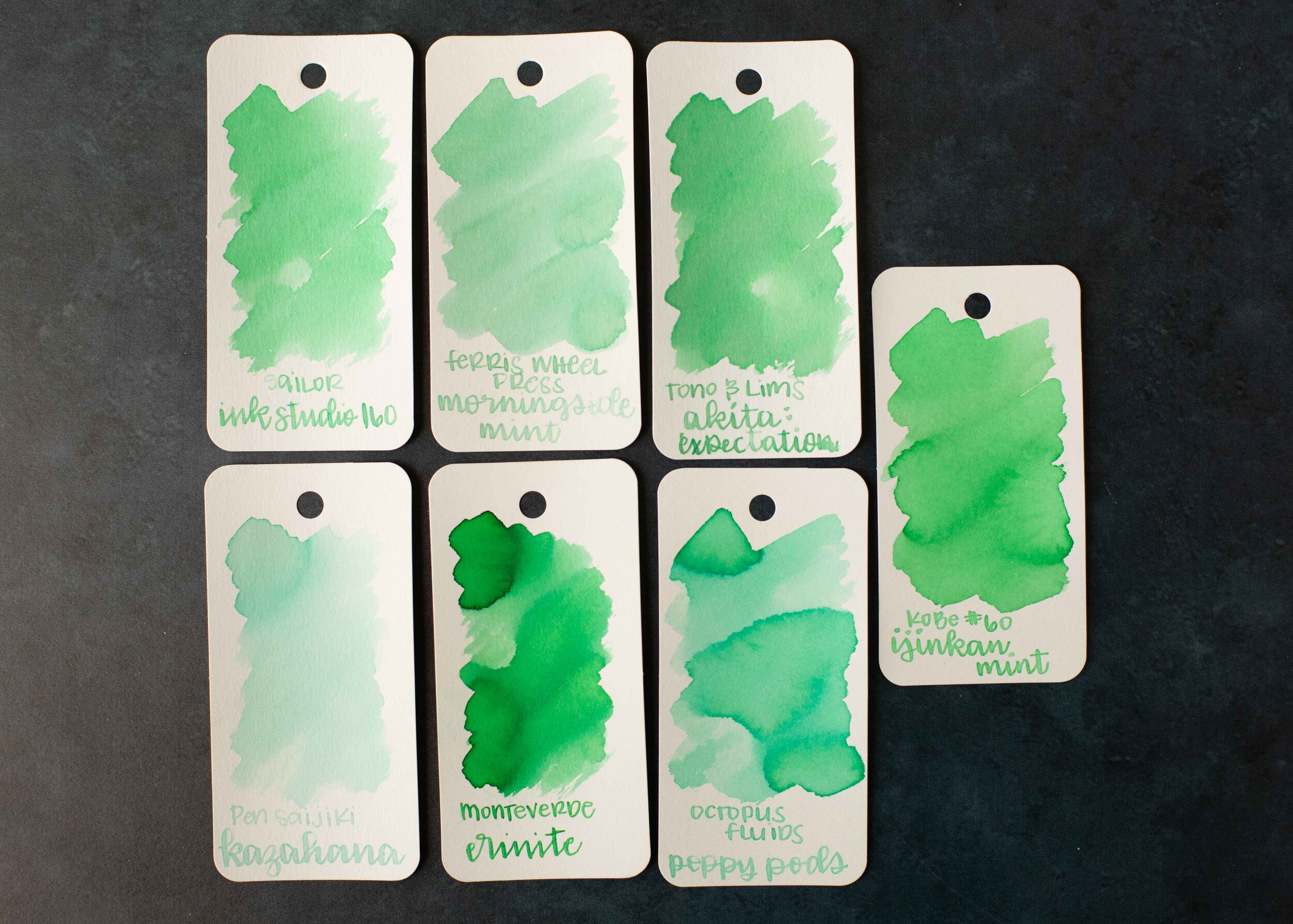
Morningside Mint is similar to Sailor Ink Studio 160.
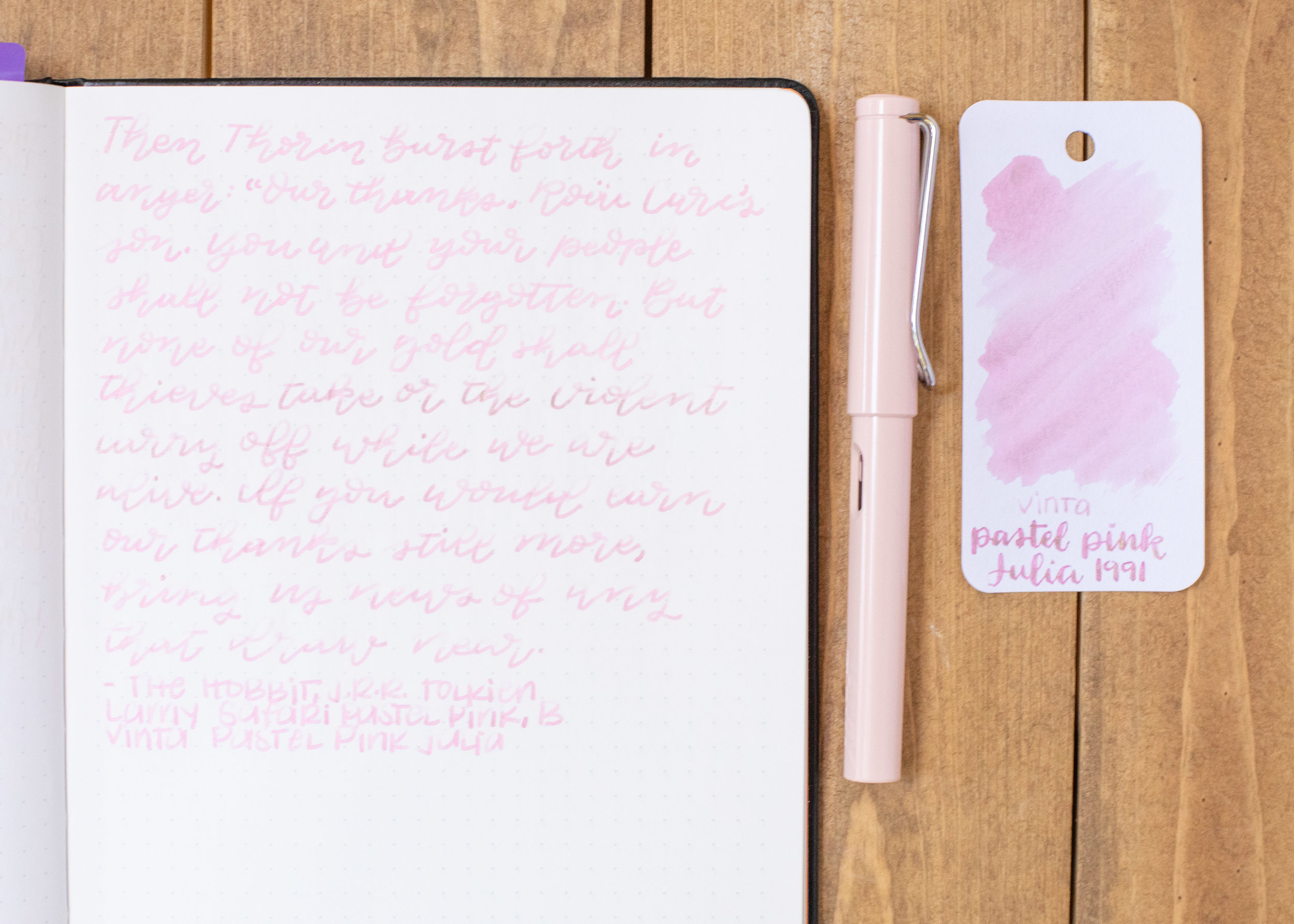
Longer Writing:

I used a Taroko Odyssey notebook, all three inks had a dry flow.
Overall, I love the color of all three inks, but Morningside MInt can be too light in most nib sizes. Even in a wet broad nib it’s still pretty light. All three are a bit drier than I prefer, but are great colors for a spring season.
Disclaimer: These inks were provided by Phidon Pens for the purpose of this review. All photos and opinions are my own. This page does not contain affiliate links, and this post is not sponsored.