
Ink Review: Robert Oster Ryde Green
/
Today's ink is Ryde Green by Robert Oster. Summer calls for bright fun greens, and this ink certainly delivers. Ryde is a suburb of Sydney, Australia (I have no idea if this ink was named after Ryde, Australia, but that's my guess). I purchased my bottle of ink from Pen Chalet. The bottle is 50 ml of ink.
The color...
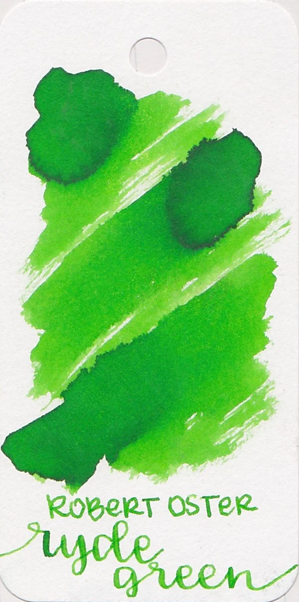
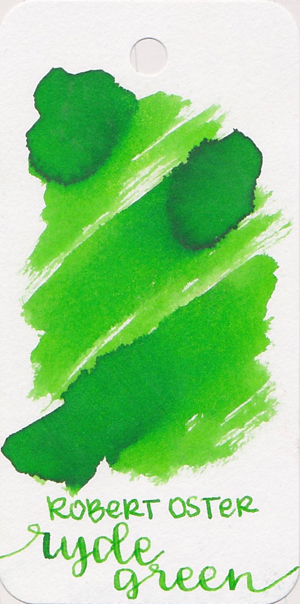
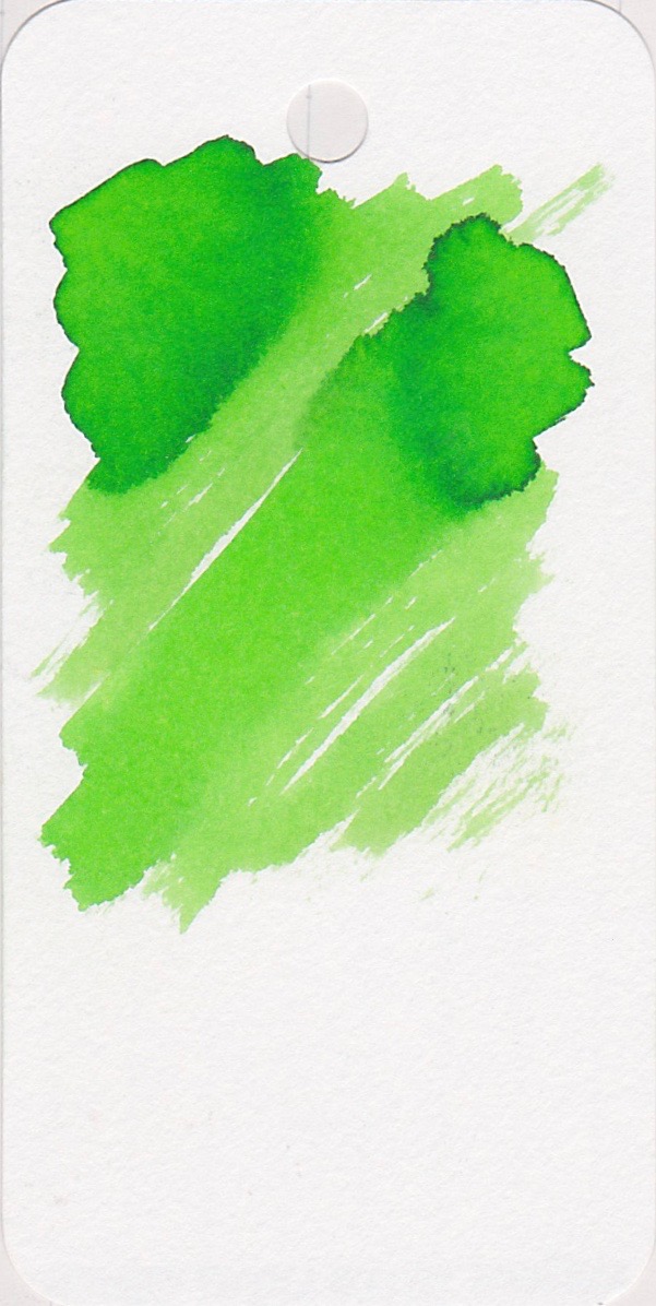
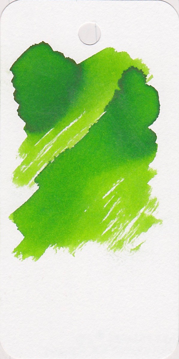
Ryde Green is a bright lime green. There is shading, but no sheen.
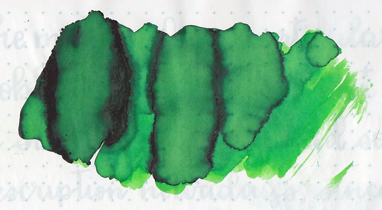
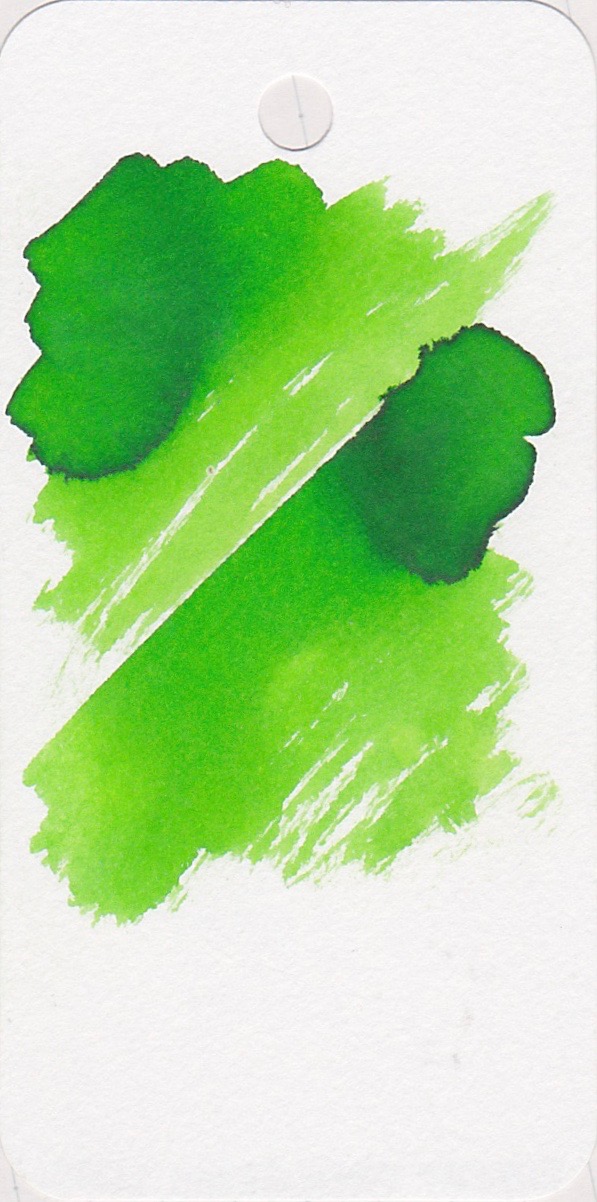
In heavy swabs, Ryde Green looks almost black. There is some shading.
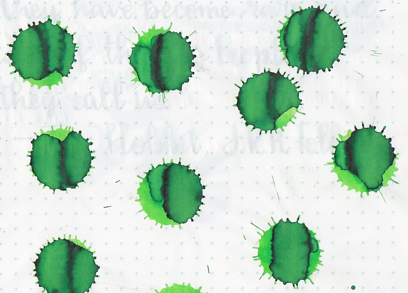
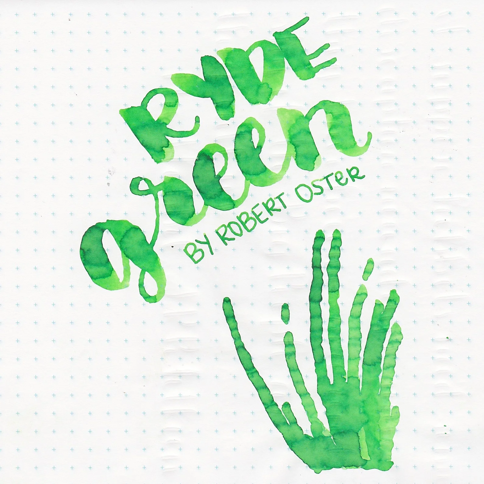
I don't know why, but ink drops always make me happy. I love the shading Ryde Green has.
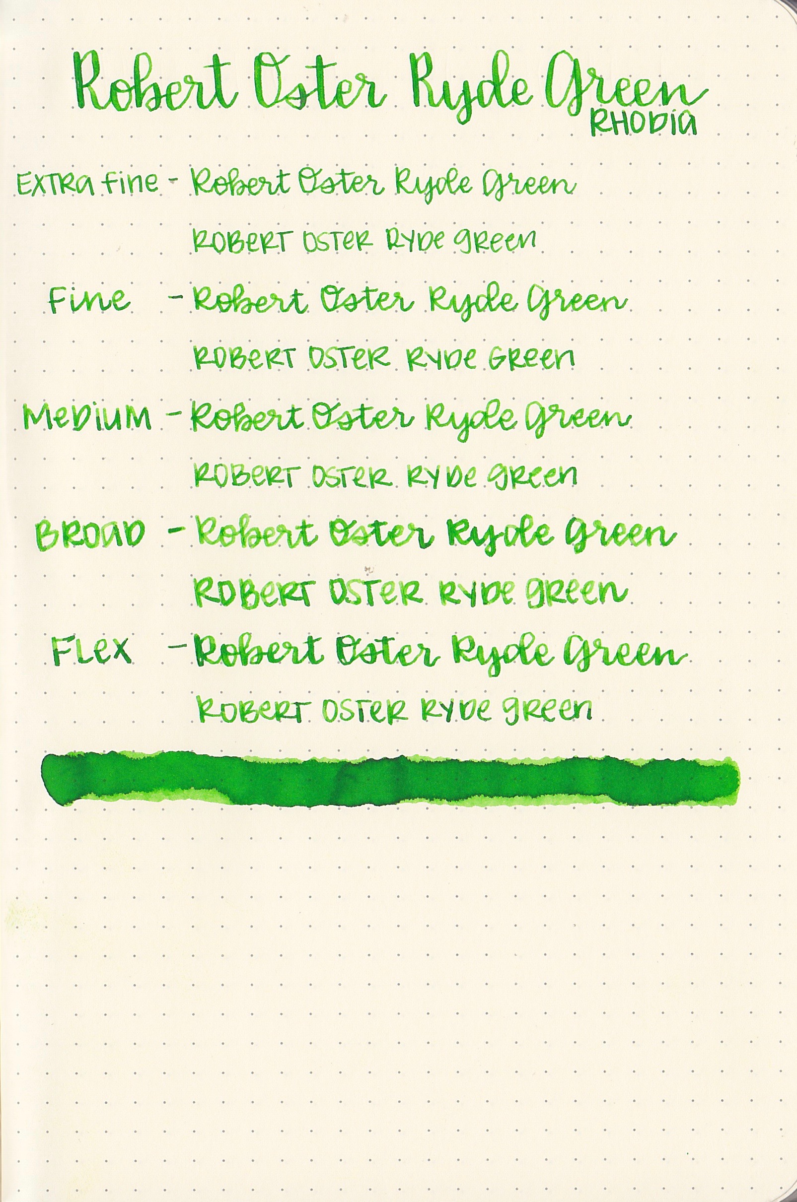
Feathering: Ryde Green had no feathering.
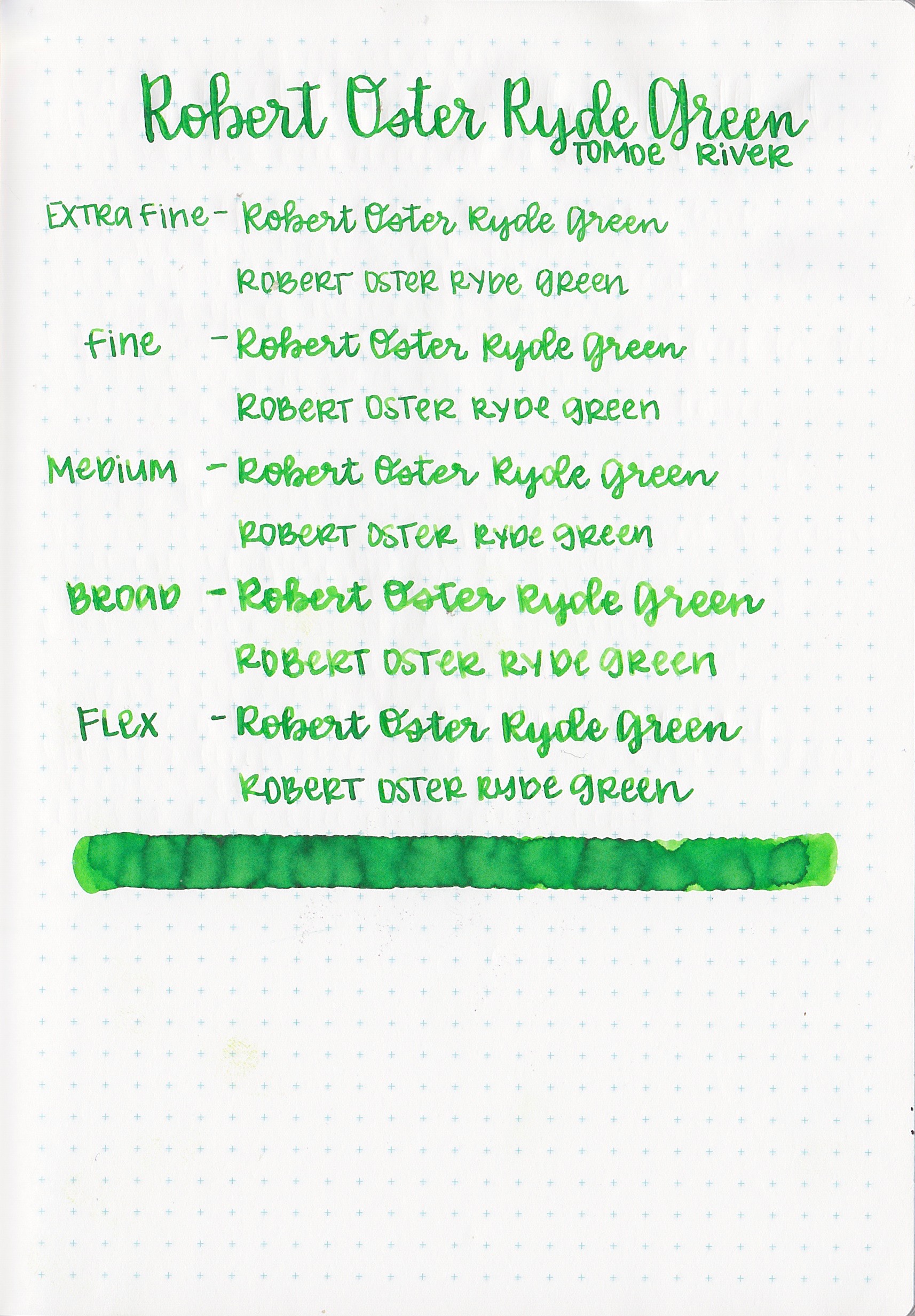
Bleeding: Ryde Green only bled a little bit on the Tomoe River swab.

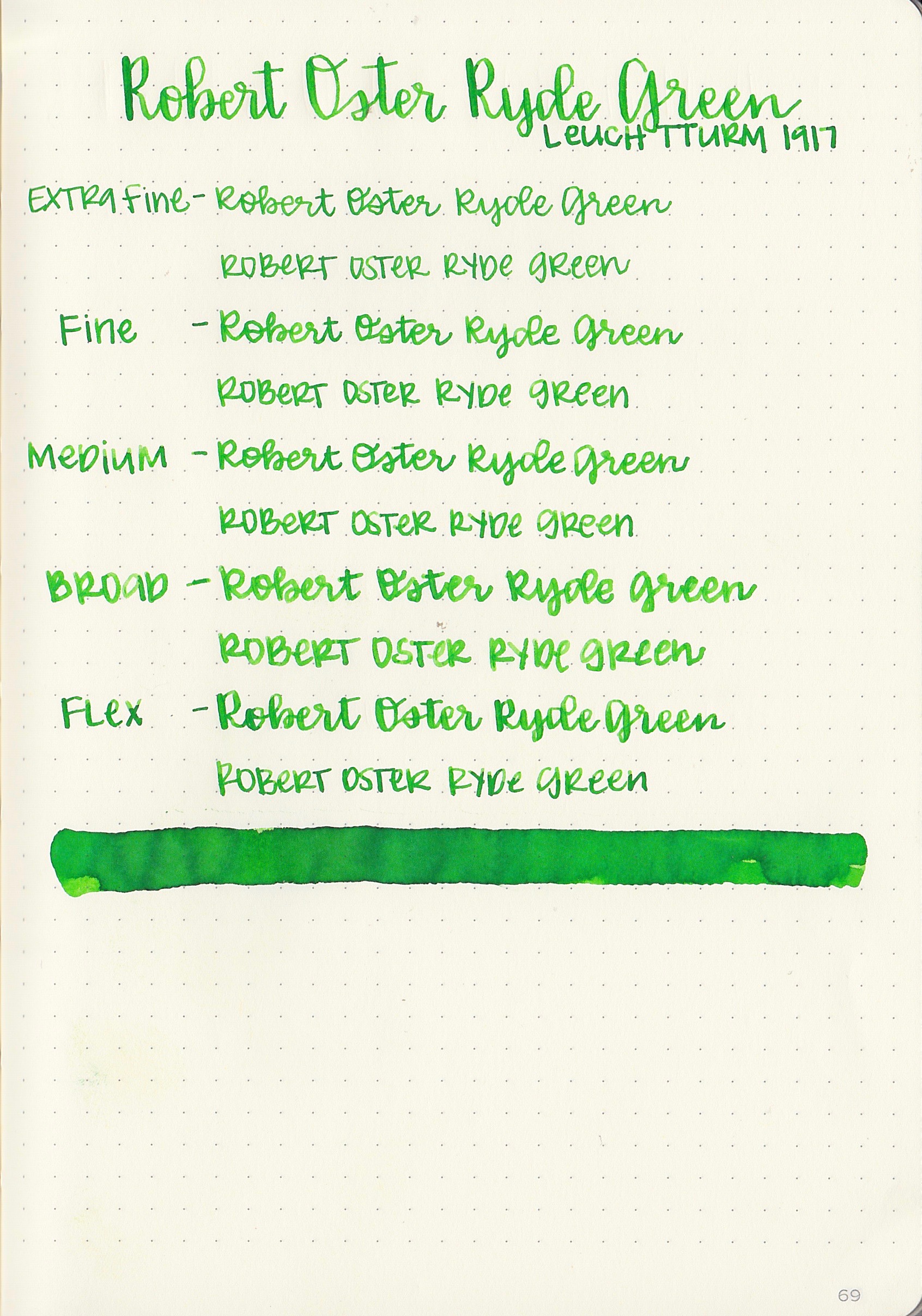
Ghosting: Ryde Green had low ghosting on Rhodia, and medium on the other three papers.
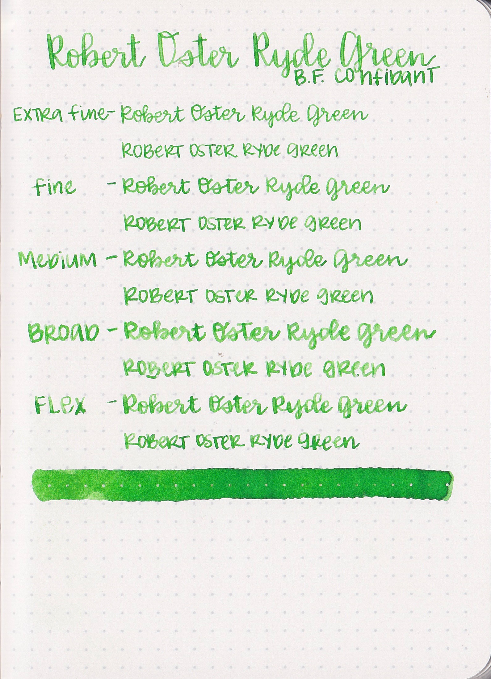
Shading: Ryde Green had low shading on all of the papers, and no sheen.
Here are three Robert Oster inks: Ryde Green, Green Lime, and Light Green. They almost look like the same color, just different levels of saturation-starting with Ryde Green, then Green Lime is one shade lighter, and Light Green is one shade lighter than that. (When I get bottles of Lime Green and Light Green I will do a review of them)


Left to right: Akkerman #28 Hofkwartier Green, Diamine Kelly Green, and Diamine Meadow. All three of these are a bit more yellow and darker than Ryde Green.
Longer writing...
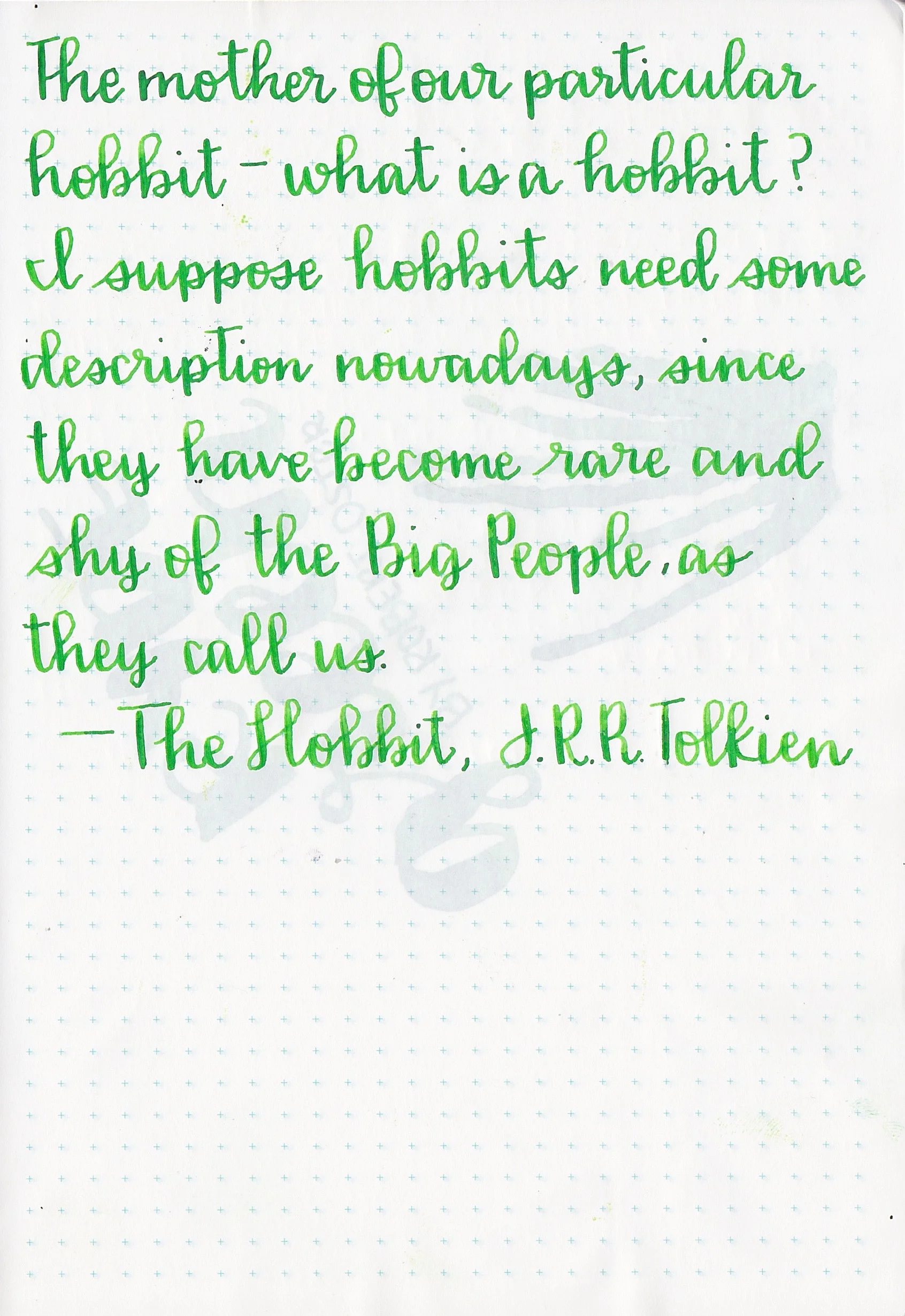
Ryde Green kept up really well with the flex nib. Some inks that run a bit dryer than average have a hard time keeping up with the heavy ink needs of a flex nib, but Ryde Green did really well.
Overall, I really liked this ink. It kept up well with the flex nib and had some good shading.
Disclaimer: I purchased this ink myself, and all opinions and photos are my own. This page contains no affiliate links.