Tono & Lims Earth Contact Inks Part 2
/
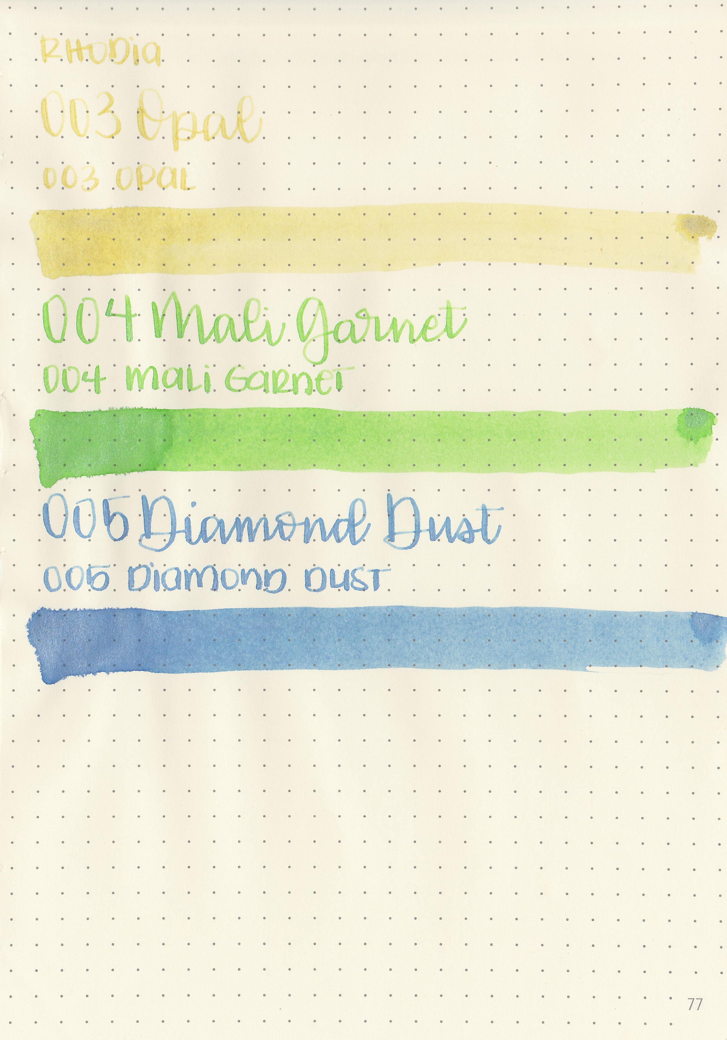
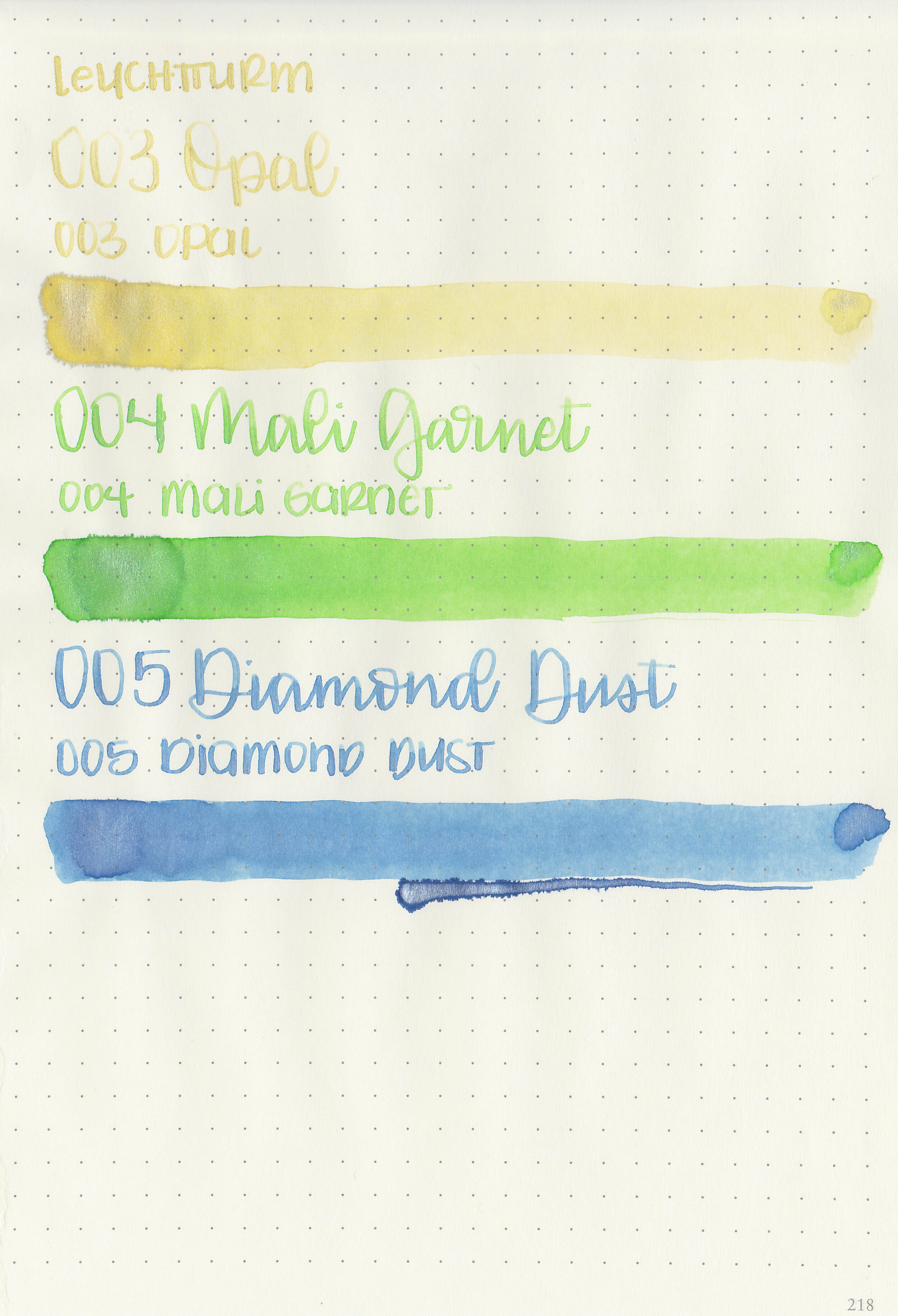
Tono & Lims has recently added three new inks to their Earth Contact lineup: 003 Opal, 004 Mali Garnet and 005 Diamond Dust. Thanks to Shigure Inks for sending samples over for review!
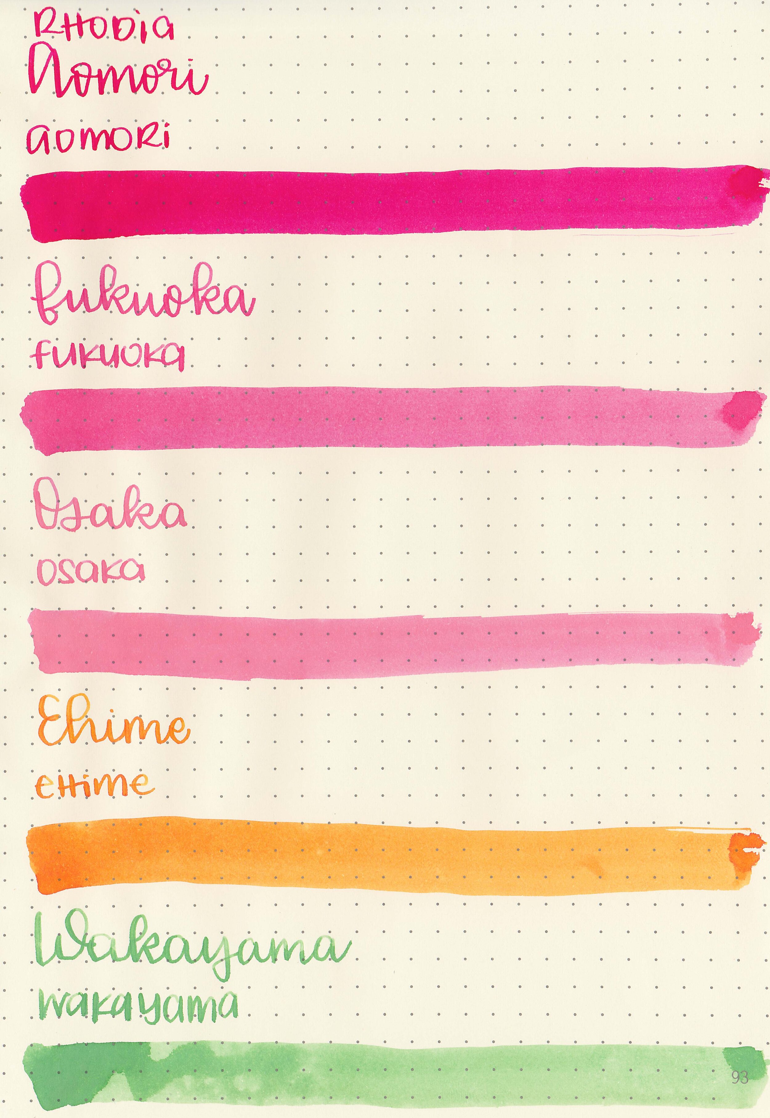
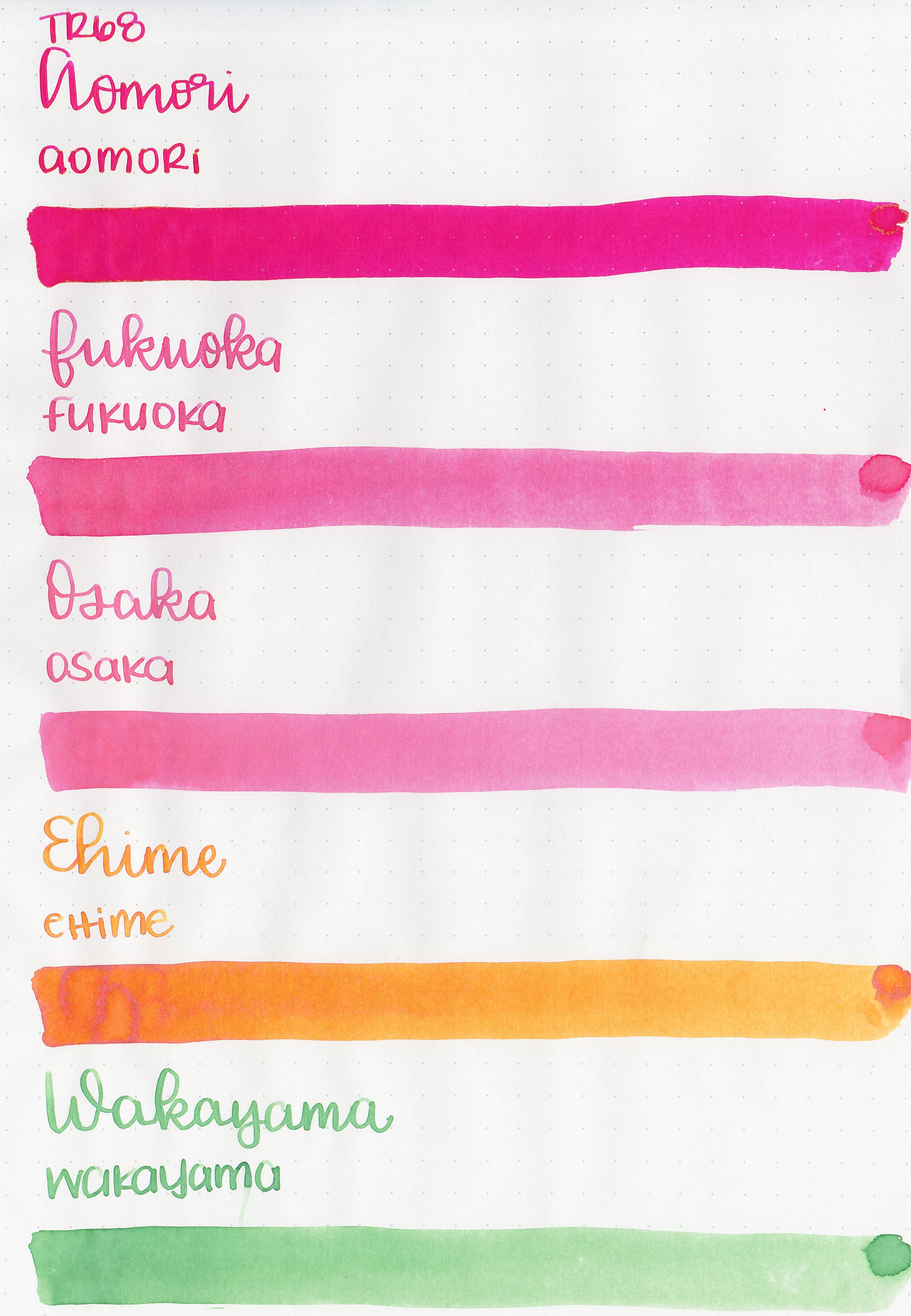
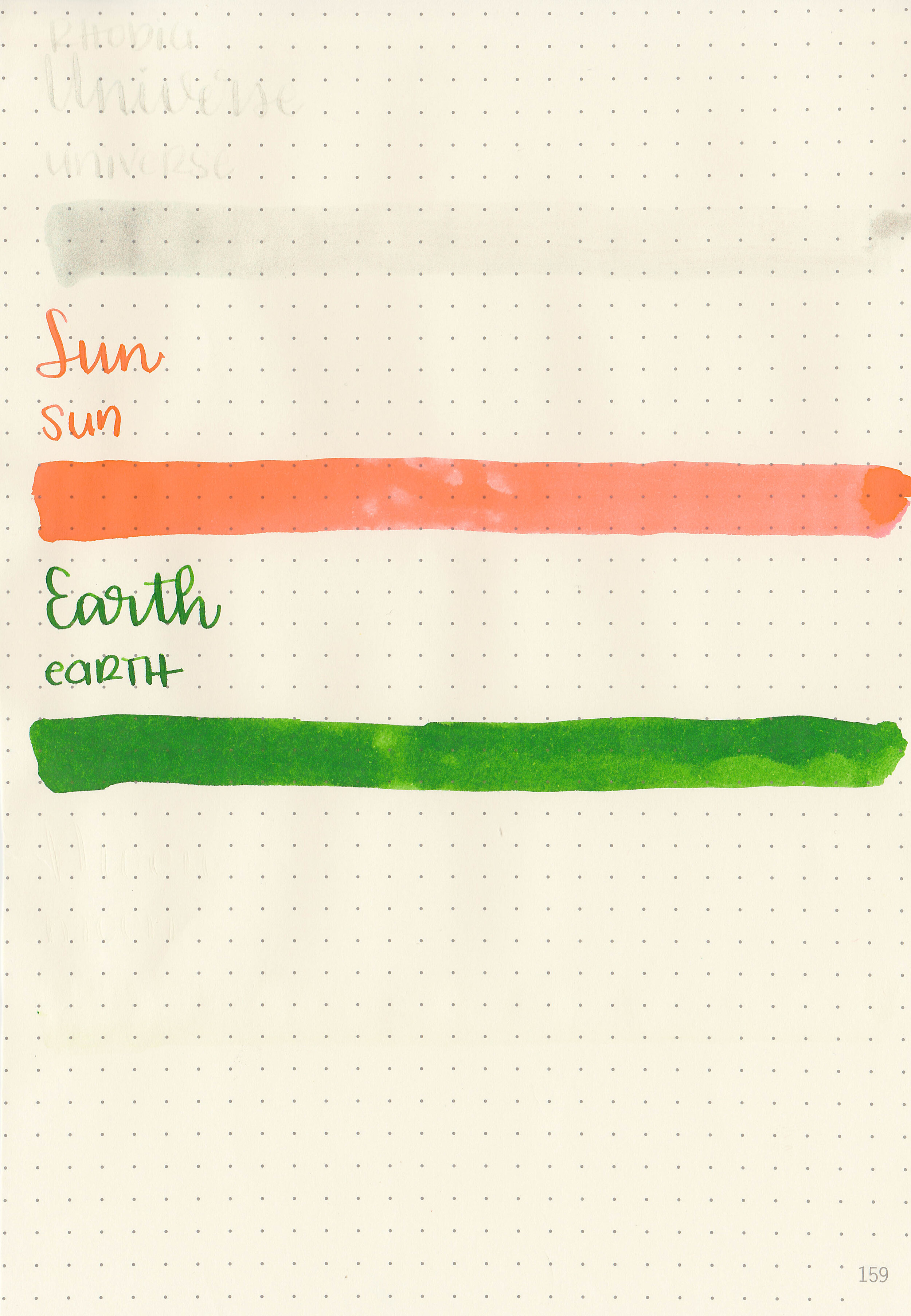
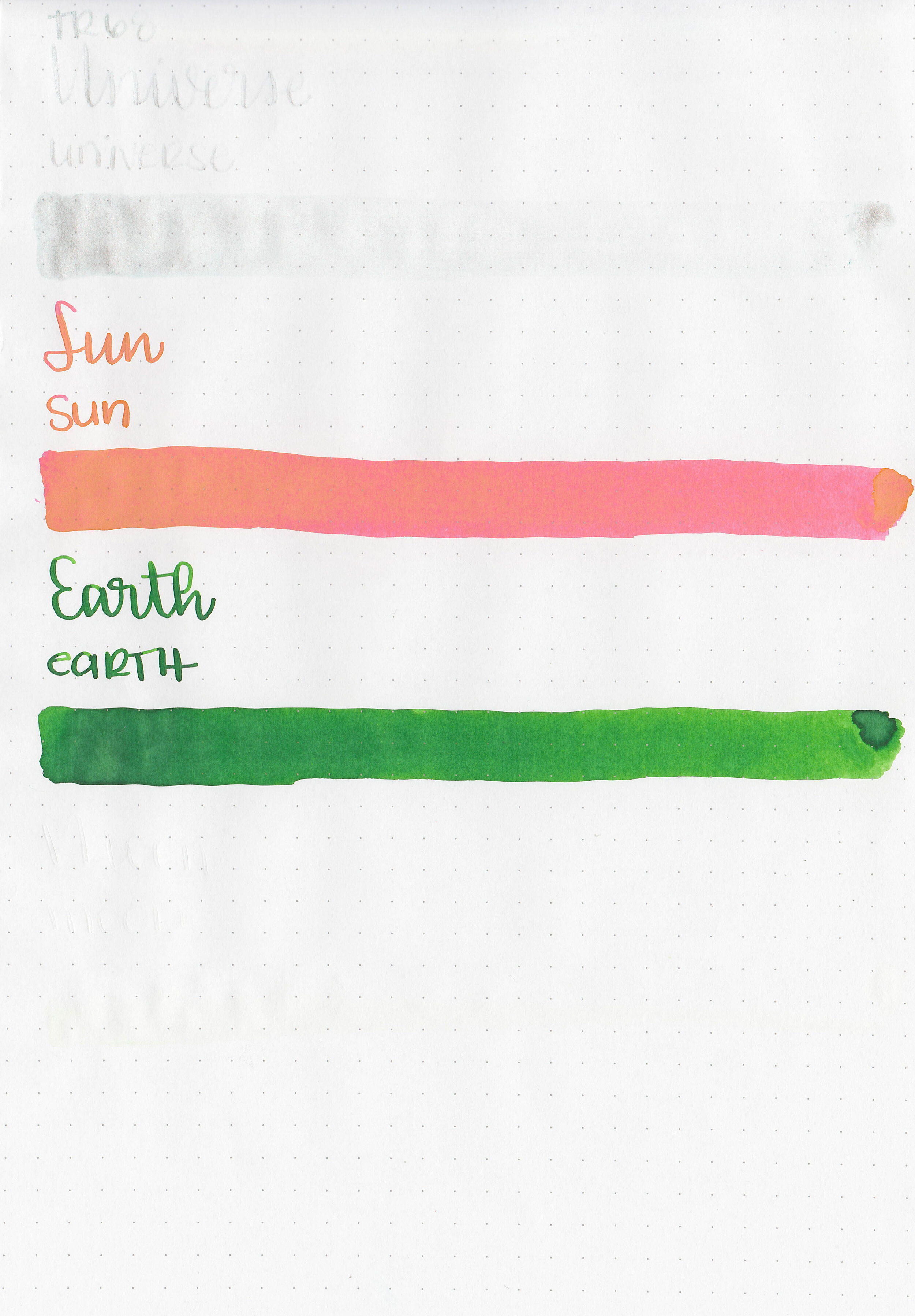
Swabs:

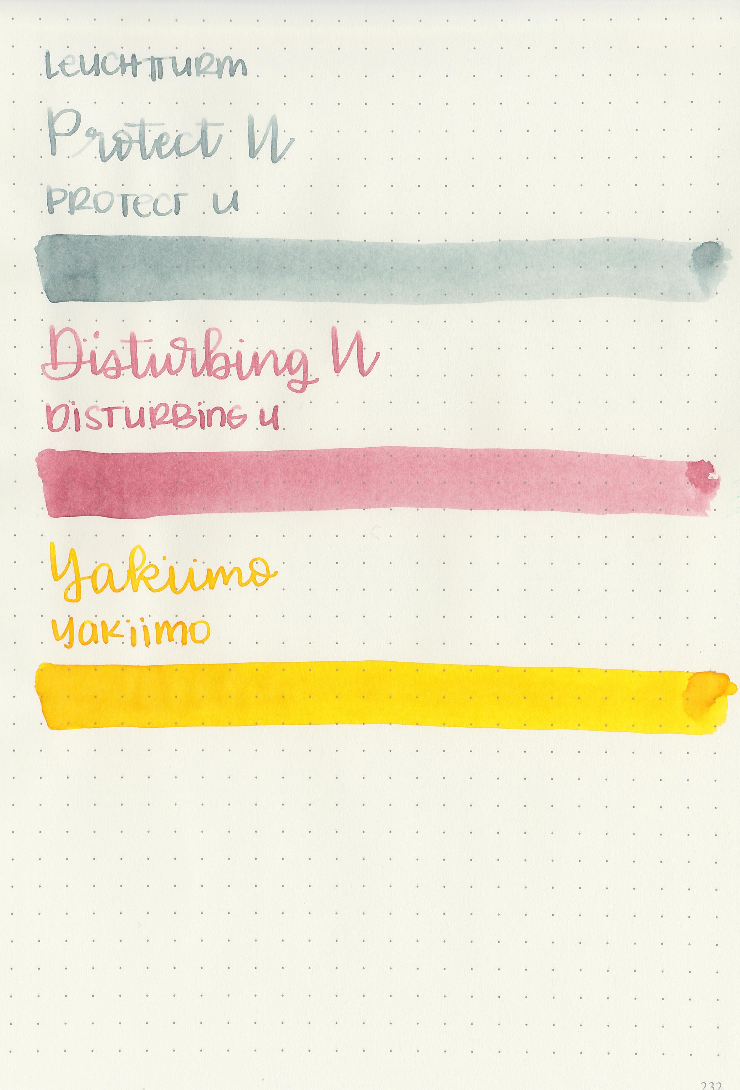
Left to right: 003 Opal, 004 Mali Garnet and 005 Diamond Dust.
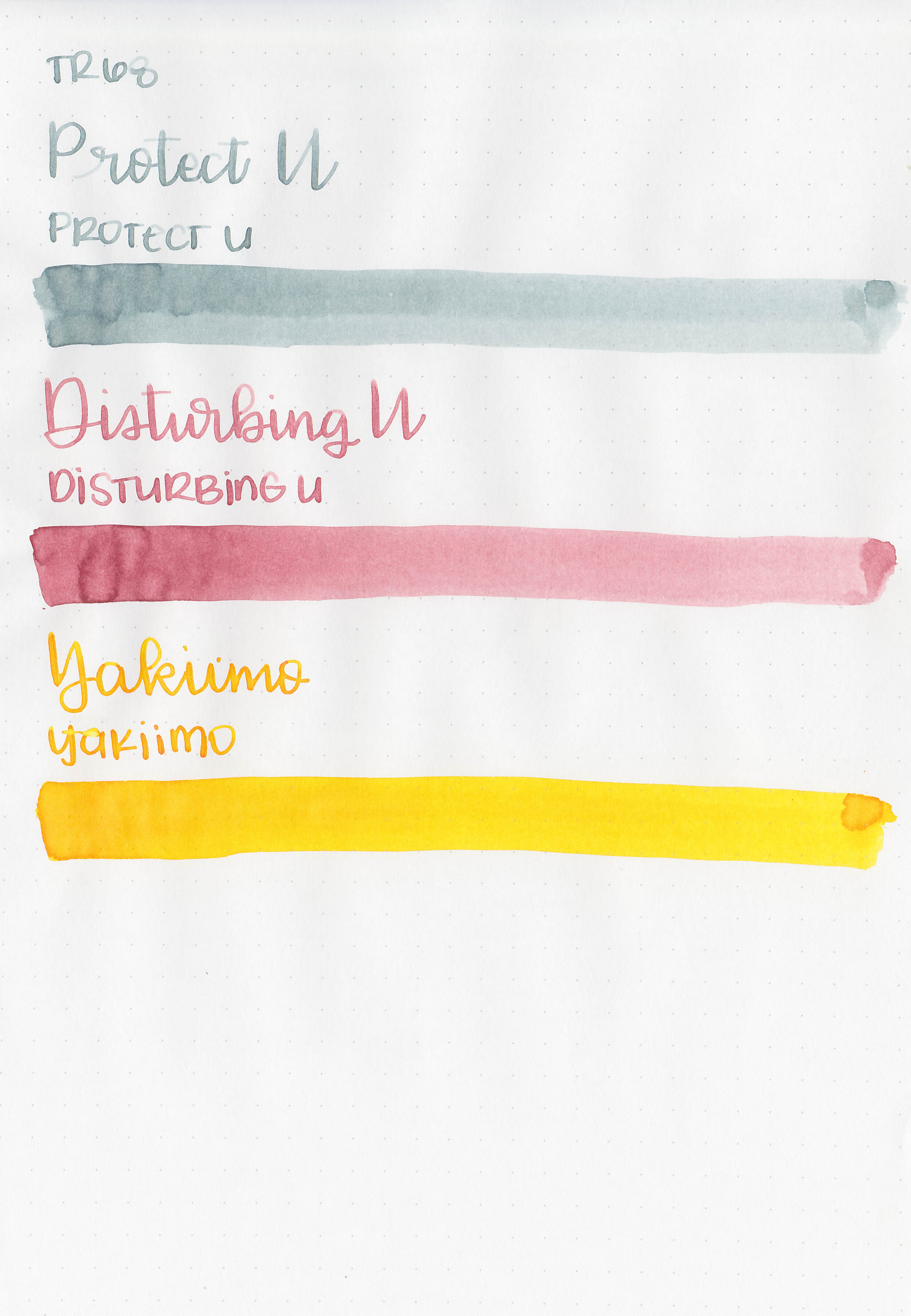
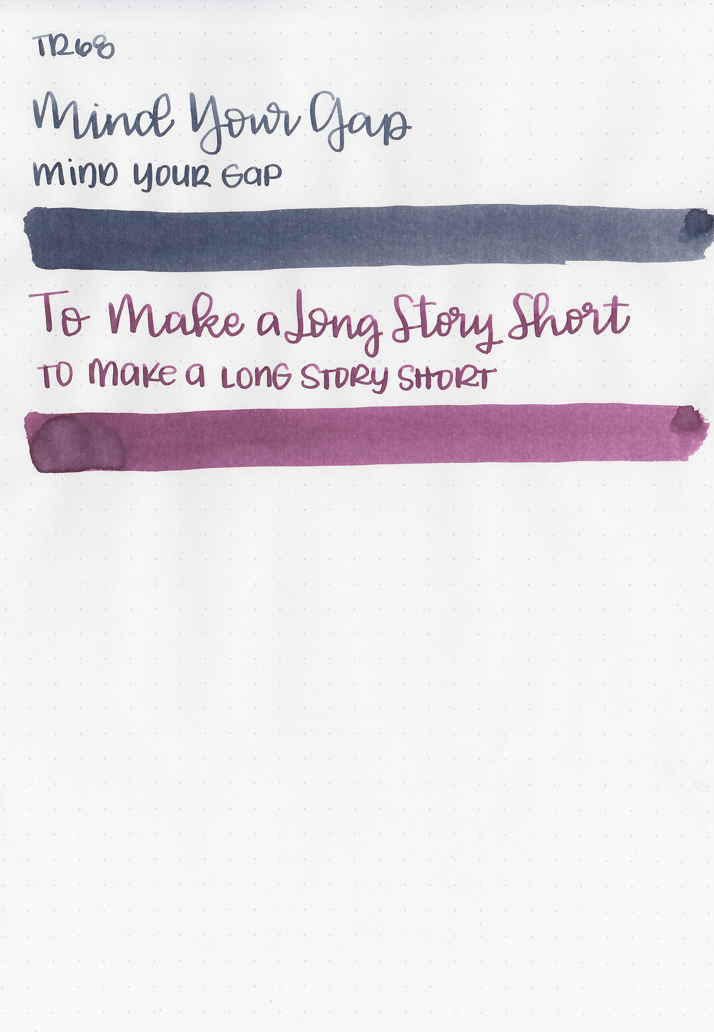
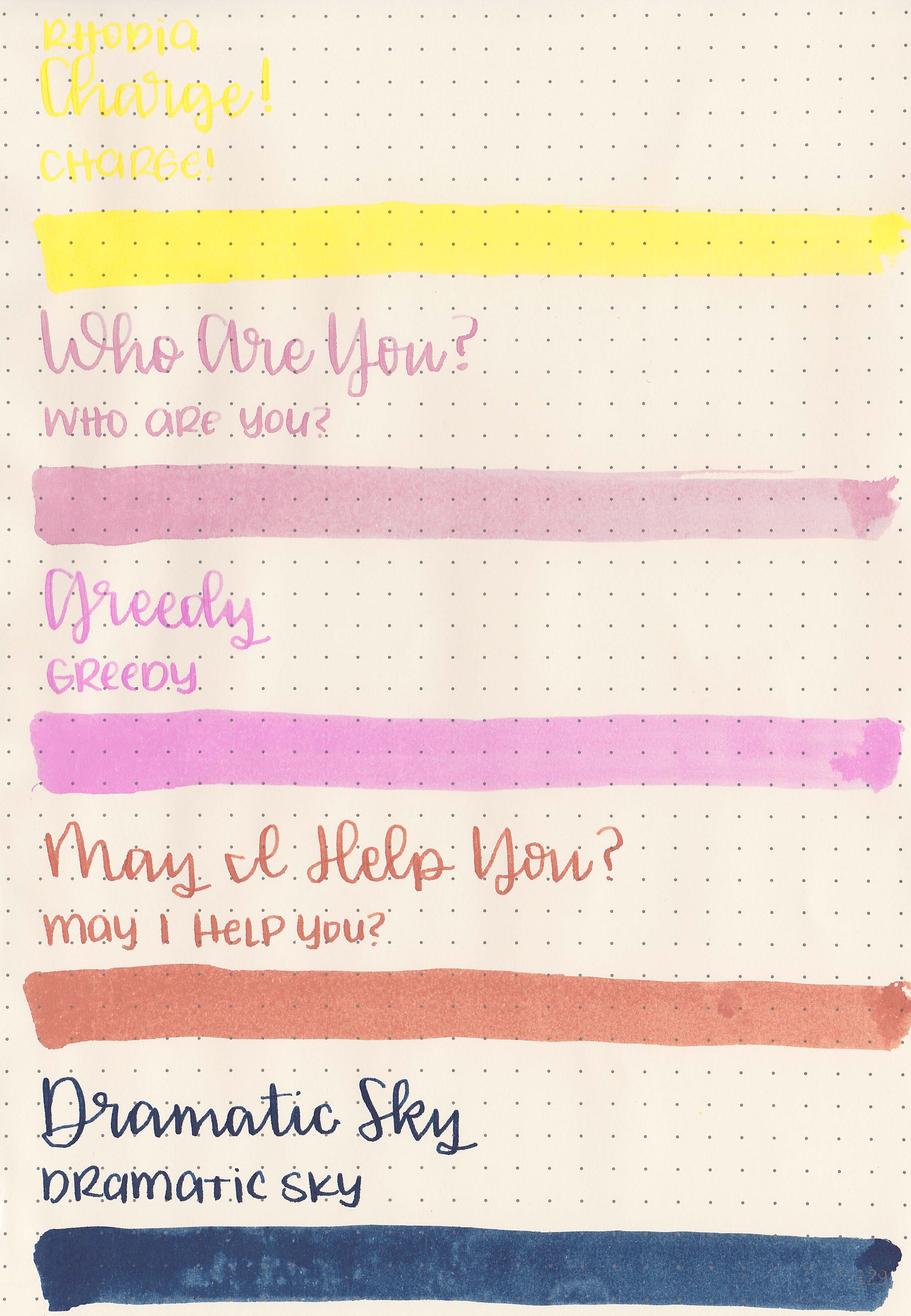
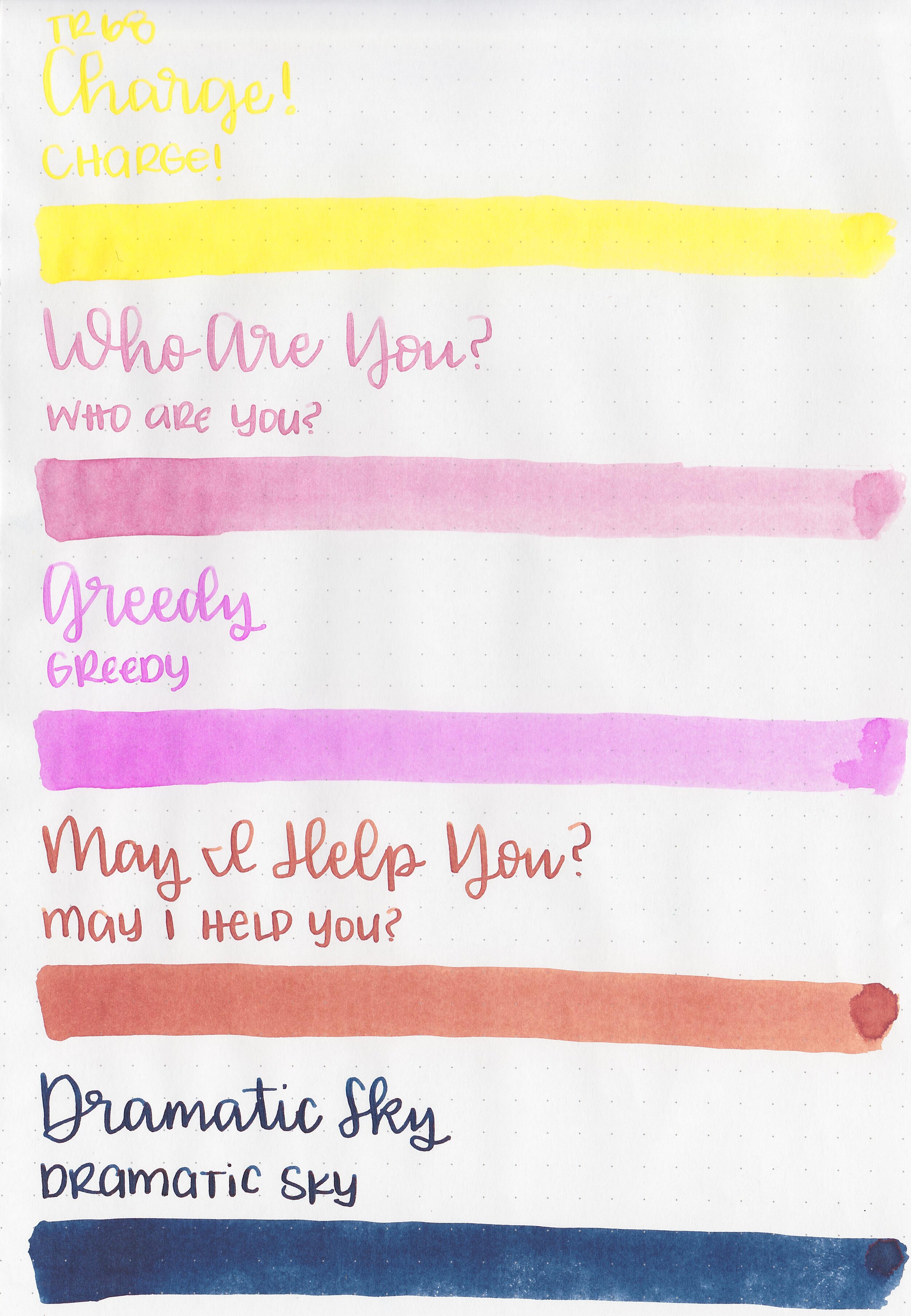
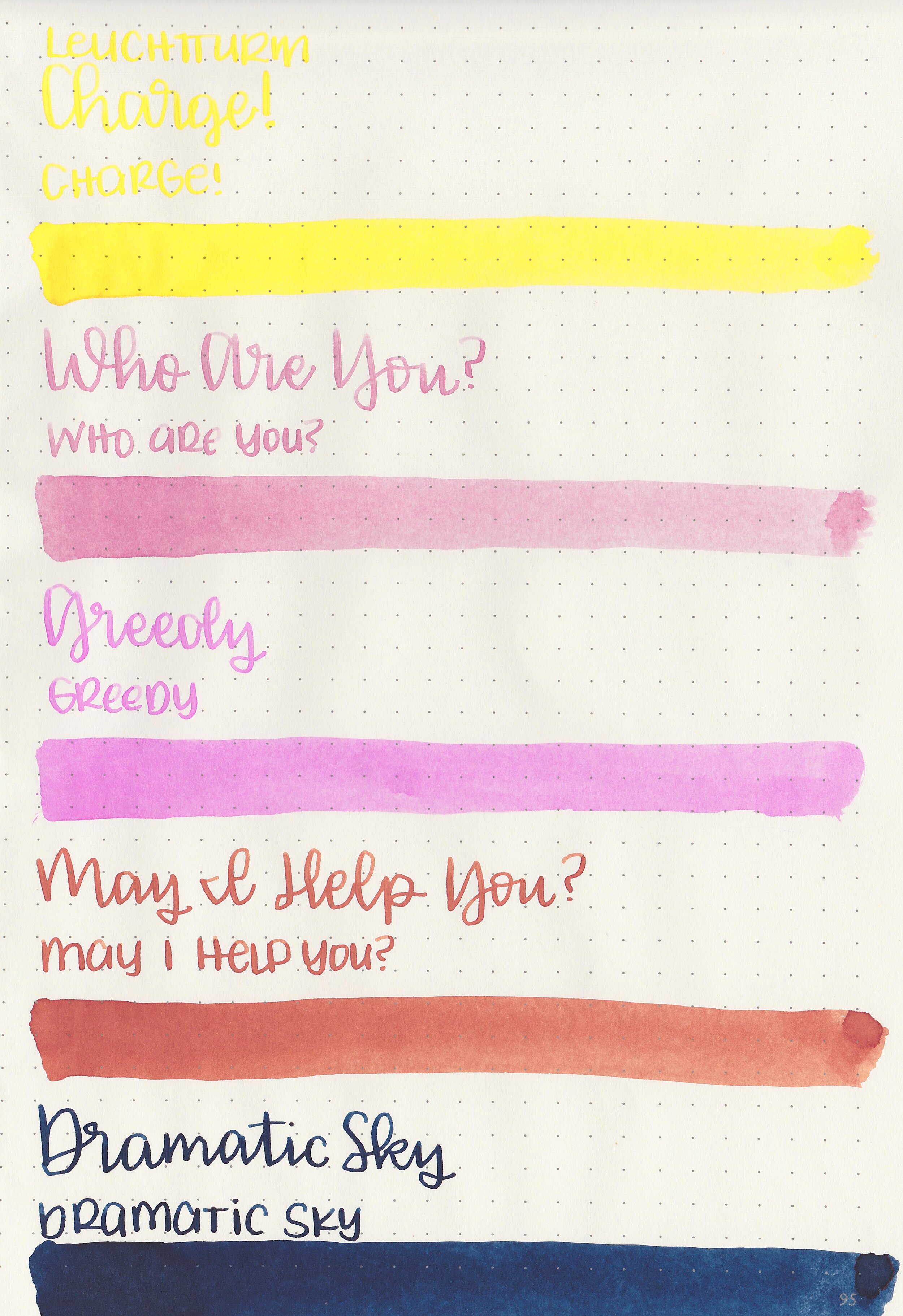
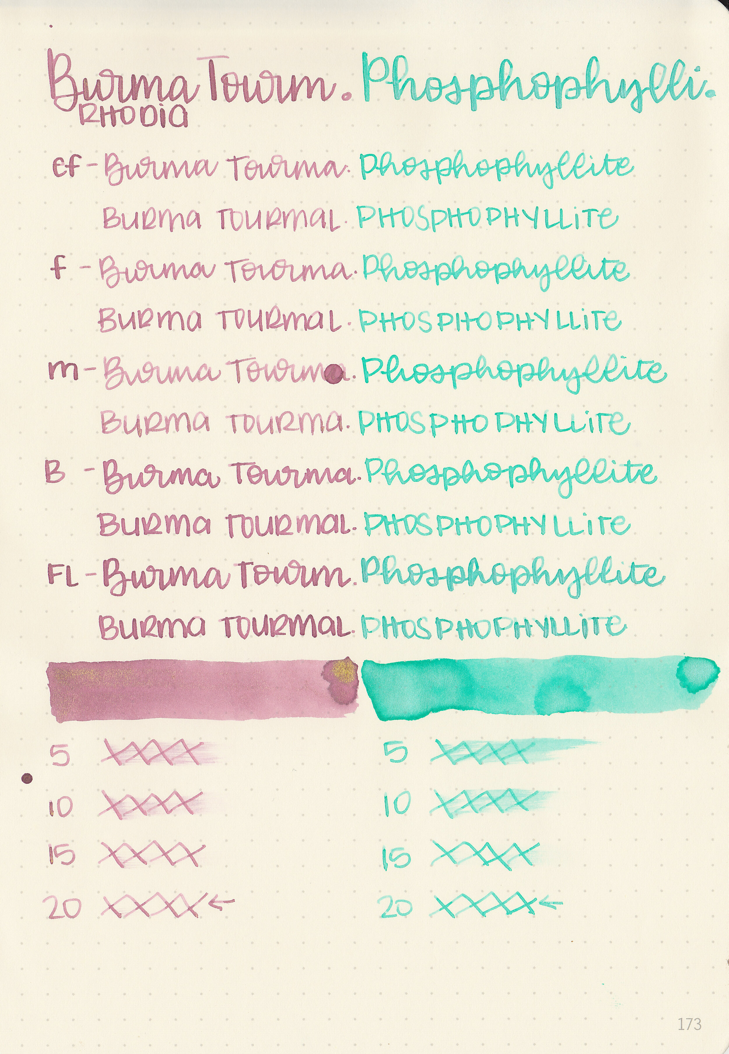
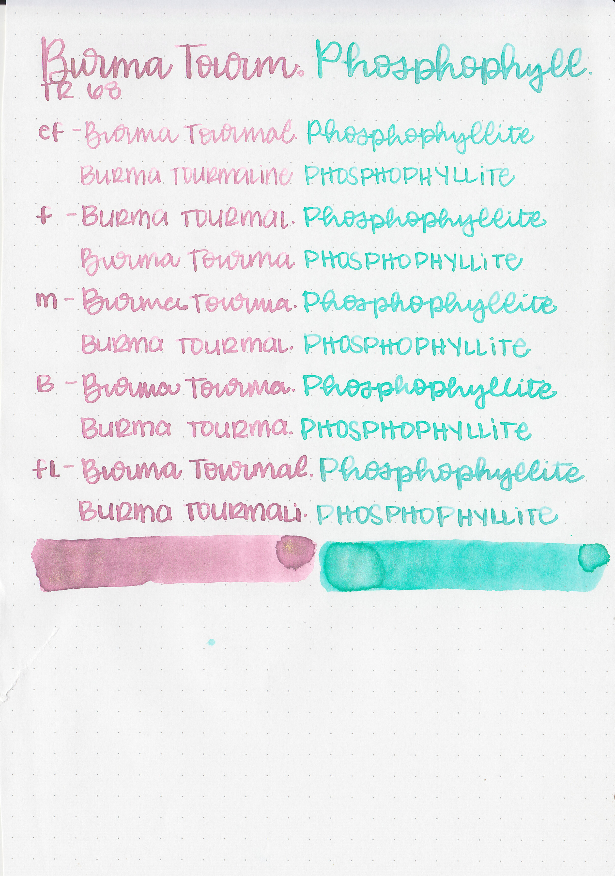
Writing samples:
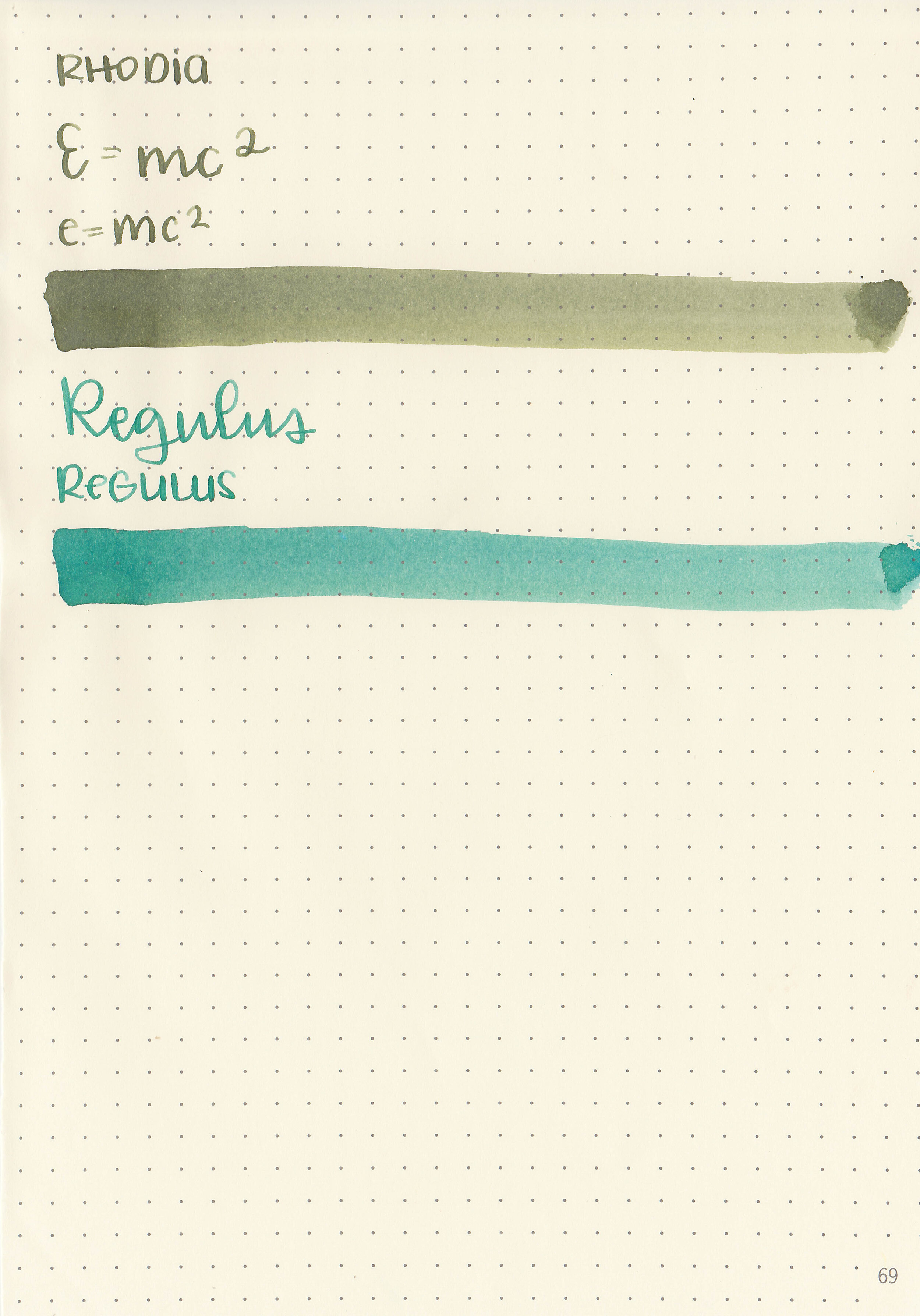
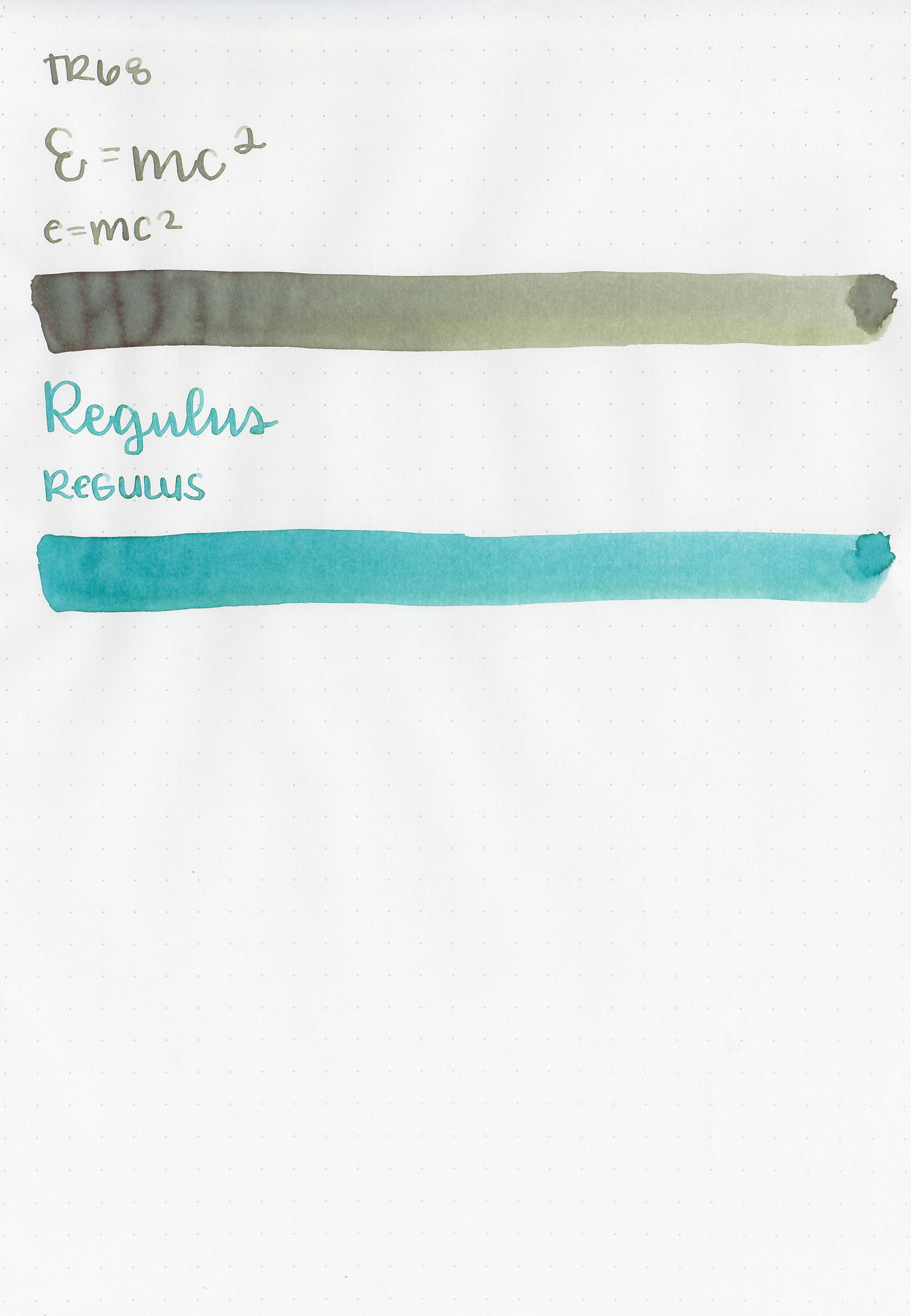
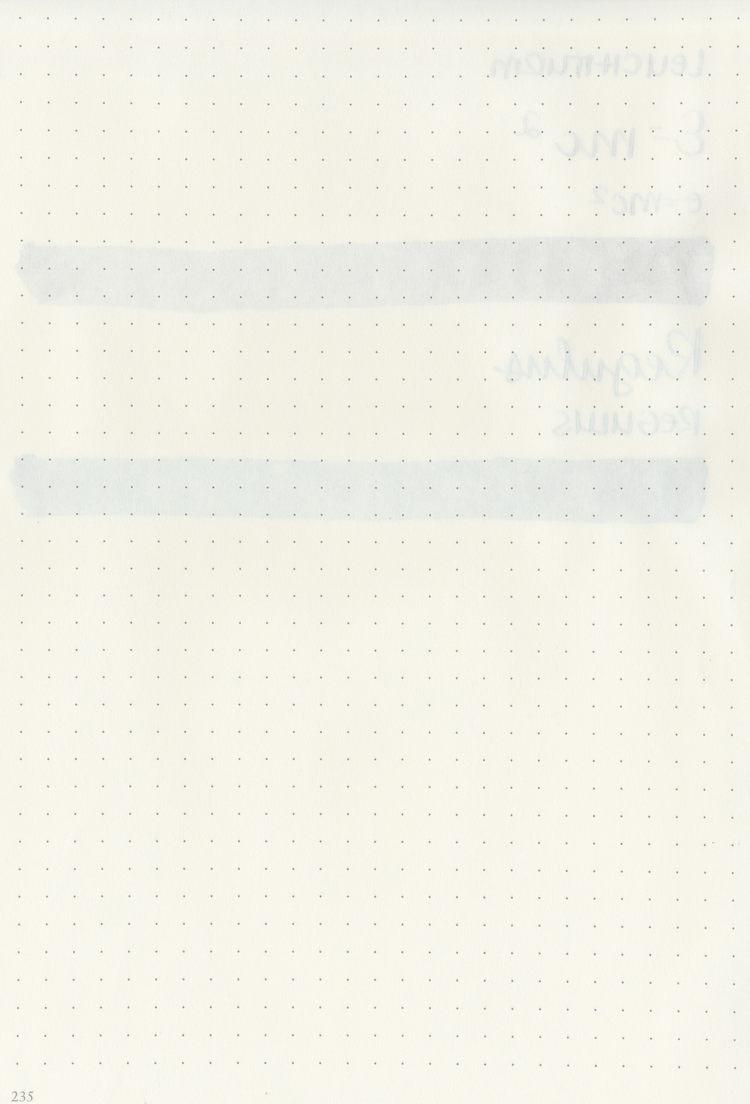
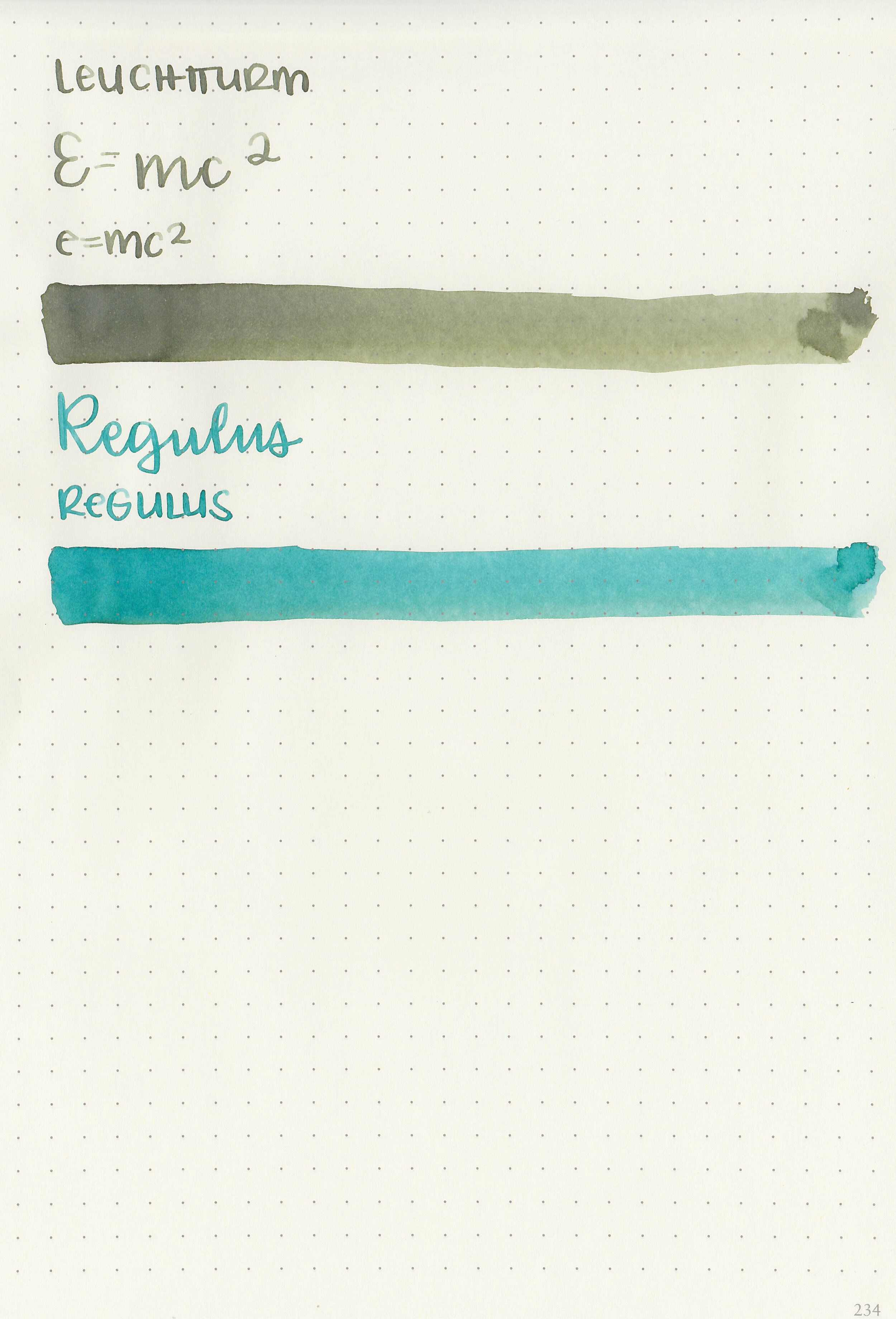
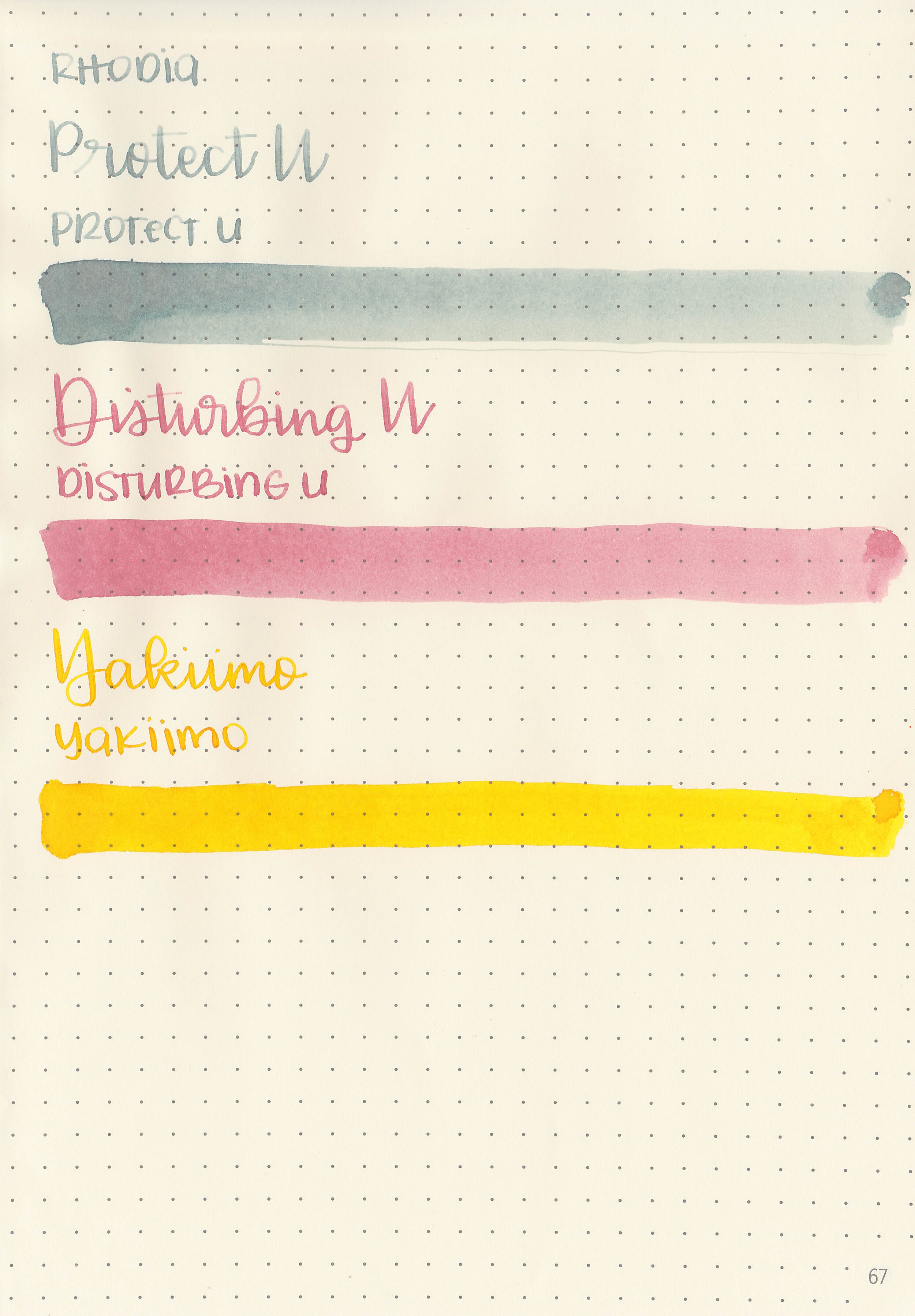
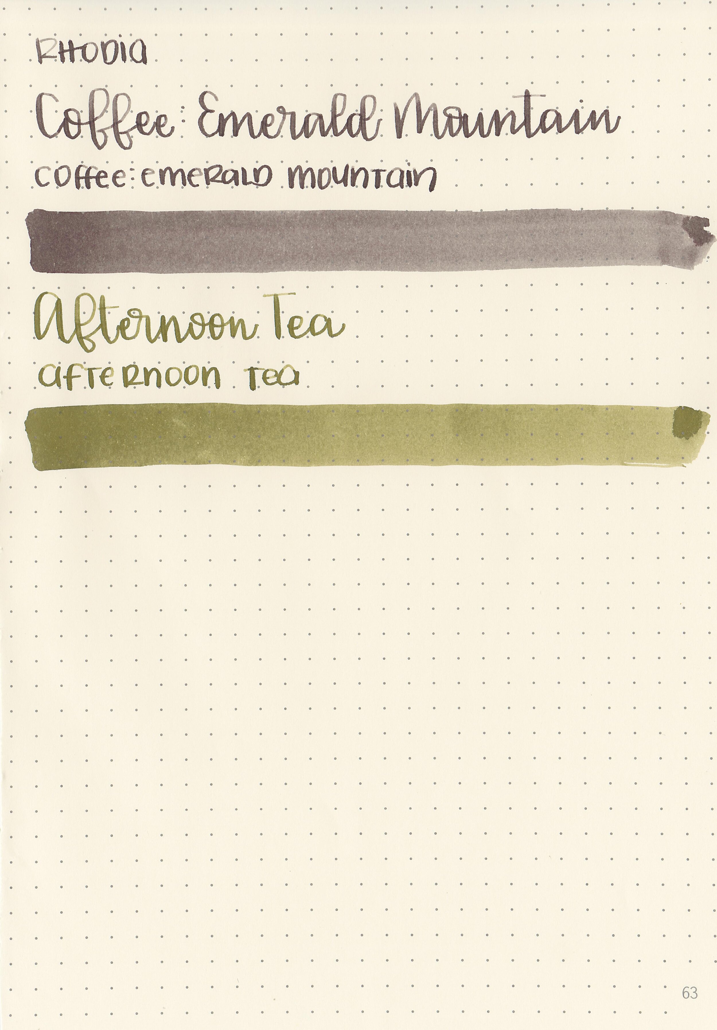
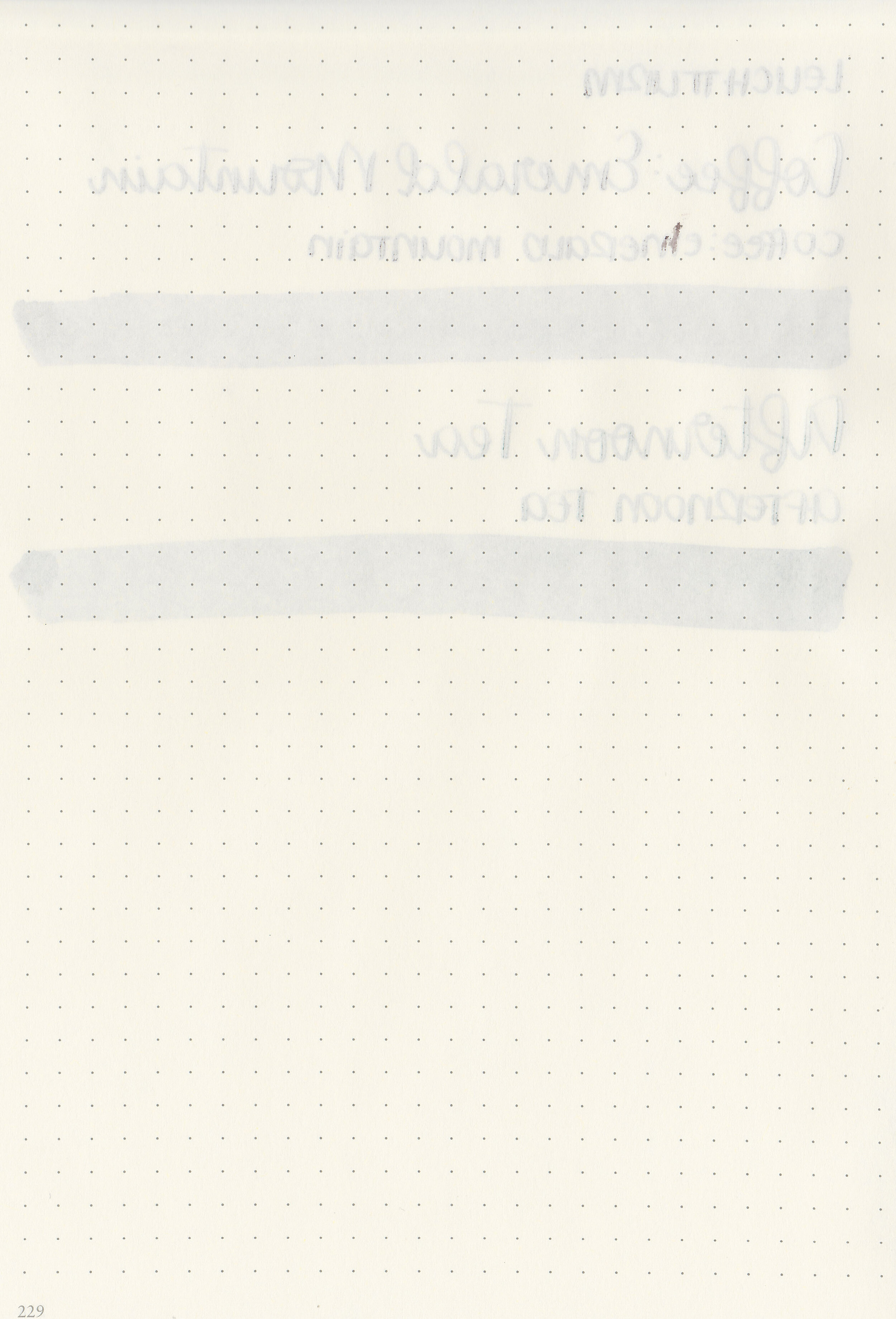
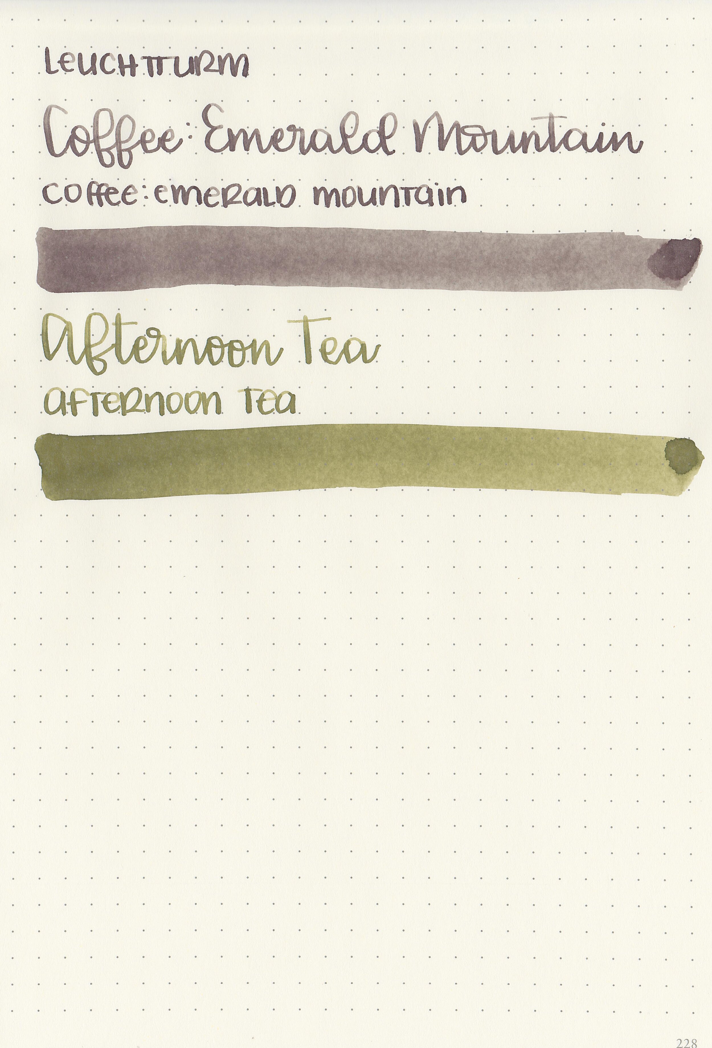
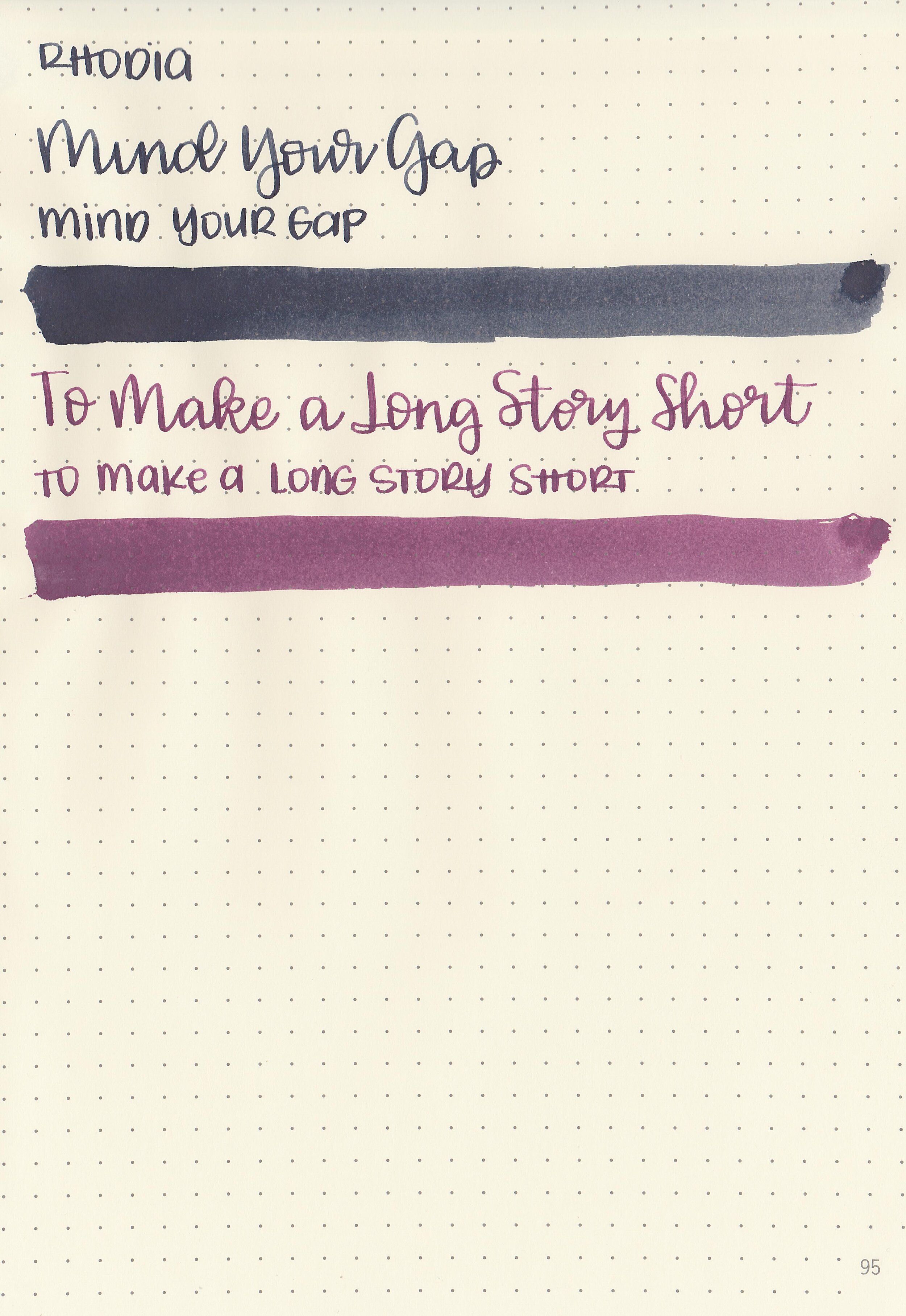
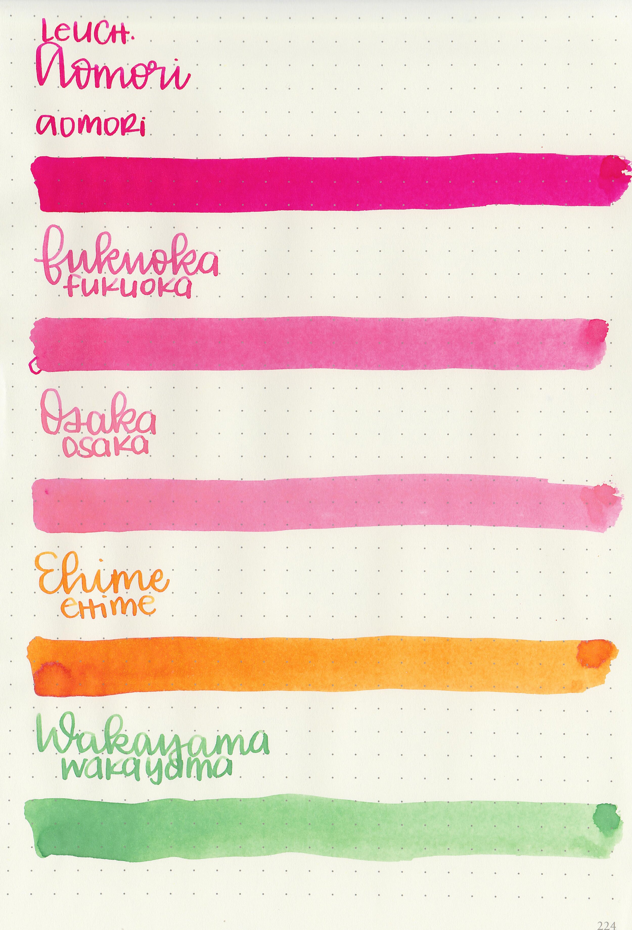
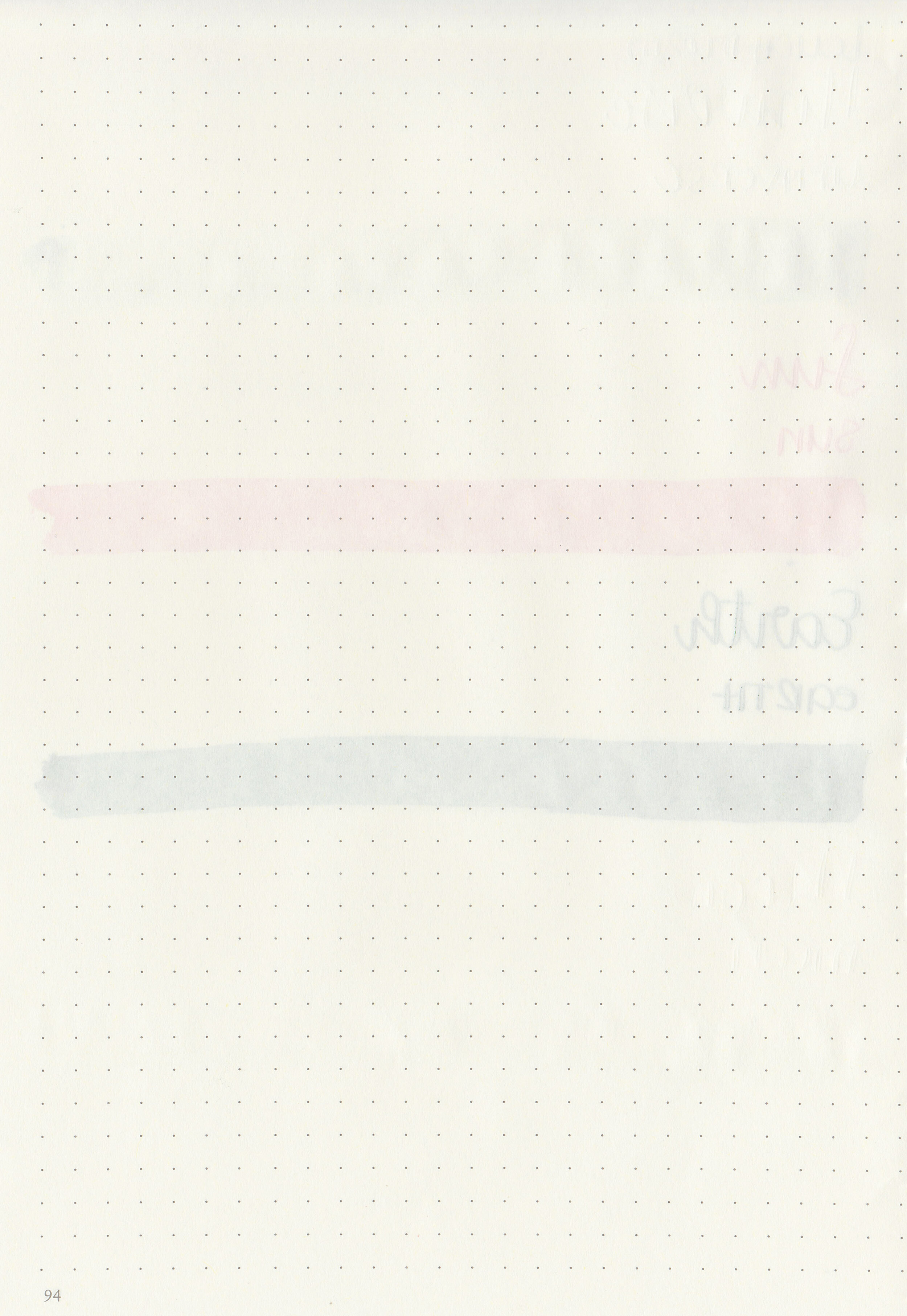
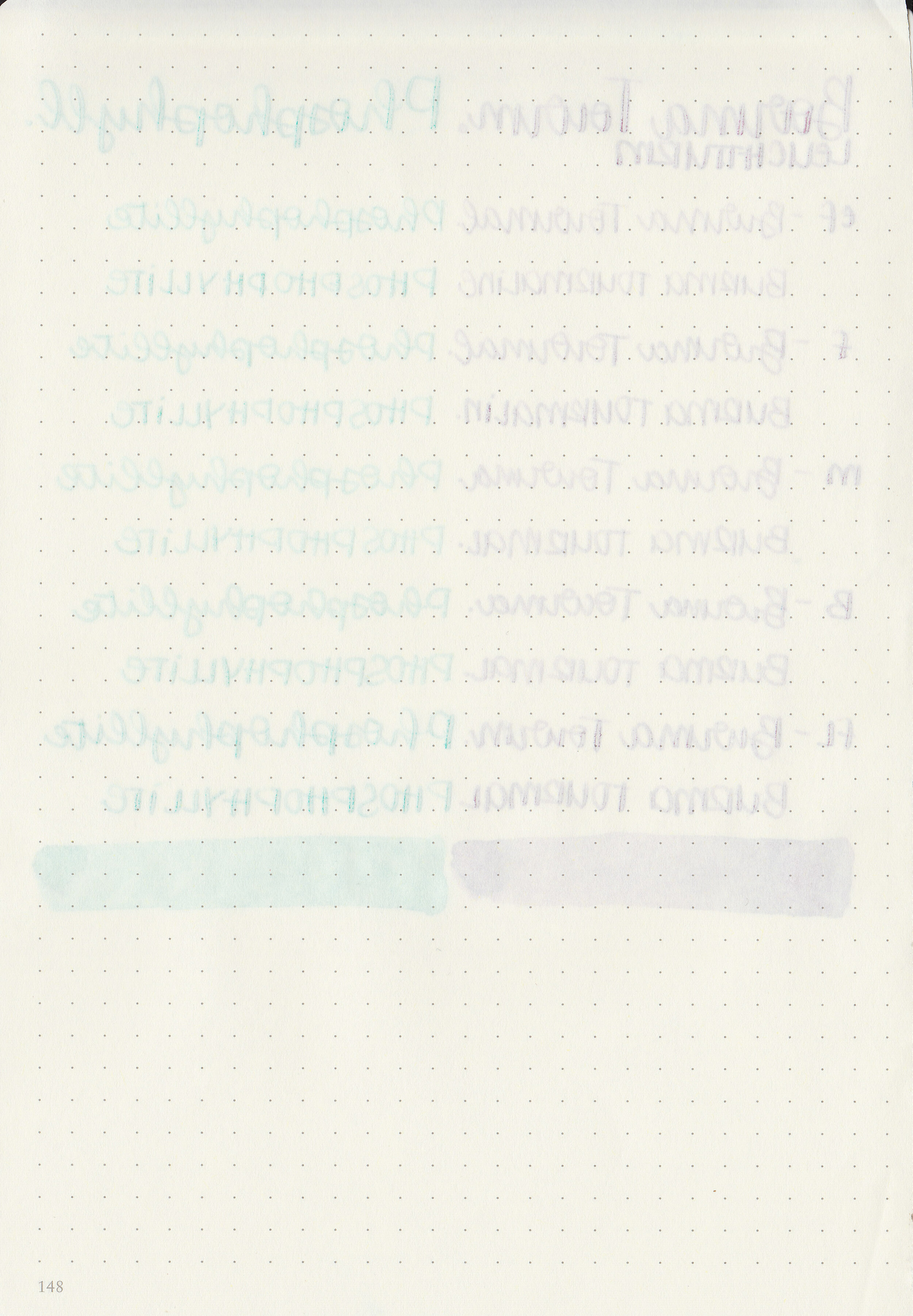
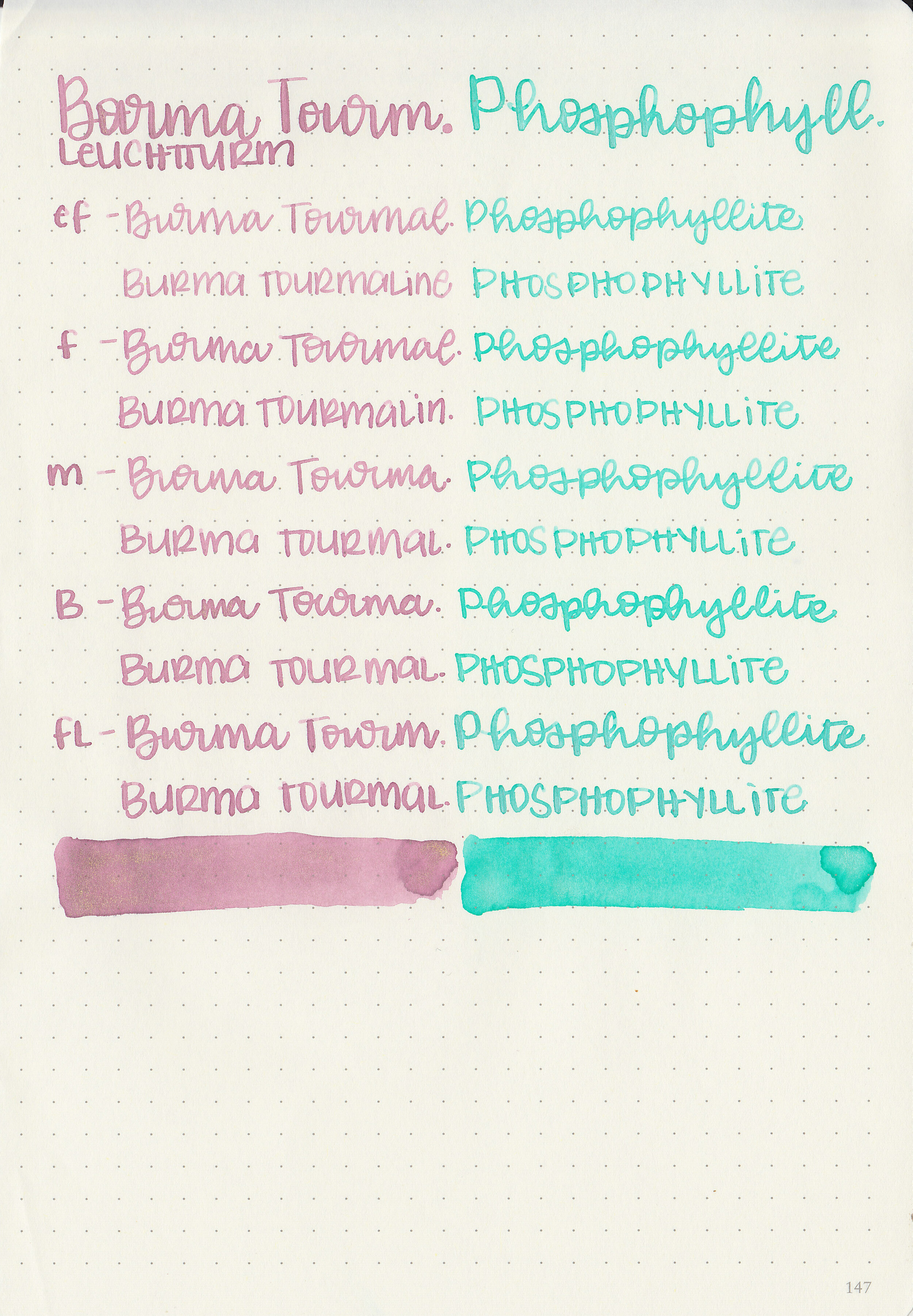
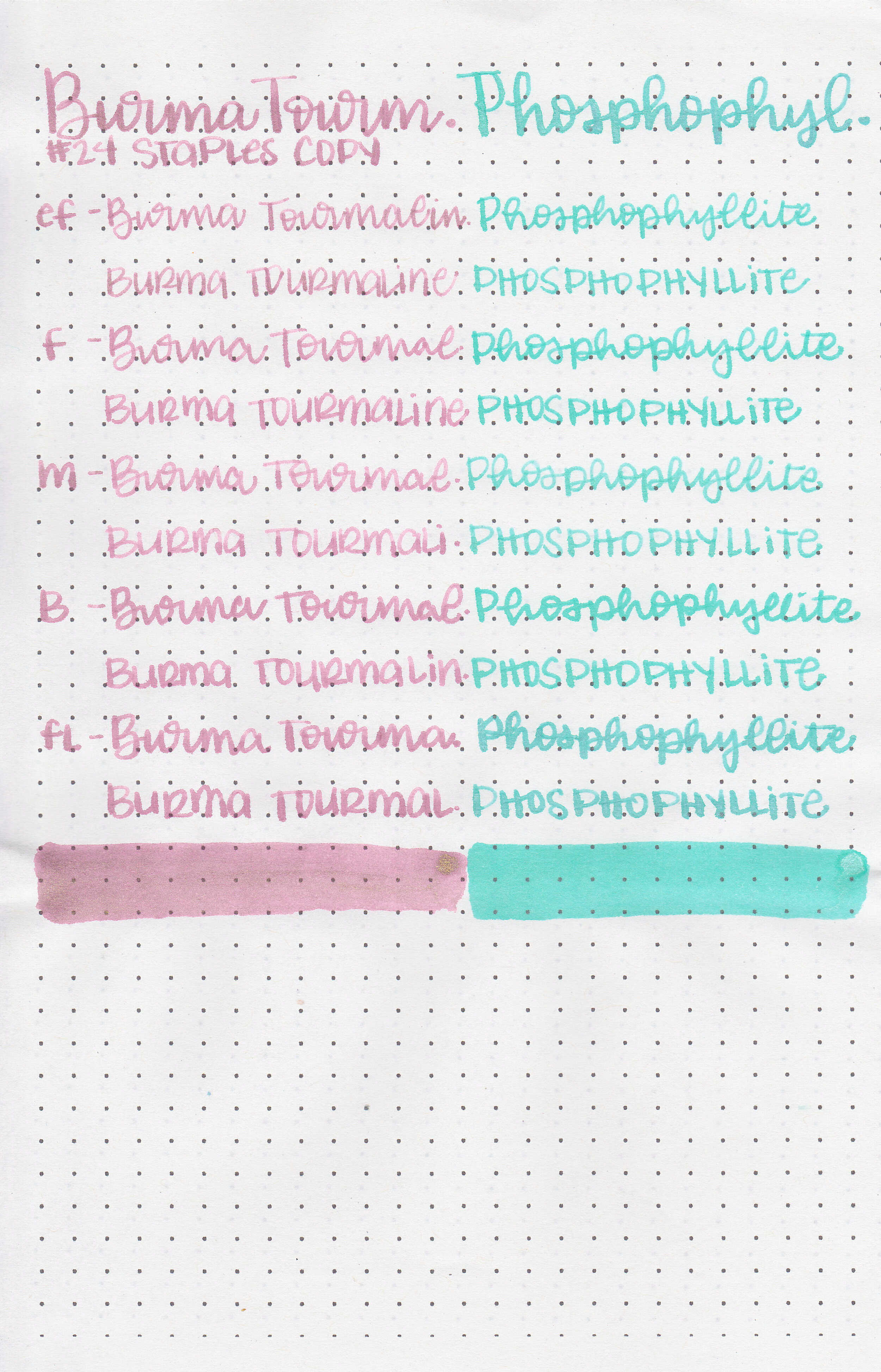
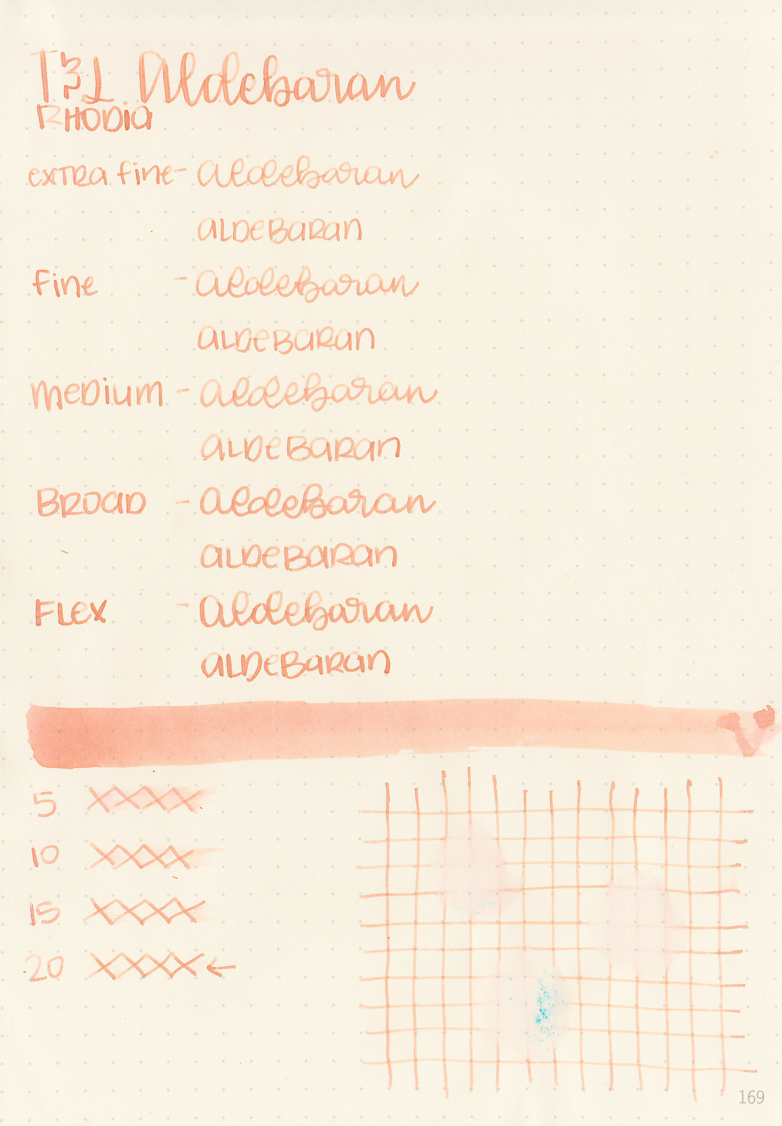
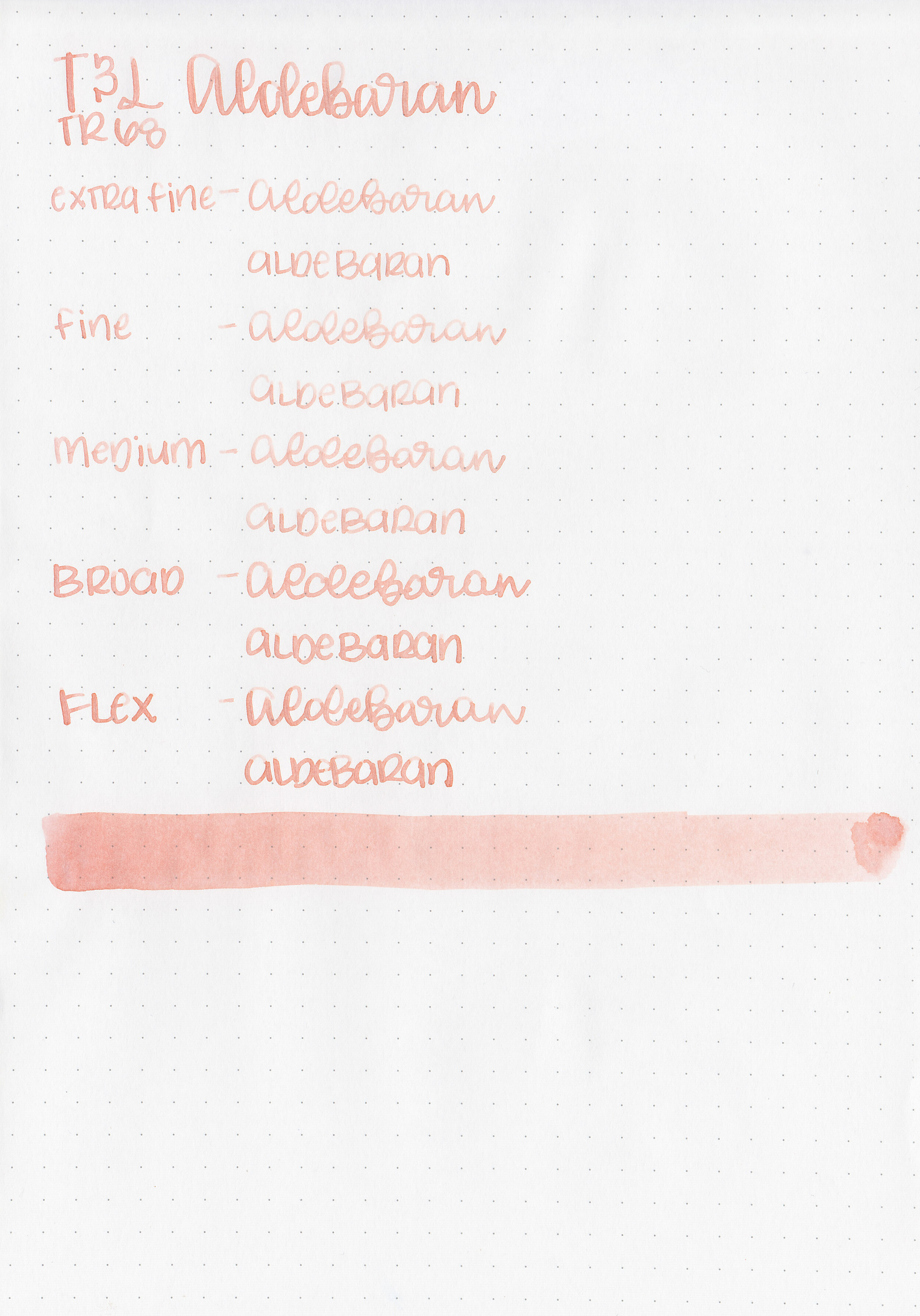
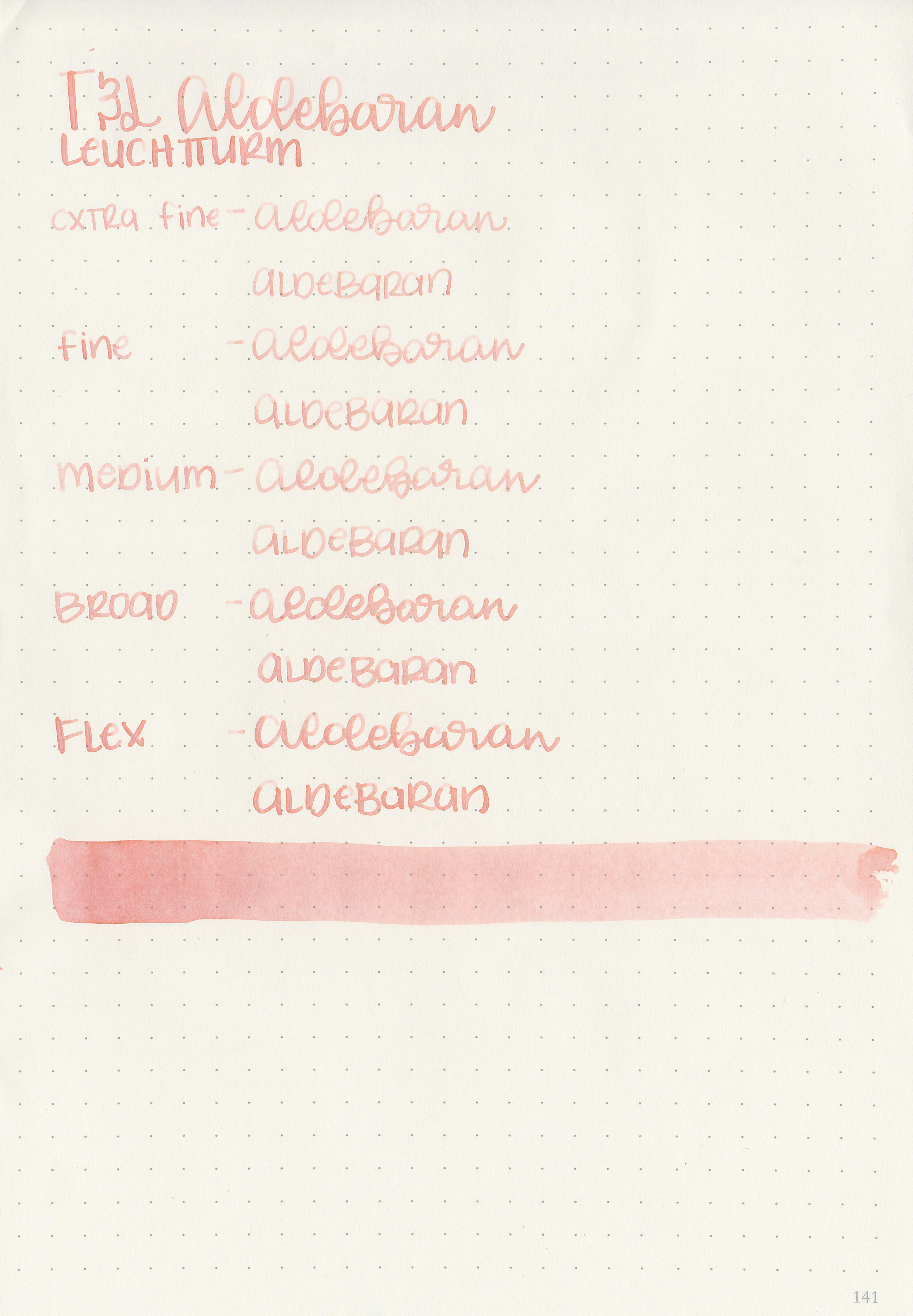
Let's take a look at how the ink behaves on fountain pen friendly papers: Rhodia, Tomoe River, and Leuchtturm.
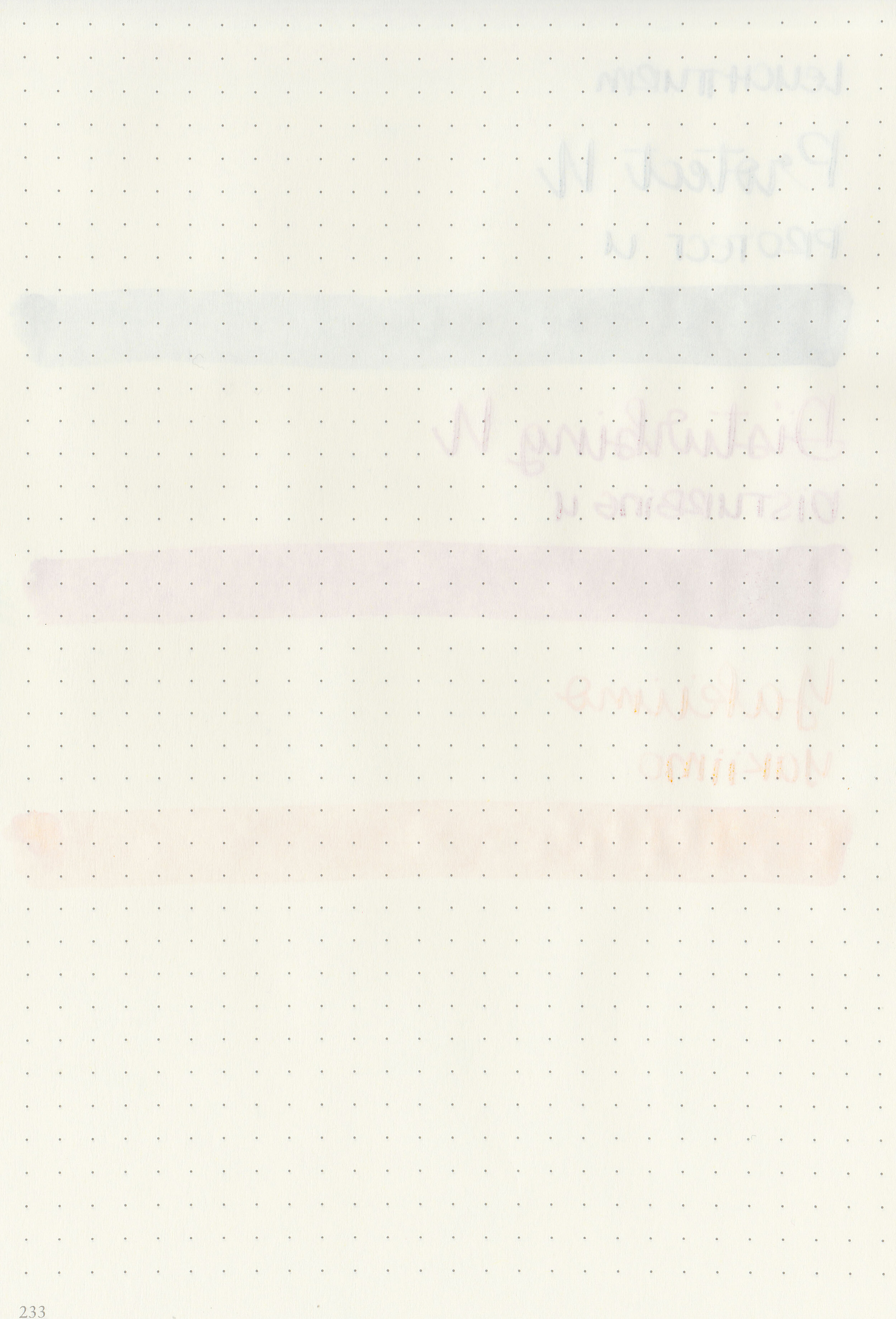
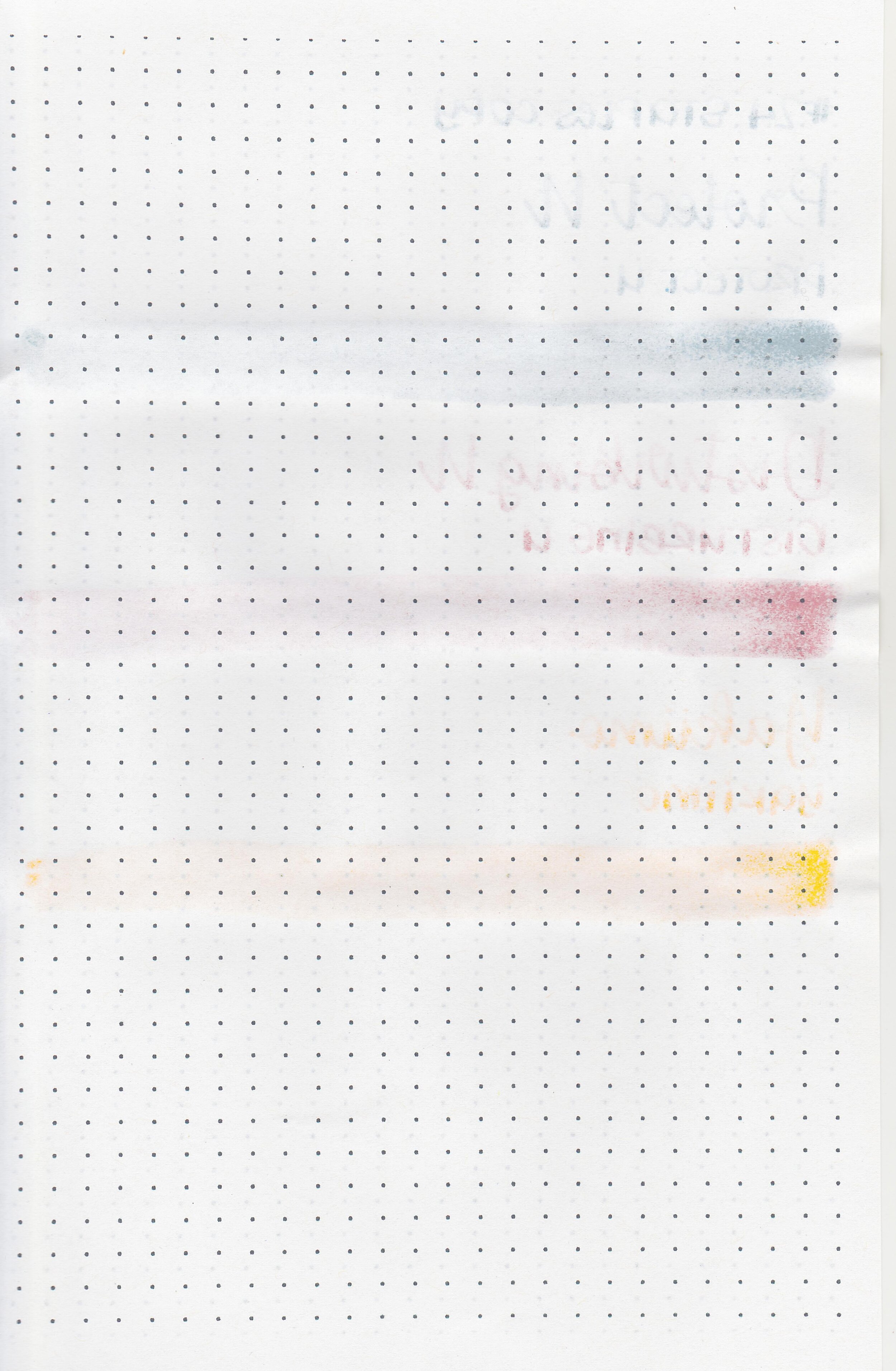
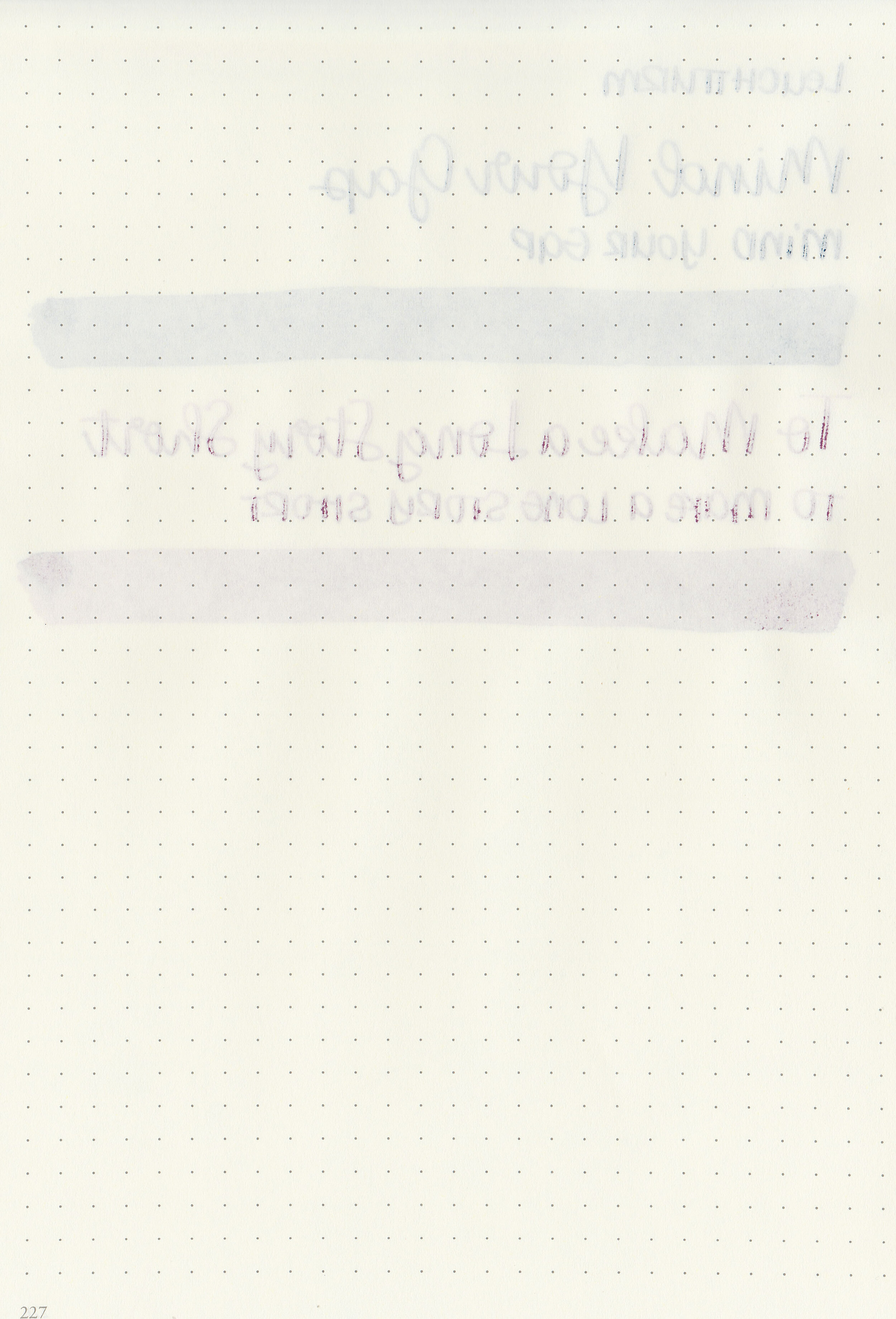
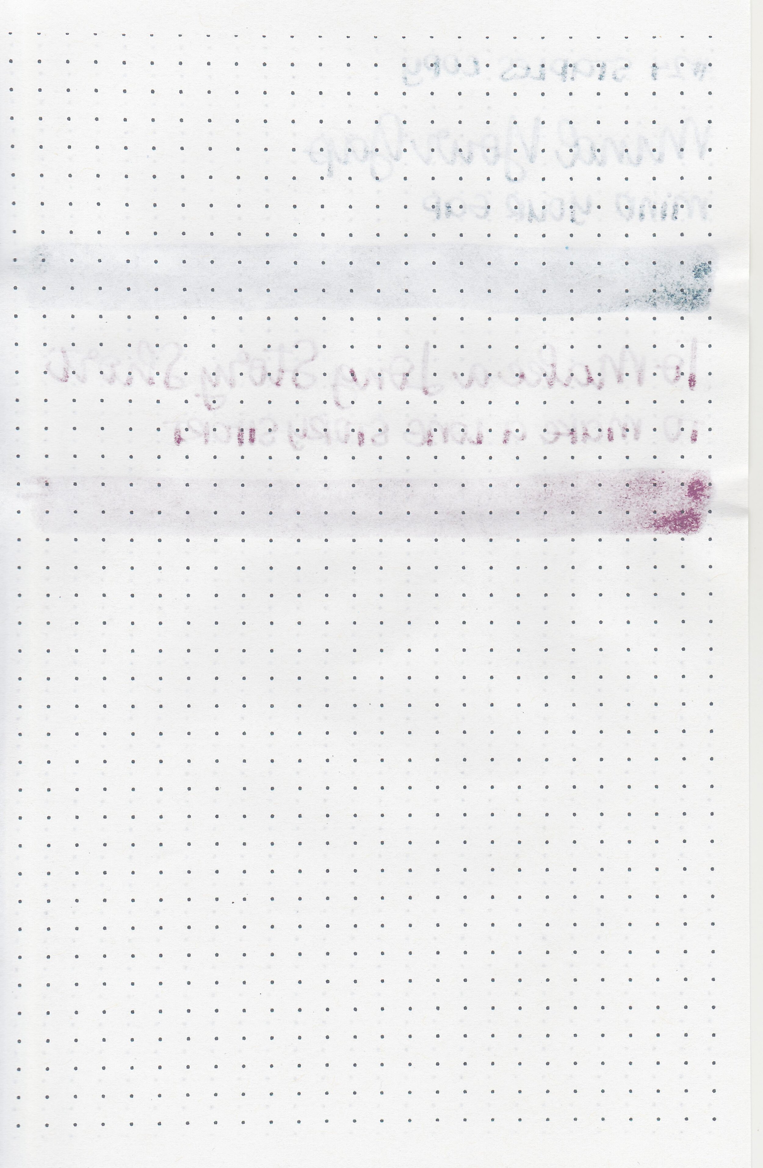
Water resistance: Low
Feathering: Low-there was some feathering on Rhodia and Leuchtturm.
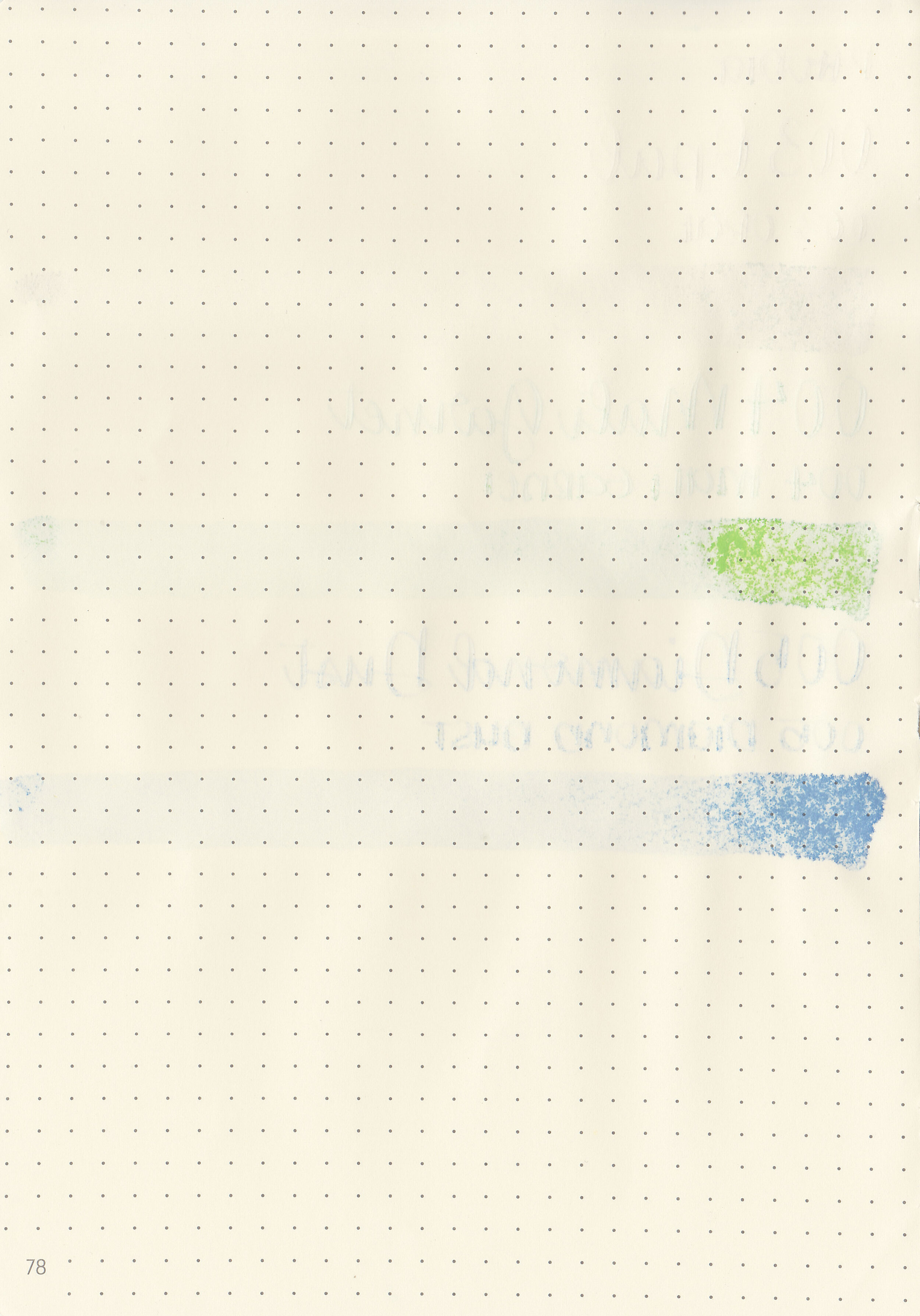
Show through: Medium
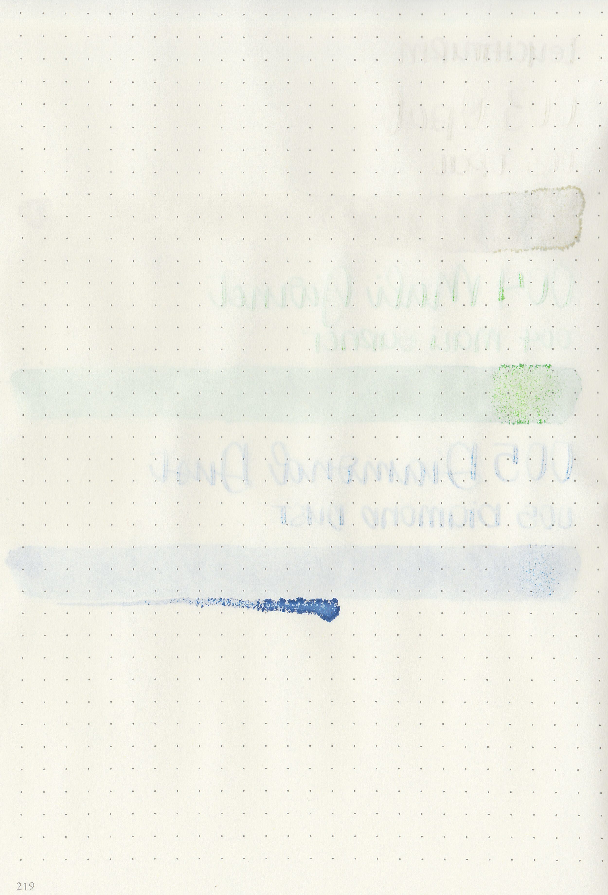
Bleeding: None
Other properties: low shading, no sheen, and silver shimmer.
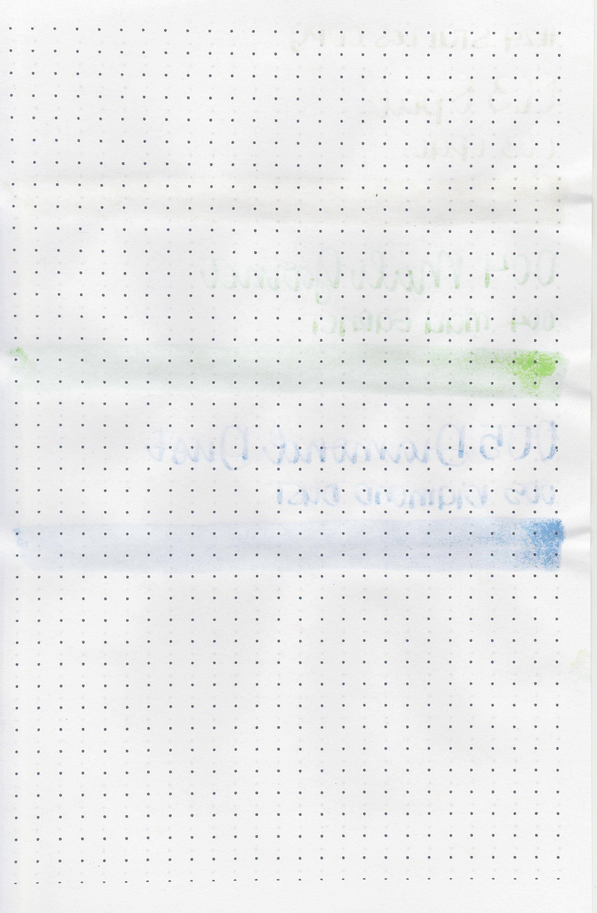
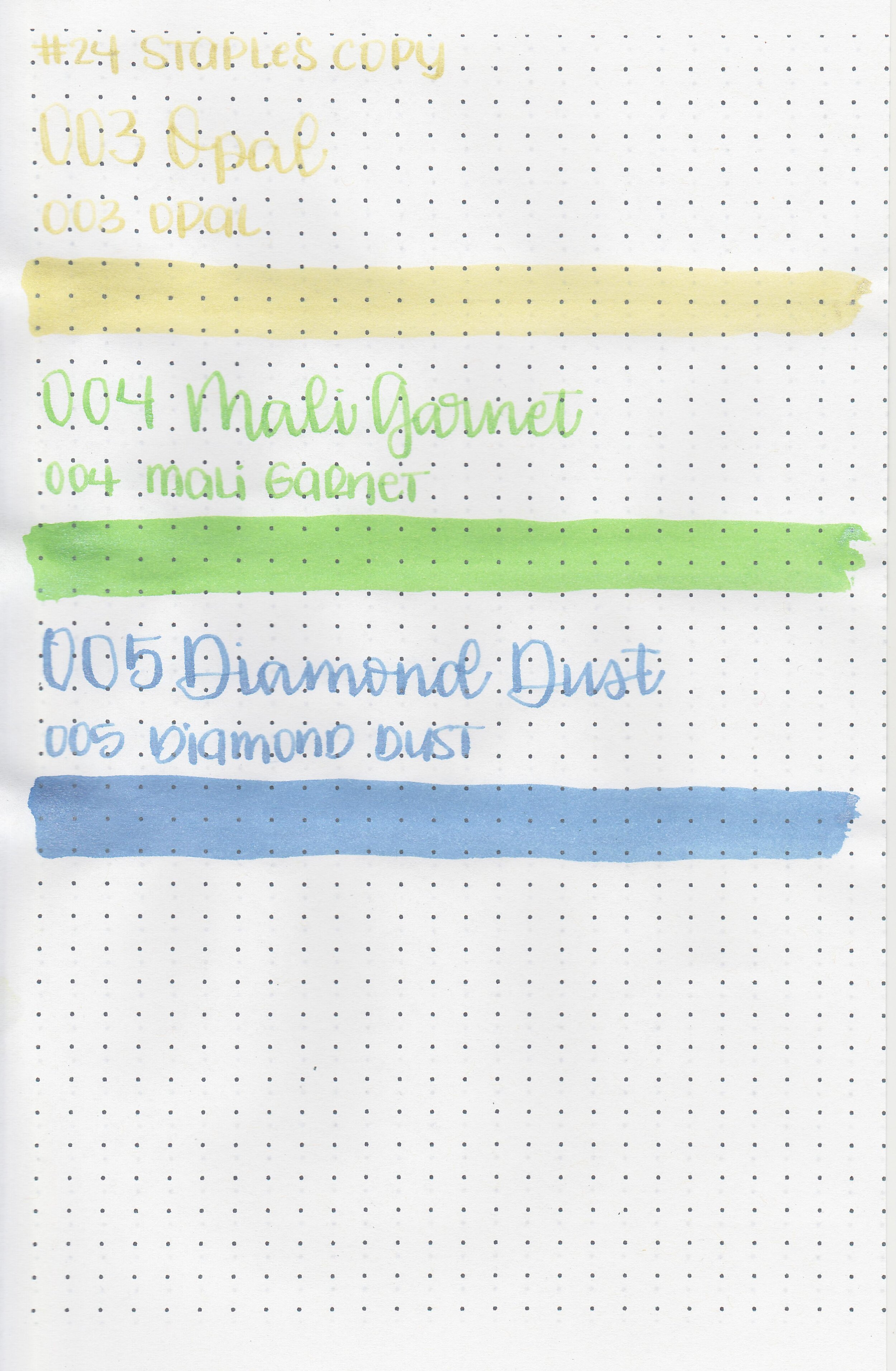
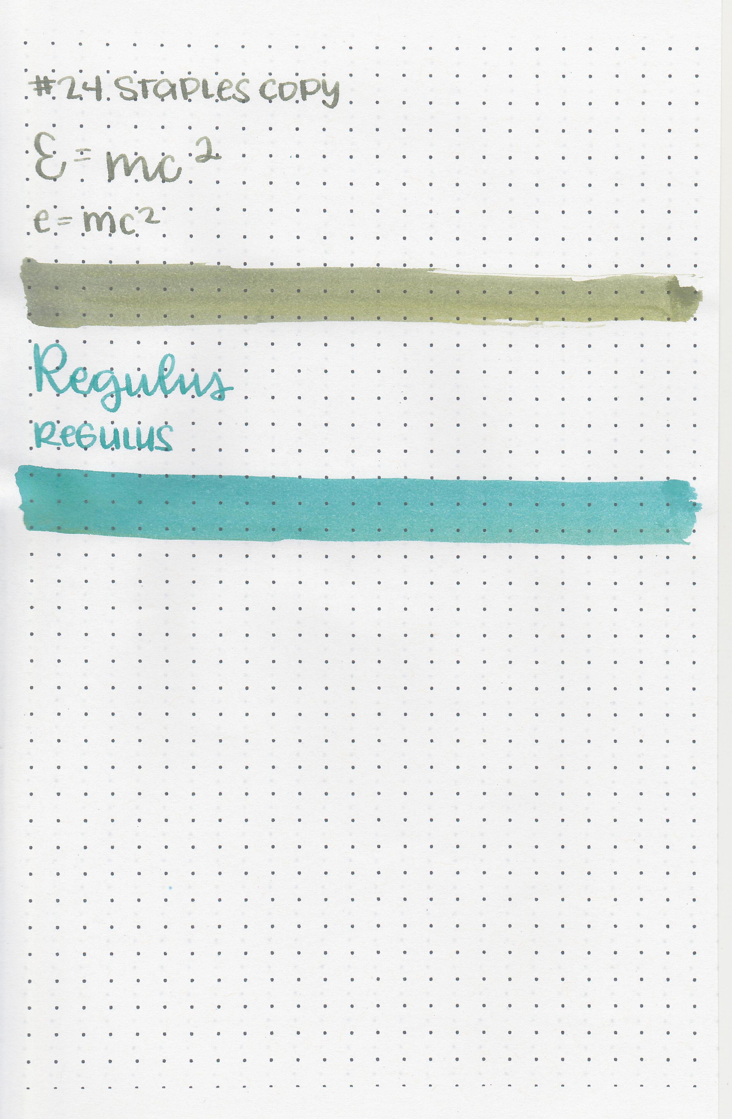
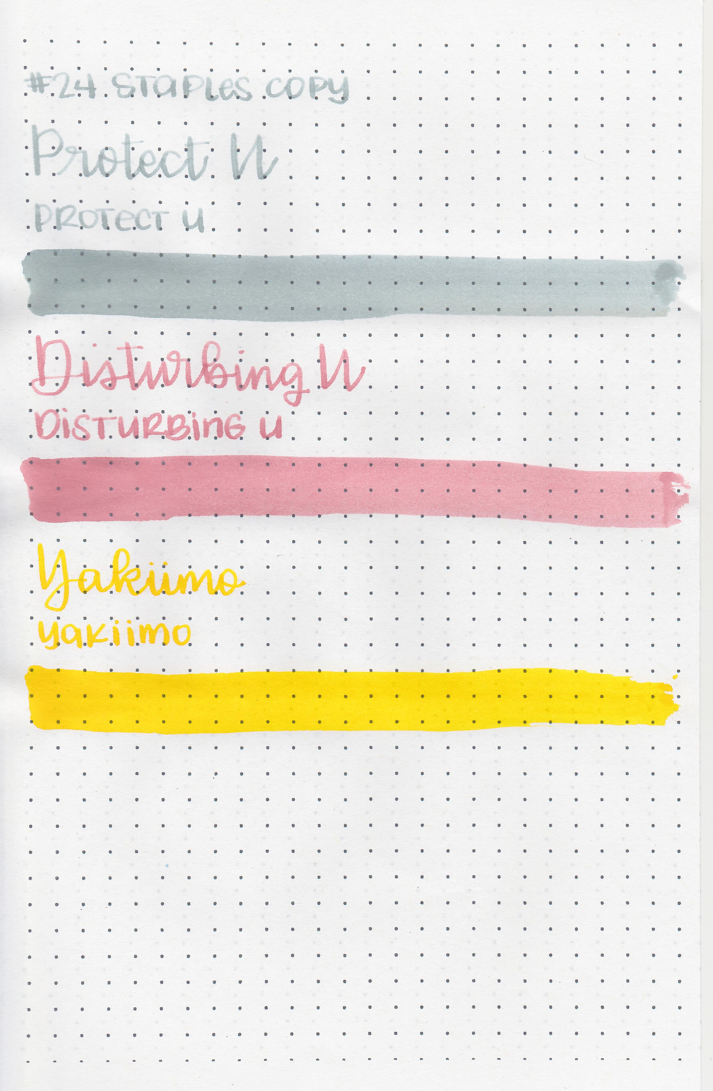
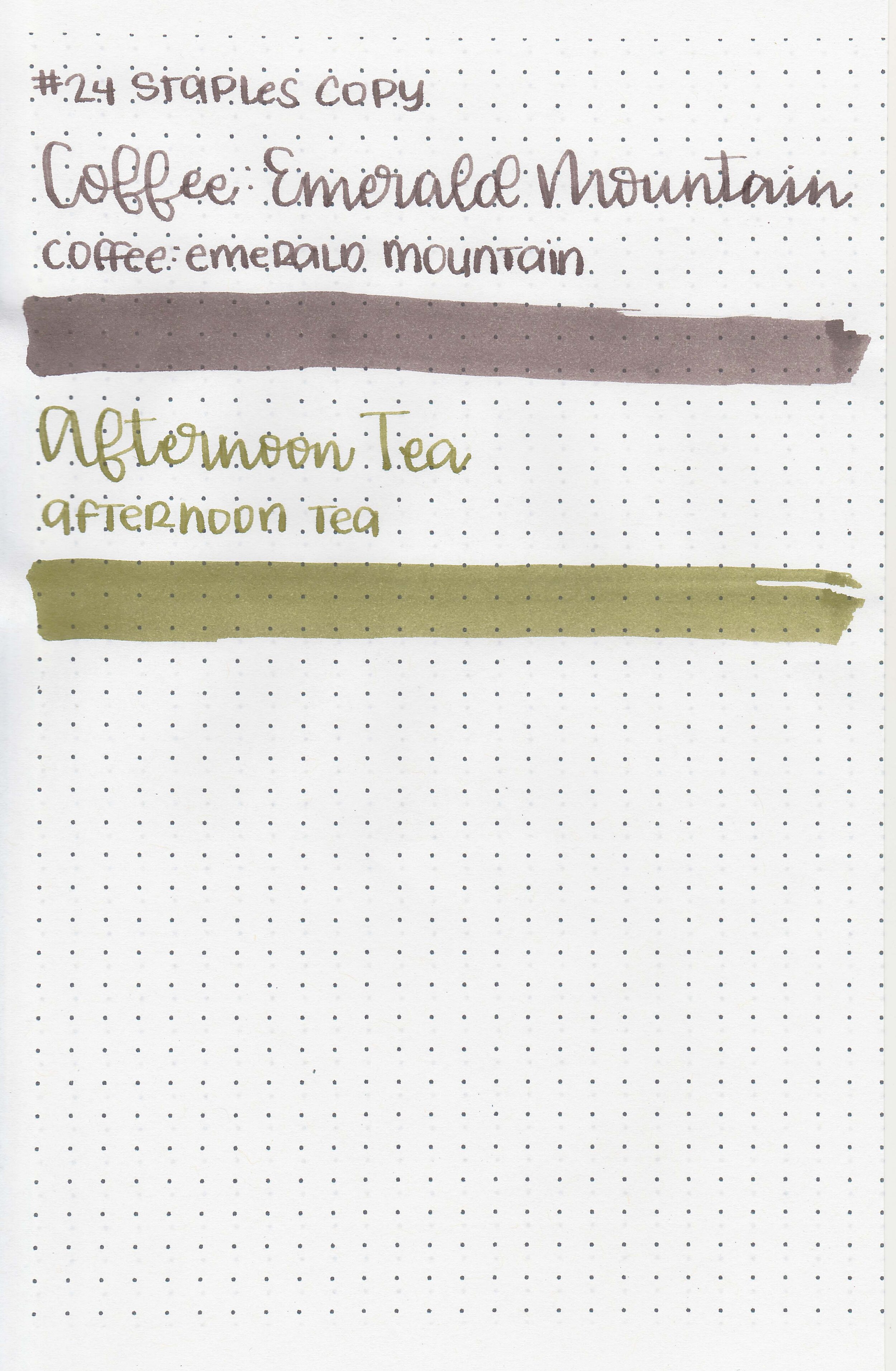
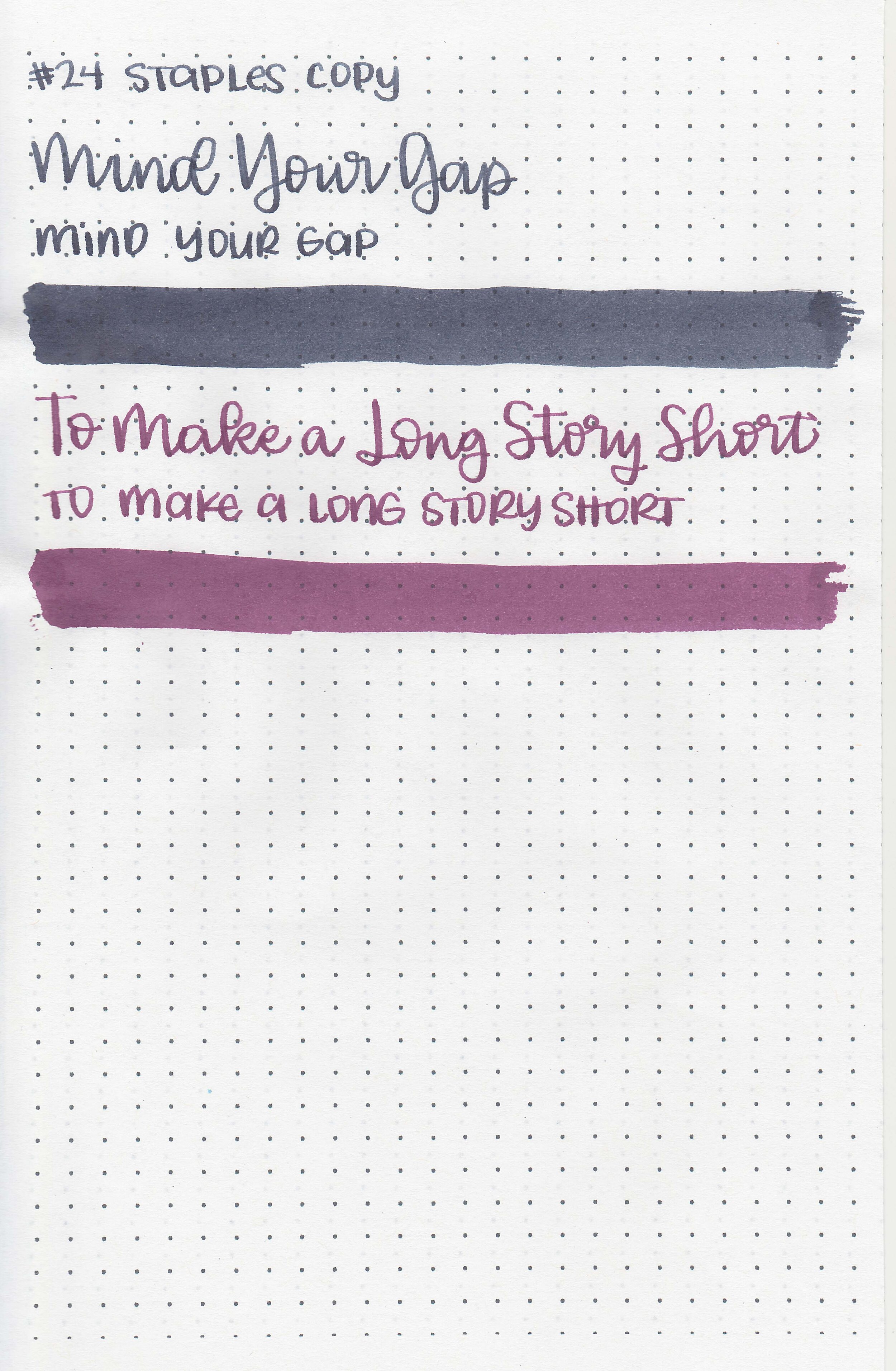
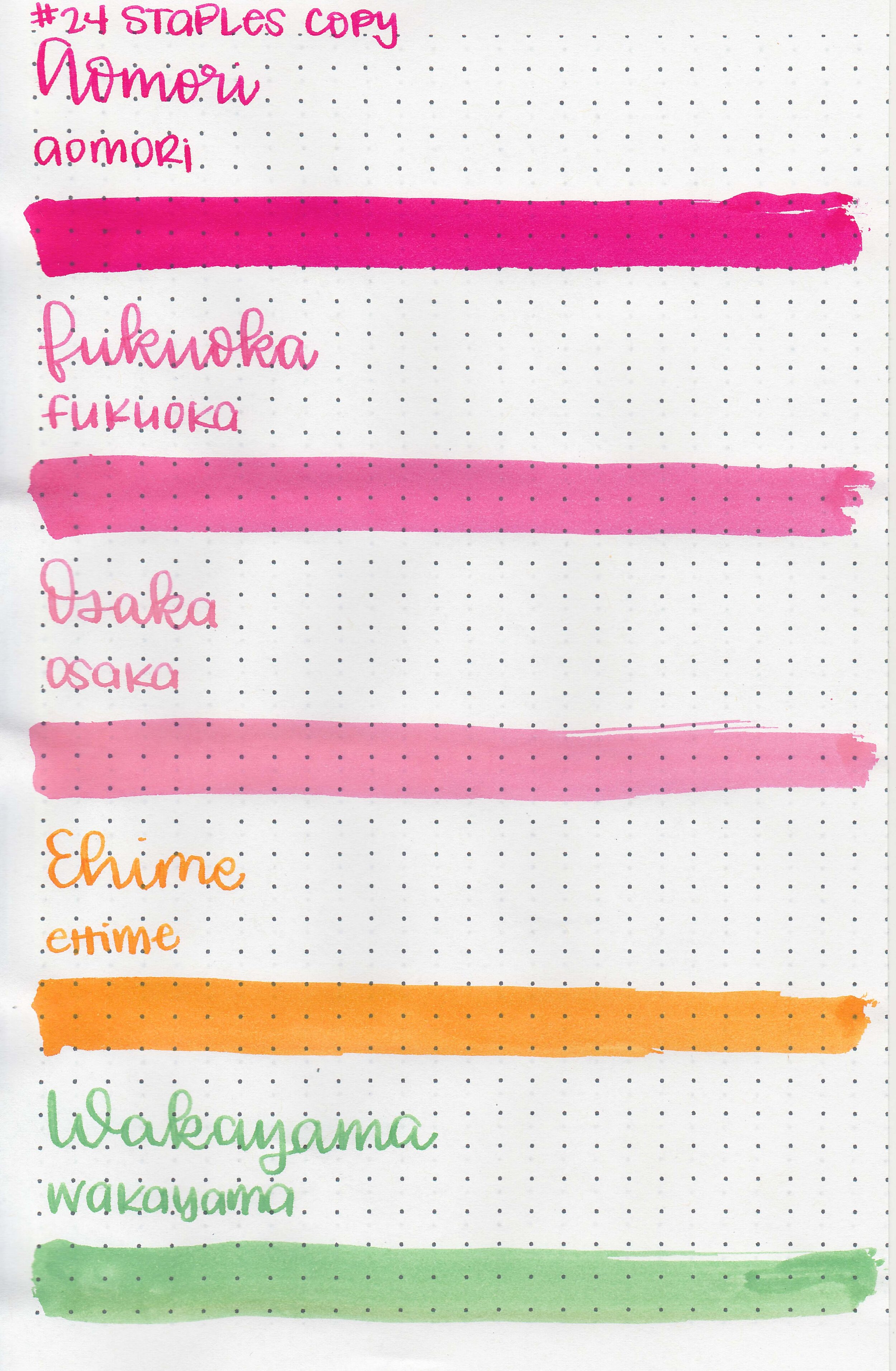
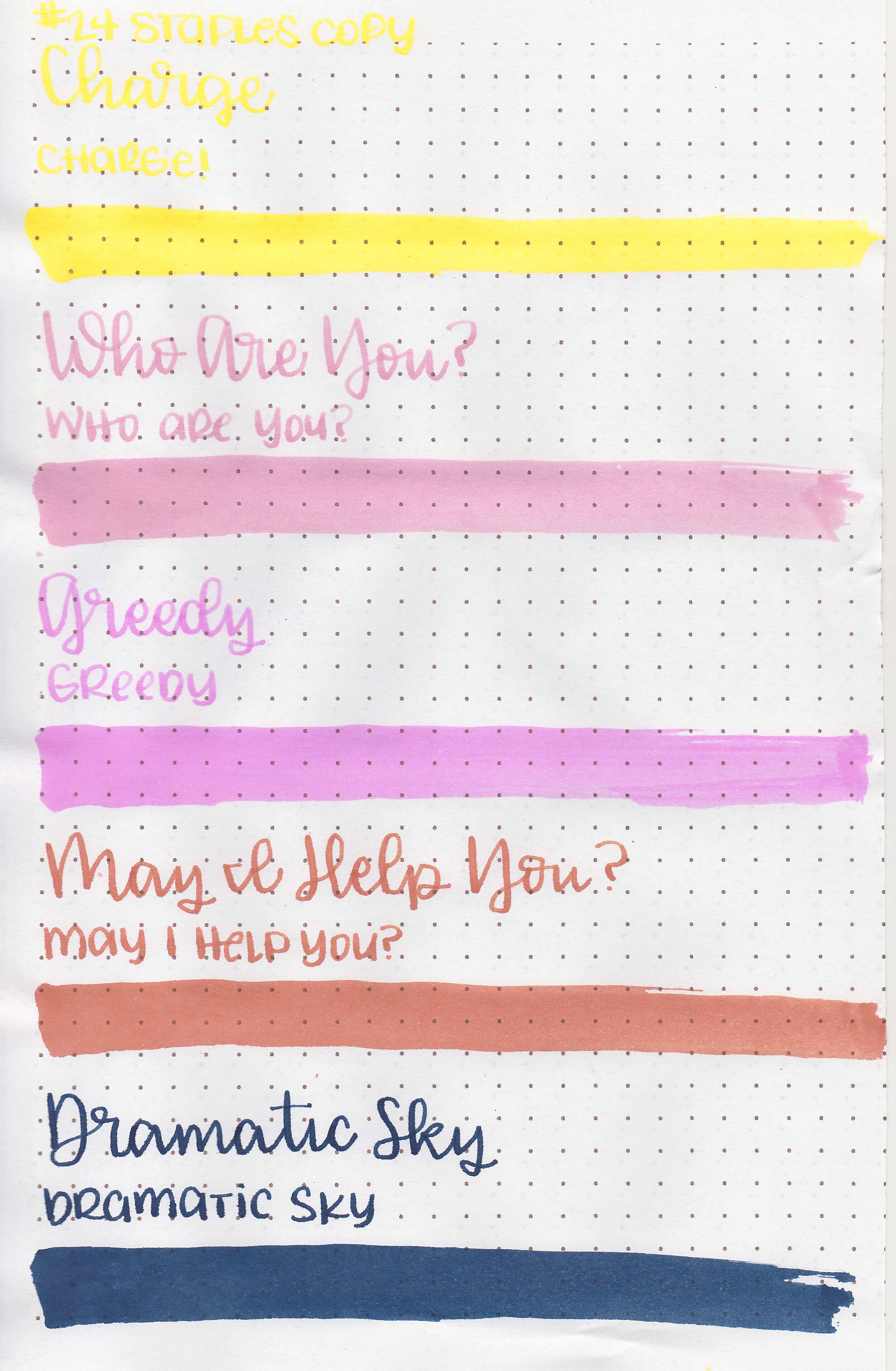
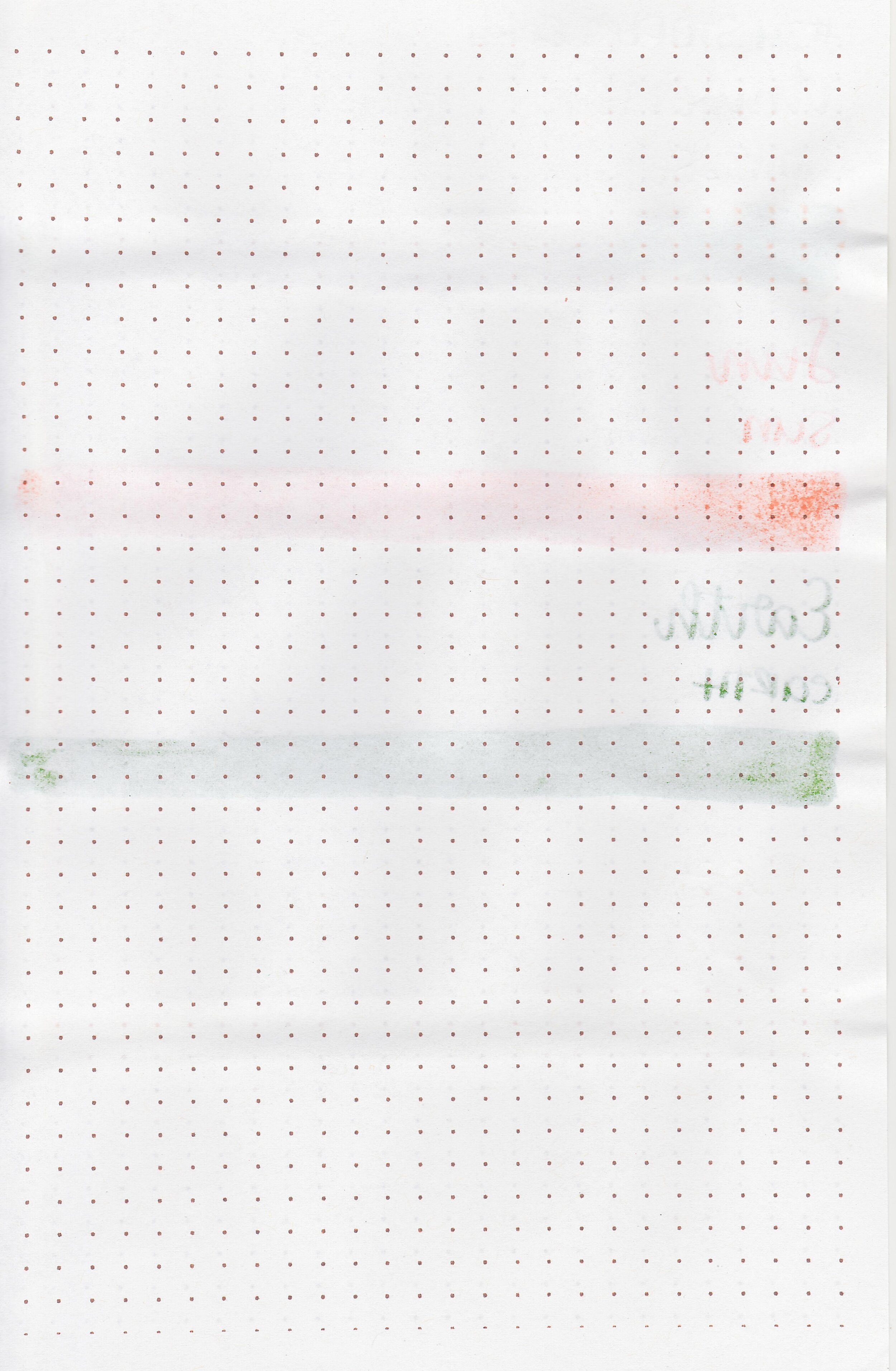
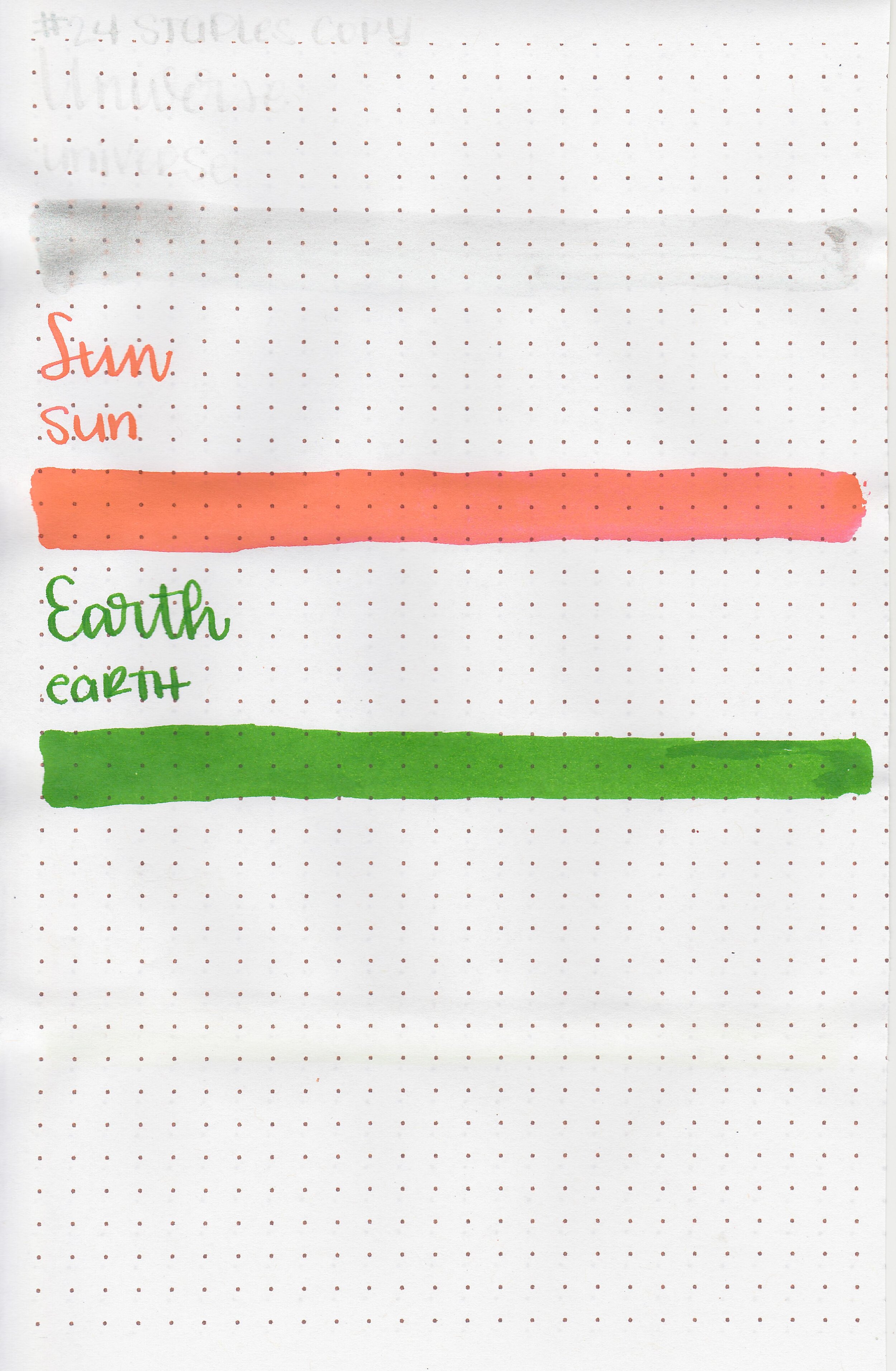
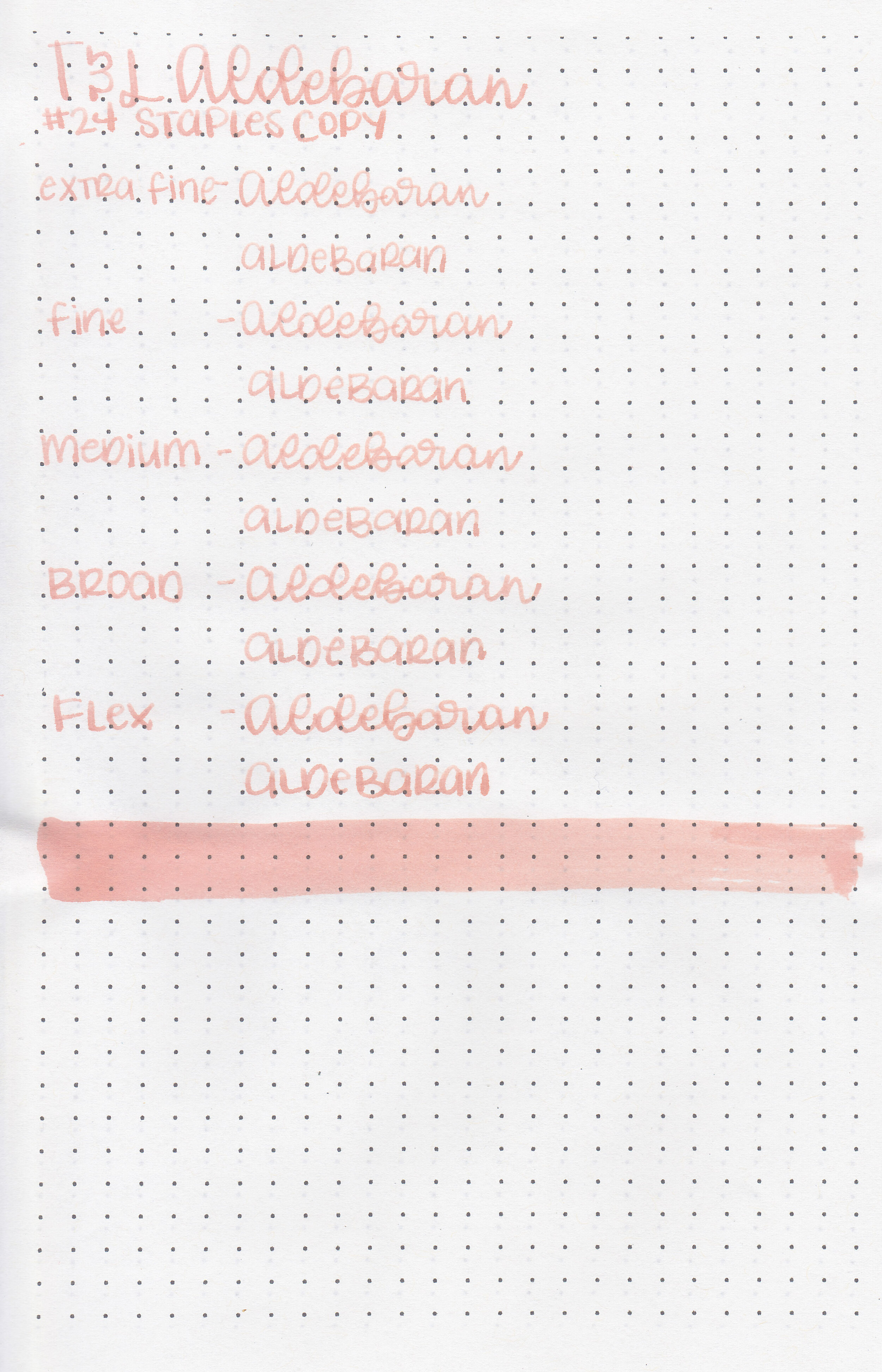
On Staples 24 lb copy paper there was lots of feathering in every nib size as well as some bleeding.
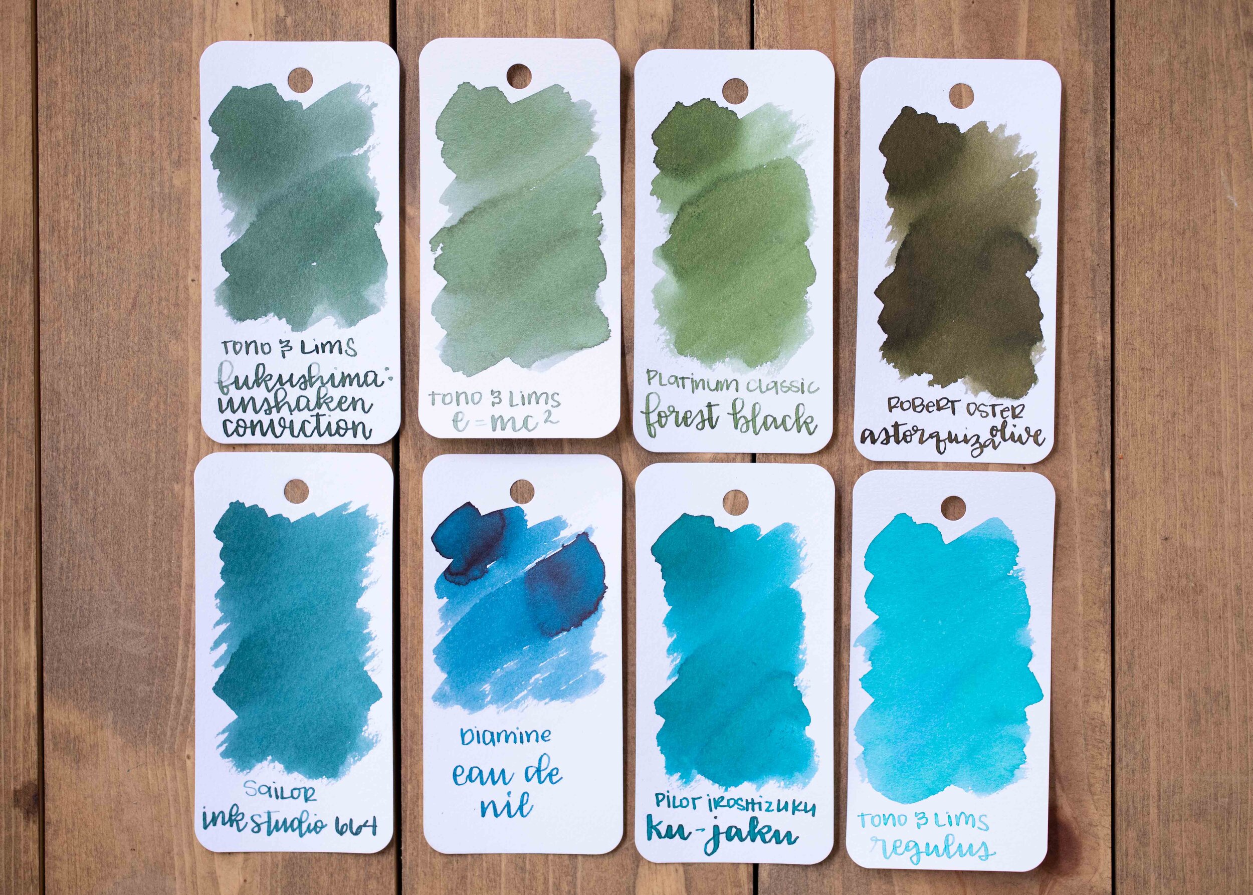
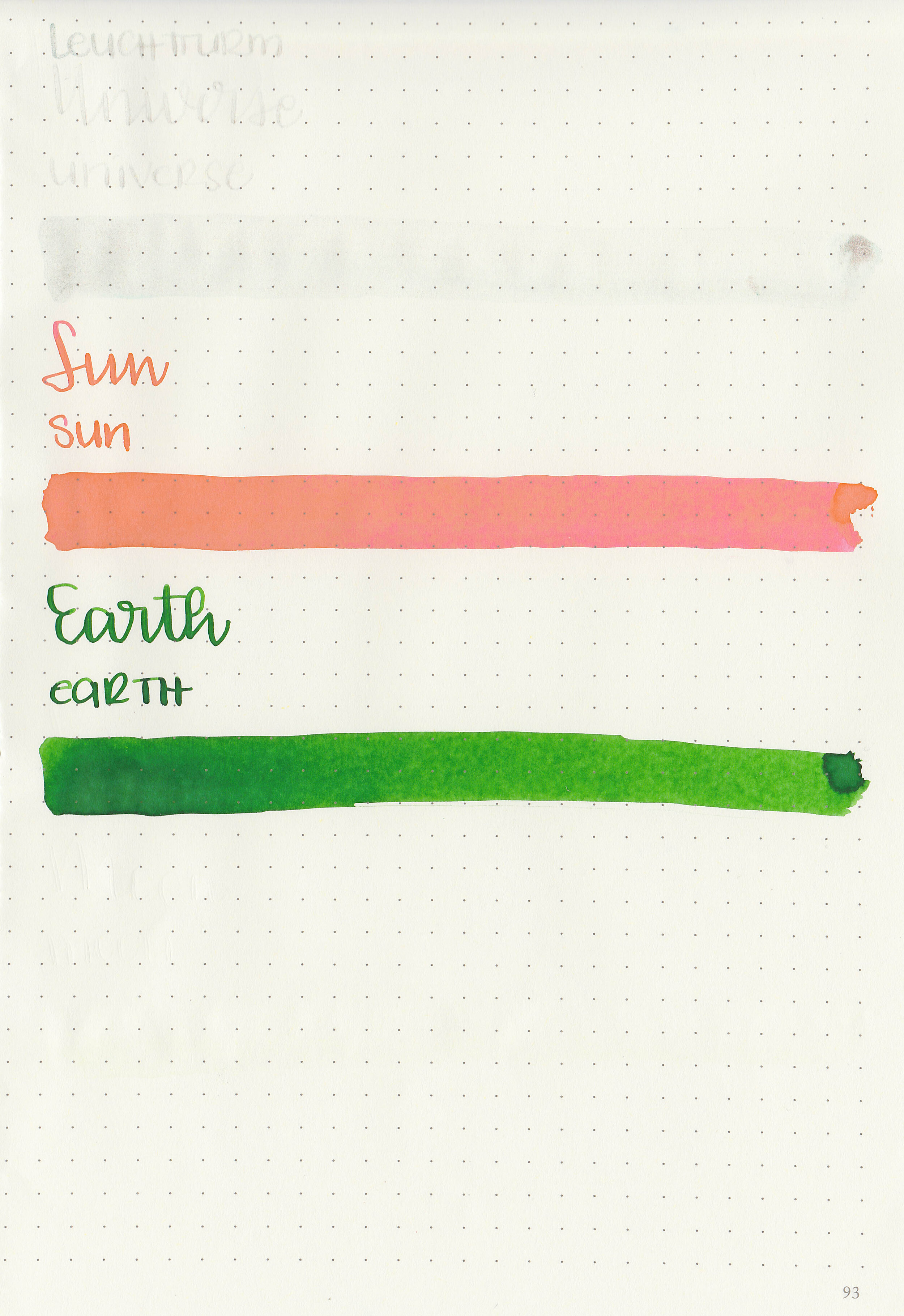
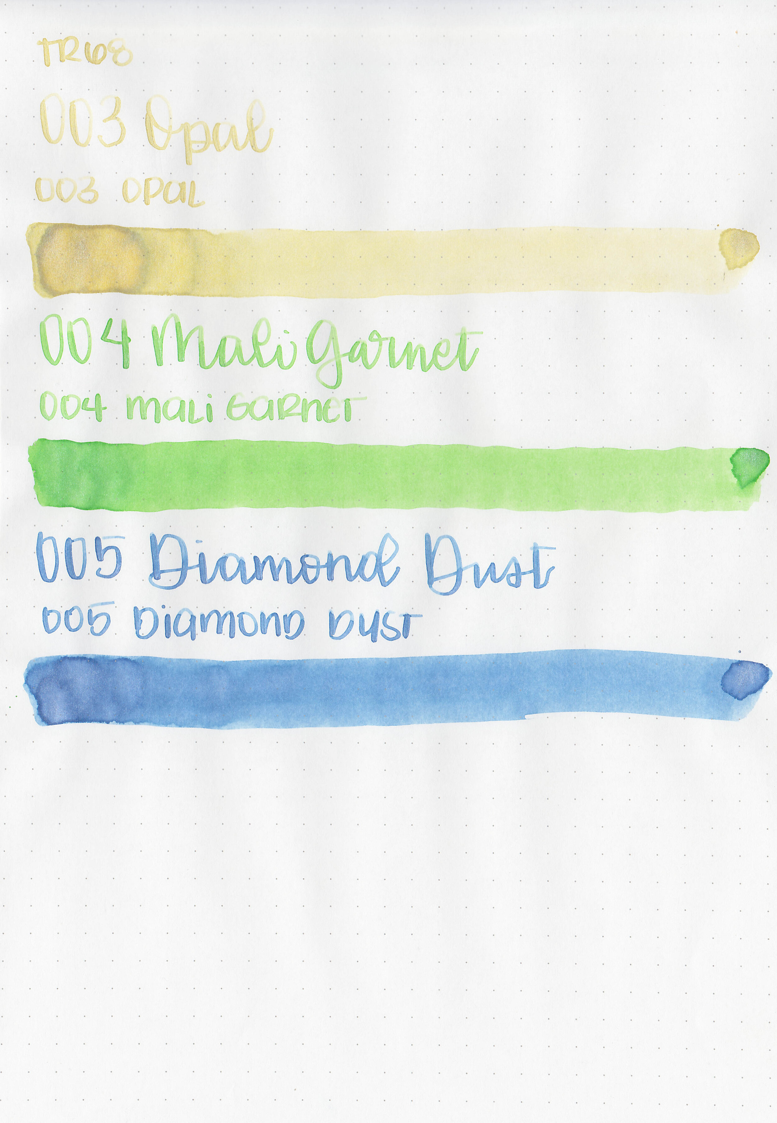
Comparison Swabs:

Opal is much lighter and less saturated than the other yellow inks. Mali Garnet is lighter and brighter than the other green inks. Diamine Dust is much lighter and less saturated than Birmingham M. River Luster.
Longer Writing:


I used a Taroko Enigma notebook. All three inks had an average flow.
Overall, out of the three I like Diamond Dust the best. Opal is too light for me to easily read it.
Disclaimer: These inks were provided by Shigure Inks for the purpose of this review. All photos and opinions are my own. This page does not contain affiliate links, and is not sponsored in any way.