
Sailor Ink Studio Set 6
/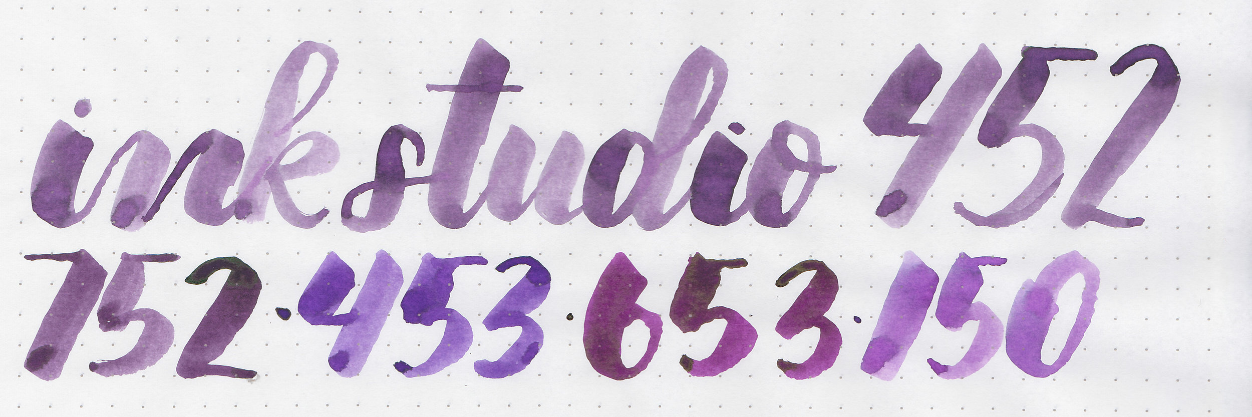
Sailor Ink Studio set #6 includes: 452, 752, 453, 653, and 150. Thanks to Sakura Fountain Pen Gallery for helping me get the full set of 100 Ink Studio samples.
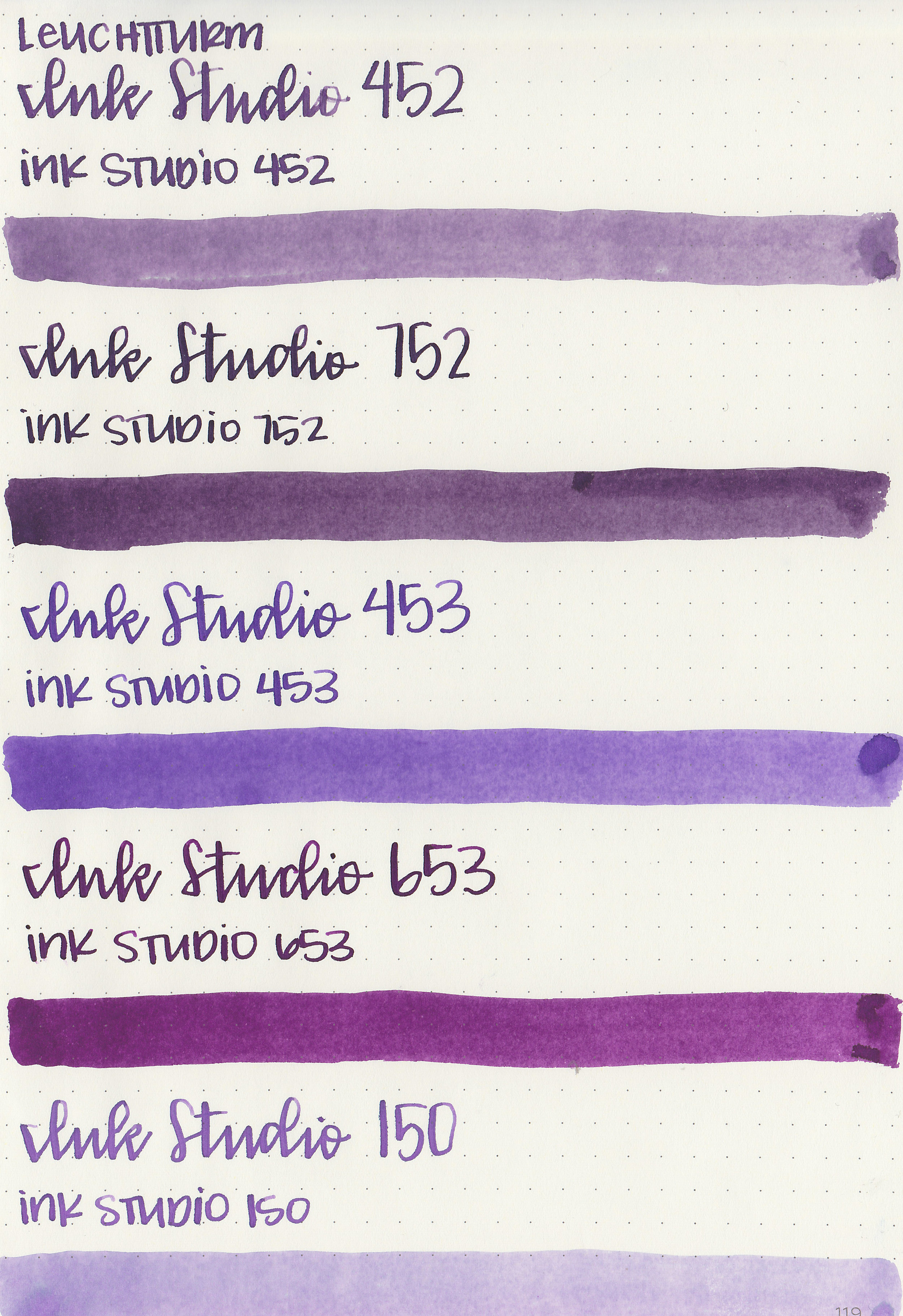
Swabs:

Left to right: 452, 752, 453, 653, and 150.
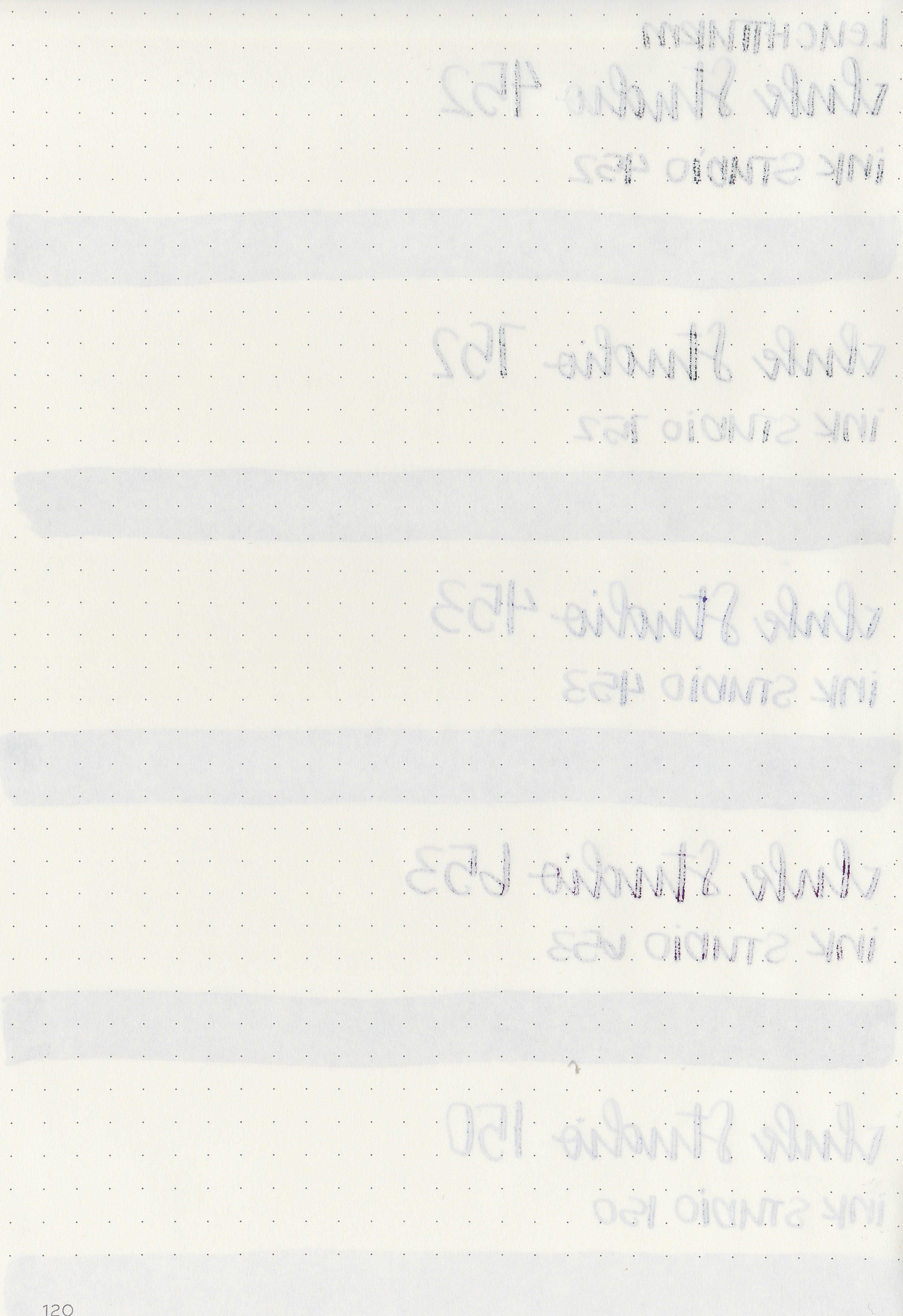
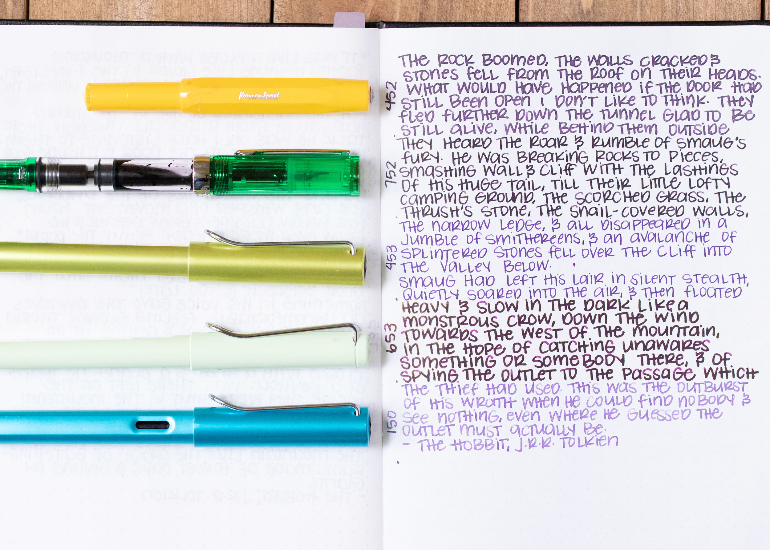
Writing samples:
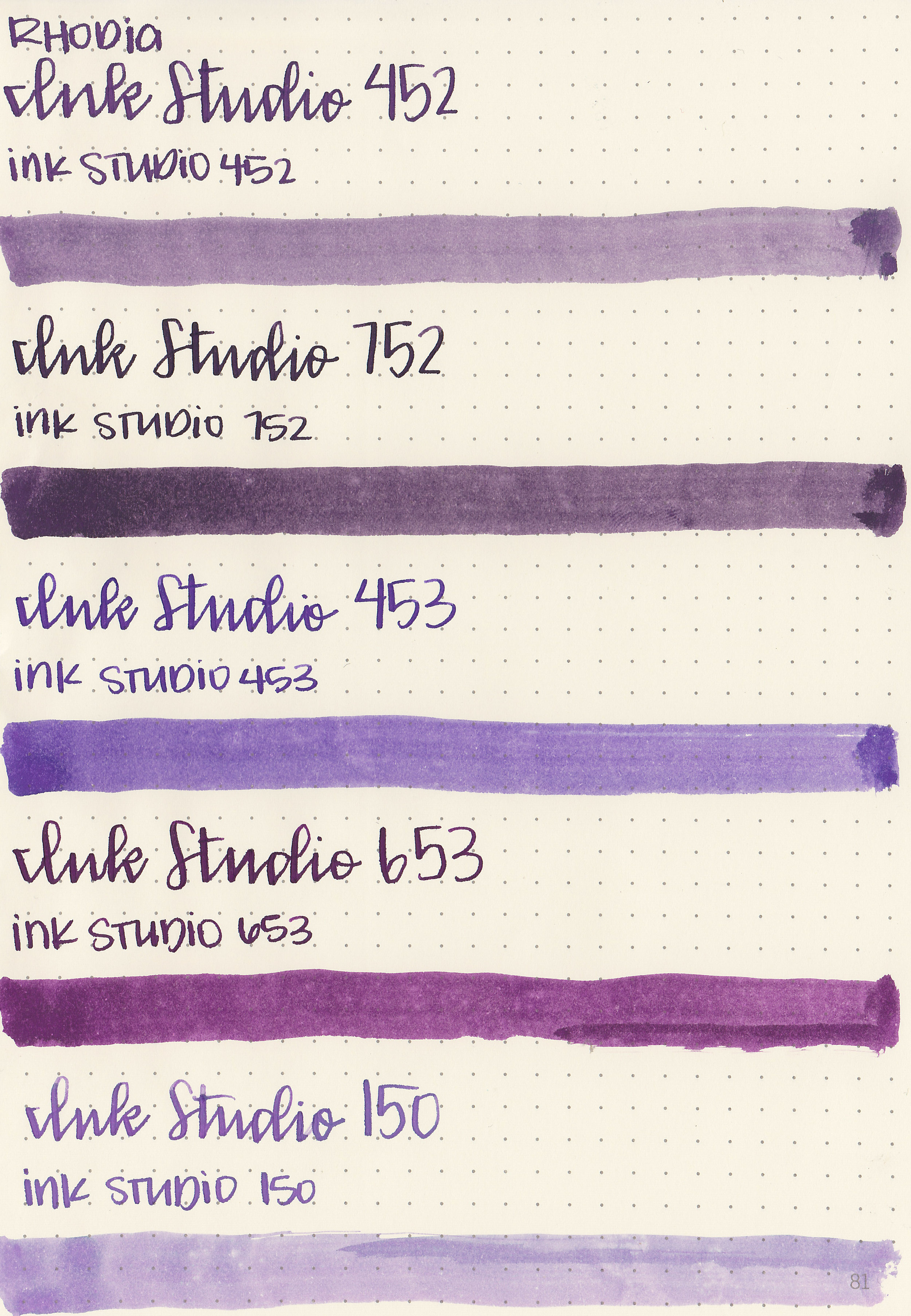
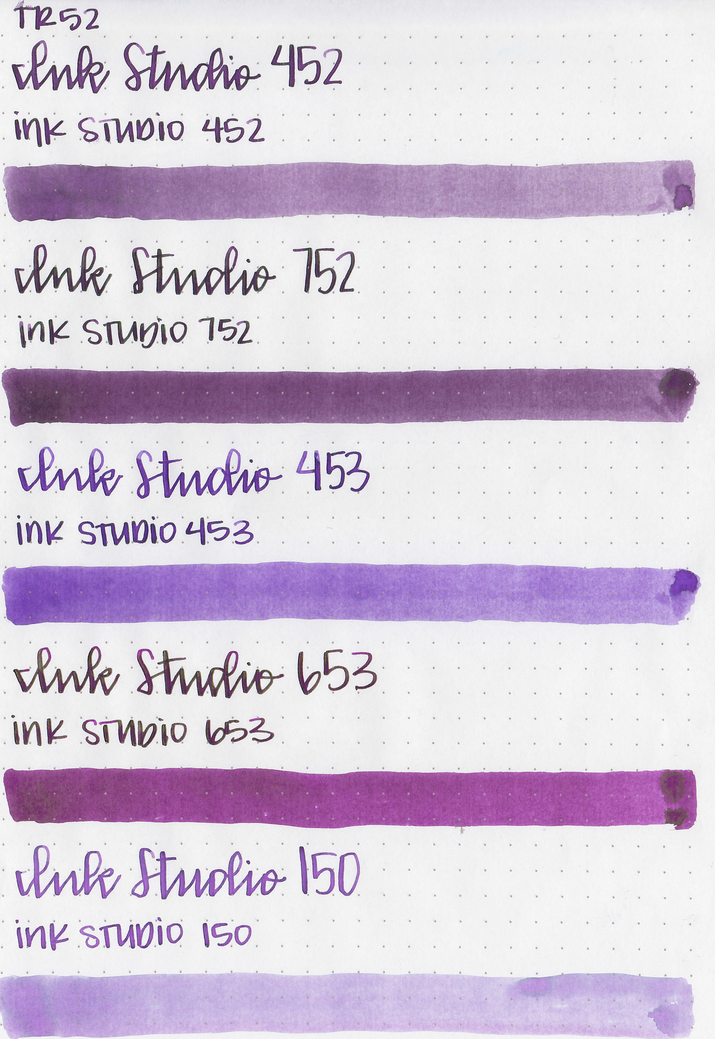
Let's take a look at how the ink behaves on fountain pen friendly papers: Rhodia, Tomoe River, and Leuchtturm.

Dry time:
The inks took 20-30 seconds to dry.

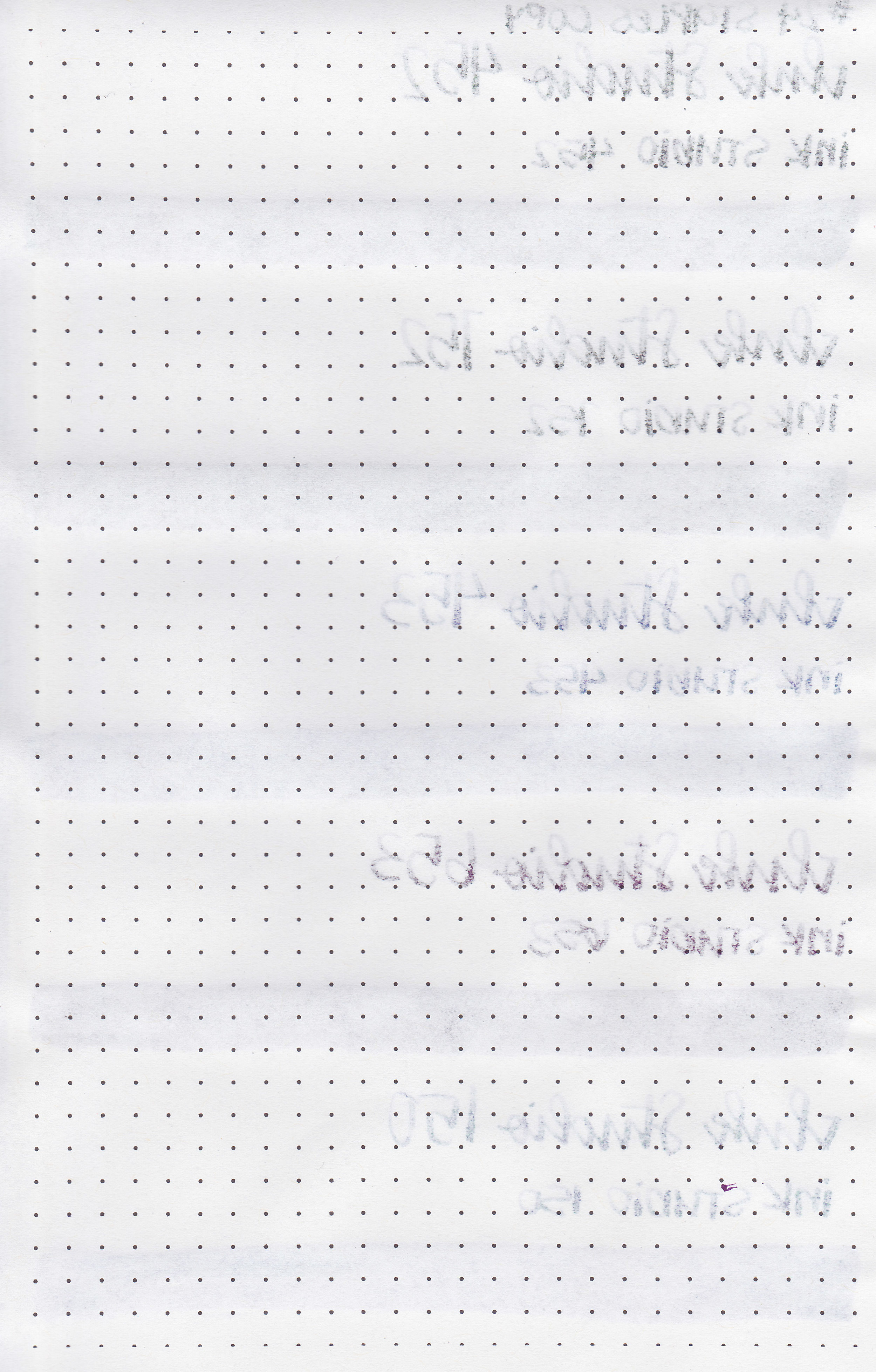
Water resistance: Low
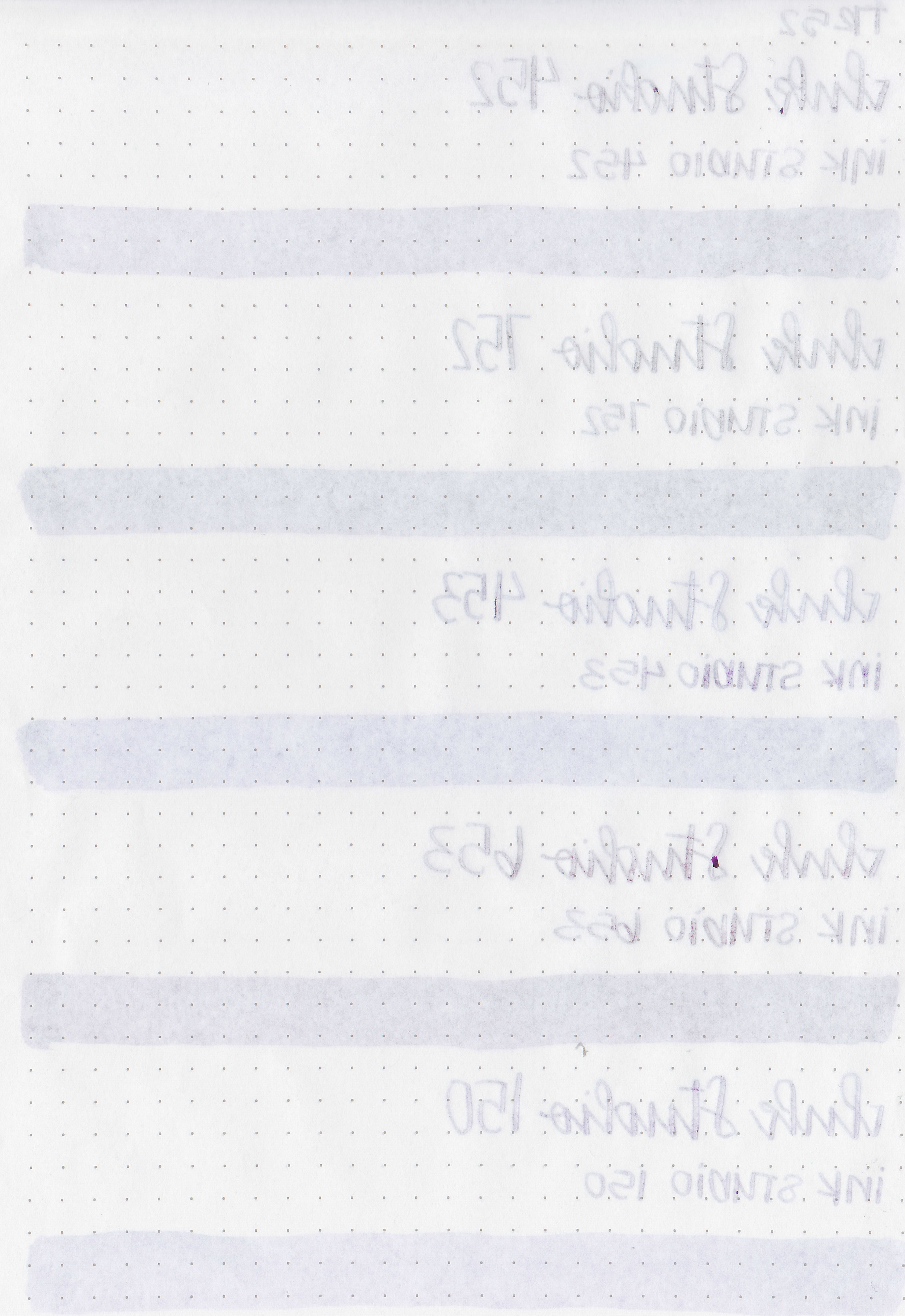
Feathering: Low-there was just a little bit of feathering in the flex nib on Rhodia and Leuchtturm.
Show through: Medium
Bleeding: Low-there was some bleeding in the flex nib.
Other properties: 452, 752, 453, and 653 have medium sheen. 452, 752, 453, and 653 have low shading and 150 has high shading.
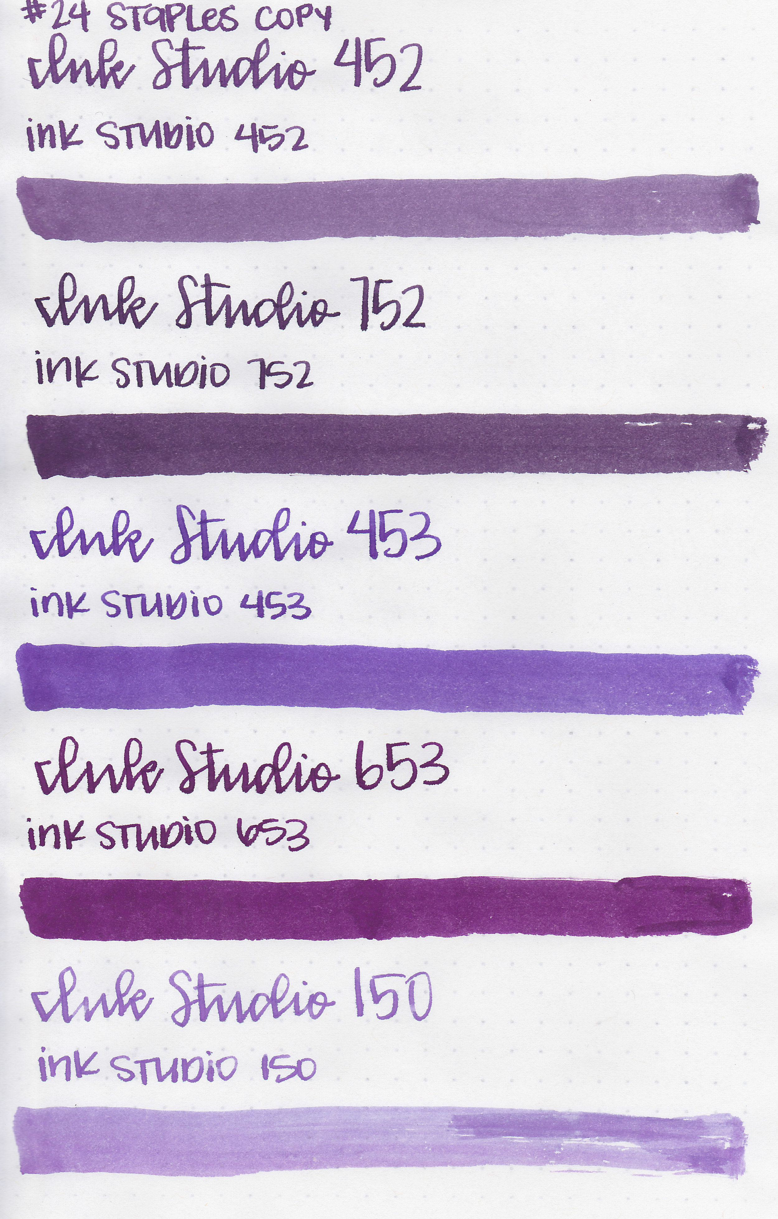
On Staples 24 lb copy paper there was lots of feathering in the larger nib sizes as well as a bit of bleeding.
Comparison Swabs:

453 is similar to Robert Oster Summer Storm. 752 is closer to 3 Oysters Purple Gray. 453 is similar to Monteverde Amethyst. 653 is close to Birmingham Boysenberry. 150 is similar to Pen Saijiki Fujifusa. Click here to see the Sailor inks together.

Life Bank paper brings out the undertones. 452 has a hint of green and 150 has a lot of blue in it. I love 150 on this paper, it almost looks like a blue-purple gradient as you write, it would be a perfect match for the Pilot VP Twilight LE.
I used a Bond Travel Gear A5 notebook. The inks all had a wetter flow.
Overall, I like all of them, but I’m a bit obsessed with 150 on bank paper. My pen pals may all get letters using Bank paper and 150 for the next year.
Disclaimer: I purchased this ink at a discount from Sakura Fountain Pen Galley for the purpose of this review. All photos and opinions are my own. This page does not contain affiliate links, and is not sponsored in any way.