
Sailor Ink Studio Set 1
/
Sailor Ink Studio set #1 includes 123, 223, 723, 130 and 230. When I first started hearing about the Sailor Ink Studio inks, 123 is the one ink I heard mentioned the most. I’ve received a few letters recently written with 123, and it’s basically a chameleon ink-on some papers it looks more gray, some more purple, and some green. Thanks to Sakura Fountain Pen Gallery for helping me get the full set of 100 Ink Studio samples.
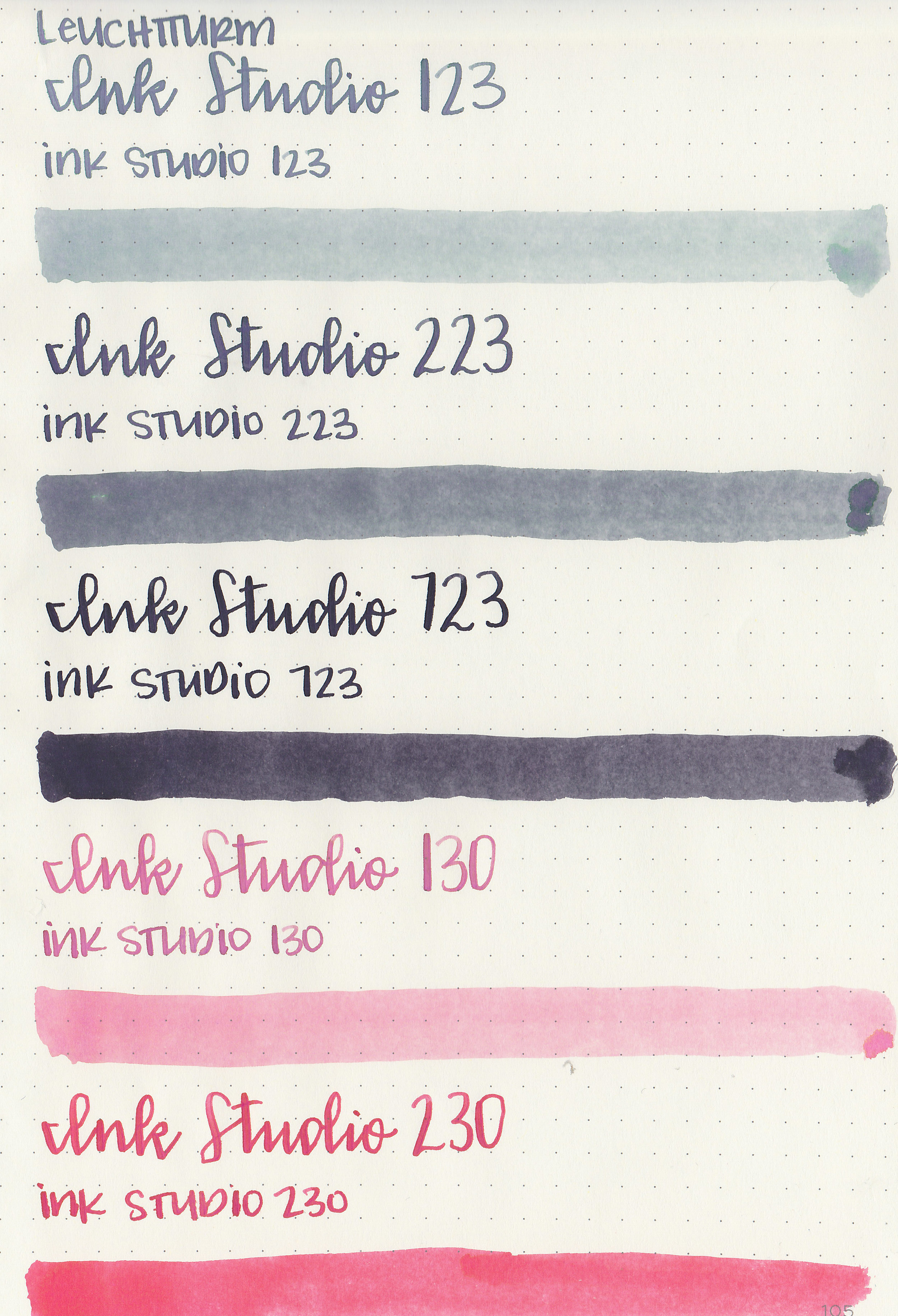
Swabs:

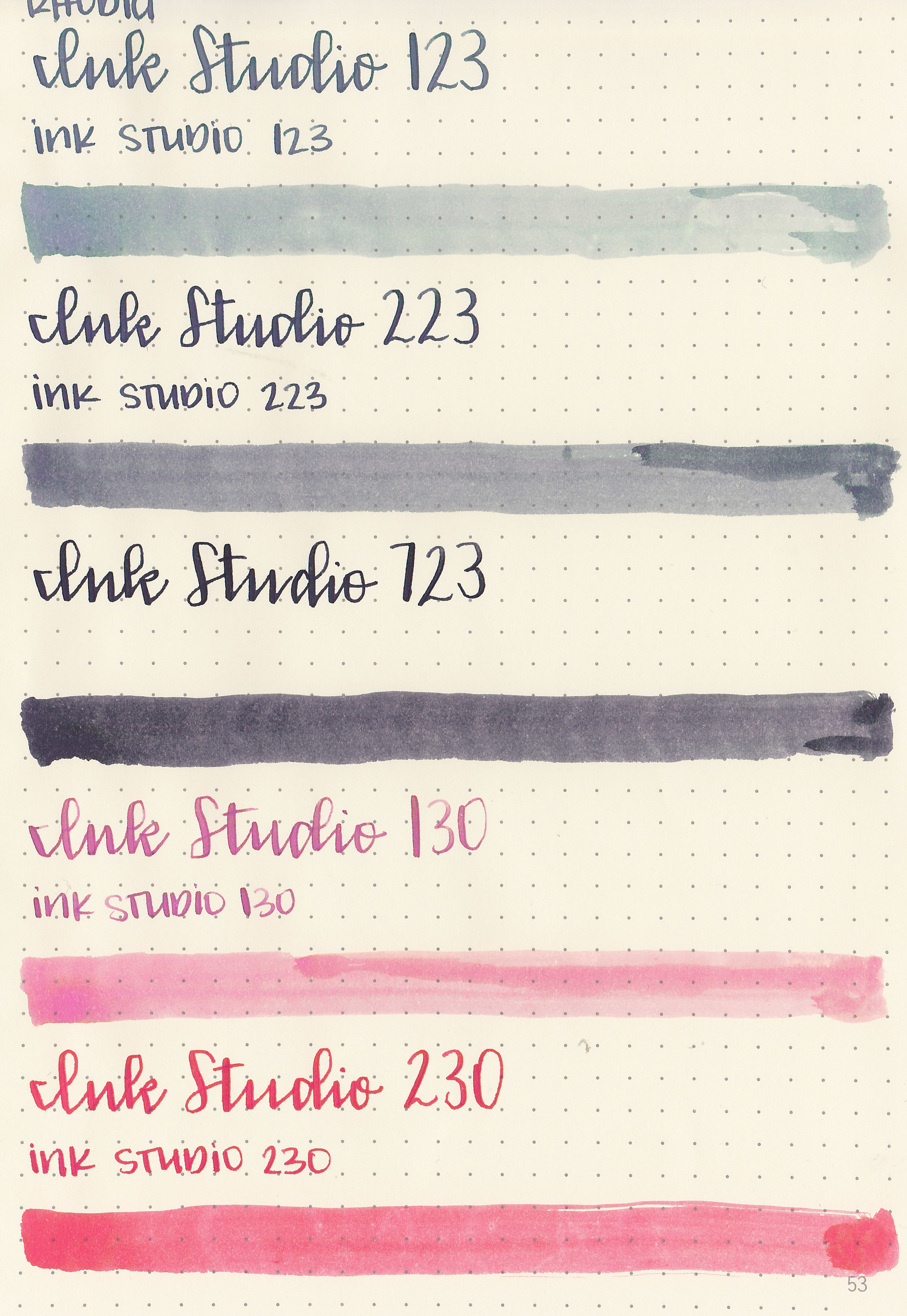
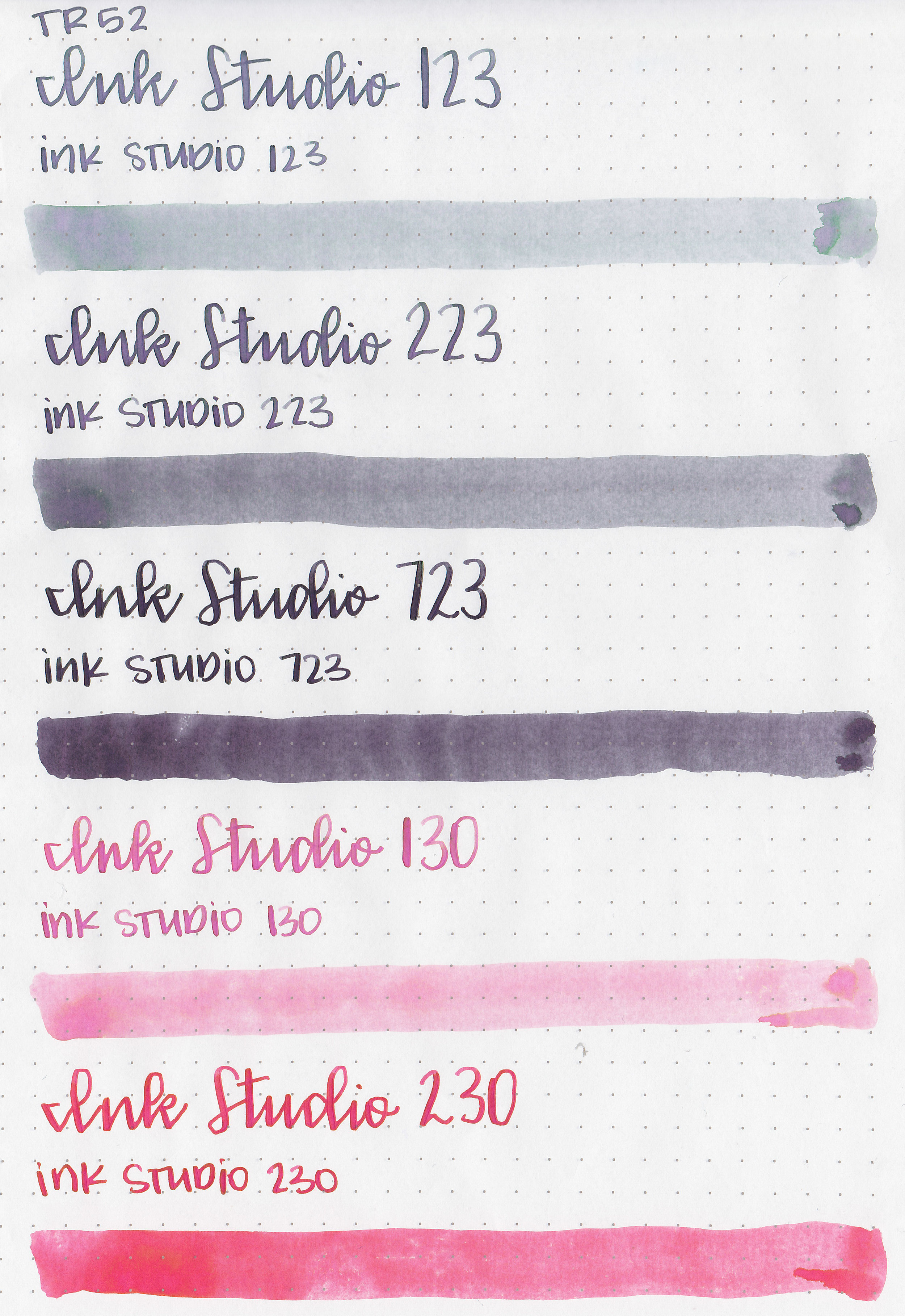
Left to right: 123, 223, 723, 130 and 230. 123, 223 and 723 all have a similar green/purple undertone. 130 and 230 both have an orange/coral undertone.
Writing samples:
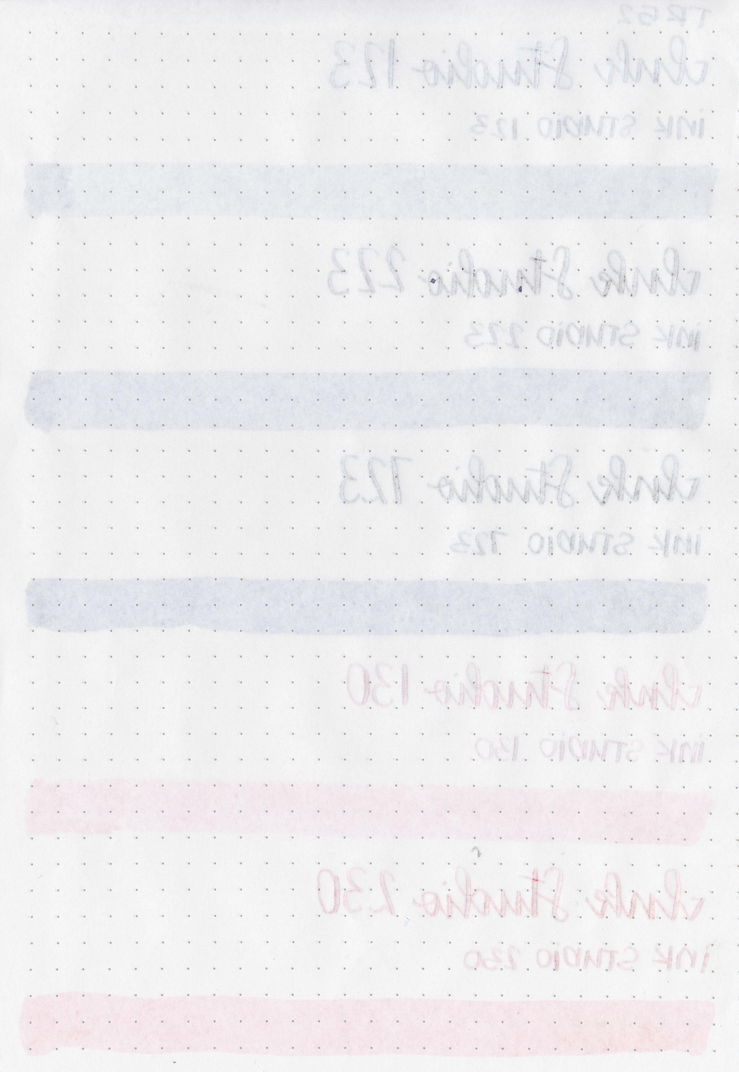
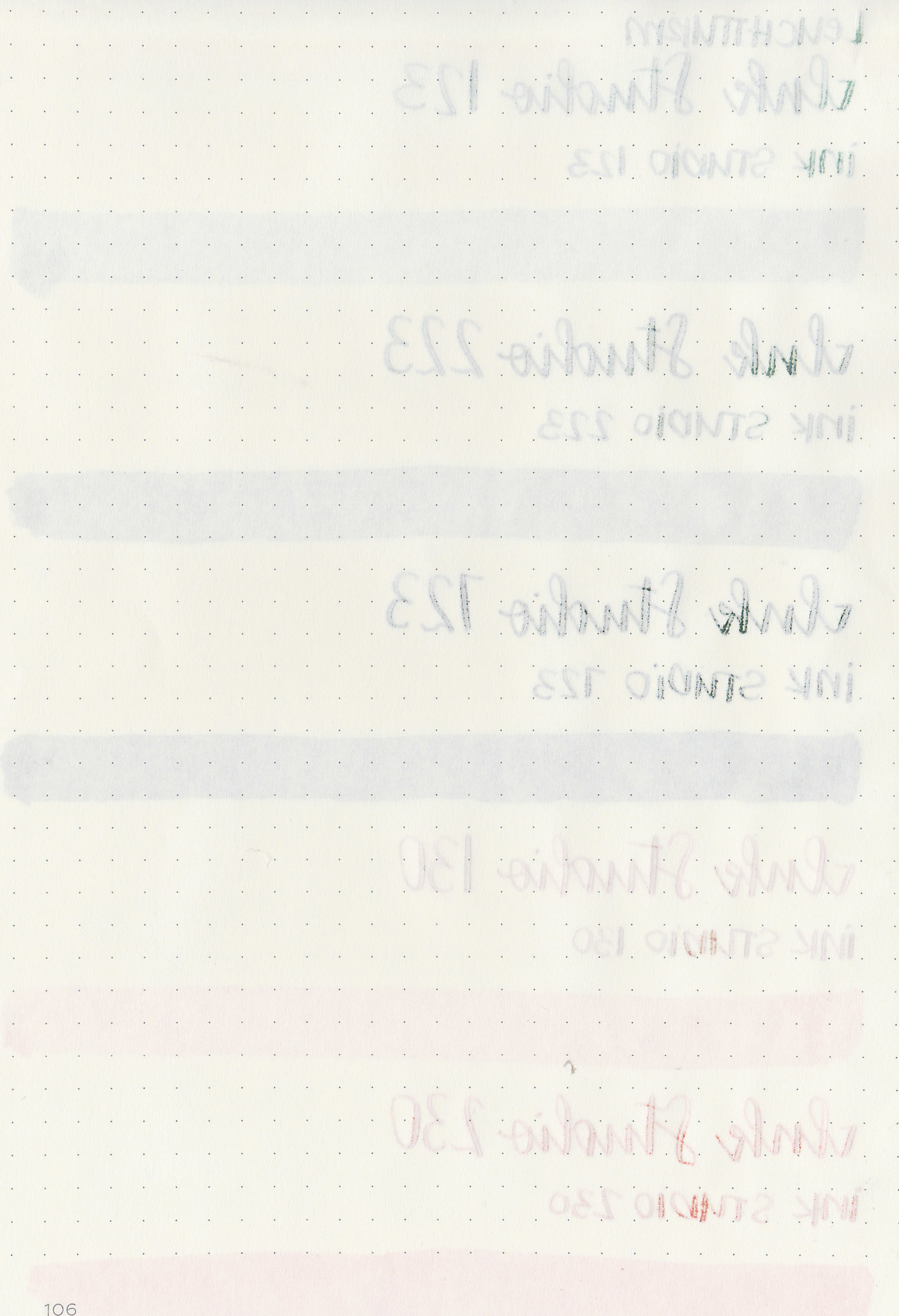
Let's take a look at how the ink behaves on fountain pen friendly papers: Rhodia, Tomoe River, and Leuchtturm.

Dry time:
The inks took 20-50 seconds to dry.
Water resistance: Low
Feathering: Low-there was just a little bit of feathering in the flex nib on Rhodia and Leuchtturm.
Show through: Medium
Bleeding: Low-there was some bleeding in the flex nib.
Other properties: 723 had low sheen, 123 had high shading, and the rest had low shading. 123, 223 and 723 all have interesting shading, they are grey inks but have purple and green shading depending on the paper you use.
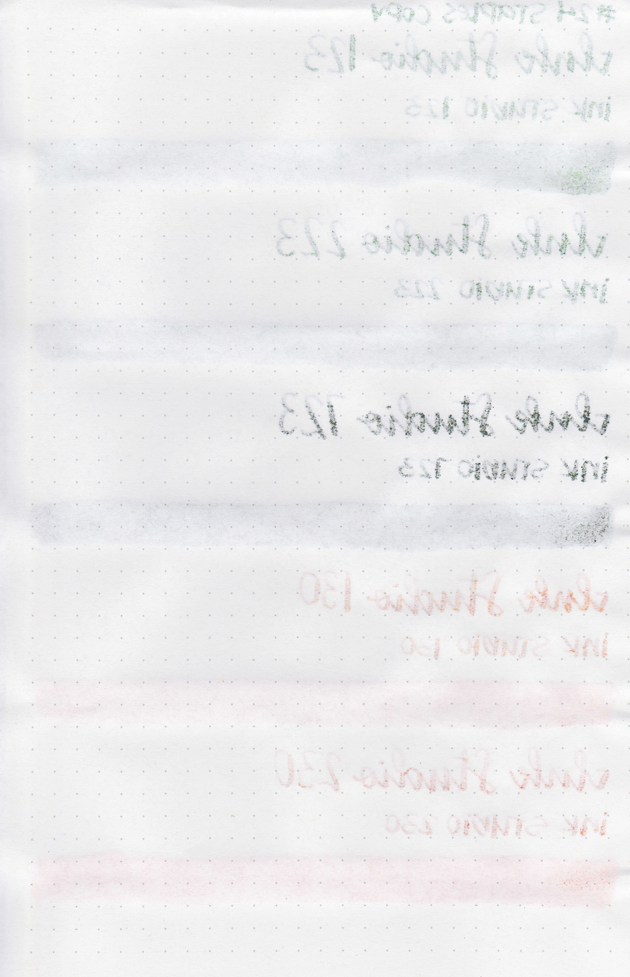
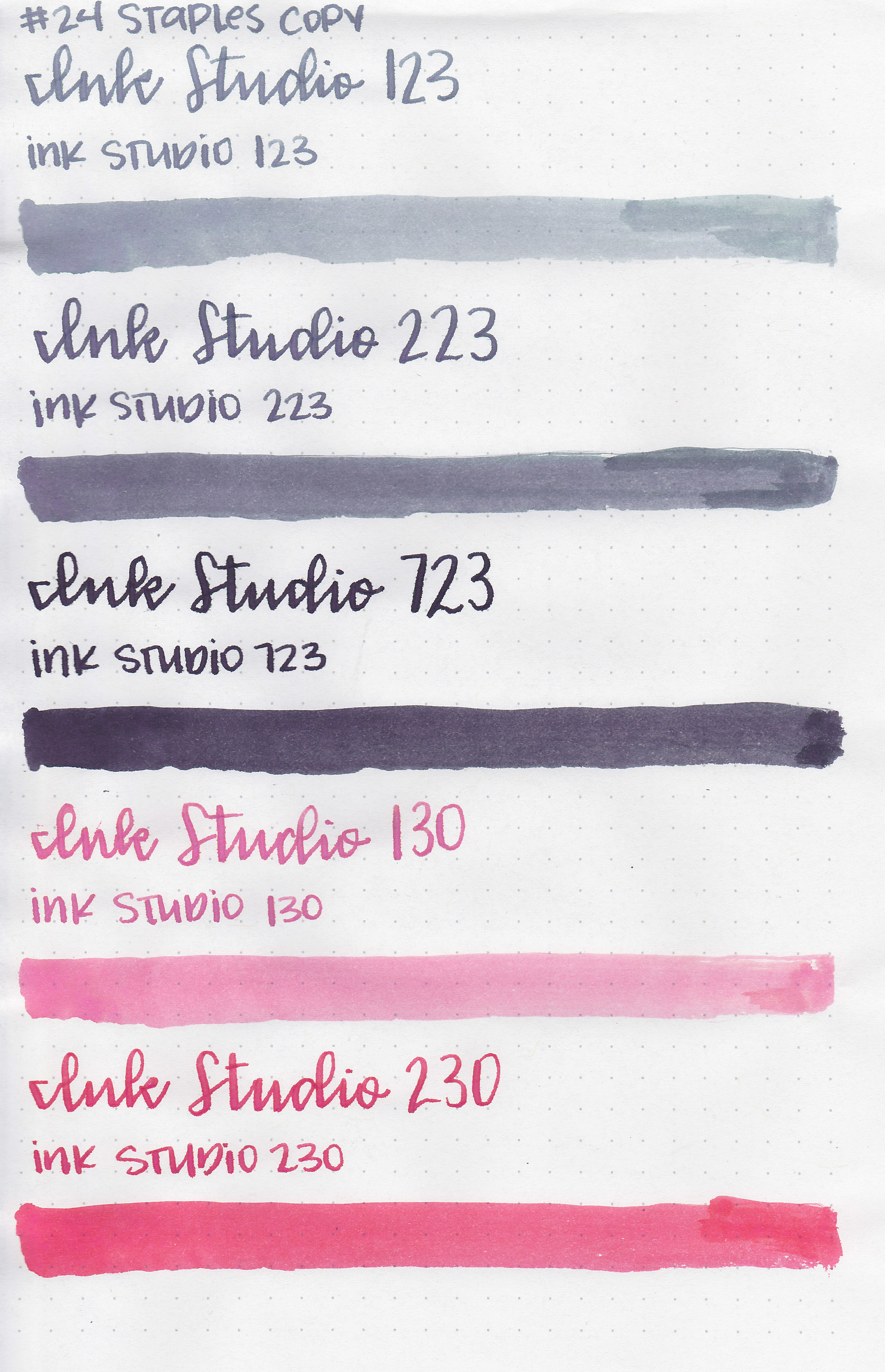
On Staples 24 lb copy paper there was lots of feathering in the larger nib sizes as well as a bit of bleeding.
Comparison Swabs:

I don’t have any good matches for 123. 223 is somewhat similar to 3 Oysters Cool Gray. 723 is similar to Organics Studio Arsenic Gray. 130 is pretty darn close to Sailor Jentle Sakura-Mori. 230 is close to J Herbin Corail des Tropiques. Click here to see the Sailor inks together.

Life Bank paper brings out the undertones, 123 and 223 look more green than gray, and 130 looks more orange than pink. I love using these inks on Bank paper just so I can see the hidden tones.

I used a Bond Travel Gear A5 notebook. The inks all had a wetter flow.
Overall, I enjoyed all of them, but 123 and 130 are my favorites from this set. I love how 123 seems to change depending on what paper it’s used on. Yes, it’s can be a bit light in extra fine nibs, but the amazing shading makes up for that.
Disclaimer: I purchased this ink at a discount from Sakura Fountain Pen Galley for the purpose of this review. All photos and opinions are my own. This page does not contain affiliate links, and is not sponsored in any way.