
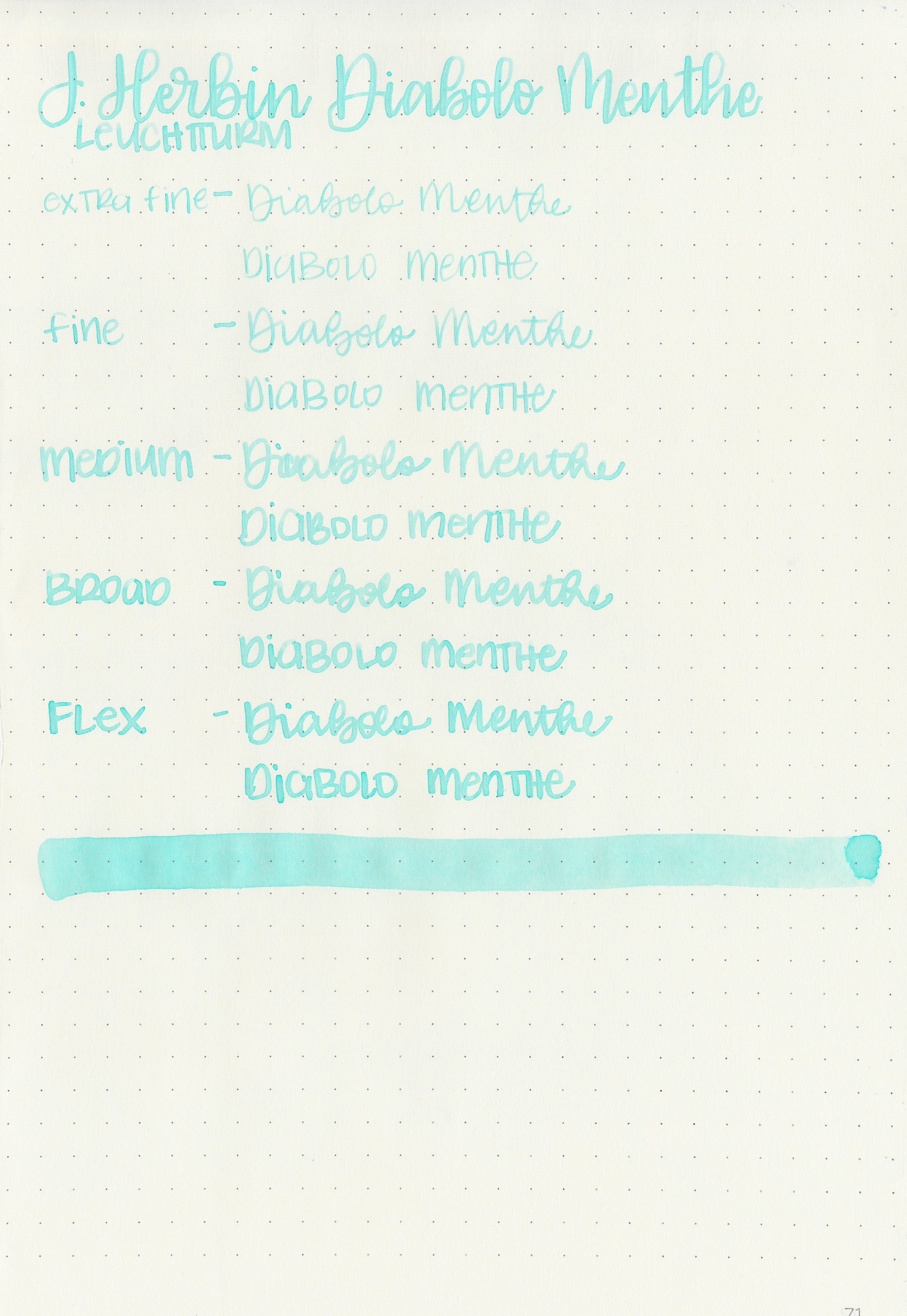
Ink Review #632: J. Herbin Diabolo Menthe
/
I tend toward lighter, more pastel colored inks during the spring, and J Herbin Diabolo Menthe definitely fits that. As soon as I swabbed it I was pretty sure it was too pastel for writing, but I still wanted to test it out.

The color:
Diabolo Menthe is a very, very light blue.
Swabs:

In large swabs you can see some shading but no sheen.

Writing samples:
Let's take a look at how the ink behaves on fountain pen friendly papers: Rhodia, Tomoe River, and Leuchtturm.
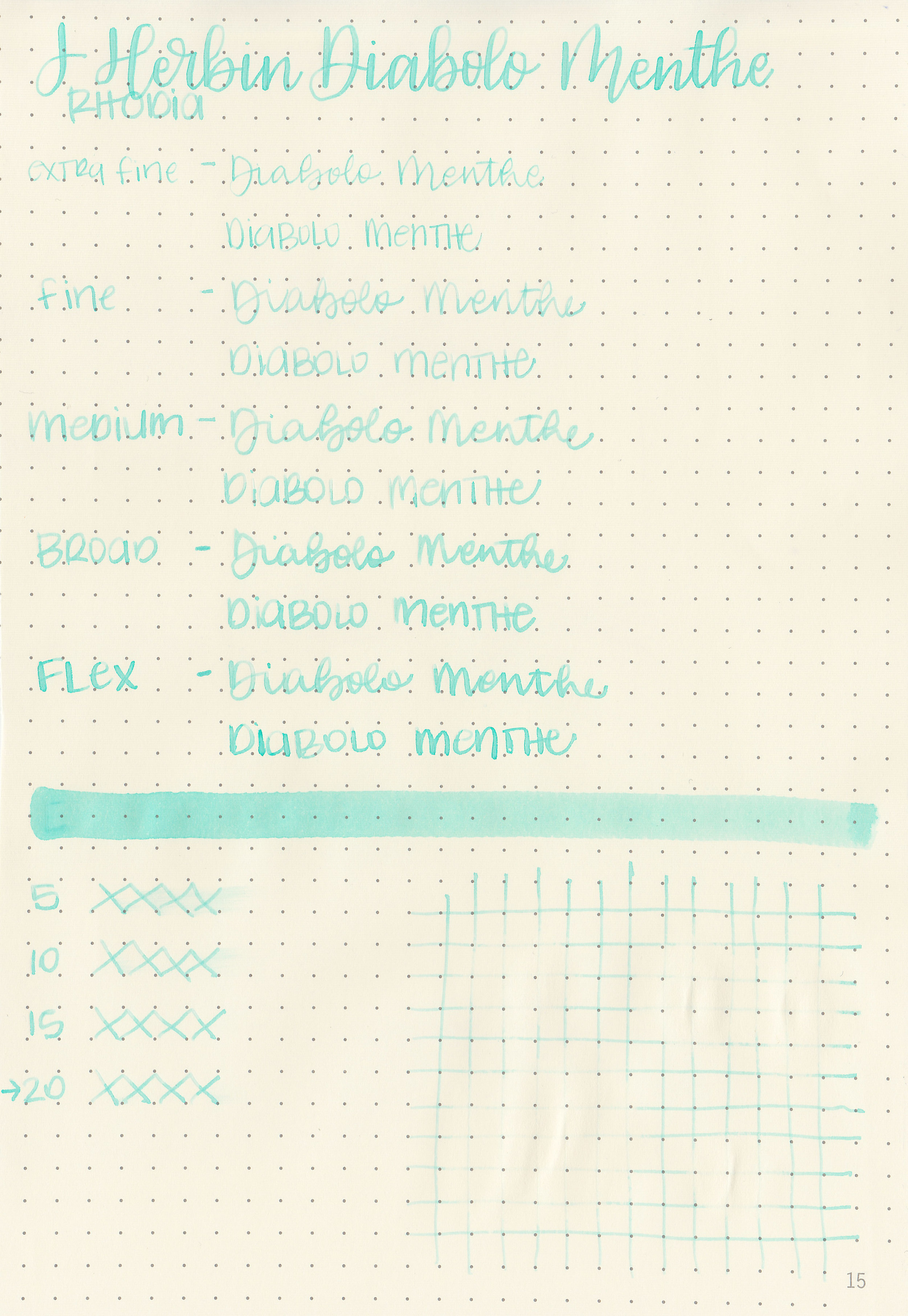
Dry time: 20 seconds
Water resistance: Low
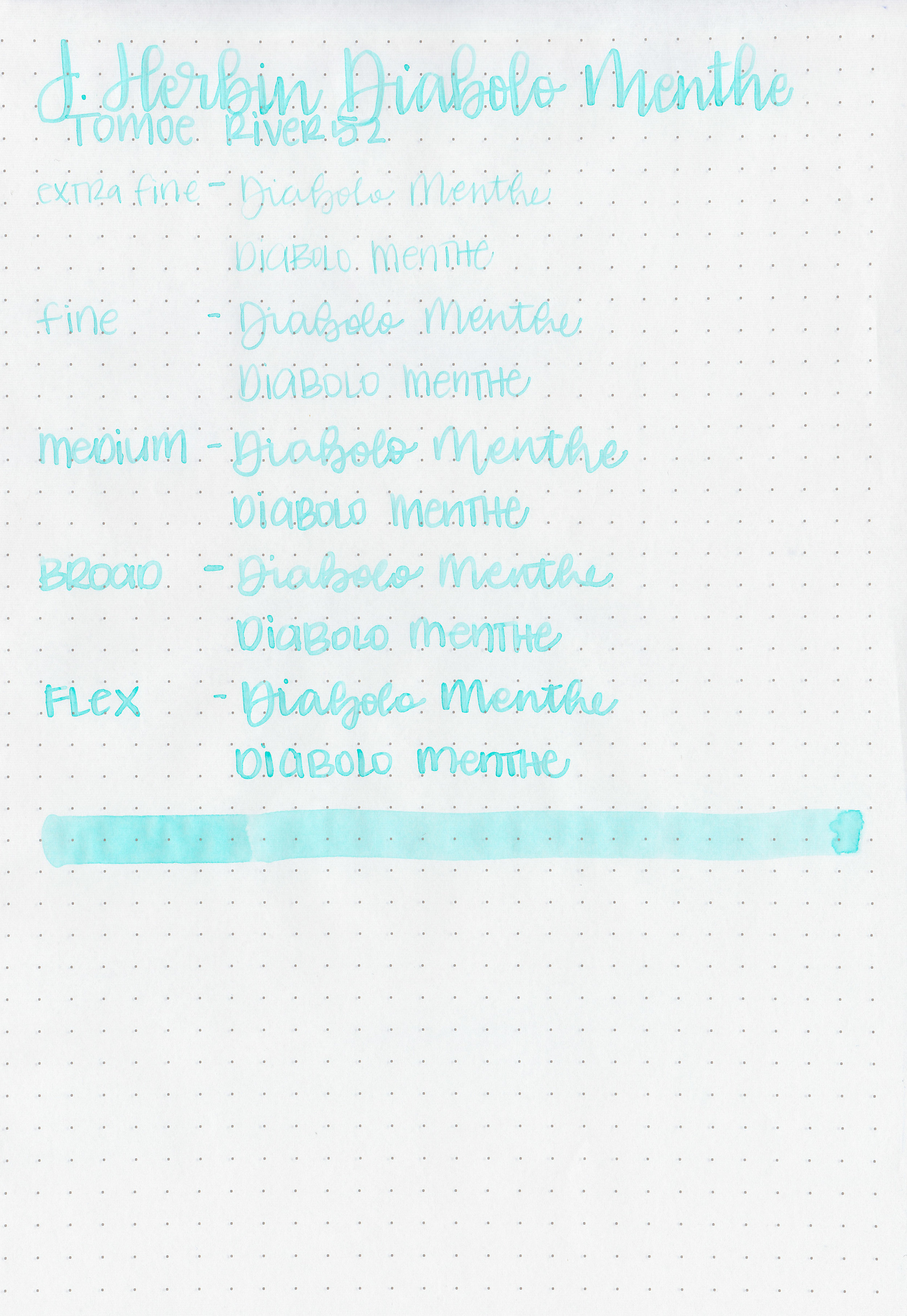
Feathering: None
Show through: Low
Bleeding: None
Other properties: low shading, no sheen, and no shimmer.
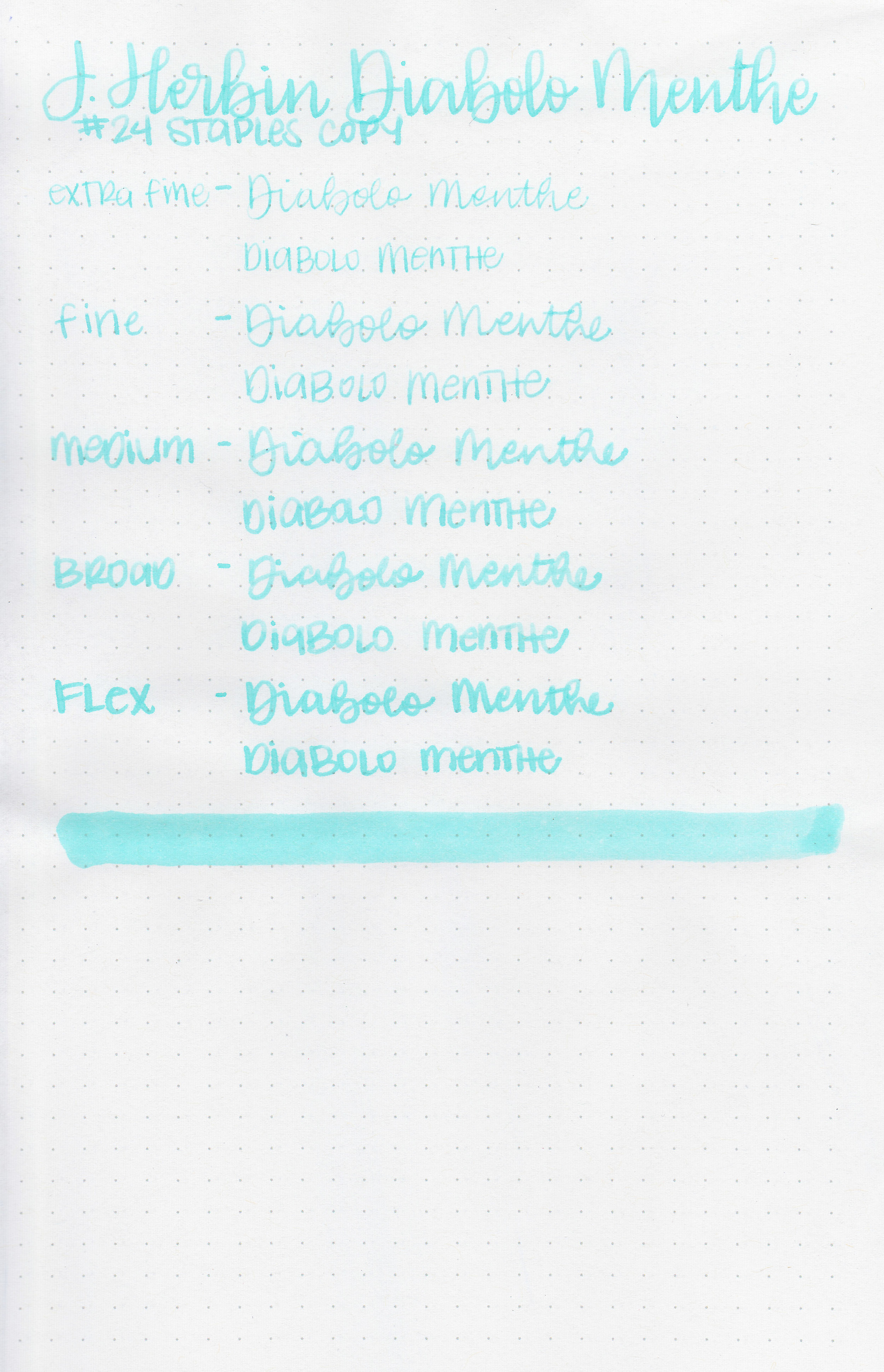
On Staples 24 lb copy paper there was bleeding in the flex nib and feathering in all nib sizes.
Comparison Swabs:

Sailor Jentle Yuki-akari is the closest to Diabolo Menthe. Click here to see the J Herbin inks together, and click here to see the blue inks together.
Longer Writing:

I used a Pilot Metropolitan Retro Pop Turquoise with a fine nib on Tomoe River paper. The ink had an average flow.
Overall, this ink is too light to ever use. Really, it’s unusable. Pretty, but there’s no way I would ever use this ink for writing.
Disclaimer: A sample of this ink was provided by a pen friend, and all photos and opinions are my own. This page does contain affiliate links, but this post is not sponsored in any way.