
Ink Review #823: Vinta Sirena
/
Recently Vanness Pens started carrying Vinta inks, which I’ve never tried before. They sent me some samples to try out, and the first one I tried is Vinta Mermaid Green Sirena 1952. I’ve shortened the name to simply Sirena for this review. According to Vinta’s website, “Sirena is an homage to Mars Ravelo's famous Filipino comics Dyesebel about a mermaid. It is one of the most popular local comics that was serialized in 1952. This beautiful mint green has undertones of grey and pink.”

The color:
Sirena is an unsaturated green, almost a pale cool tone green. I can imagine a mermaid this color, so the name is appropriate.
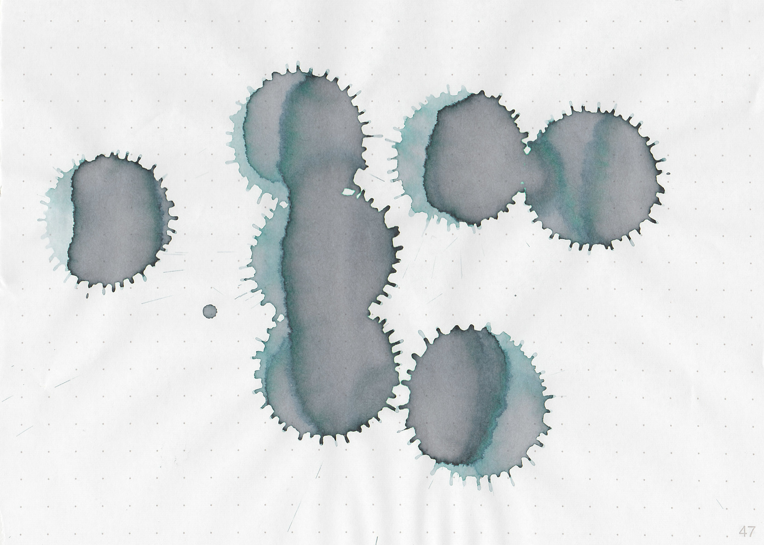
Swabs:

In large swabs on Tomoe River paper the ink shows off some of the pink/grey/brown undertones.
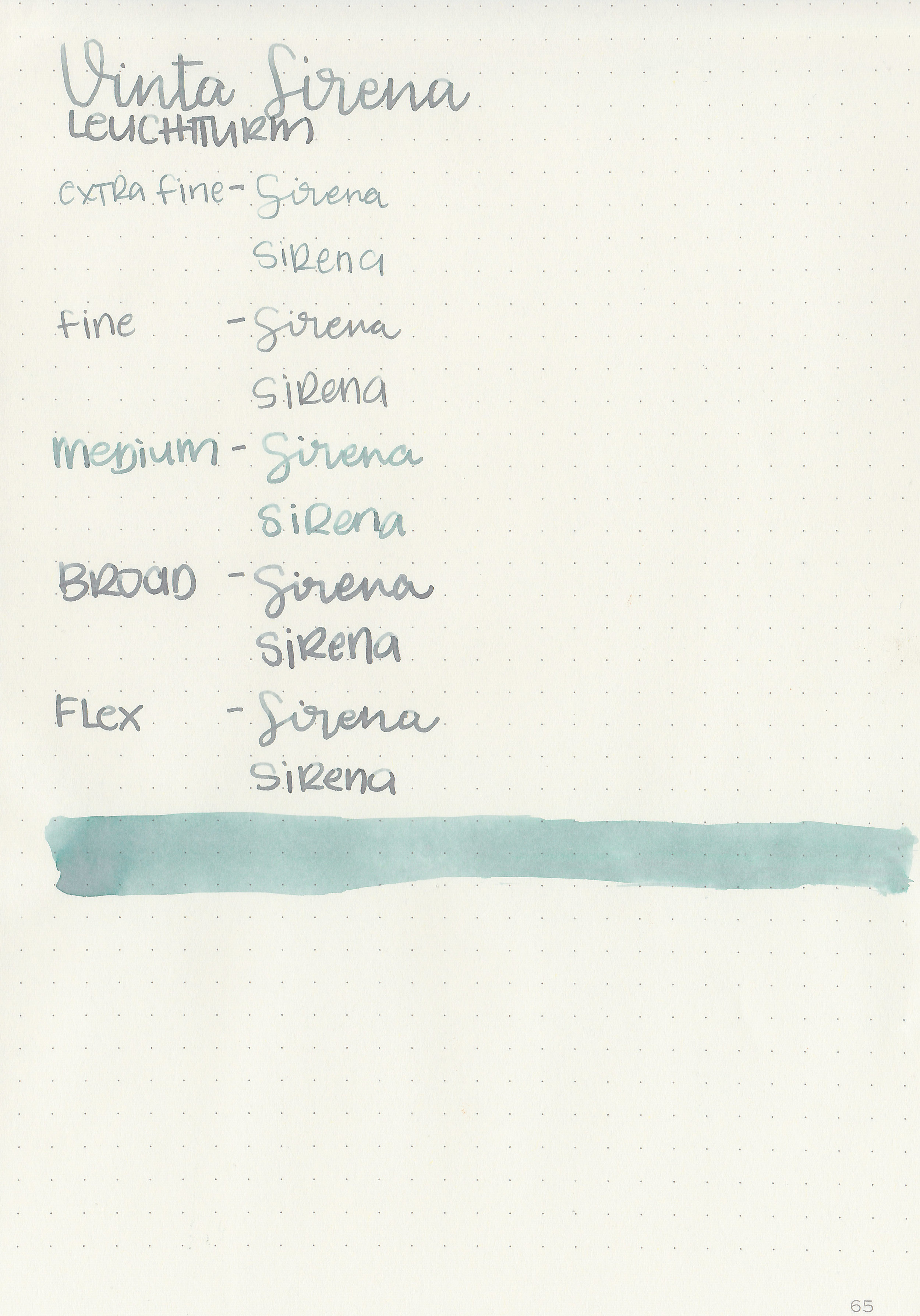
Writing samples:
Let's take a look at how the ink behaves on fountain pen friendly papers: Rhodia, Tomoe River, and Leuchtturm.
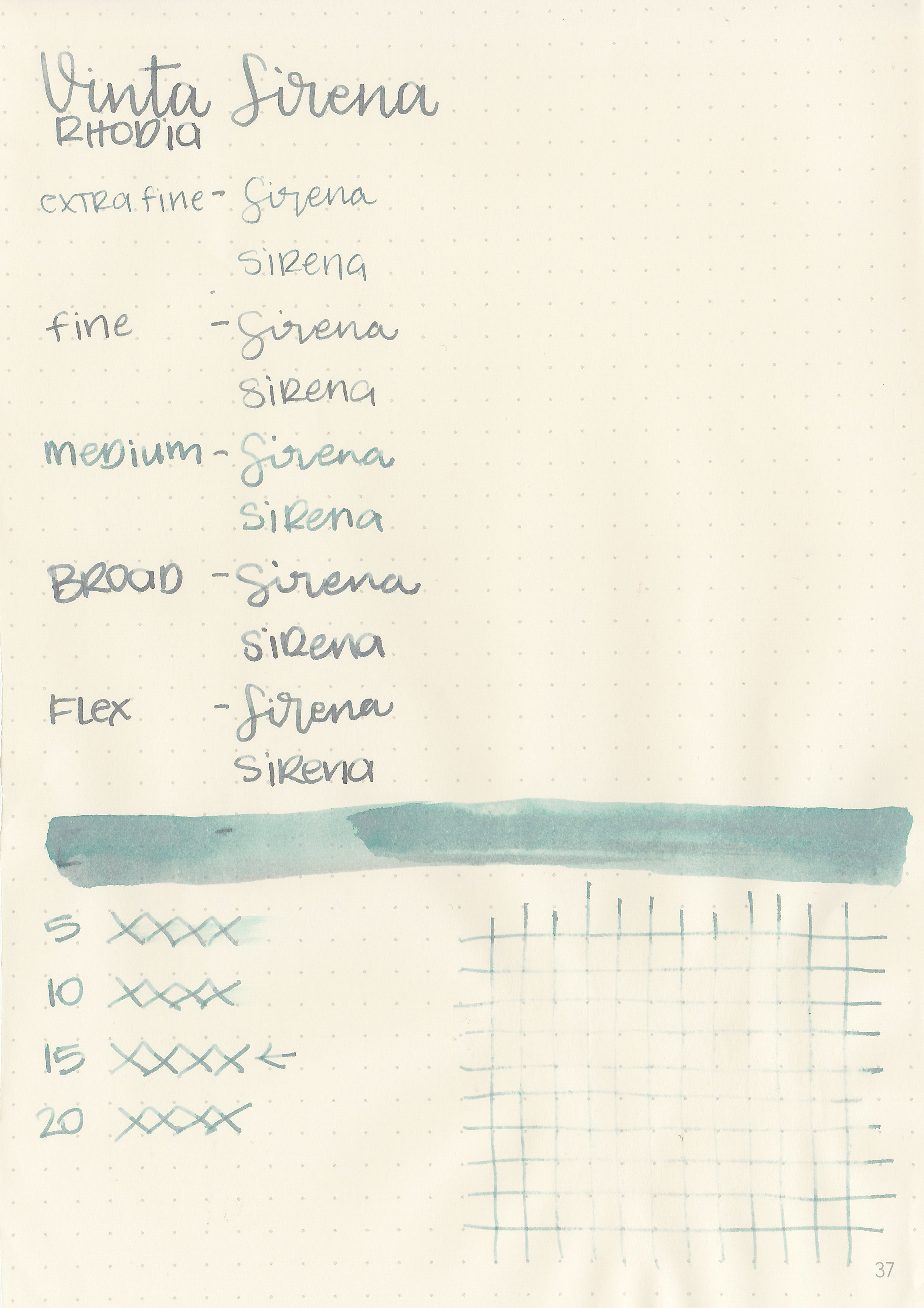
Dry time: 15 seconds
Water resistance: Low
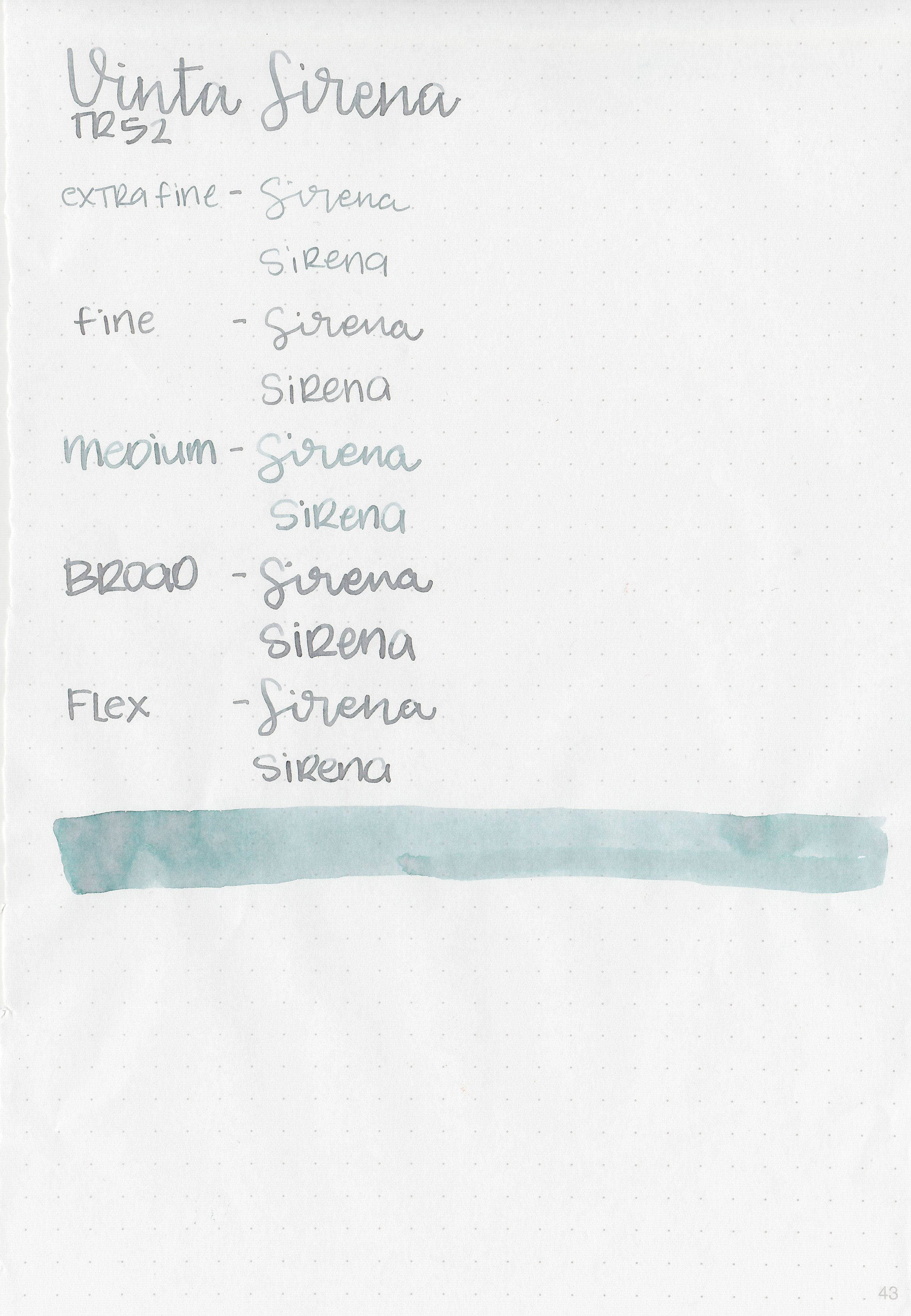
Feathering: None
Show through: Medium
Bleeding: None
Other properties: medium-high shading, no sheen, and no shimmer. I love that the shading sometimes shifts colors in the same letter-green at the top of the letter and pinkish-brown at the bottom.
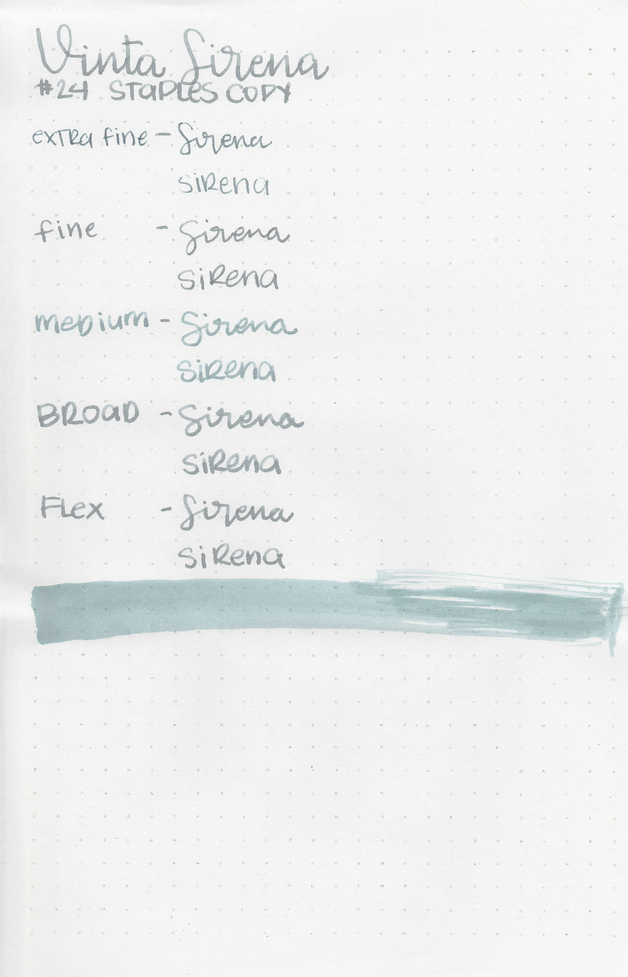
On Staples 24 lb copy paper the ink feathered in all nib sizes and had a little bit of bleeding.
Comparison Swabs:

Sirena shows off a lot of the brownish-pink undertone on the Col-o-ring paper. It looks very different from Sailor Ink Studio 162 which is more of a mint green. Papier Plume Streetcar Green is darker than Sirena. (L’Artisan Pastellier Olive has changed a lot over time. It used to be a lot more green and now it’s turned to a cool-tone brown. I think I need to update my review of it.) Click here to see the green inks together.
Longer Writing:

I used a Pilot Vanishing Point Galaxy with a medium nib on Tomoe River paper. The ink had a slightly dry flow. There is some nice shading, but because the ink is so light it’s hard to see.
Overall, I love that the color shifts between green, pink, brown and grey. It is very pale though, so I would stick to broad and flex nibs to make it readable. Even then it can still be rather pale. I enjoy pastel inks and love broader nibs, so I think I could make it work for me, but I don’t love this one as much as I thought I would.
Disclaimer: A sample of this ink was provided by Vanness Pens for the purpose of this review. All photos and opinions are my own. This page does not contain affiliate links, and this post is not sponsored in any way.