
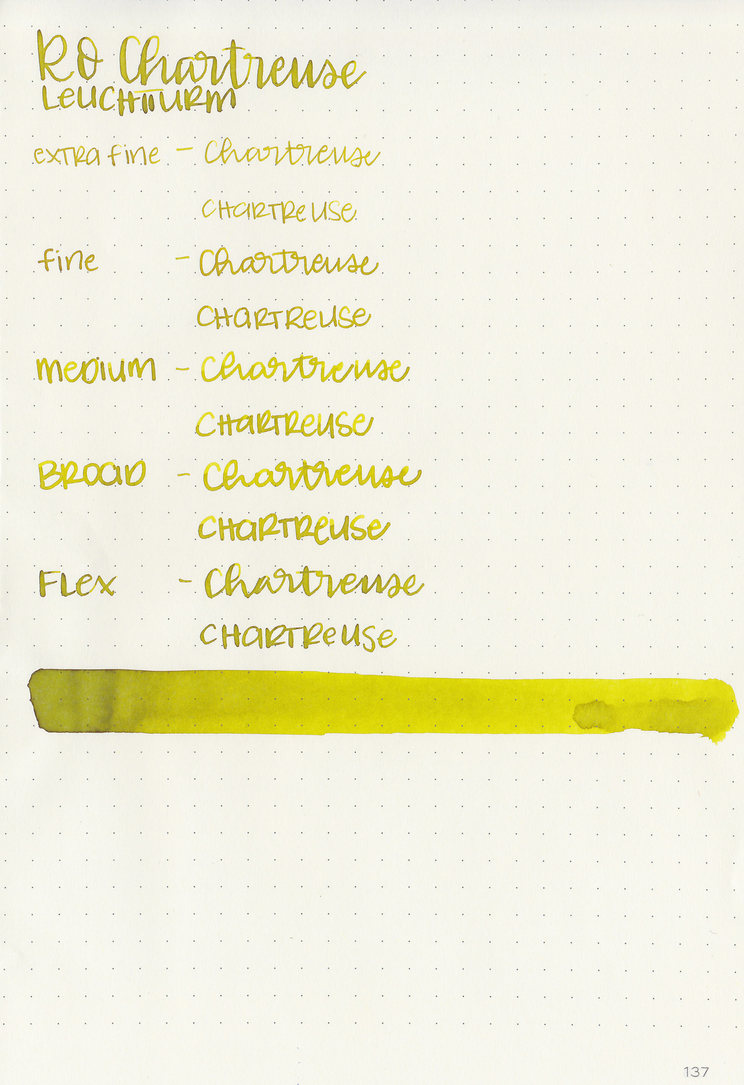
Ink Review #928: Robert Oster Chartreuse
/
Today’s ink is Robert Oster Chartreuse. I’m pretty sure this ink is the color of stomach acid, just less saturated. It’s just not the most appealing color. I purchased my bottle of ink from Pen Chalet.

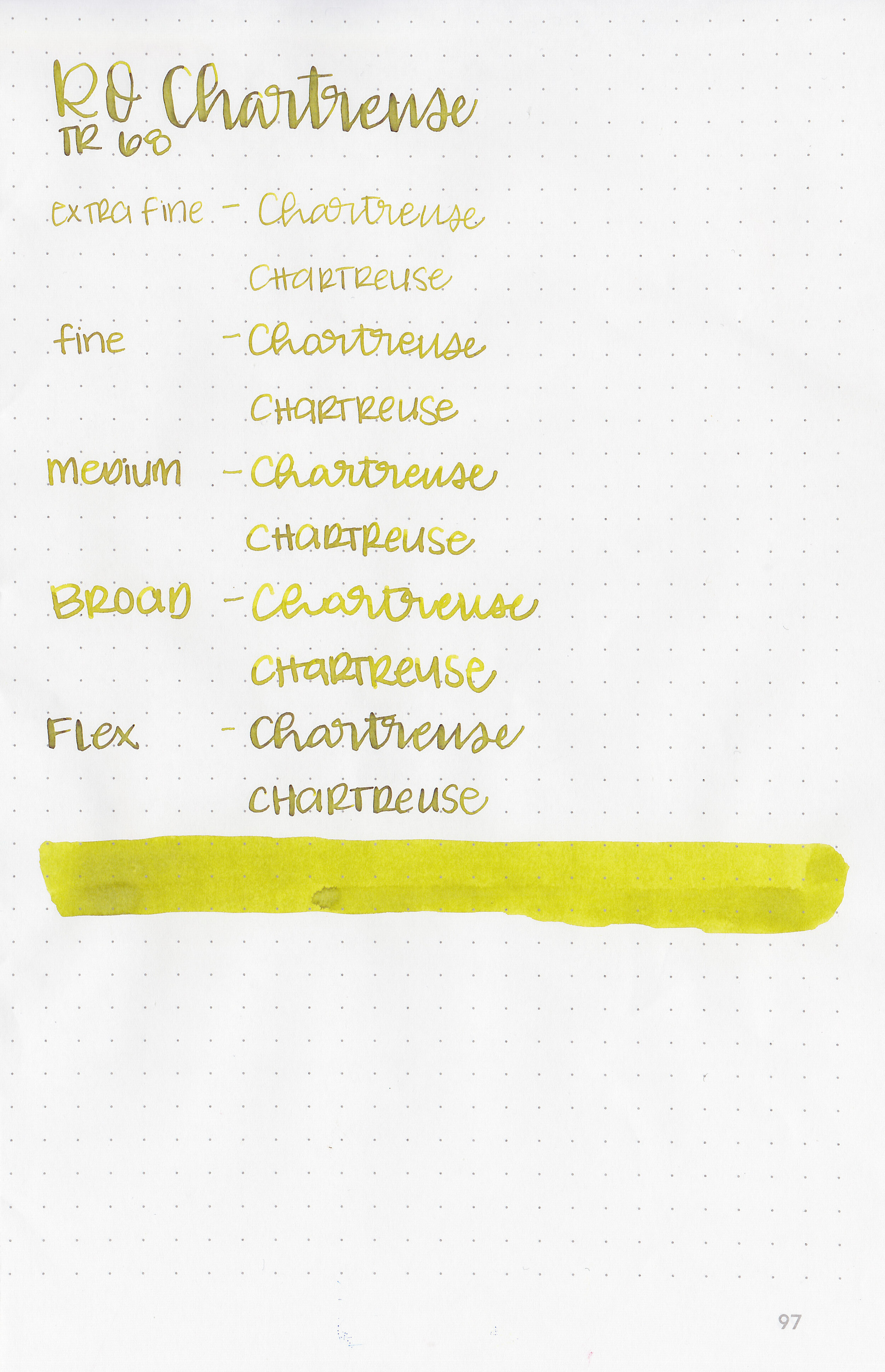
The color:
Chartreuse is an odd yellow-green. It’s definitely a chartreuse, but rather dusky at the same time.
Swabs:

In large swabs on Tomoe River paper the ink looks darker than it does in writing.

Writing samples:
Let's take a look at how the ink behaves on fountain pen friendly papers: Rhodia, Tomoe River, and Leuchtturm.
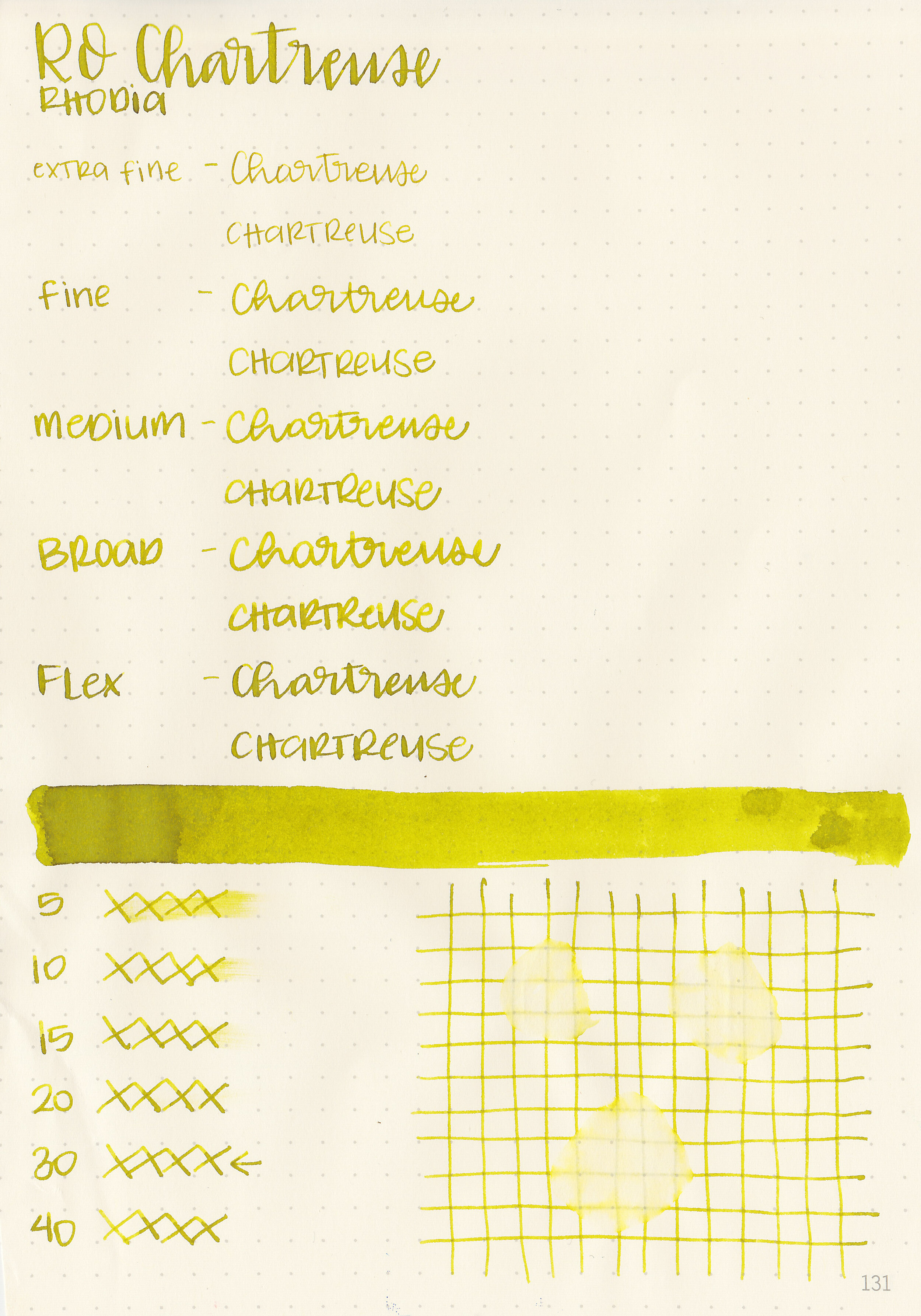
Dry time: 30 seconds
Water resistance: Low
Feathering: None
Show through: Medium
Bleeding: None
Other properties: medium shading, no sheen, and no shimmer.
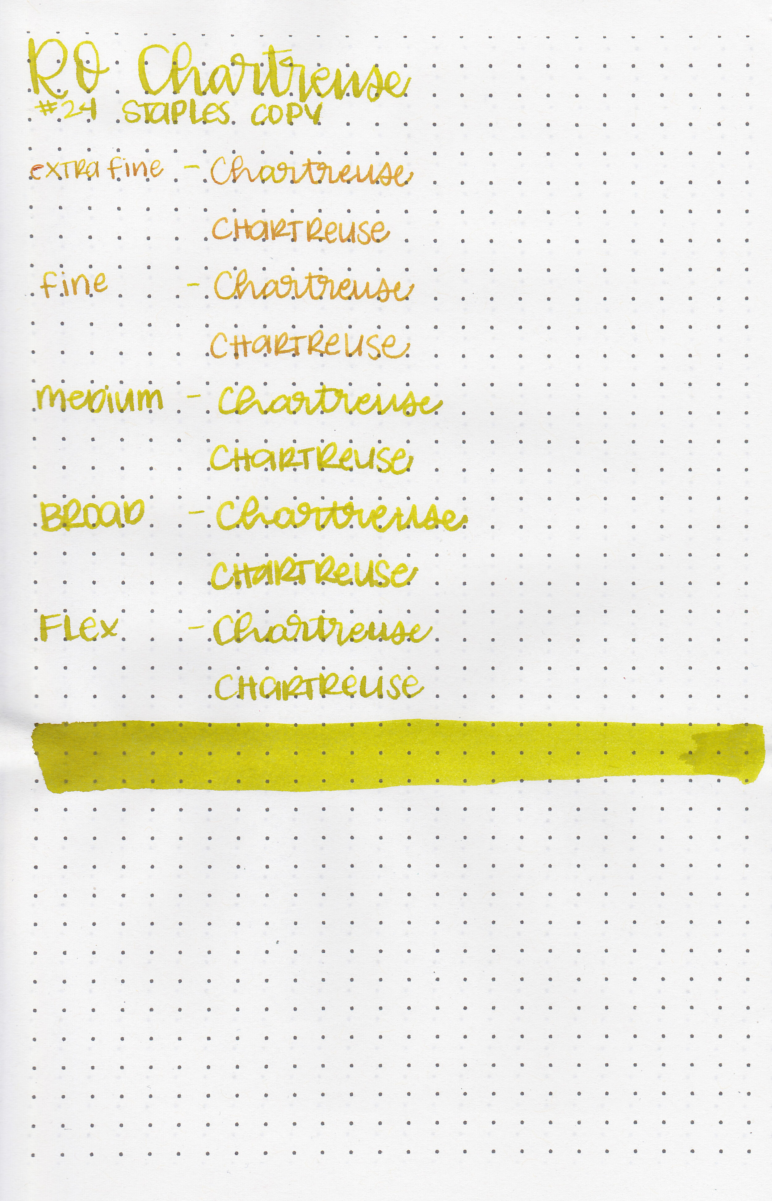
On Staples 24 lb copy paper there was feathering in every nib size and just a little bit of bleeding in the larger nib sizes.
Comparison Swabs:

Chartreuse is similar to Birmingham Gunpowder Tea. Click here to see the Robert Oster inks together, and click here to see the green inks together.
Longer writing:

I used a Lamy Al-star Charged Green with an extra fine nib on a Lochby A5 Lined Refill-Tomoe River 68gsm. The ink had a dry flow.
Overall, it’s a bit light in extra-fine nibs, but in the larger nib sizes it’s very readable. It’s not my favorite color, but it’s still well behaved.
Disclaimer: I purchased this ink myself and all photos and opinions are my own. This page does contain affiliate links, but this post is not sponsored in any way.