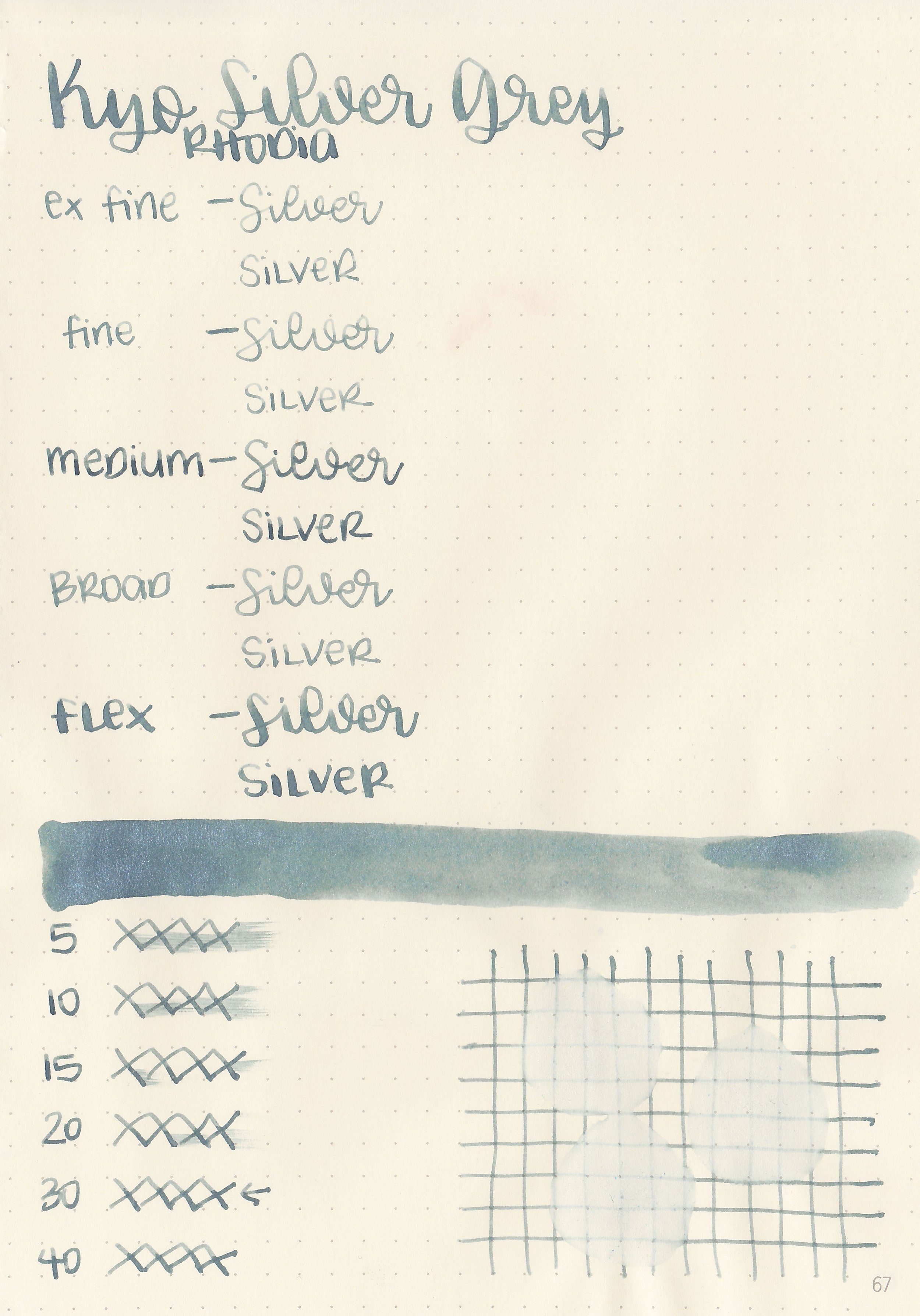
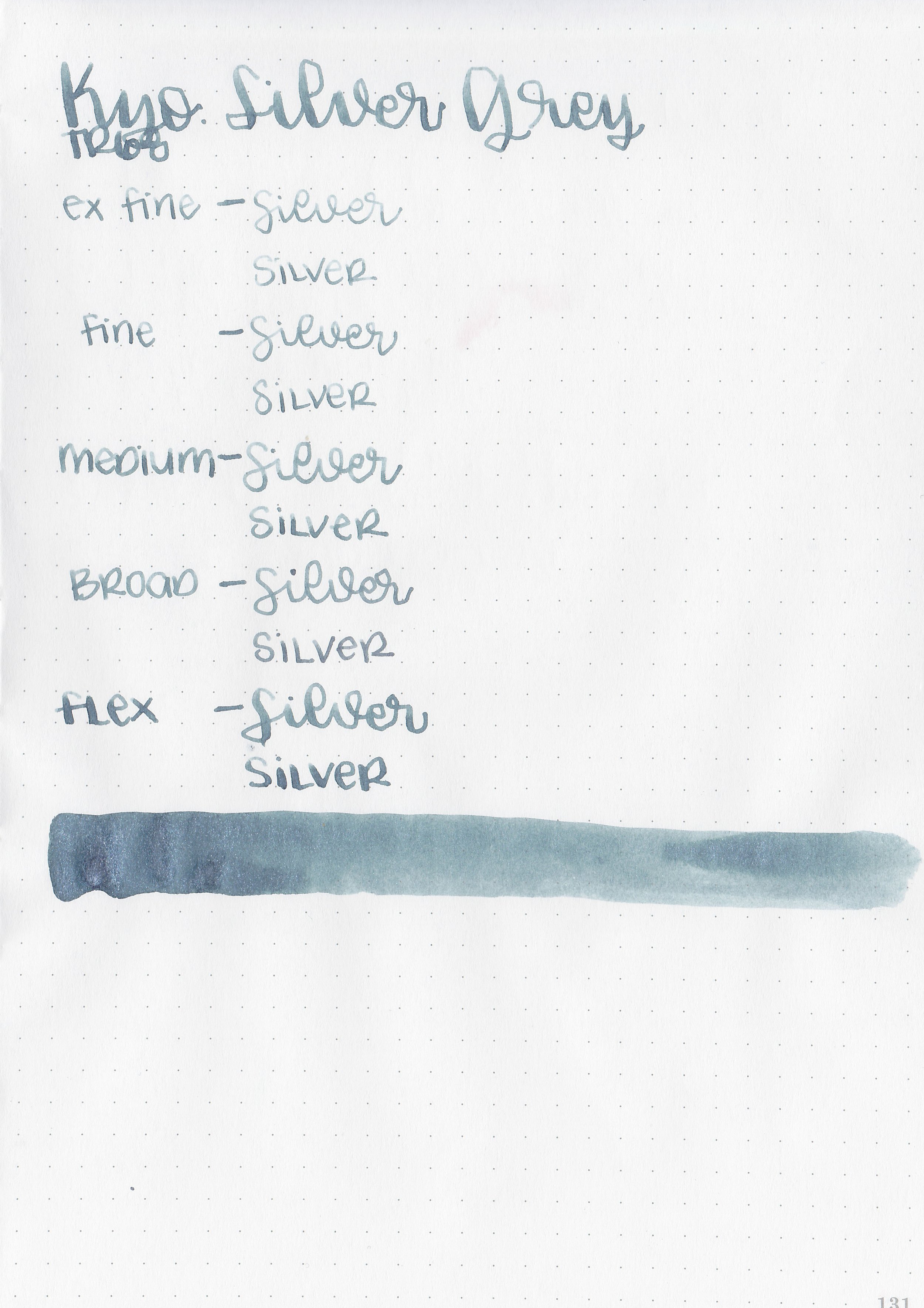
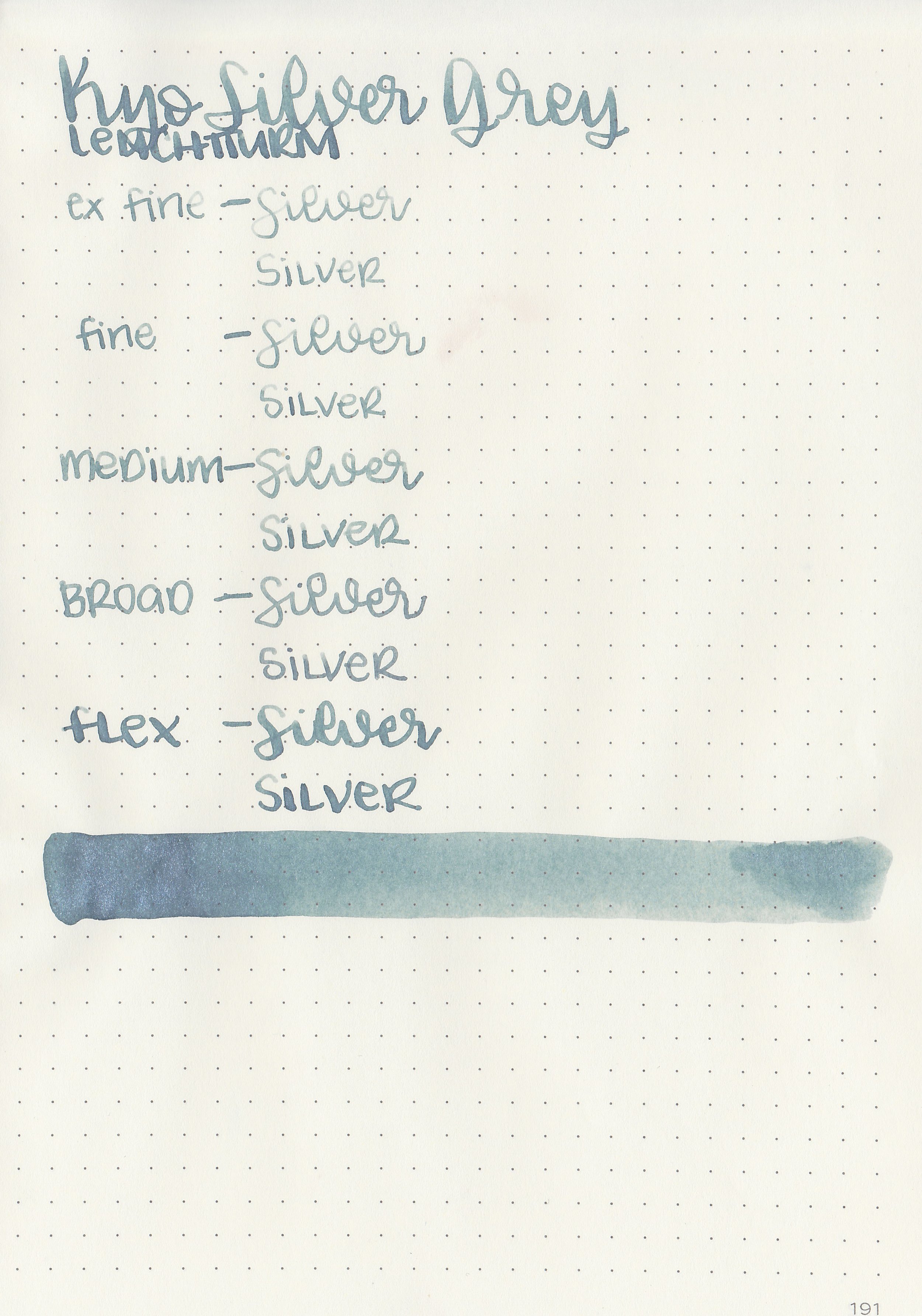
Ink Review #2506: Kyo-no-oto Ginkaisyoku Silver Grey
/
Today’s ink is Kyo-no-oto Ginkaisyoku Silver Grey. You can find this ink for sale at most retailers including Vanness Pens.

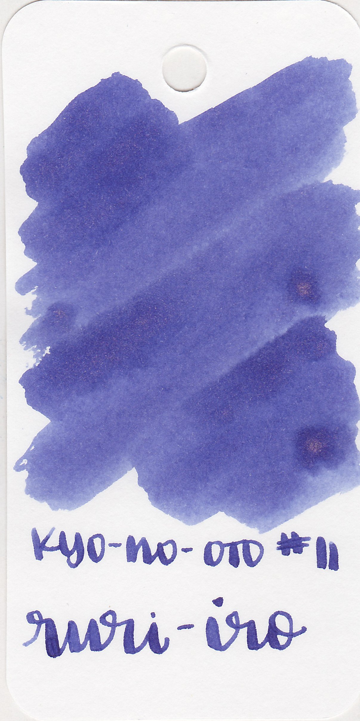
The color:
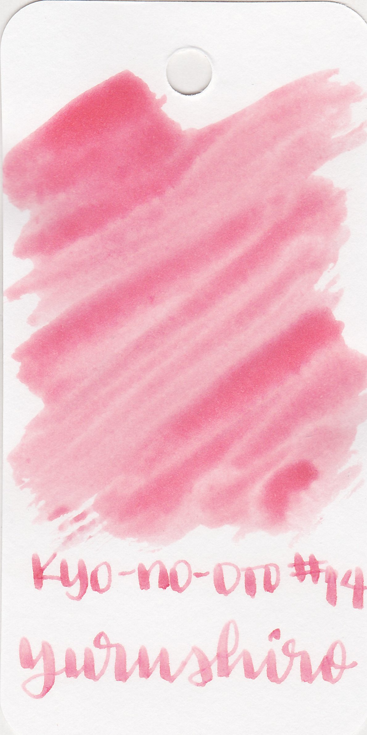
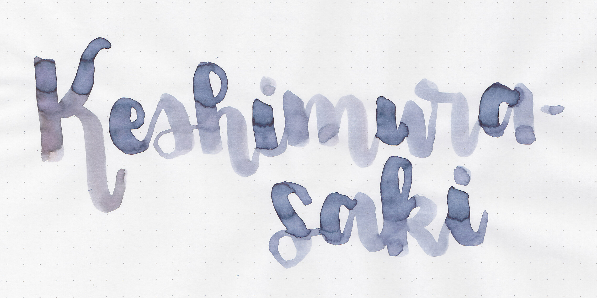
Ginkaisyoku is a medium blue grey with silver shimmer.
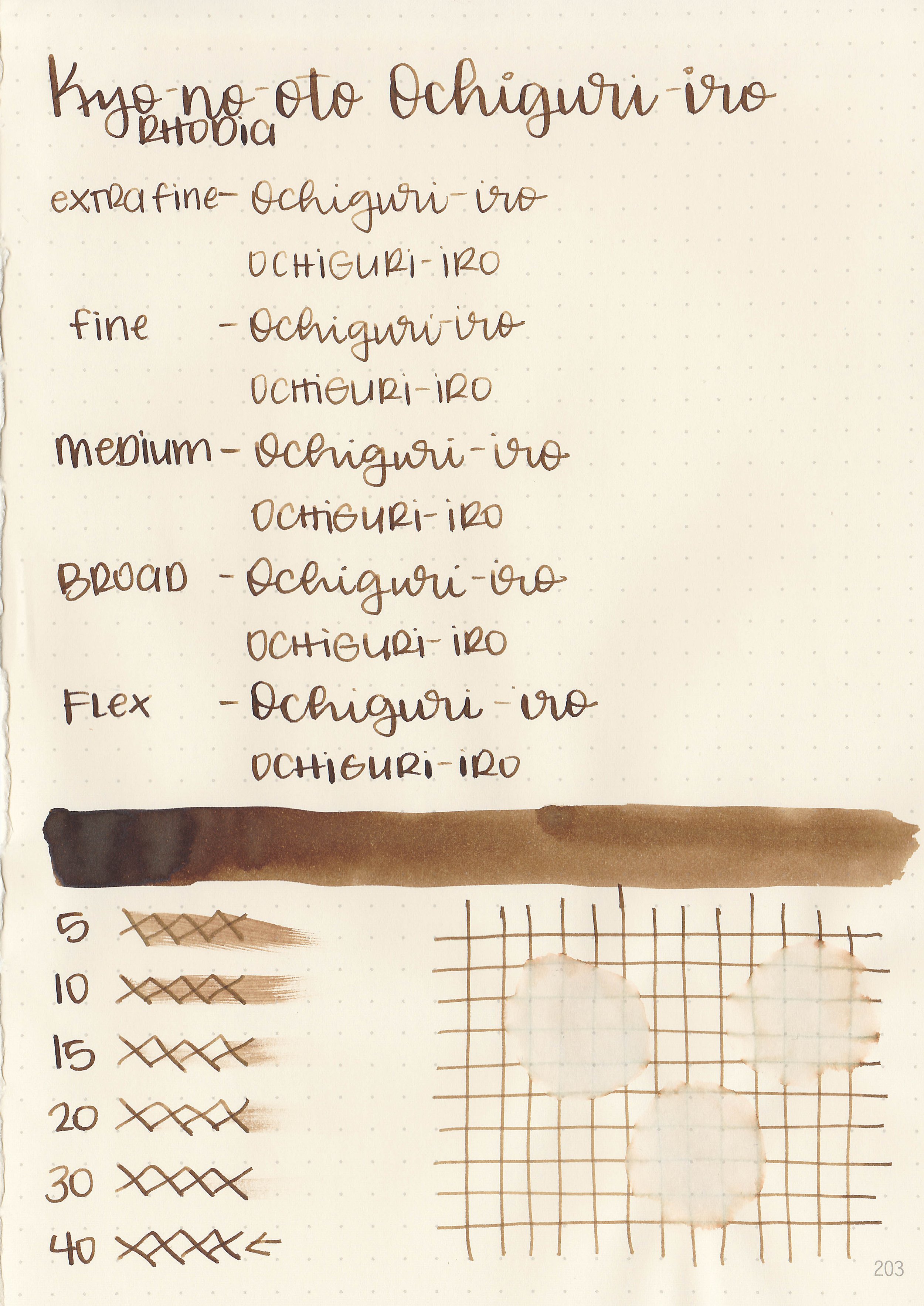
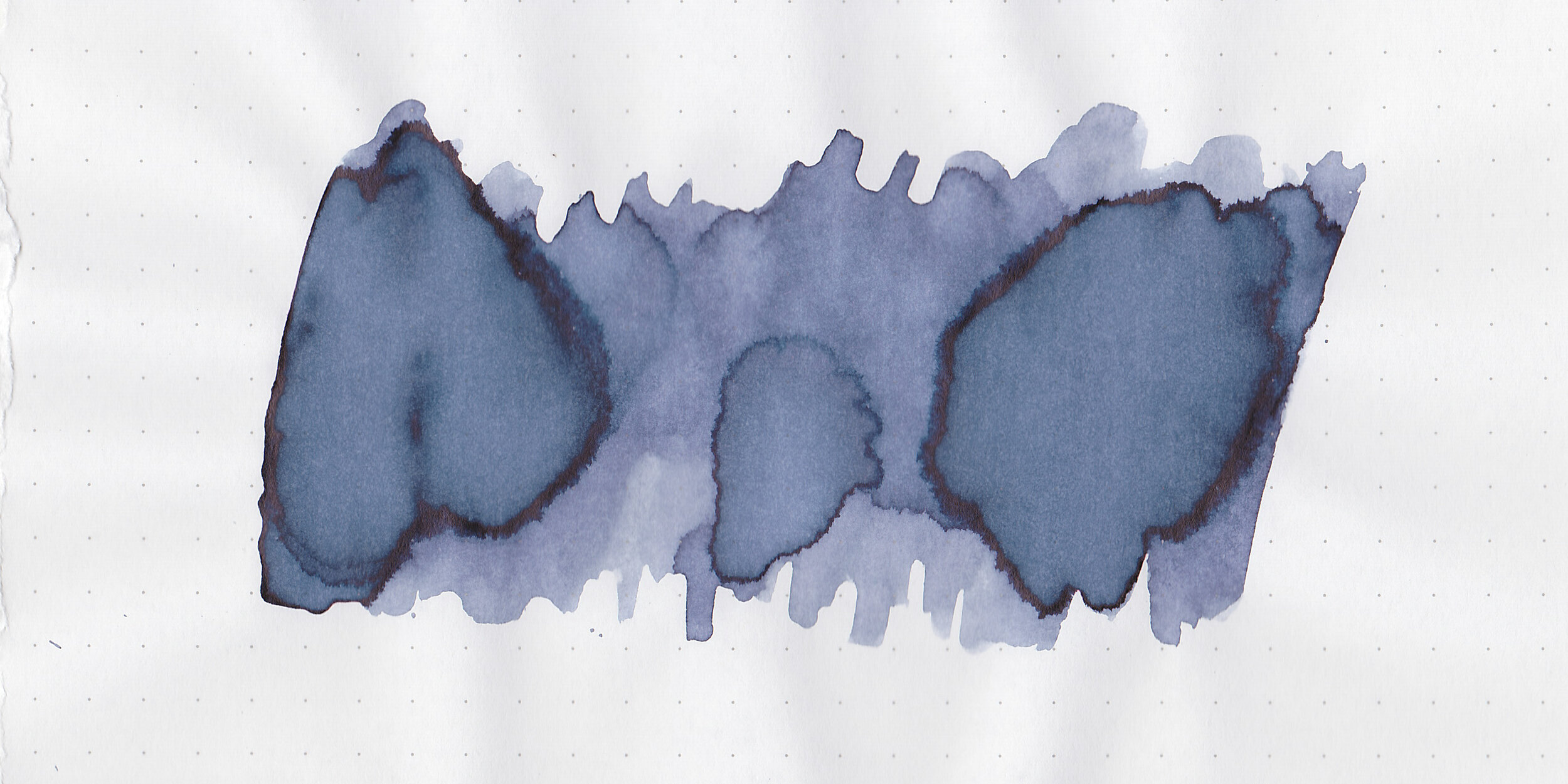
*For my swab cards I use a Col-o-ring by Skylab Letterpress, a medium Pilot Ishime and a Mabie Todd Swan.
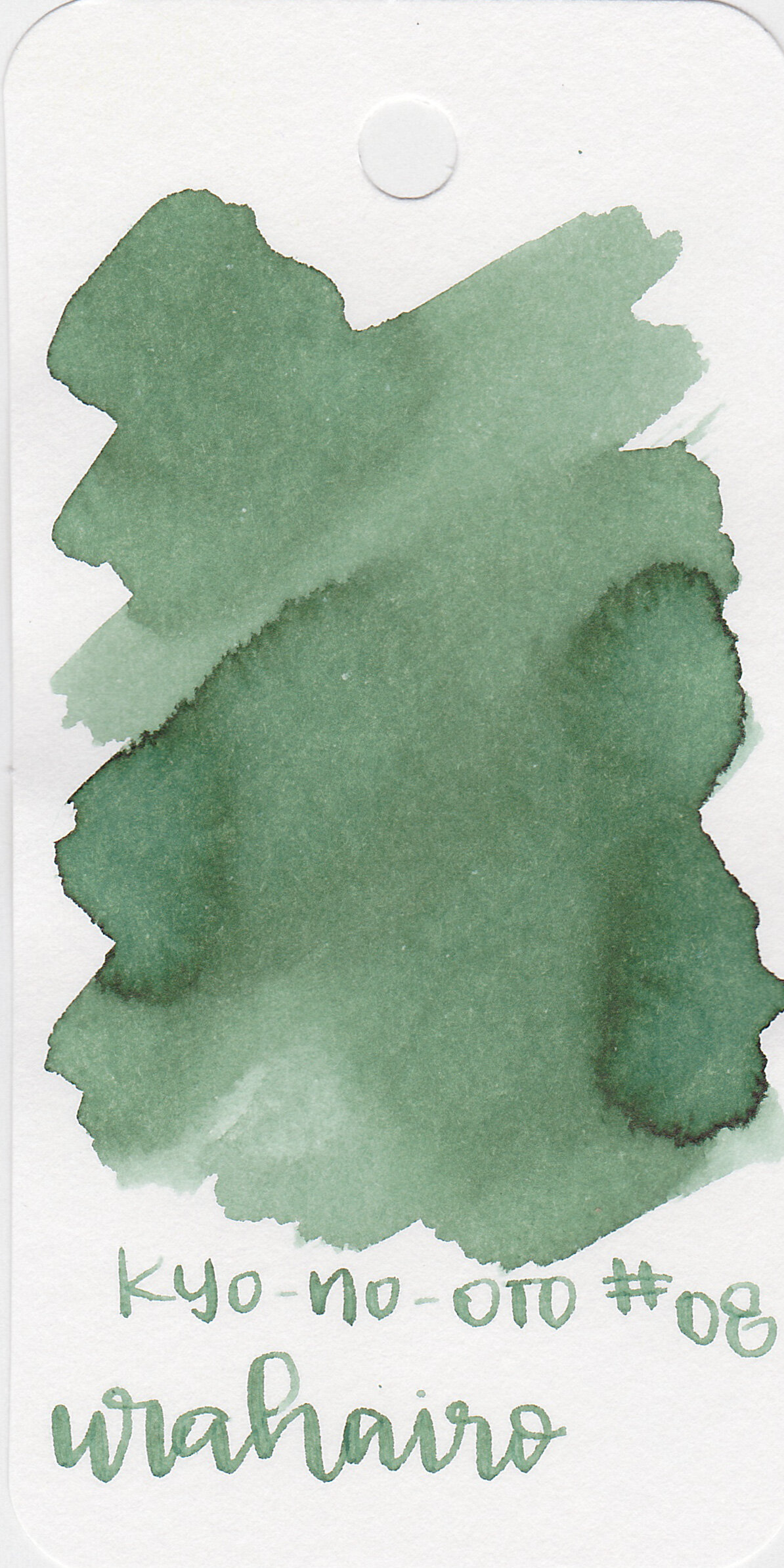
Swabs:
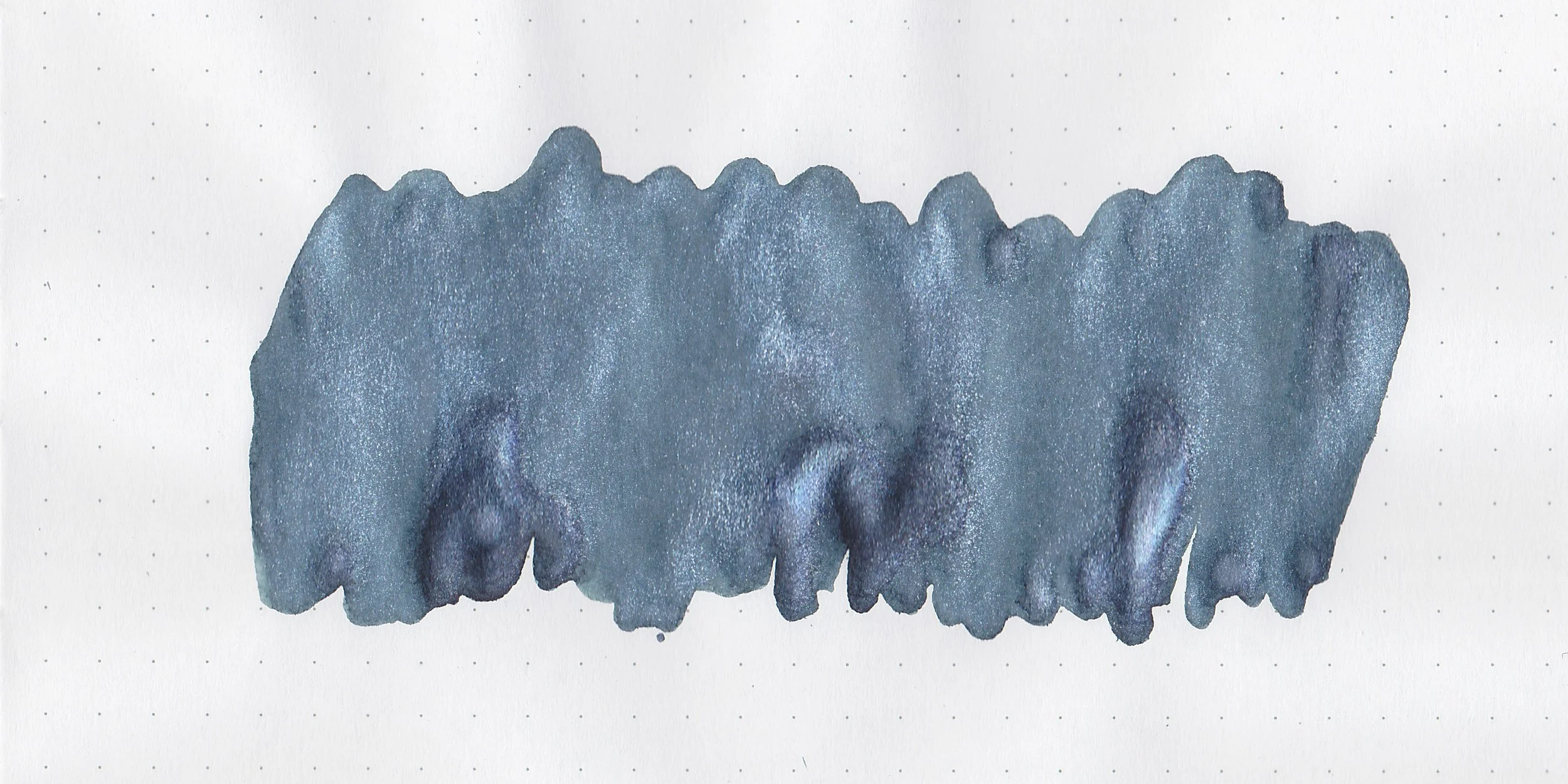
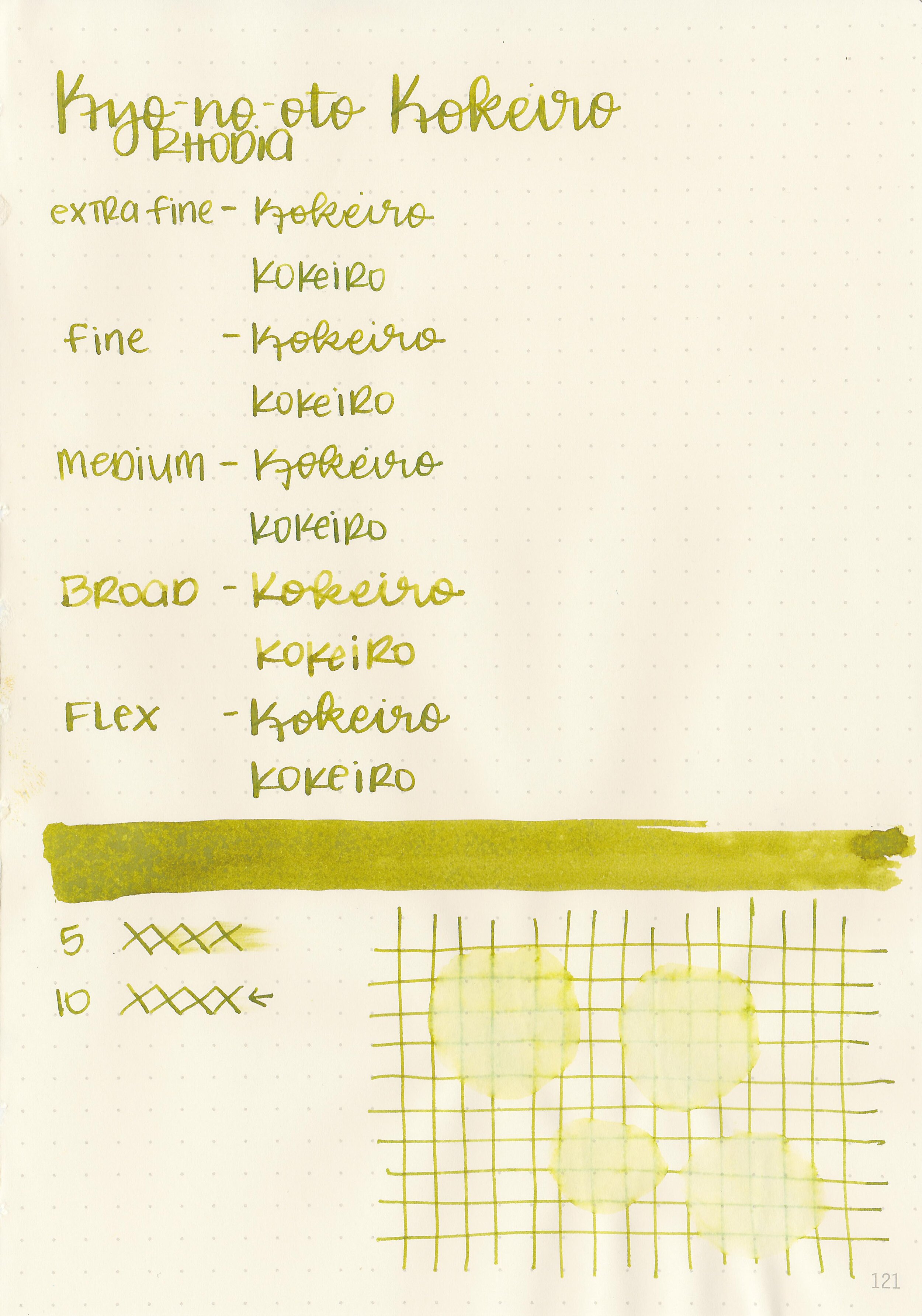
In large swabs on Tomoe River paper the ink has a medium amount of silver shimmer.

Writing samples:
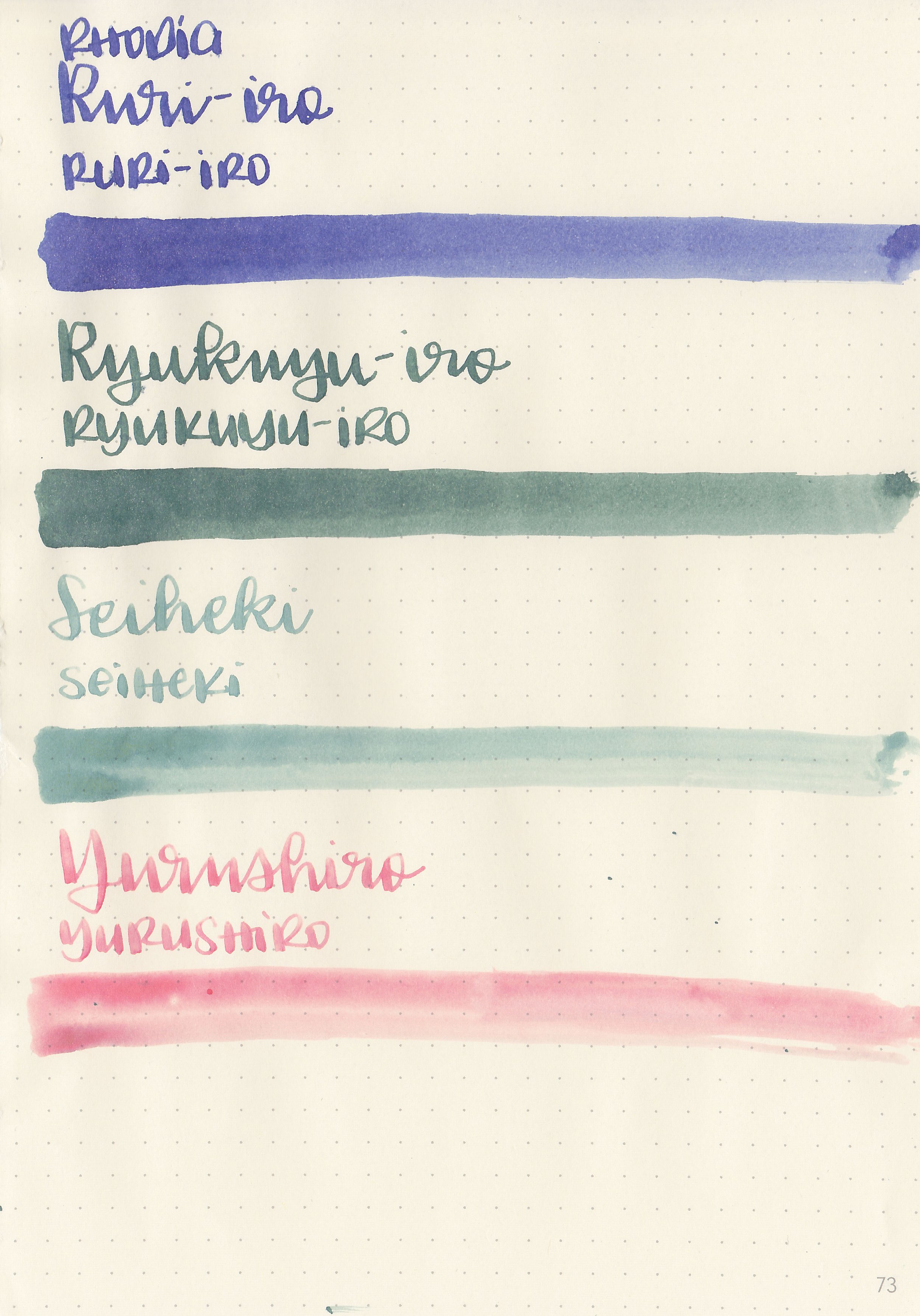
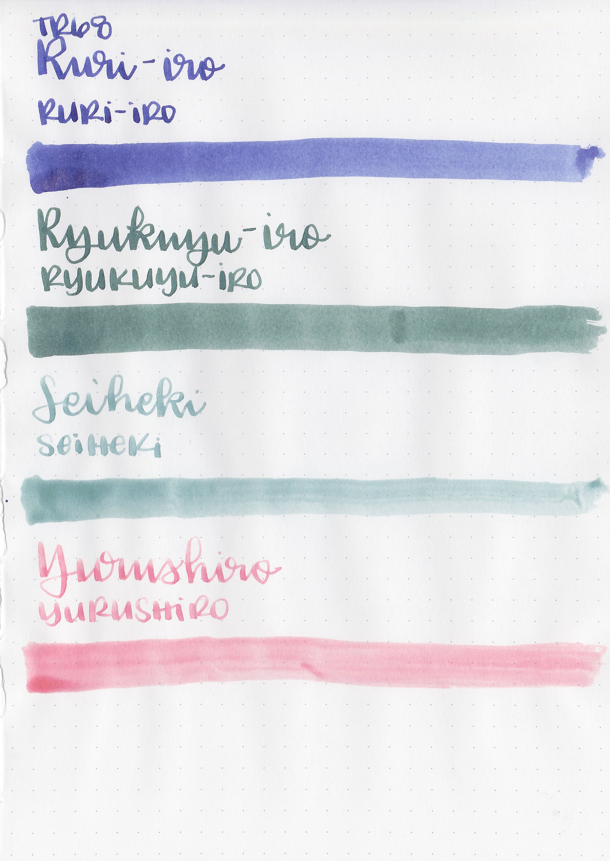
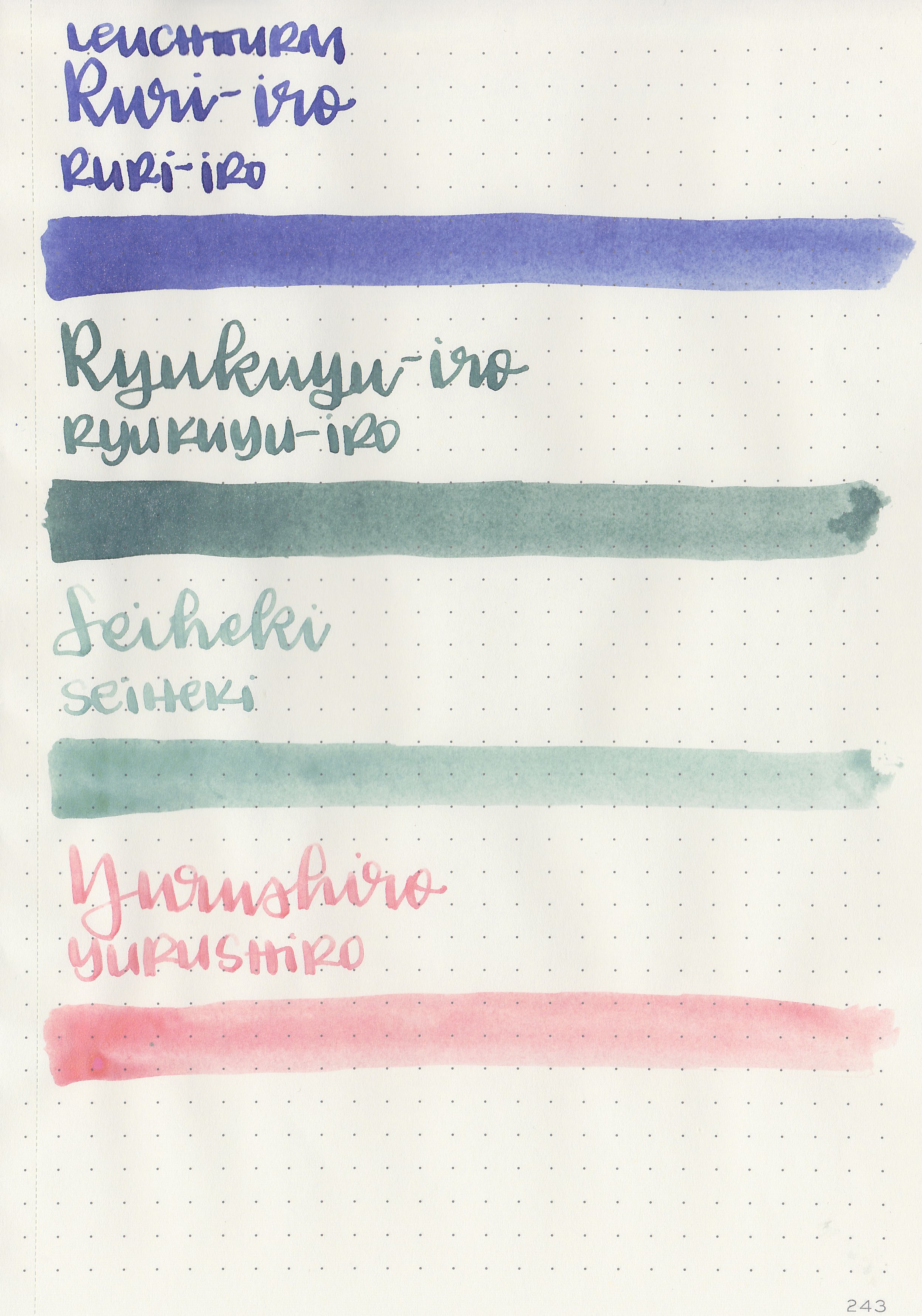
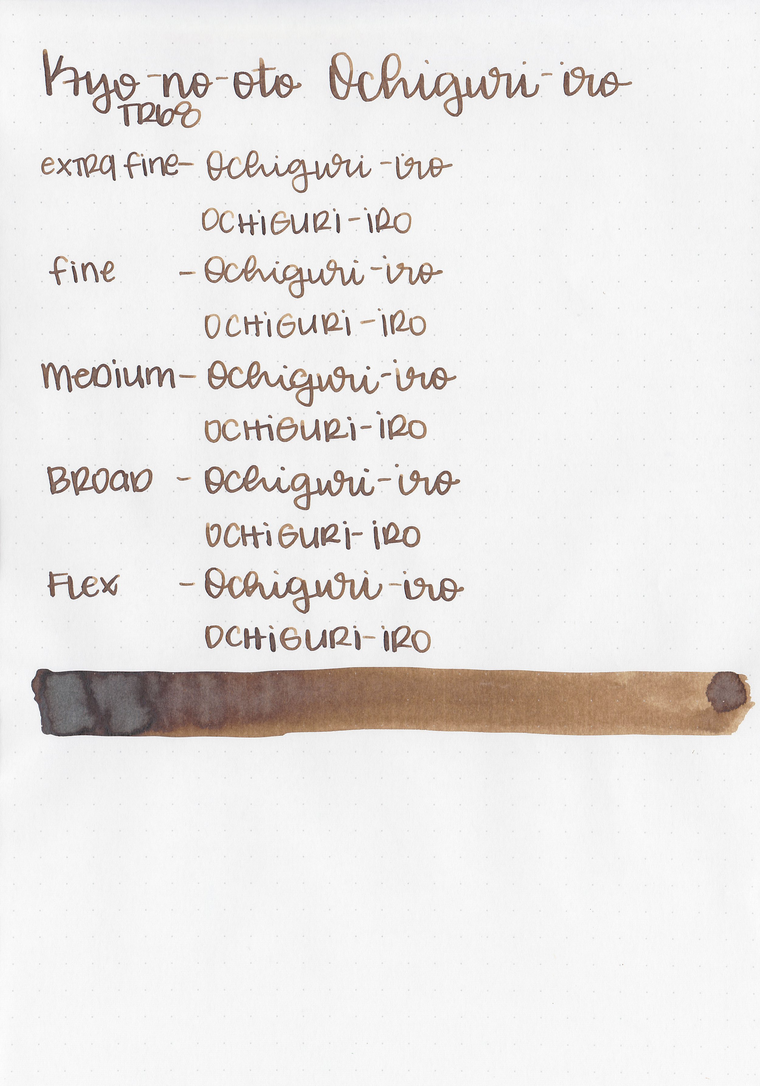
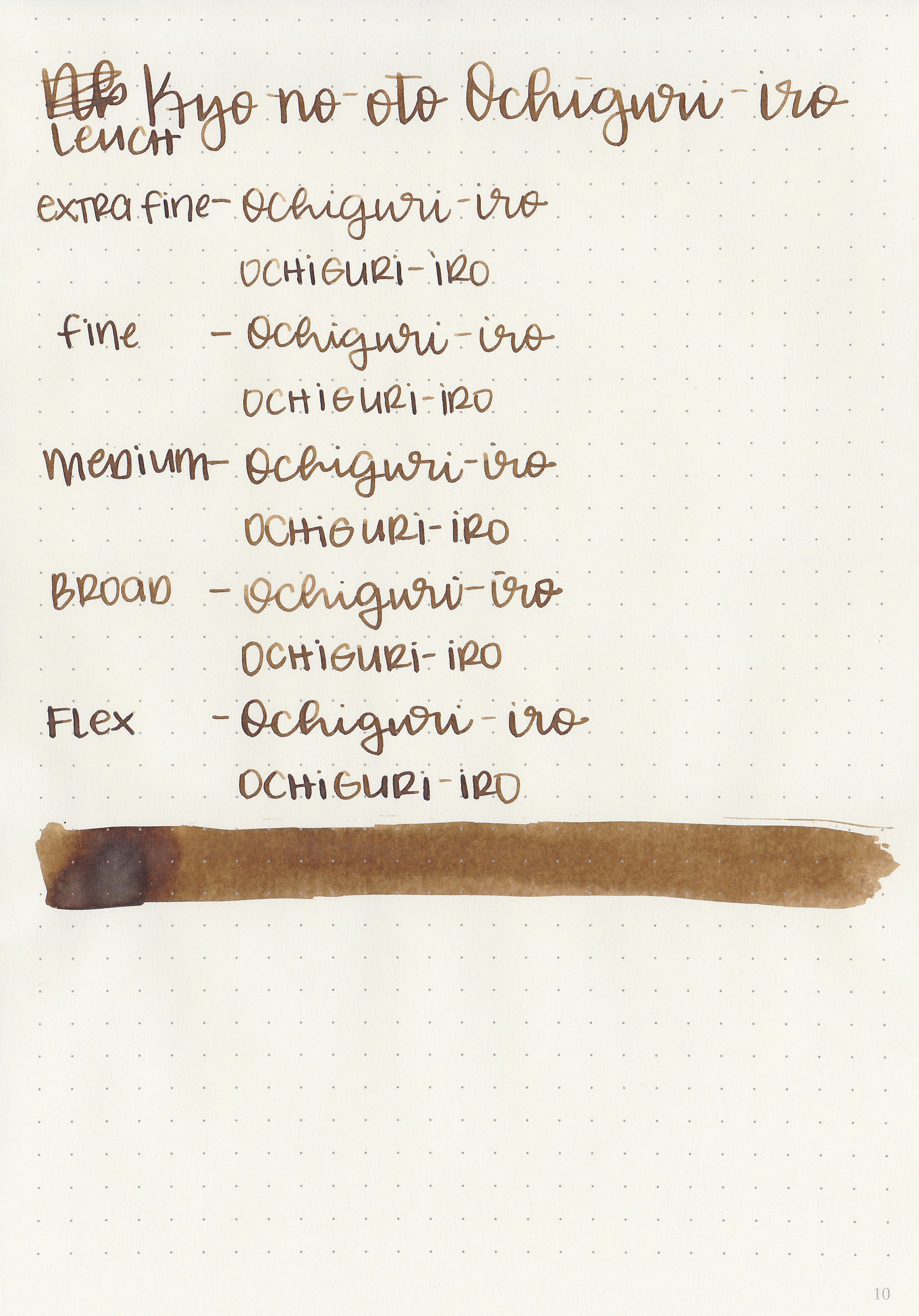
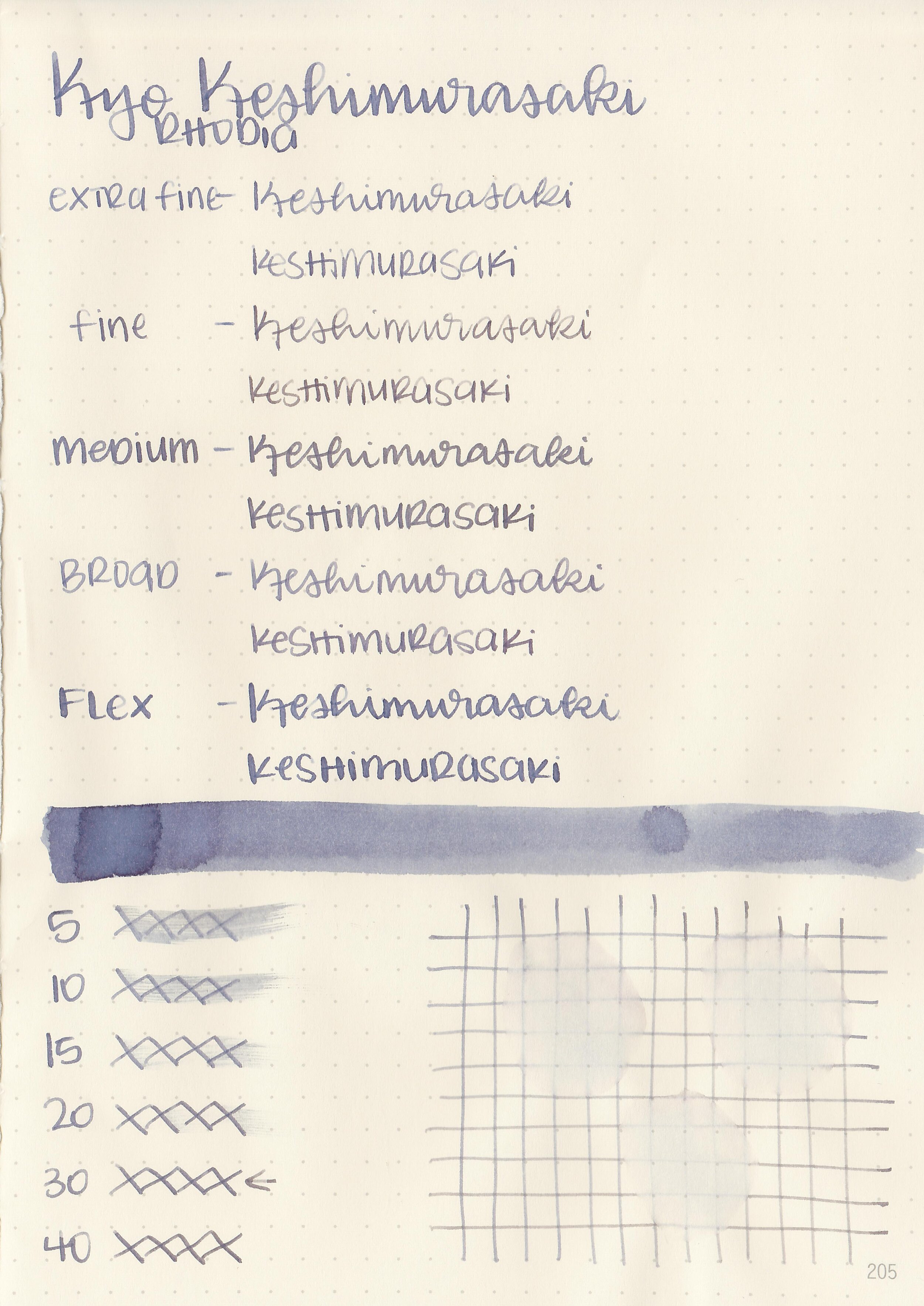
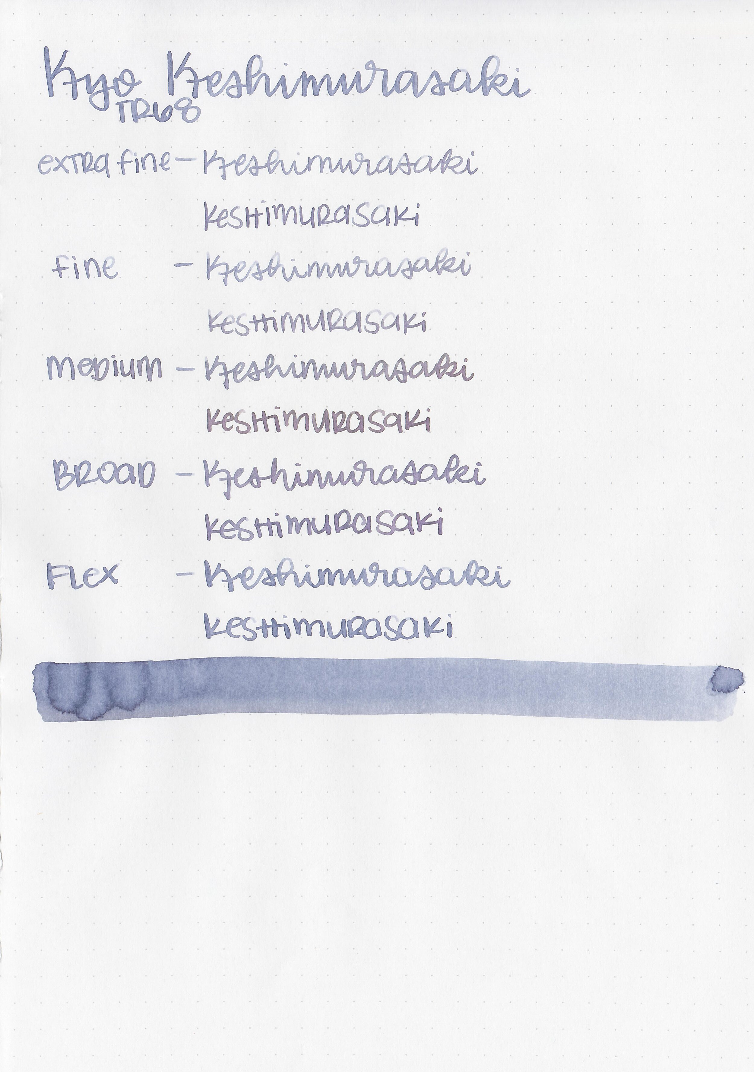
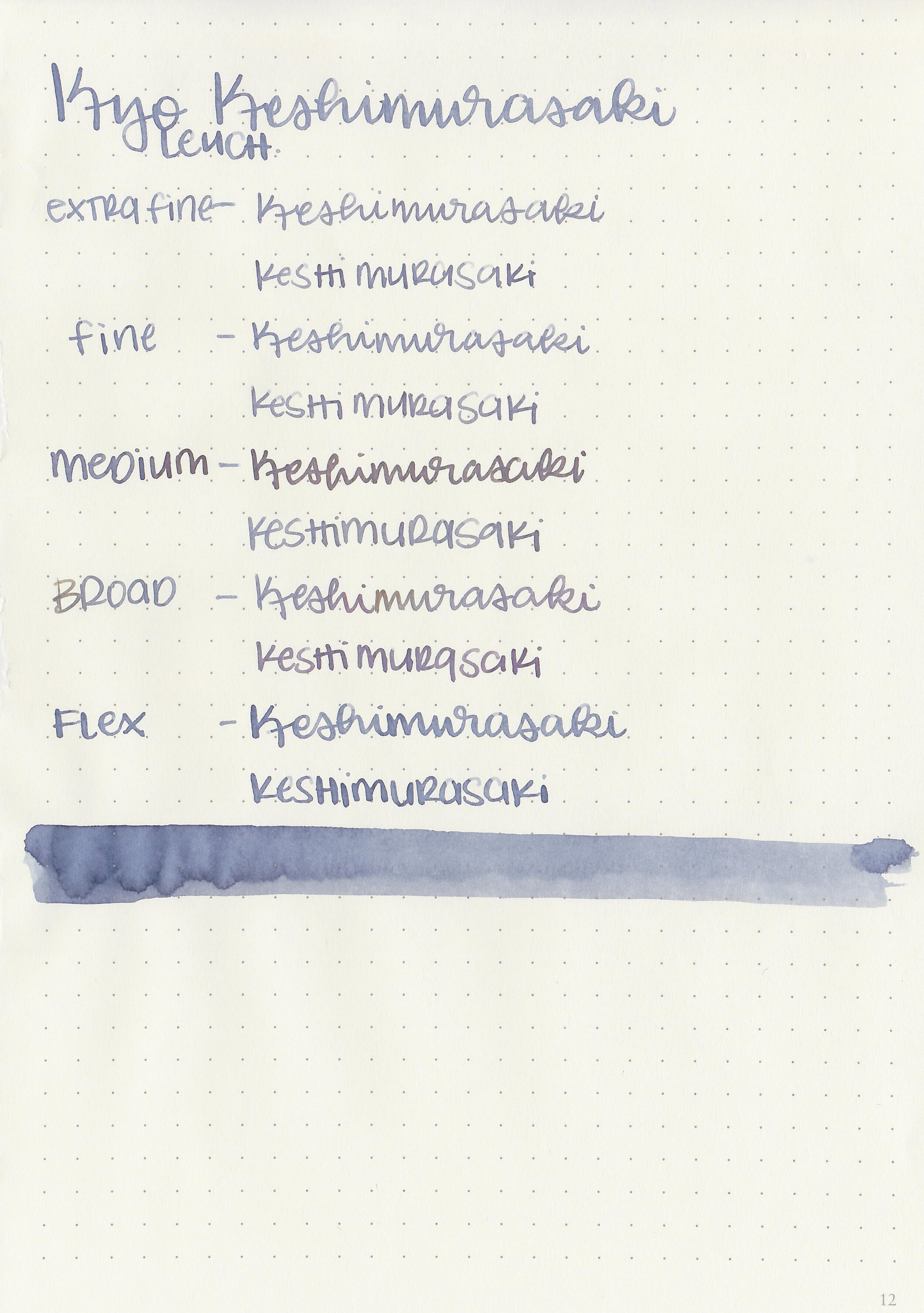
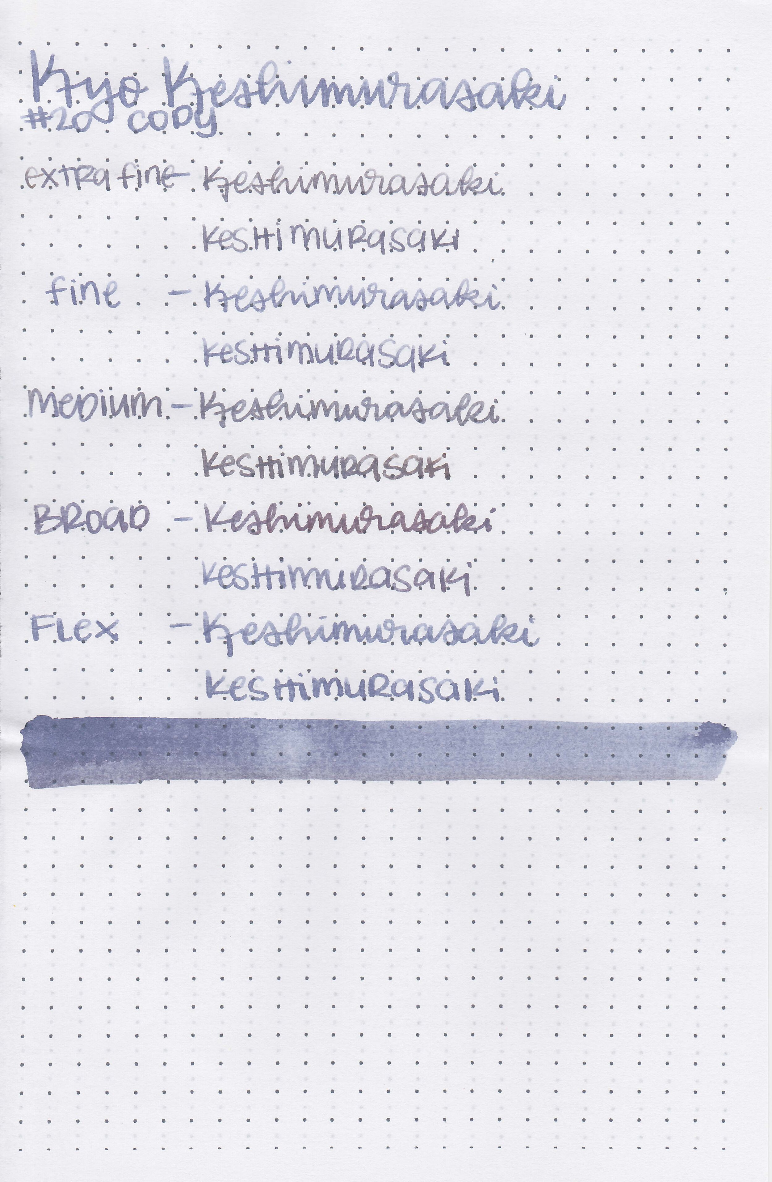
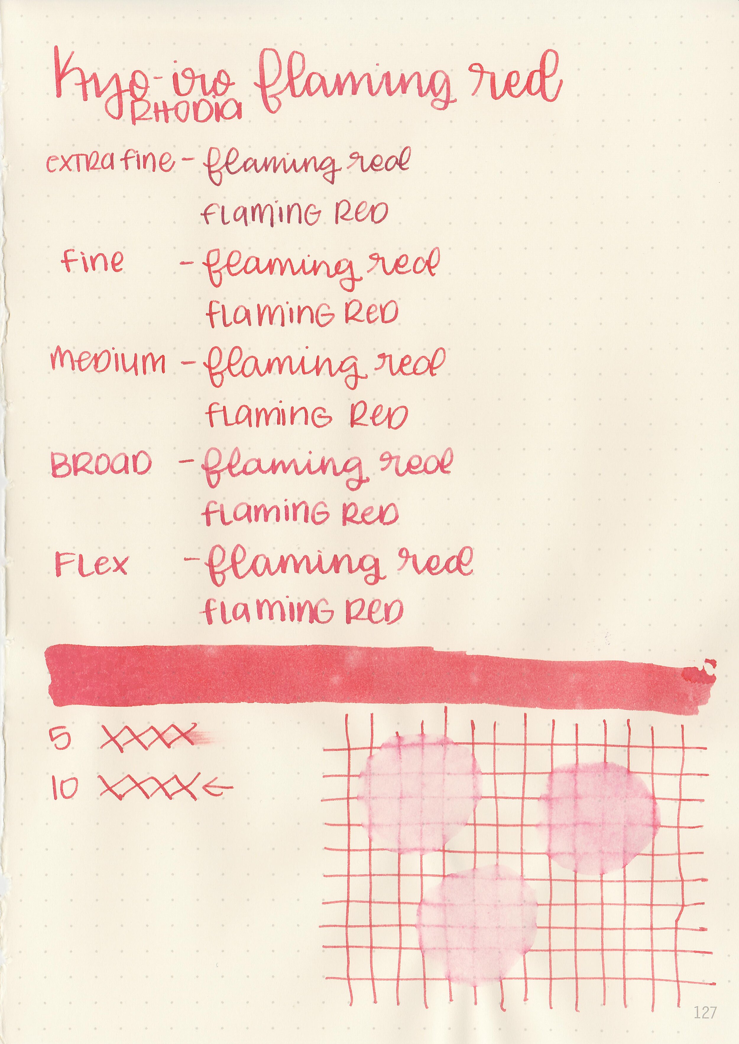
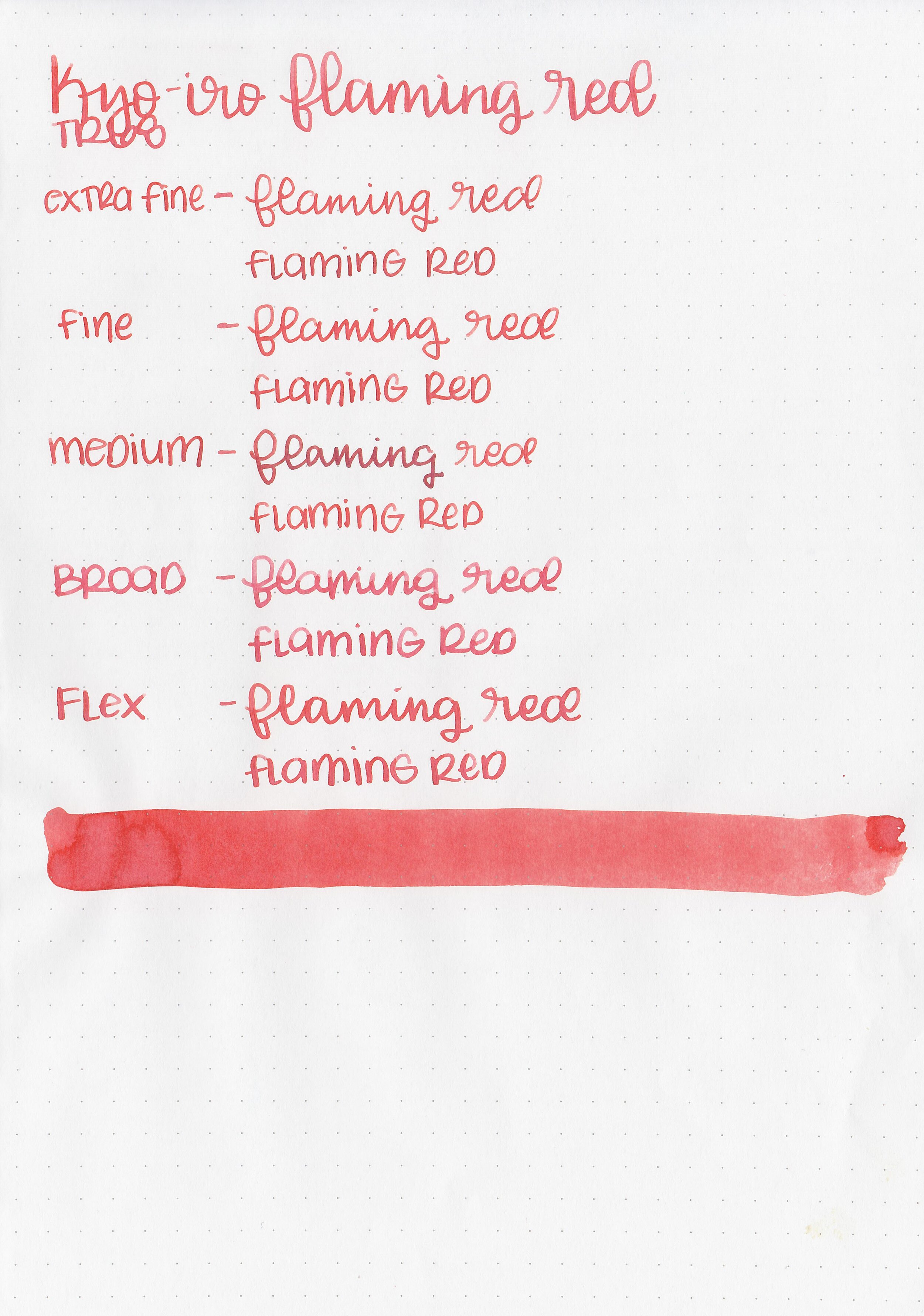
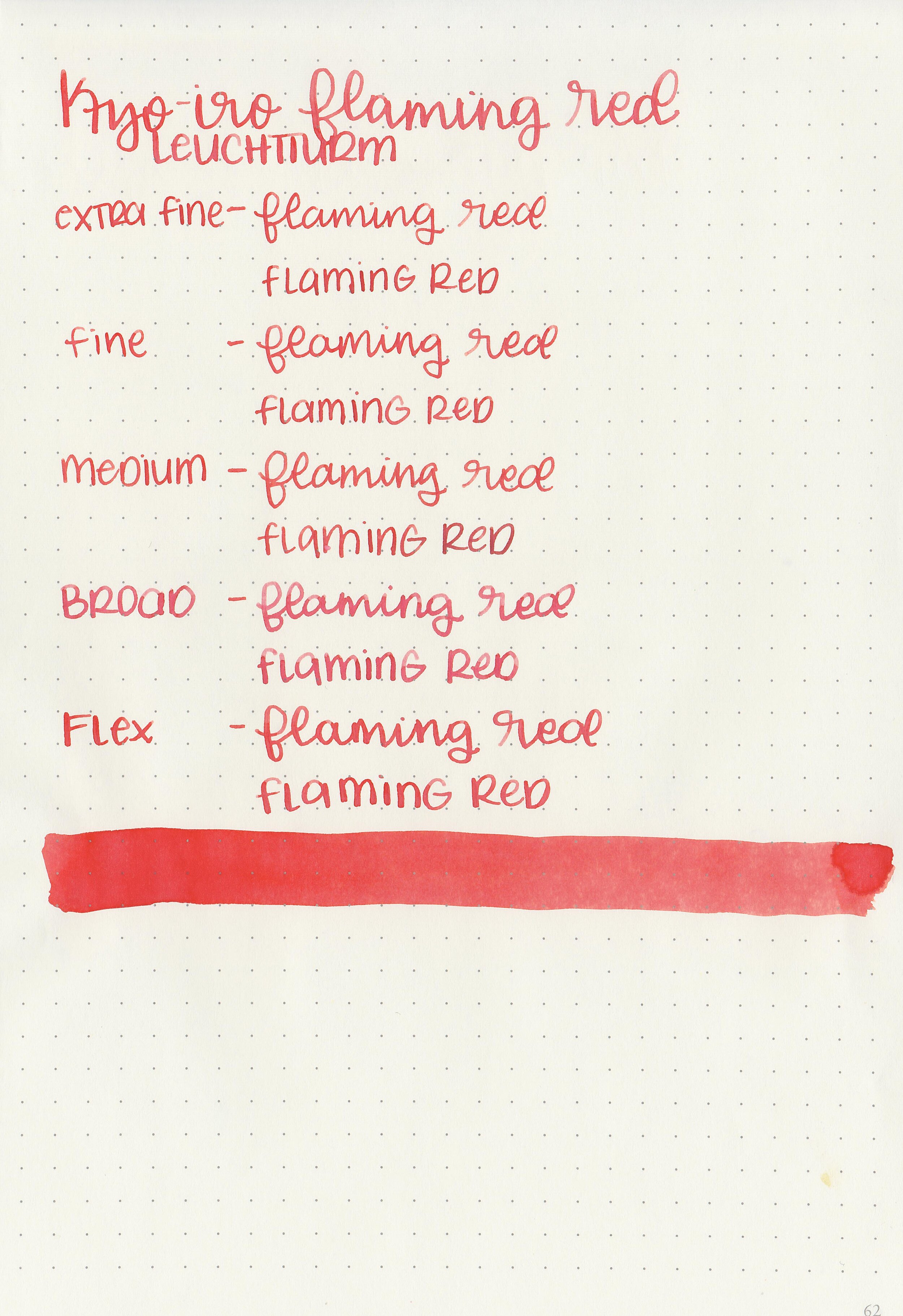
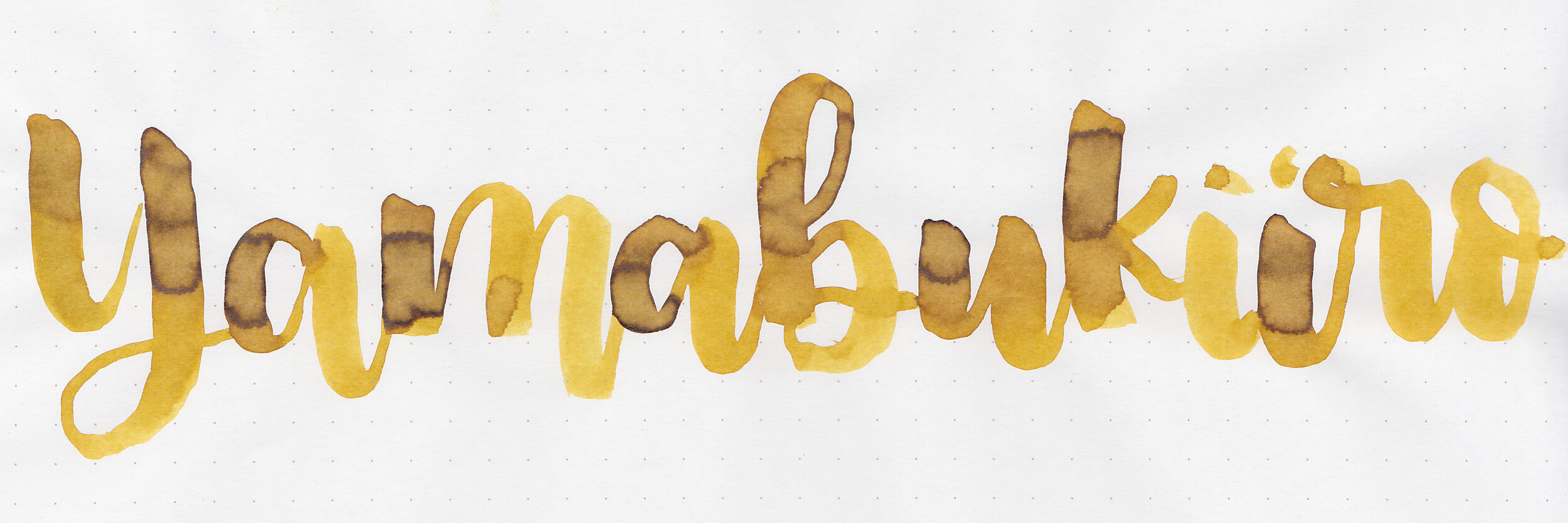
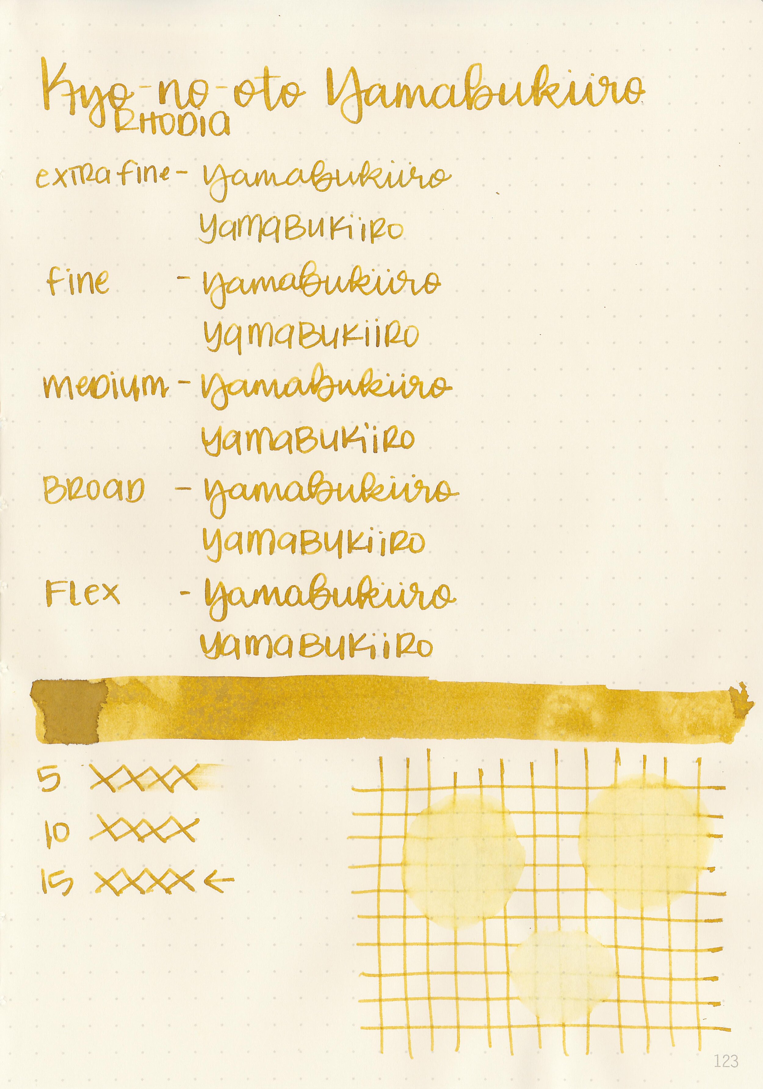
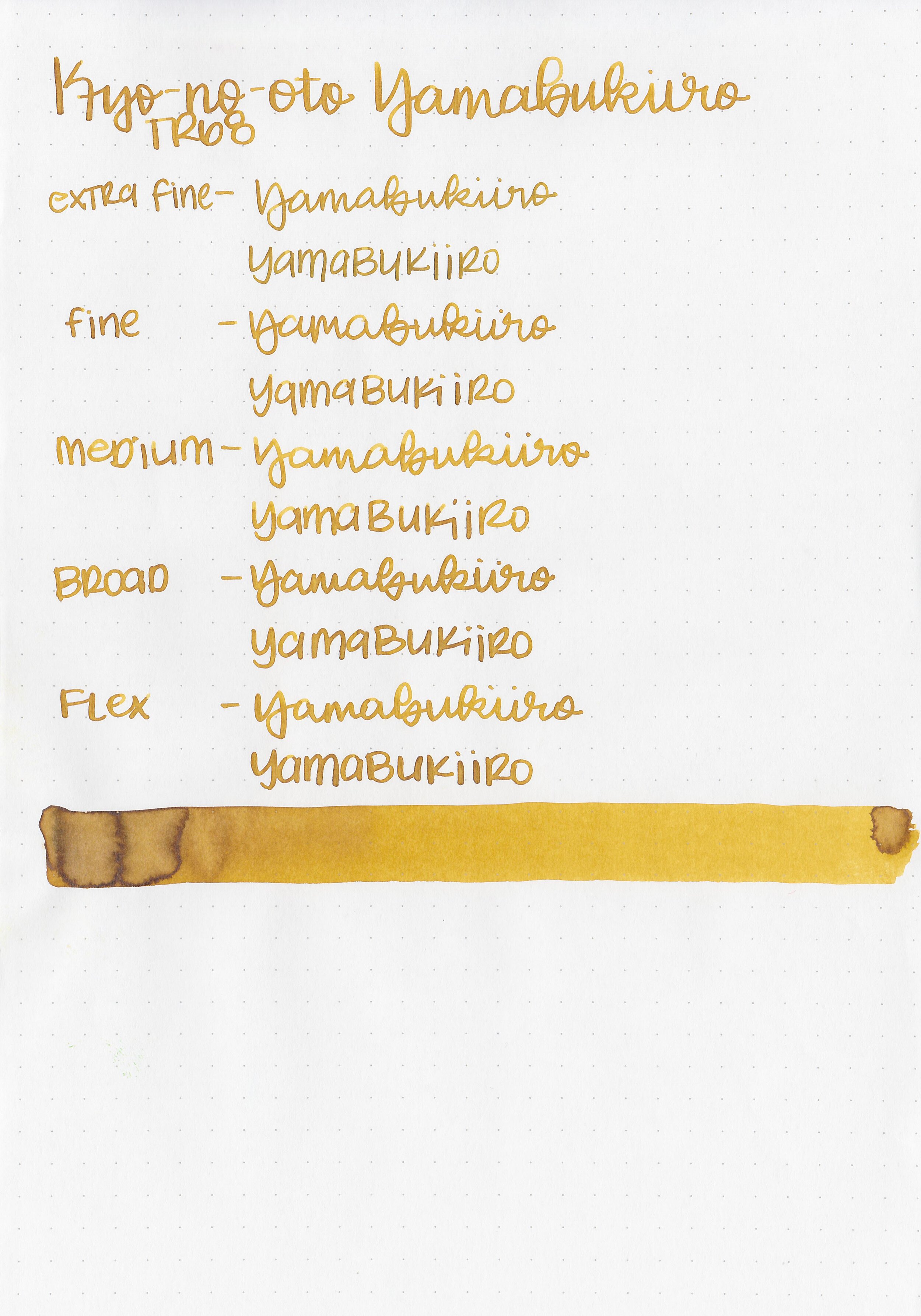
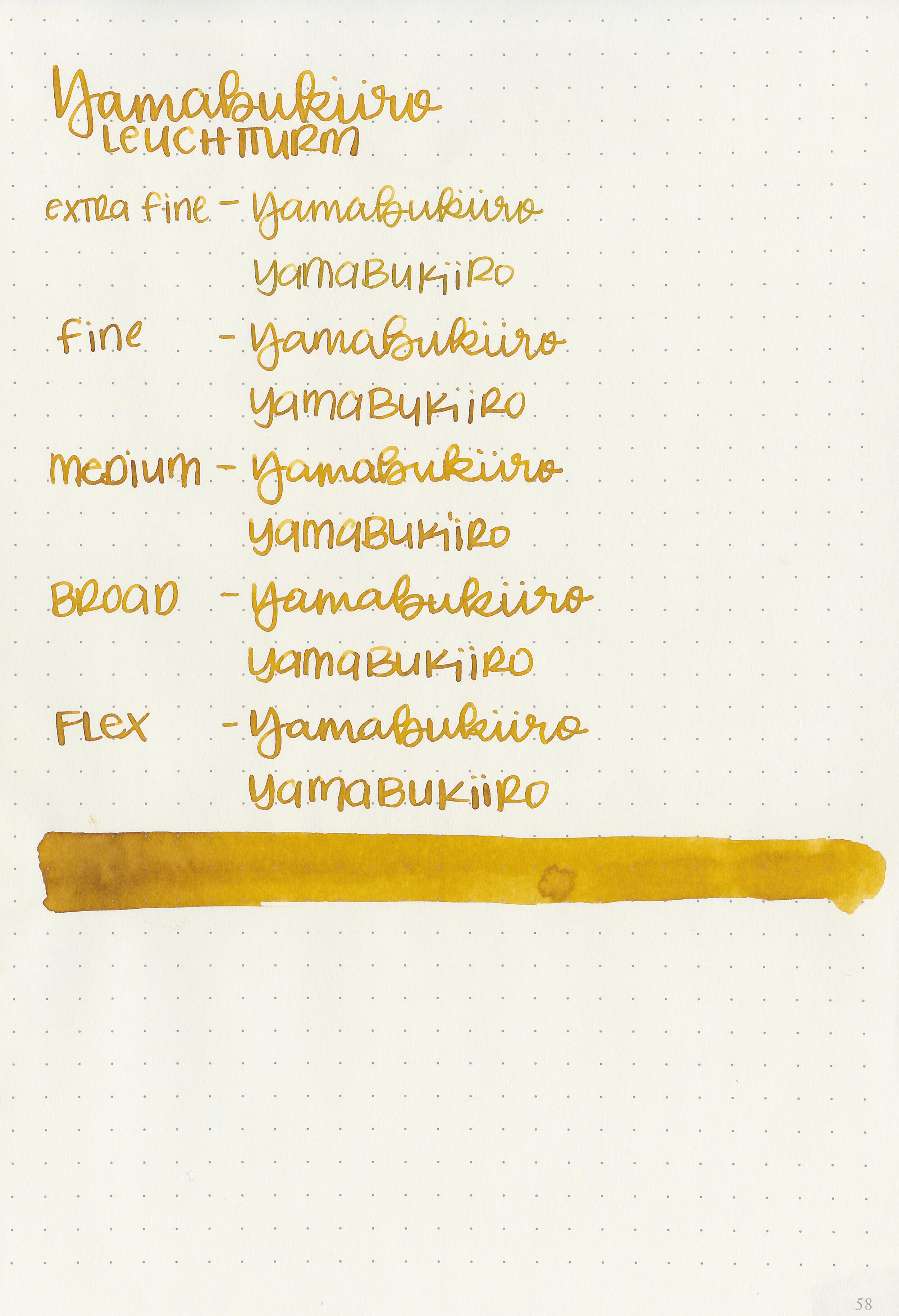
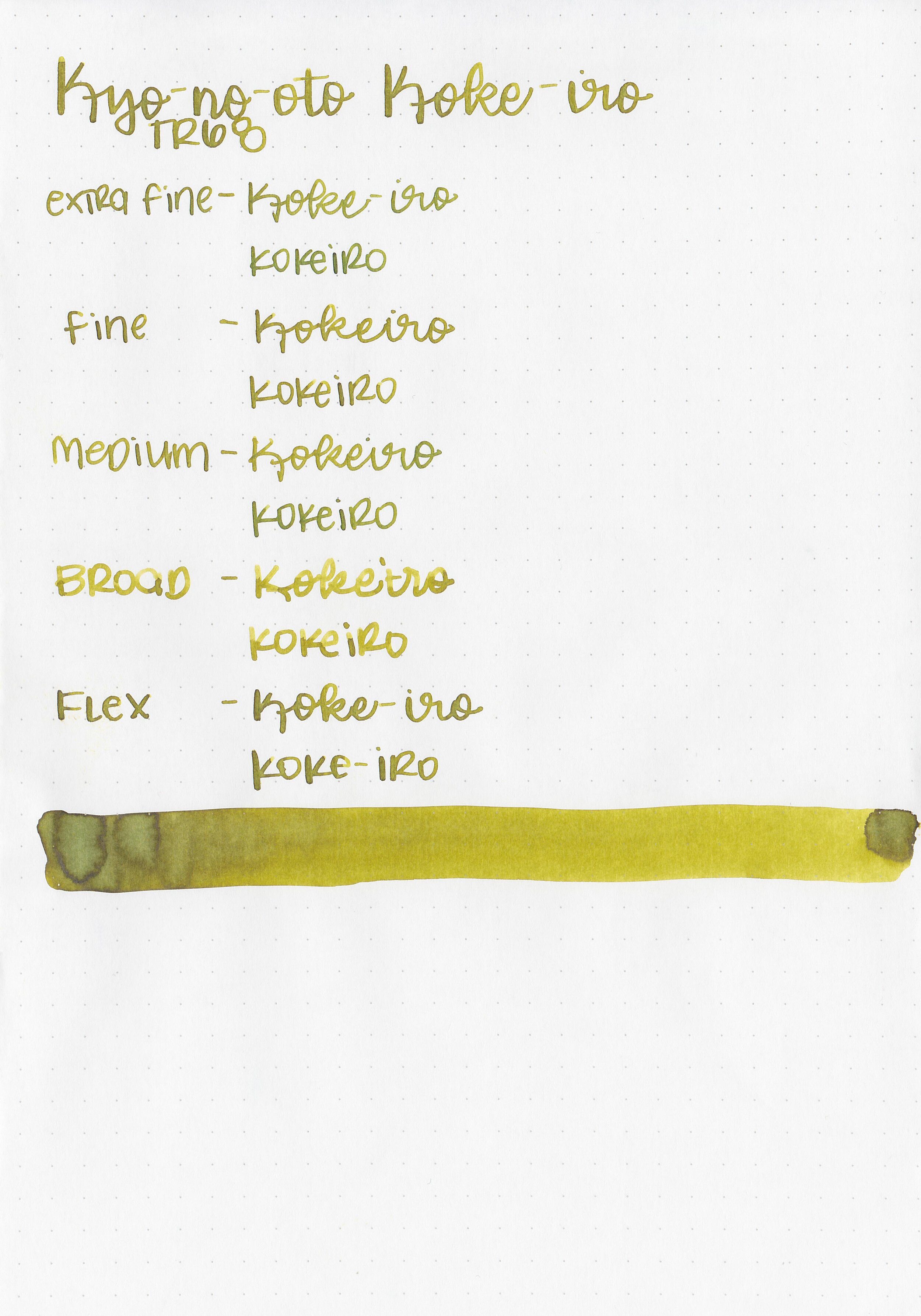
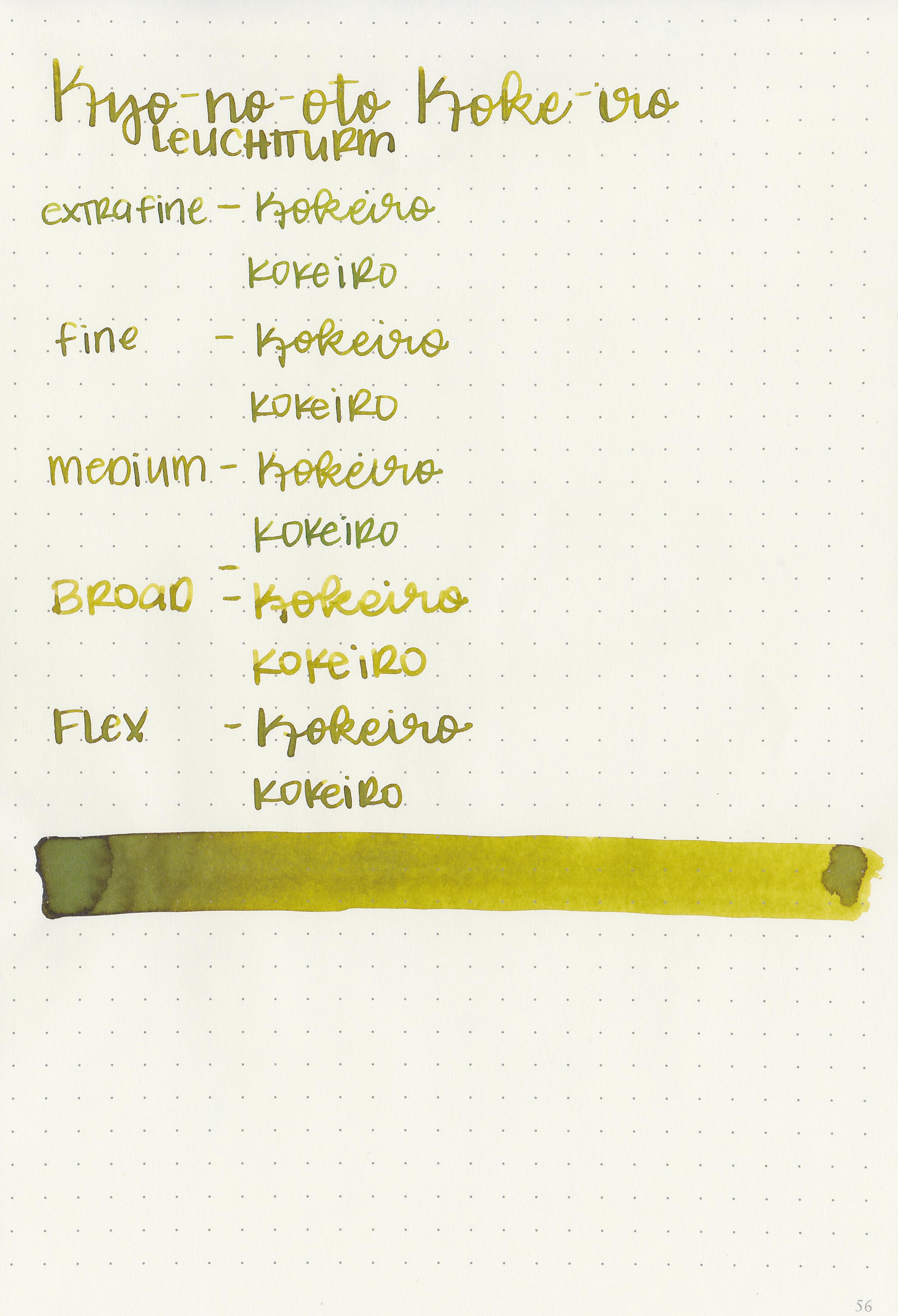
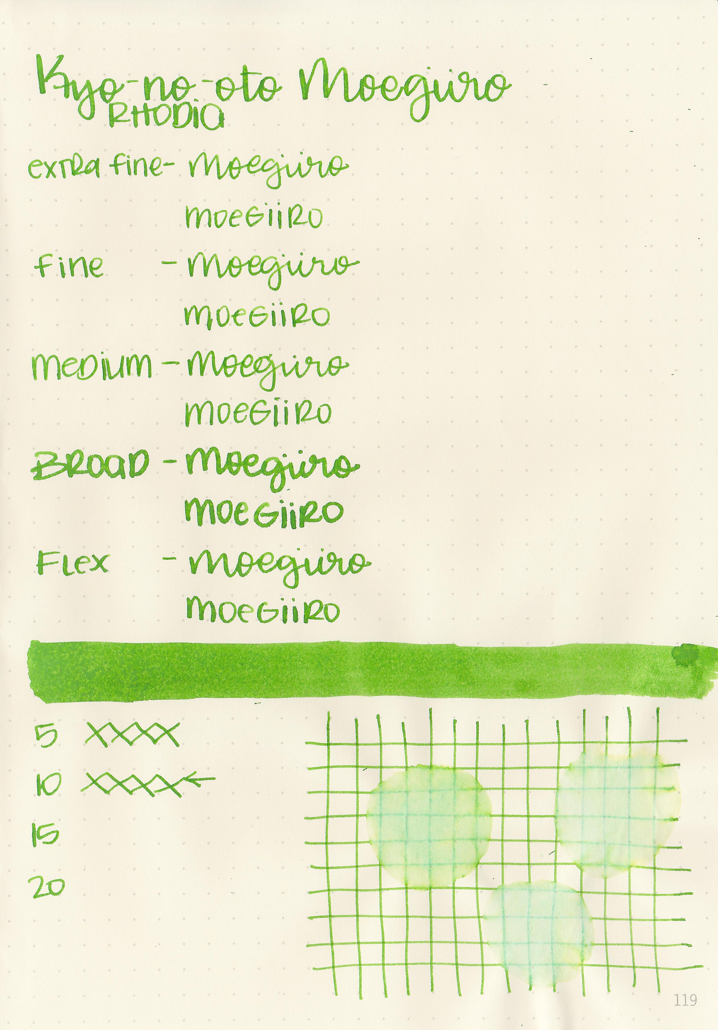
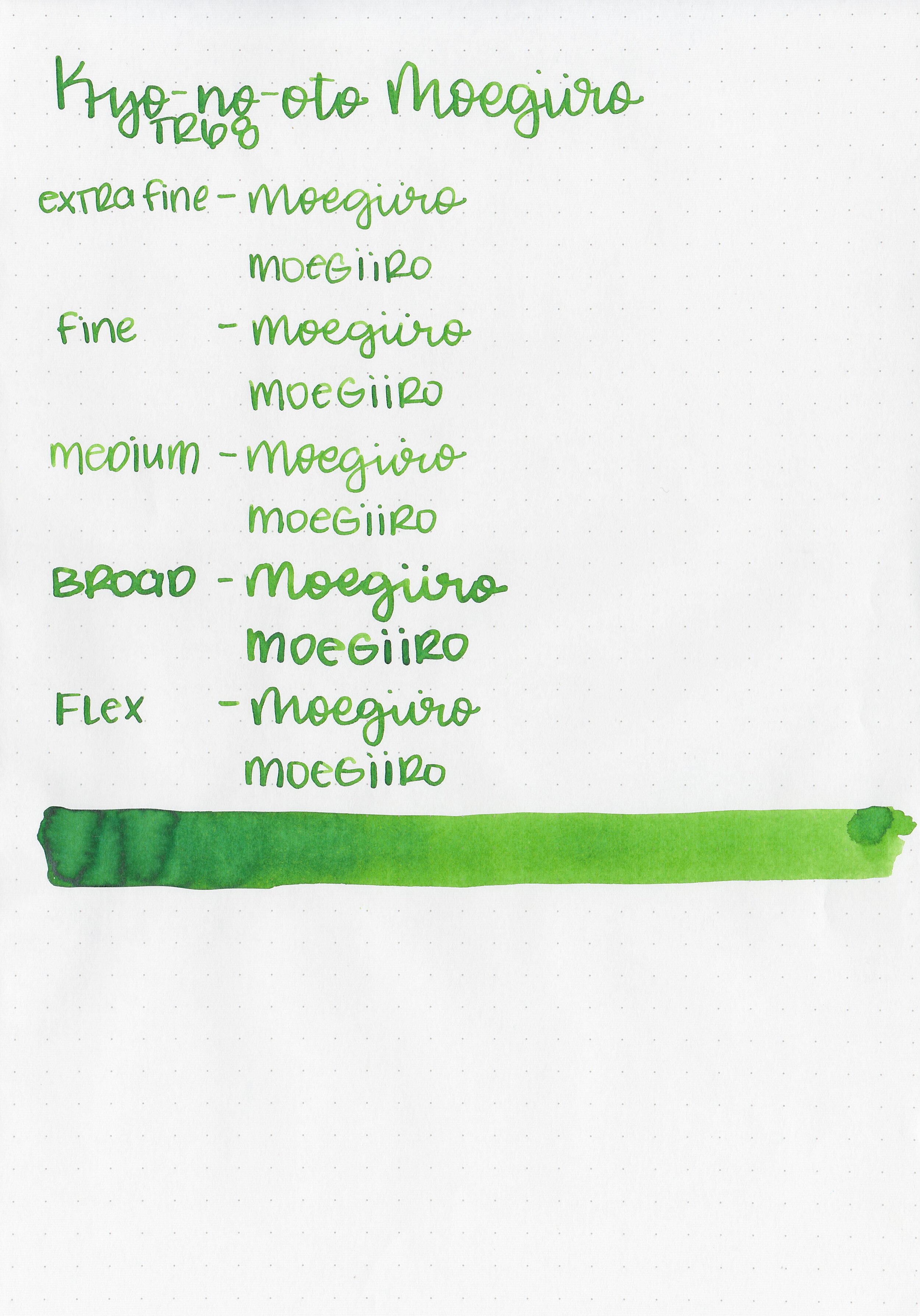
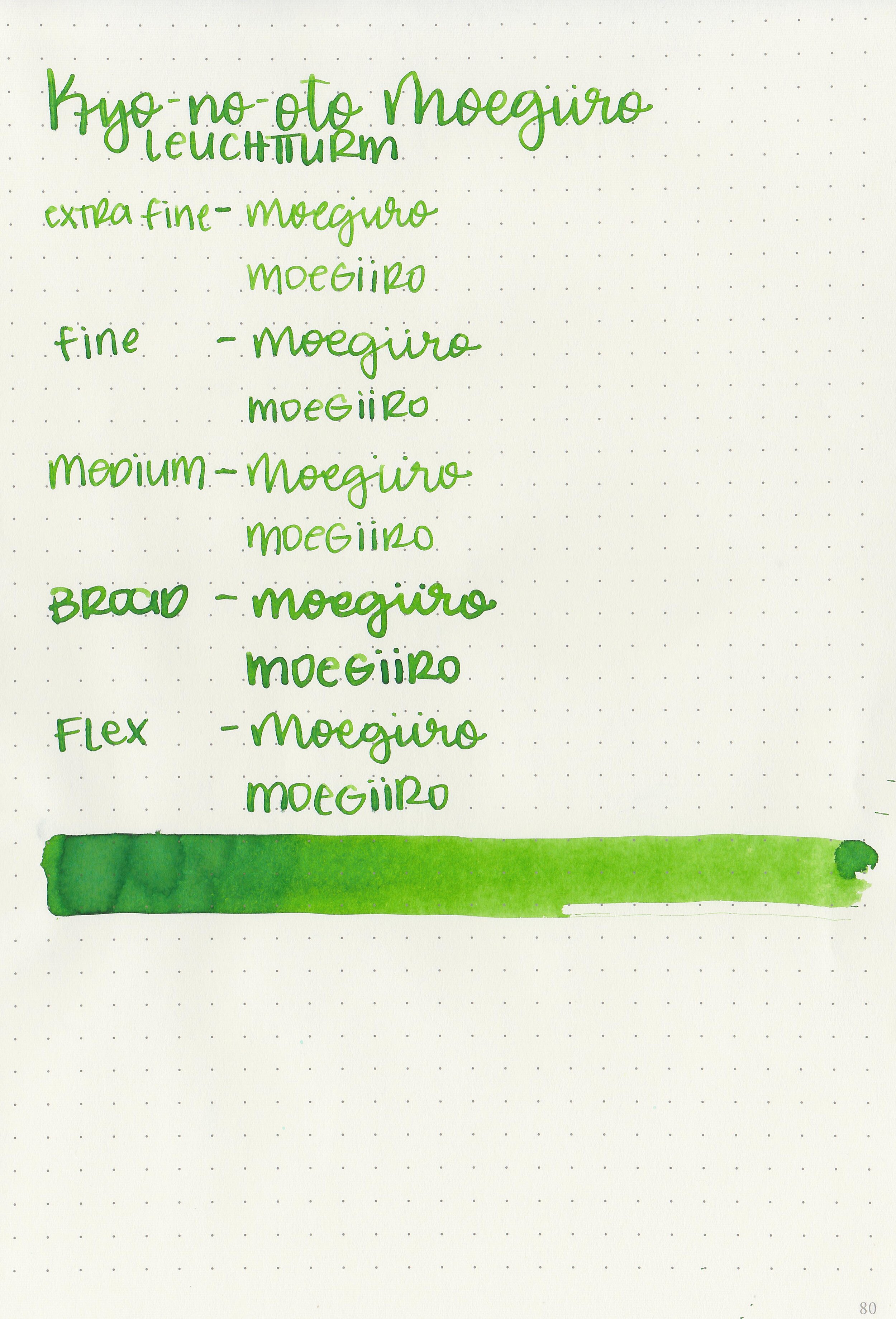
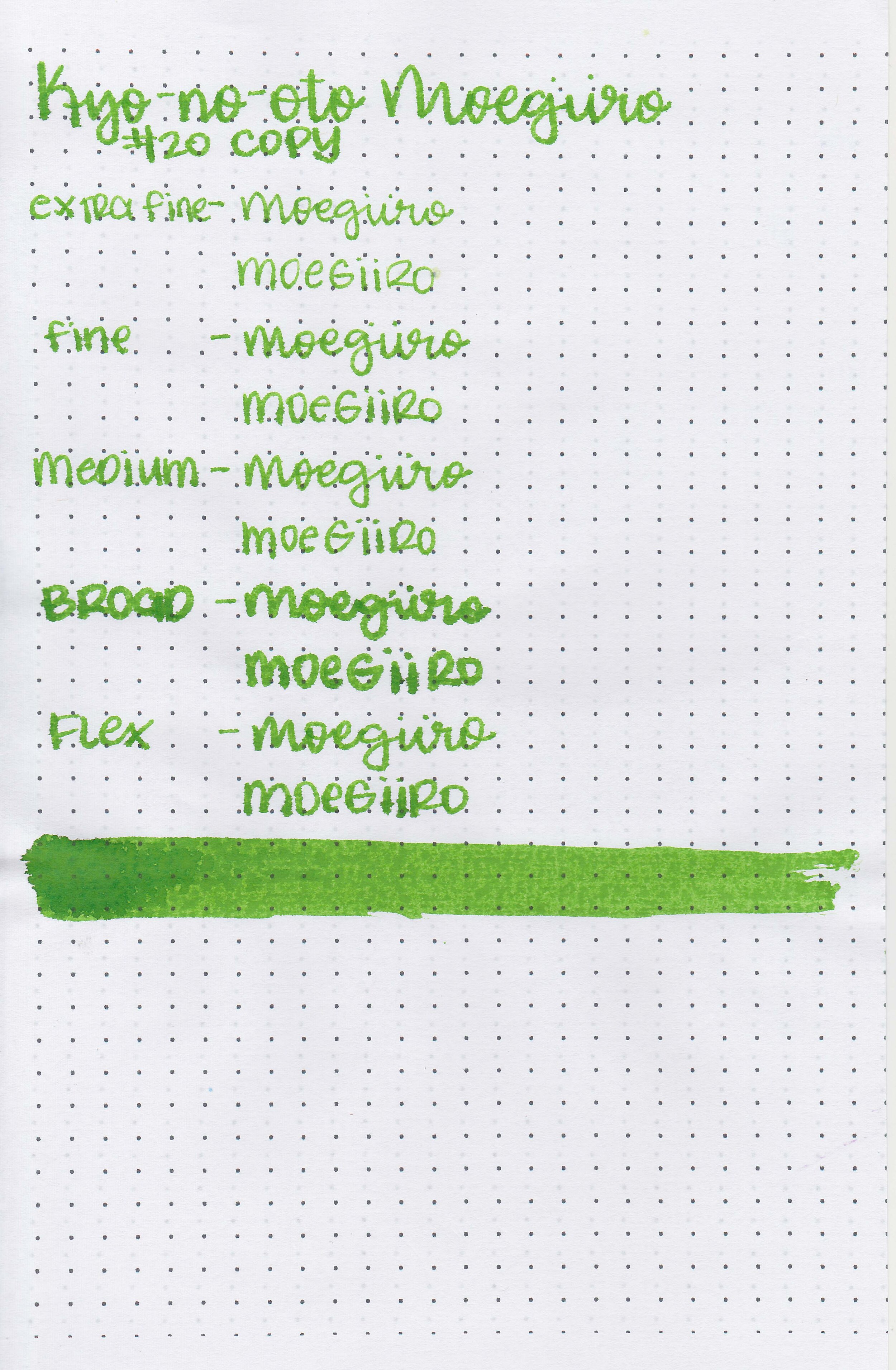
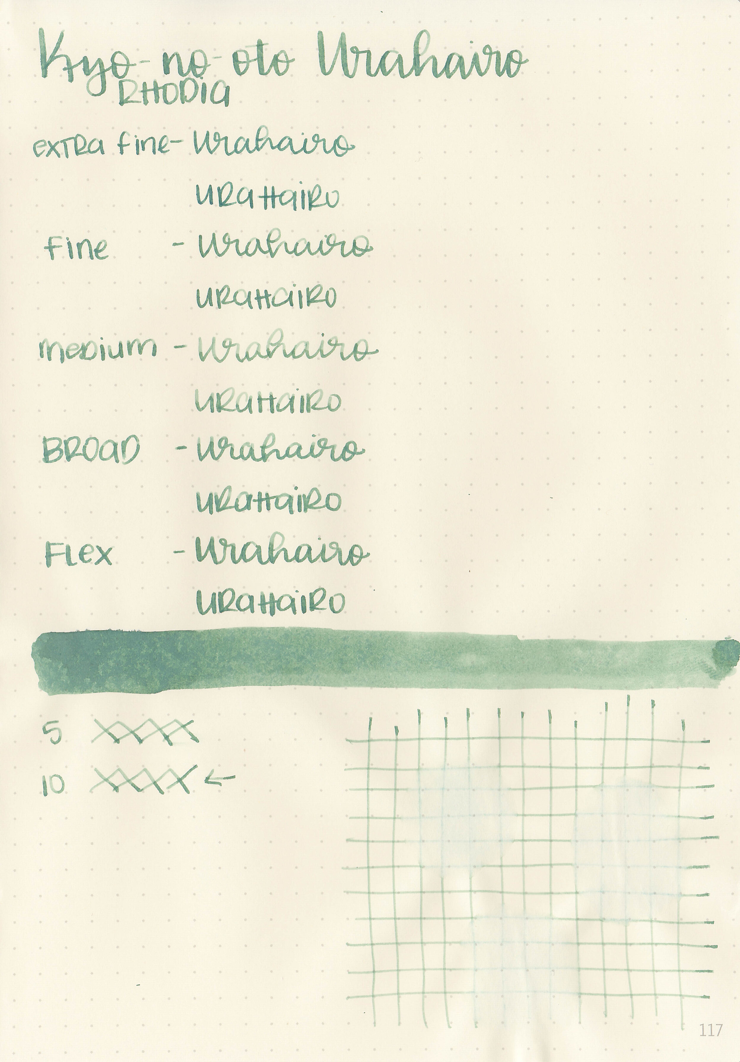
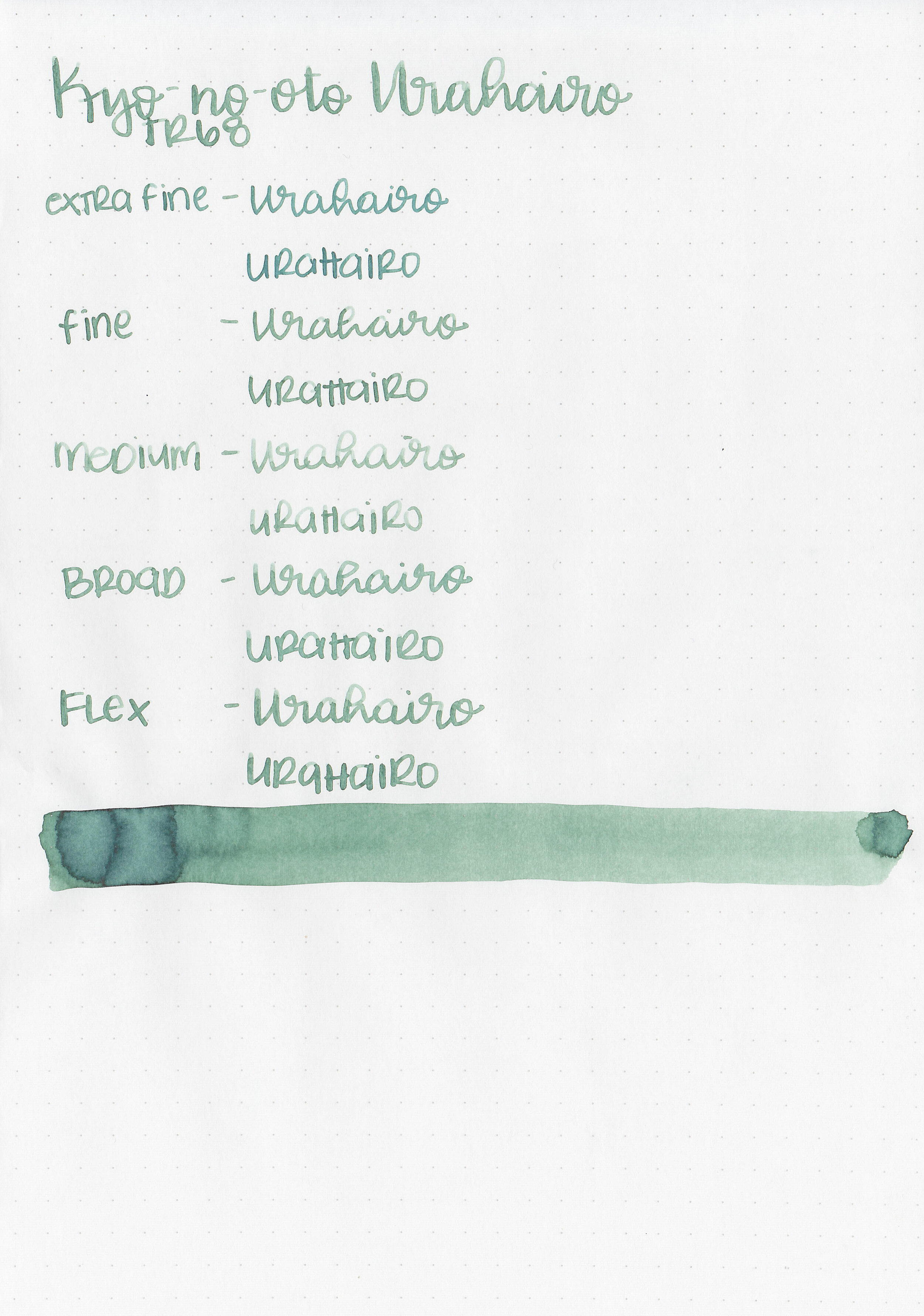
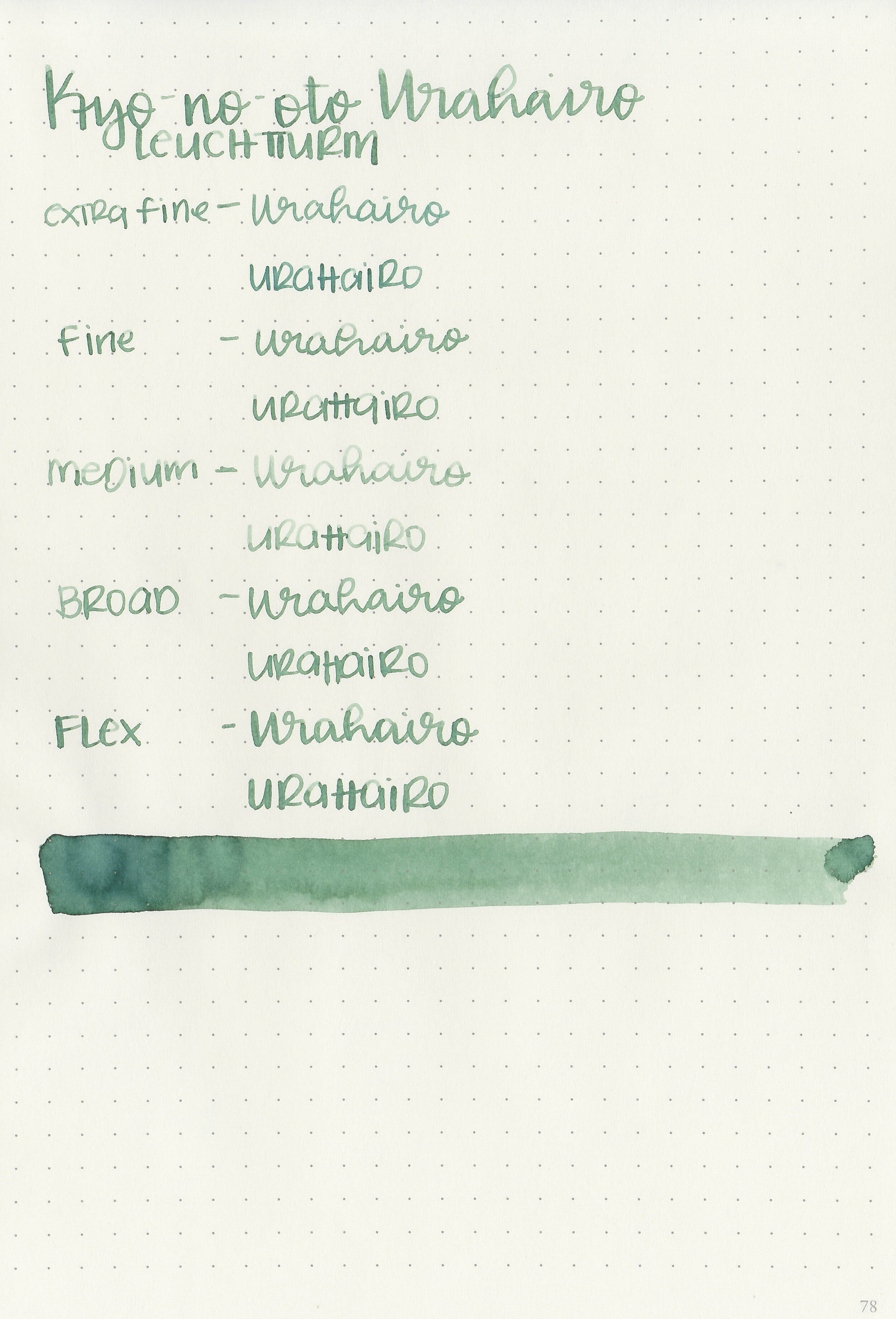
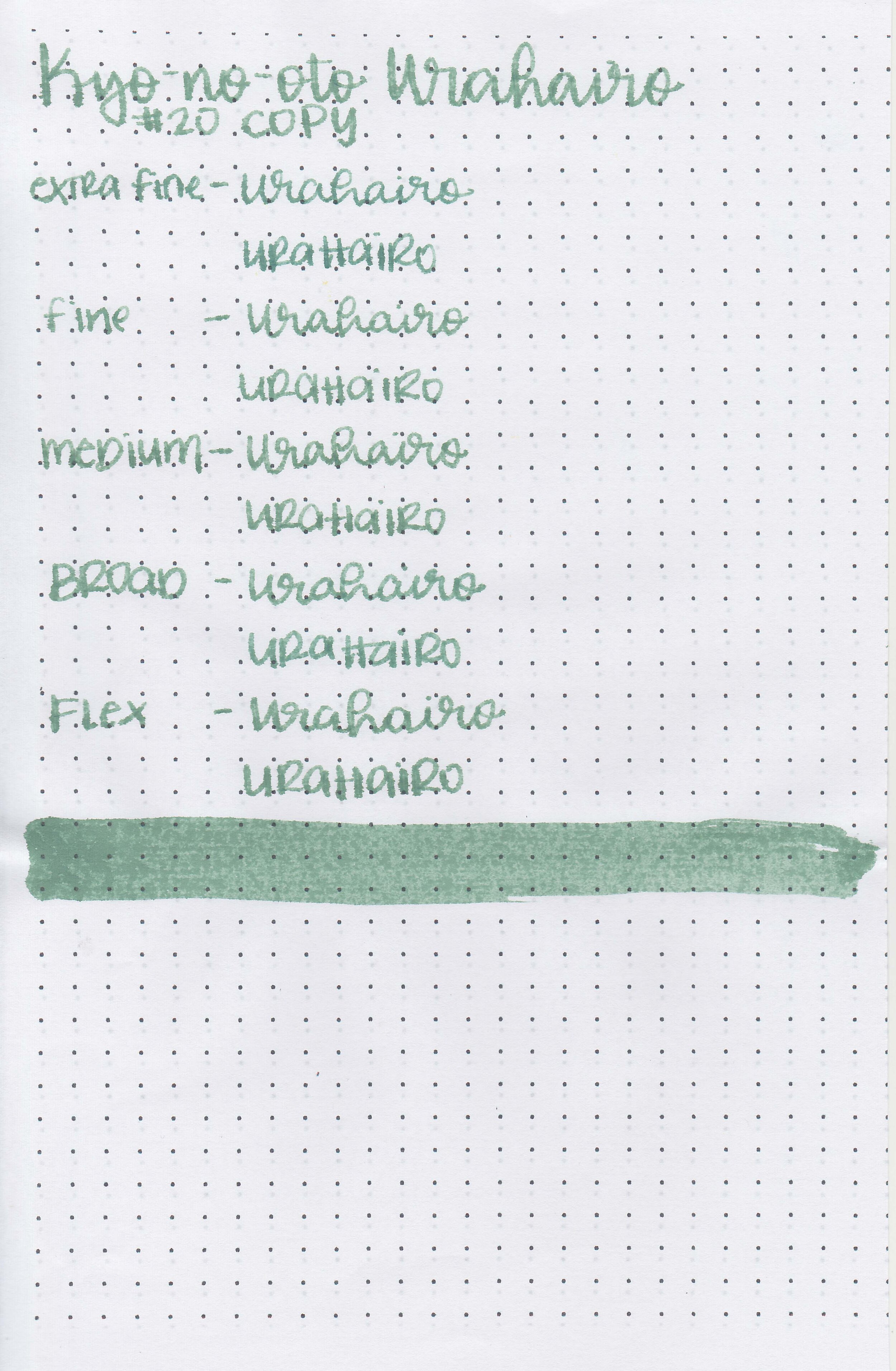
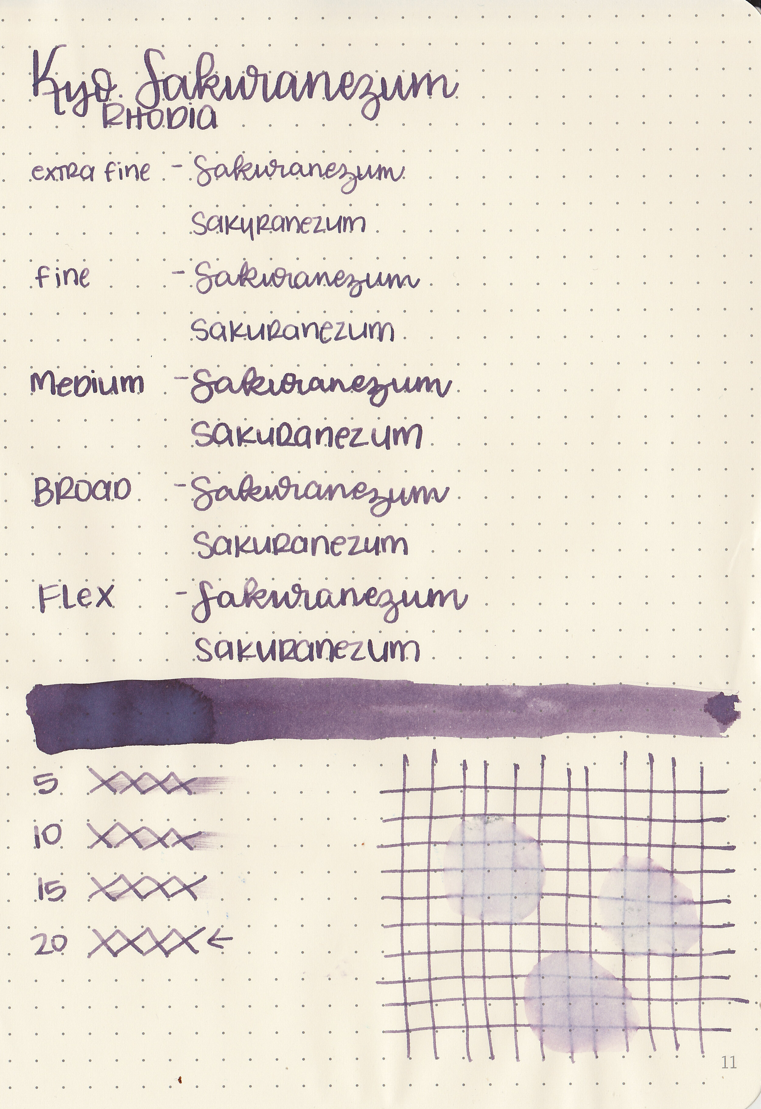
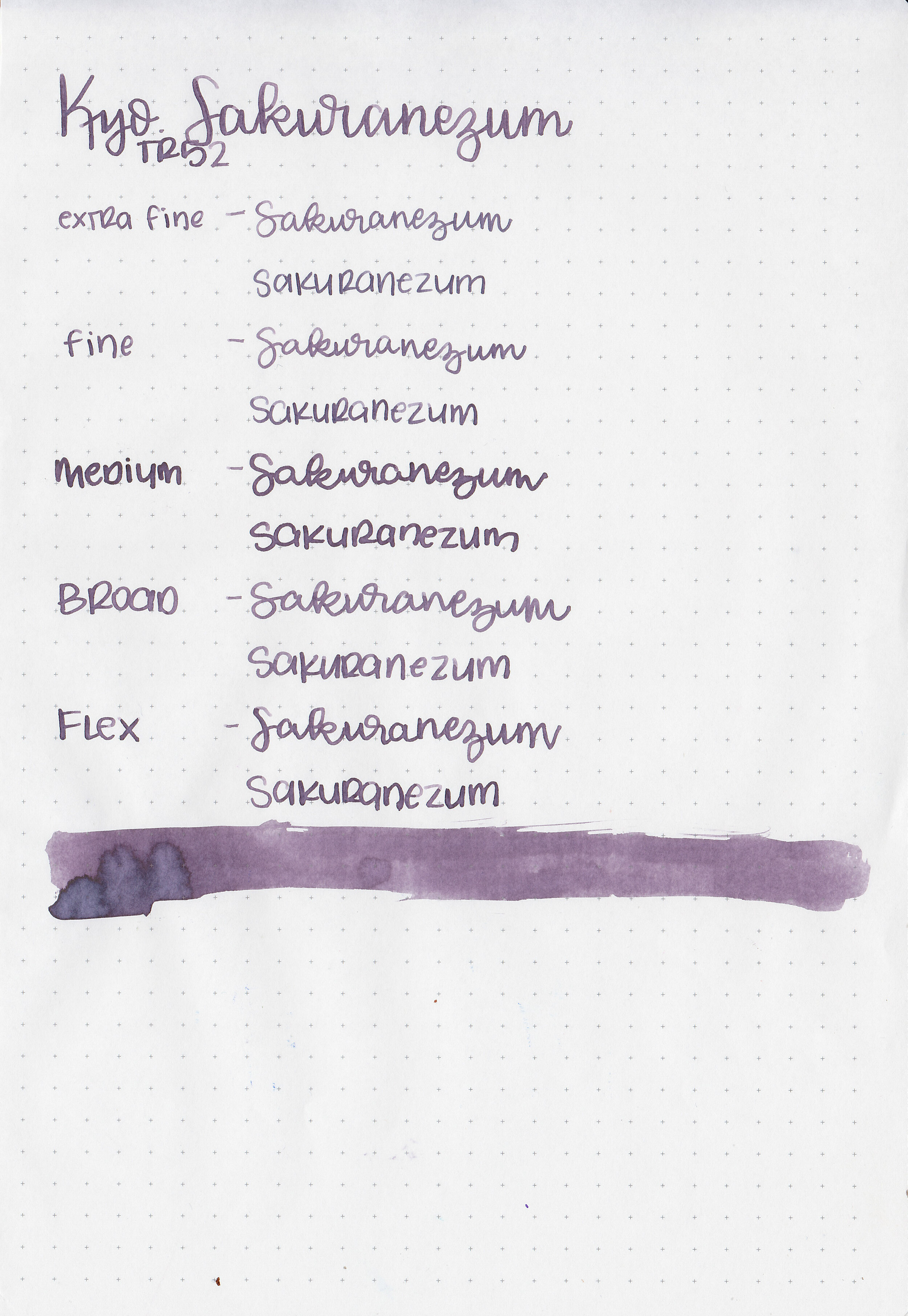
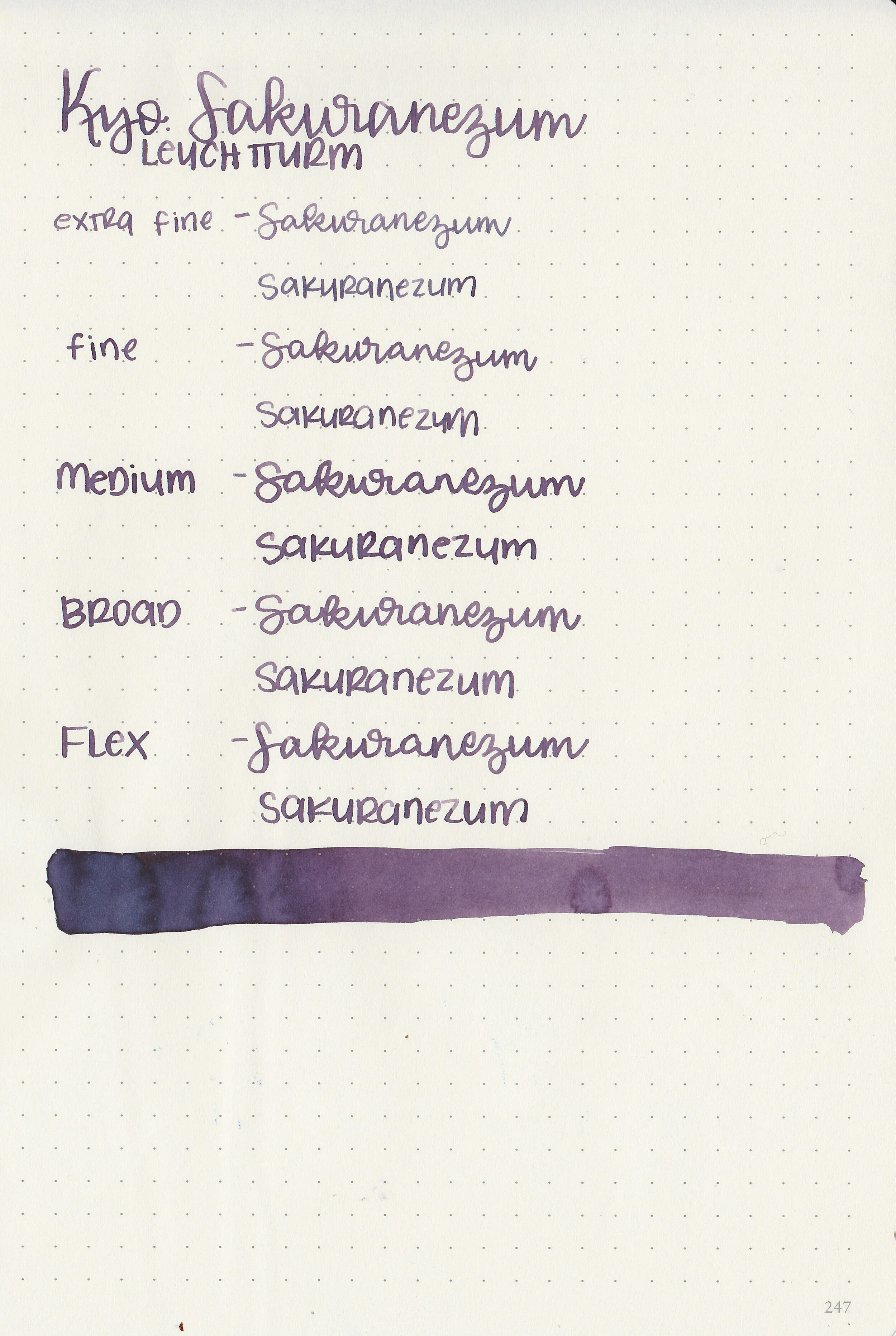
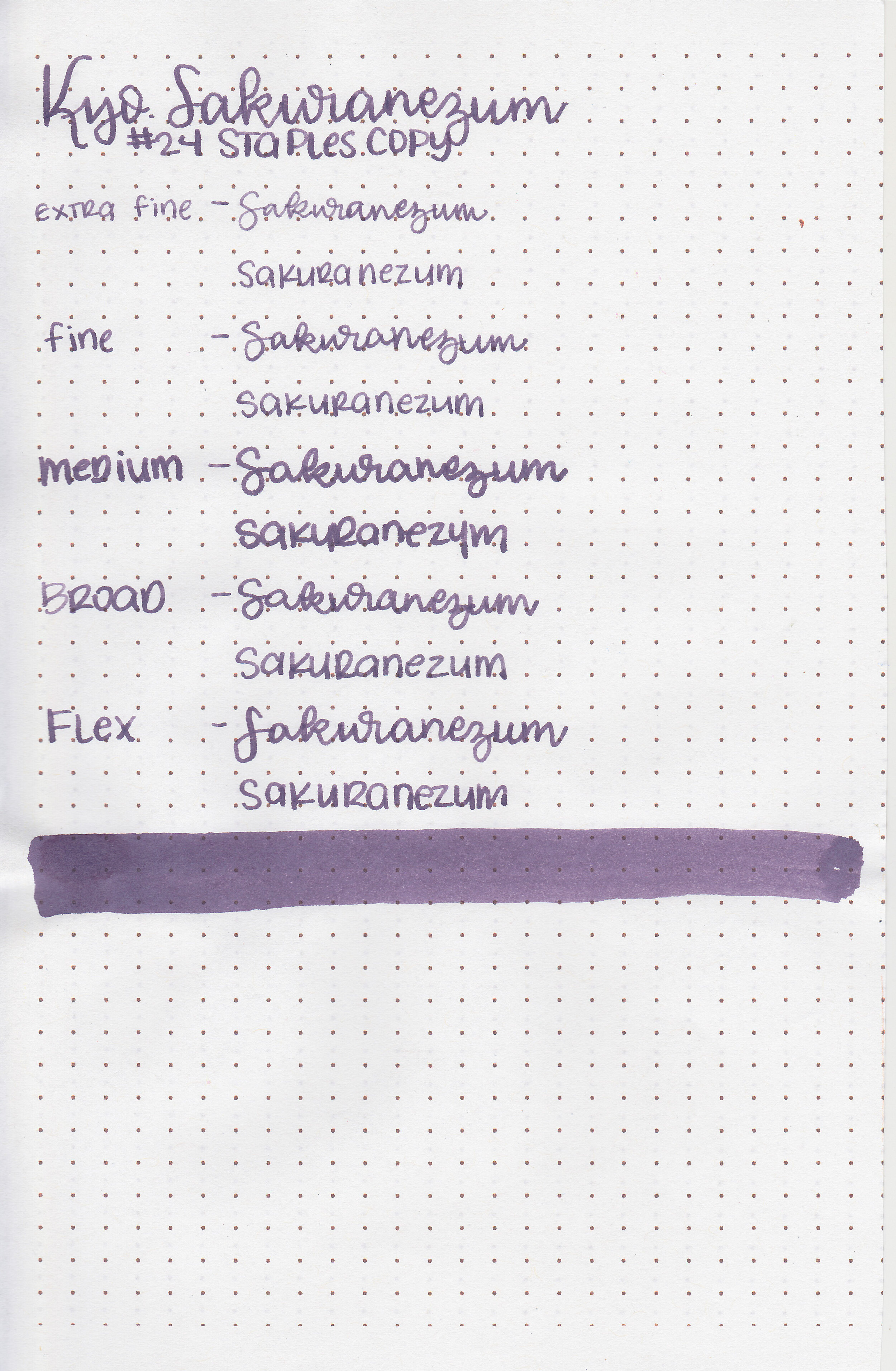
Let's take a look at how the ink behaves on fountain pen friendly papers: Rhodia, Tomoe River, and Leuchtturm.
*For my writing samples I use:
Vintage Mabie Todd Swan (flex nib)
Taroko Enigma notebooks (68gsm TR)
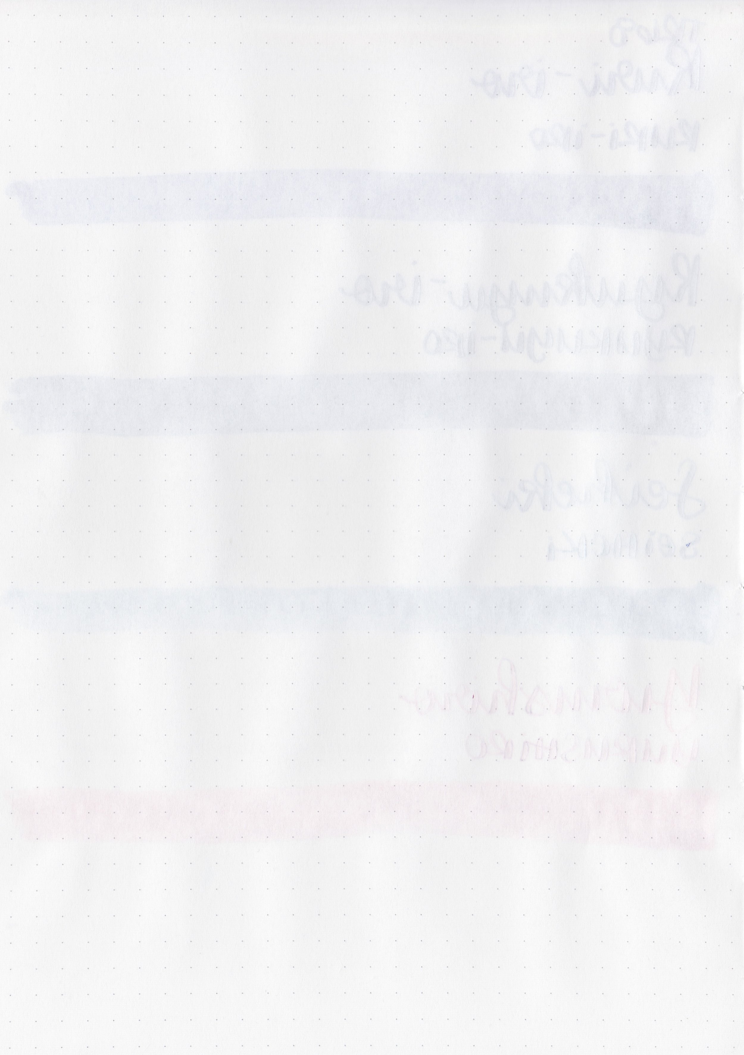
Dry time: 30 seconds
Water resistance: Low
Feathering: None
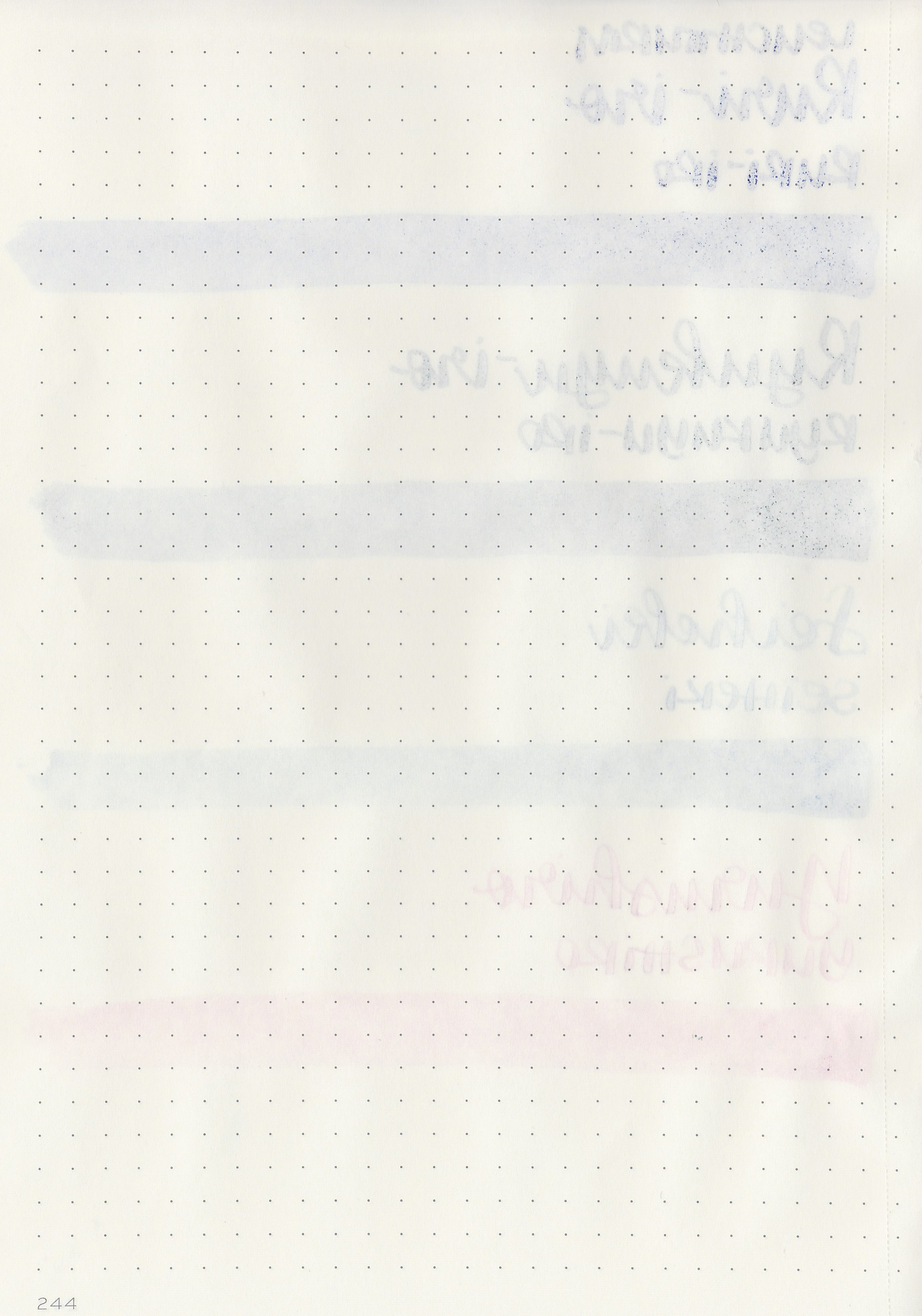
Show through: Medium
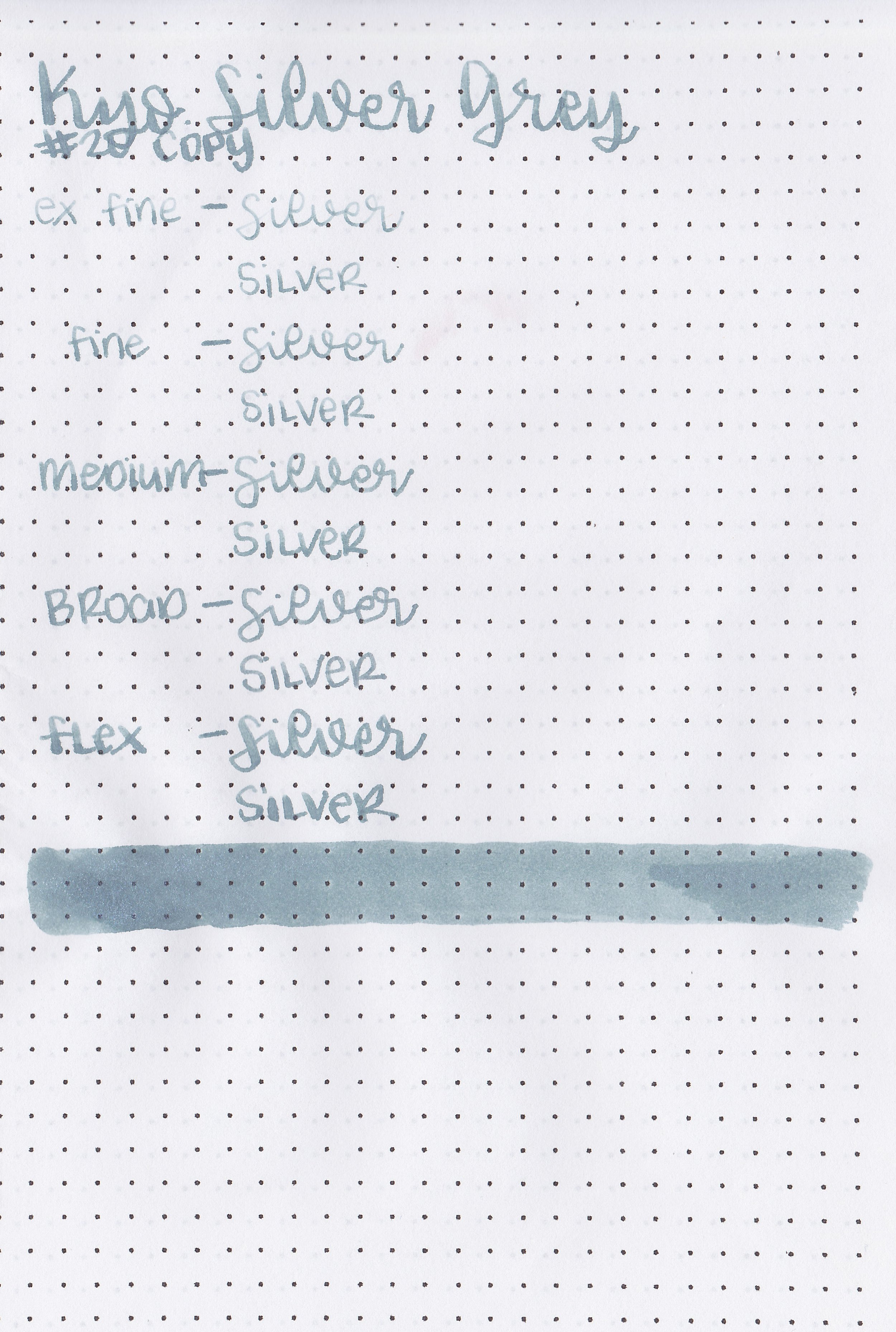
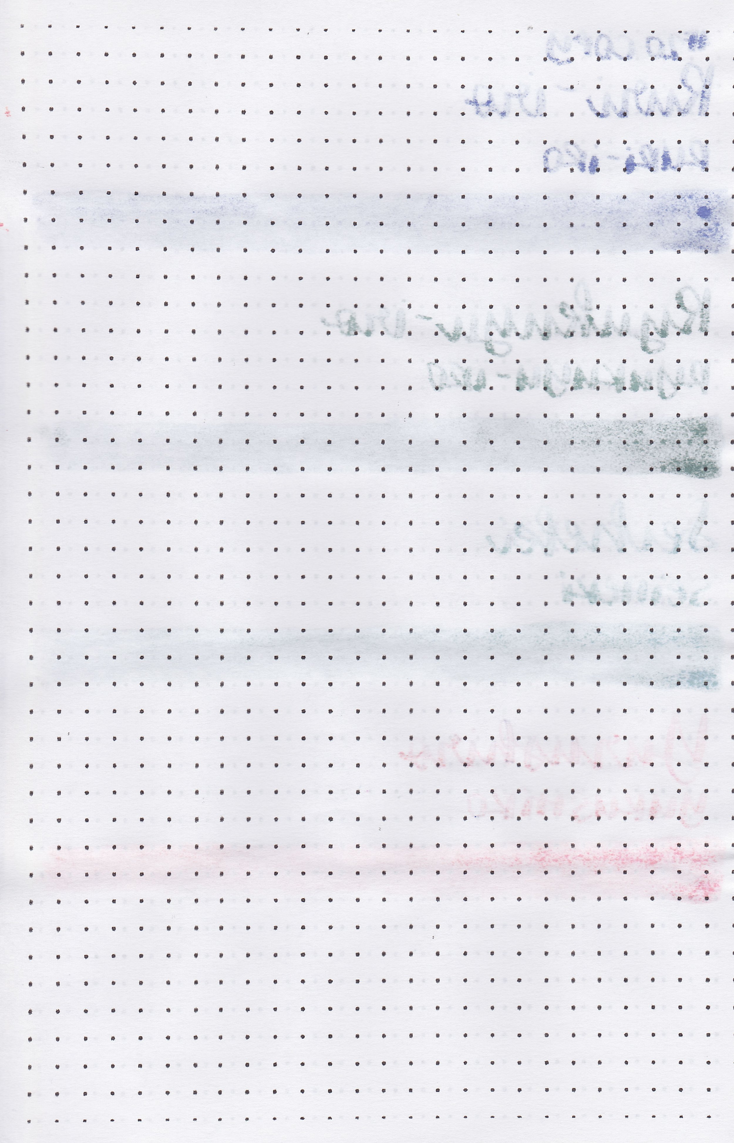
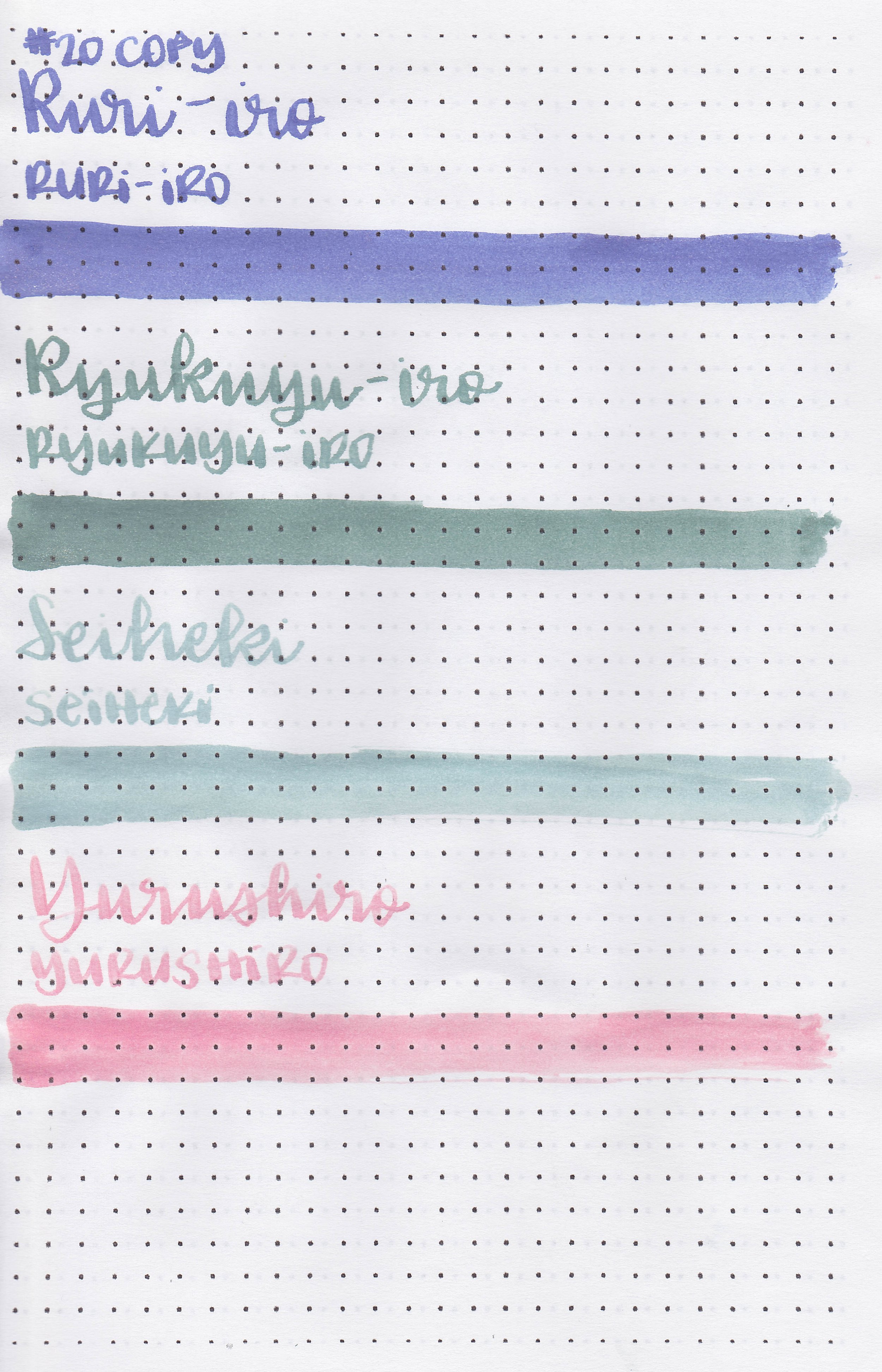
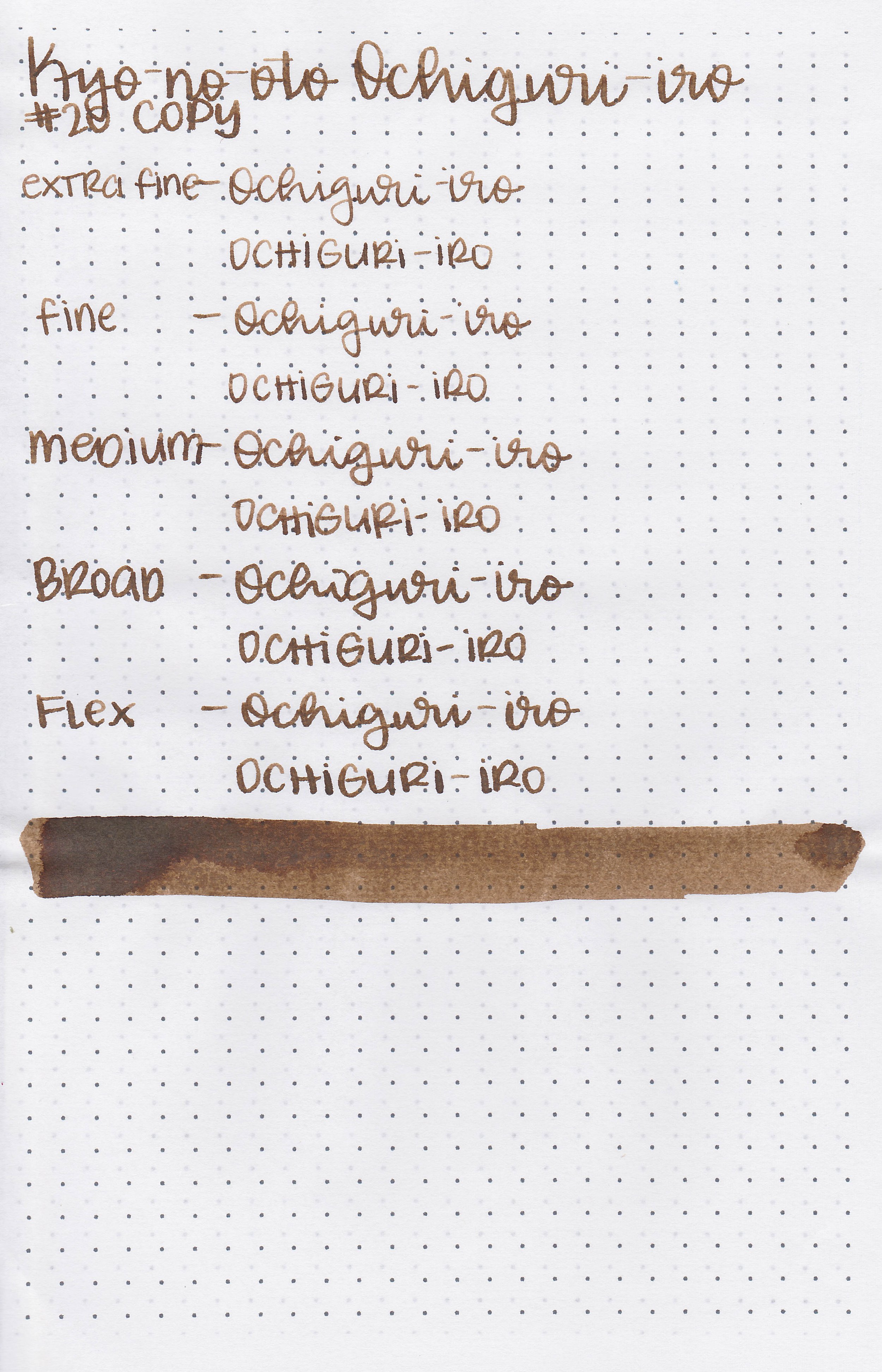
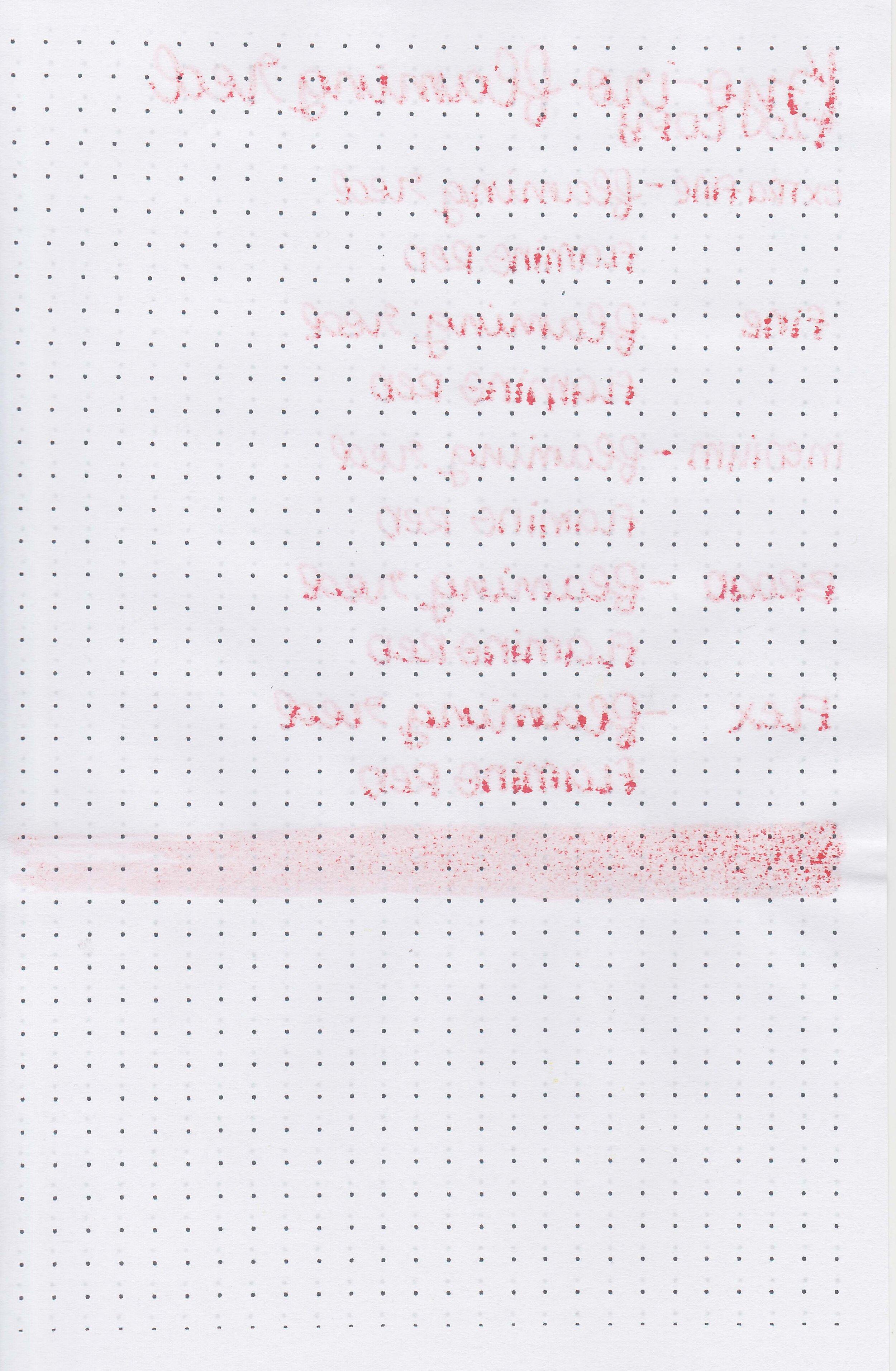
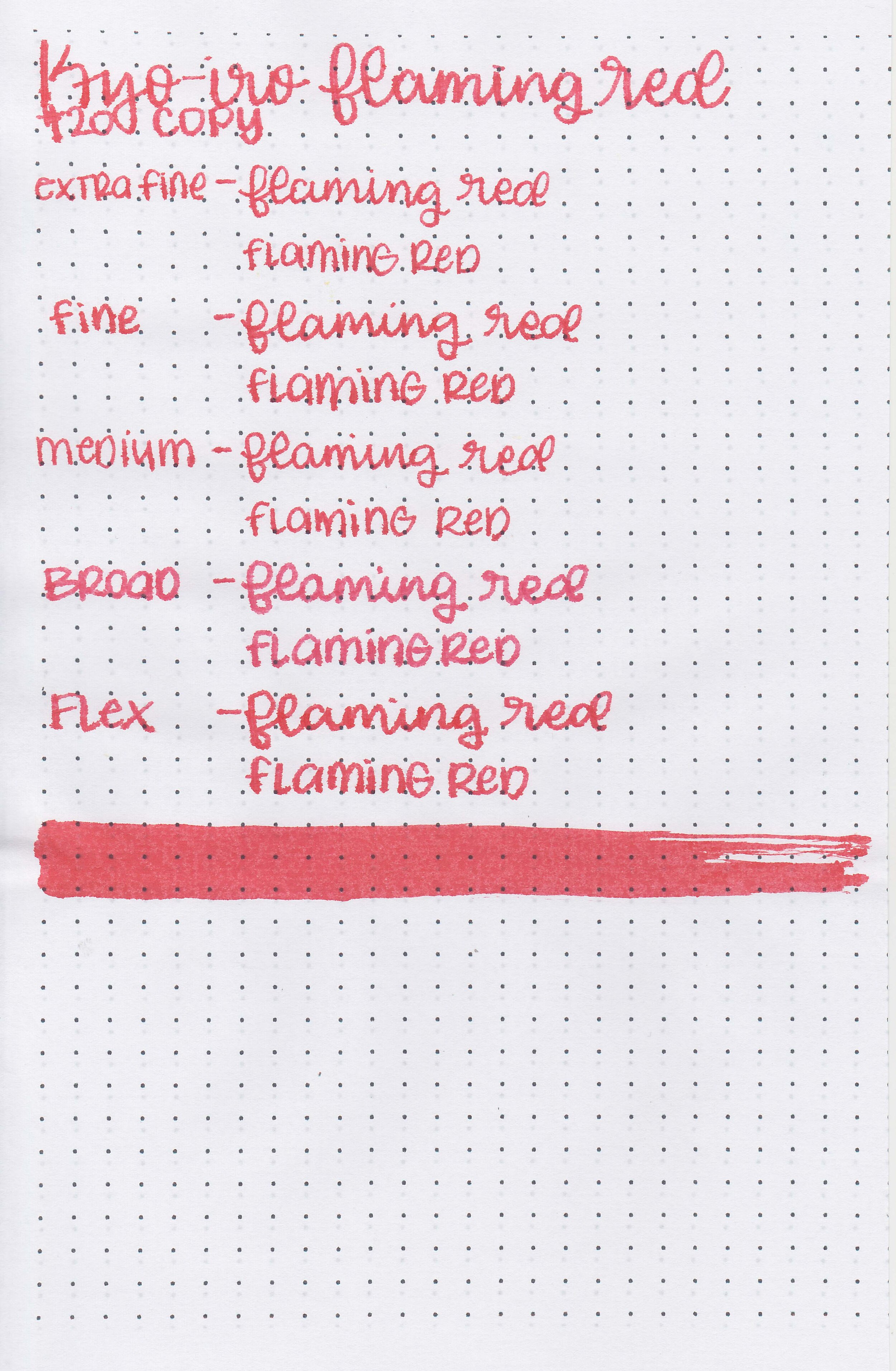
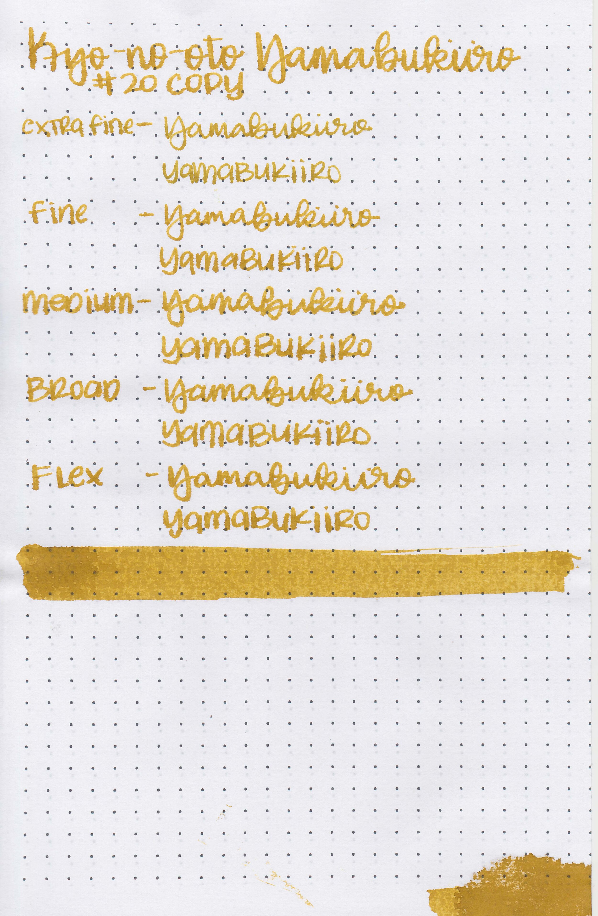
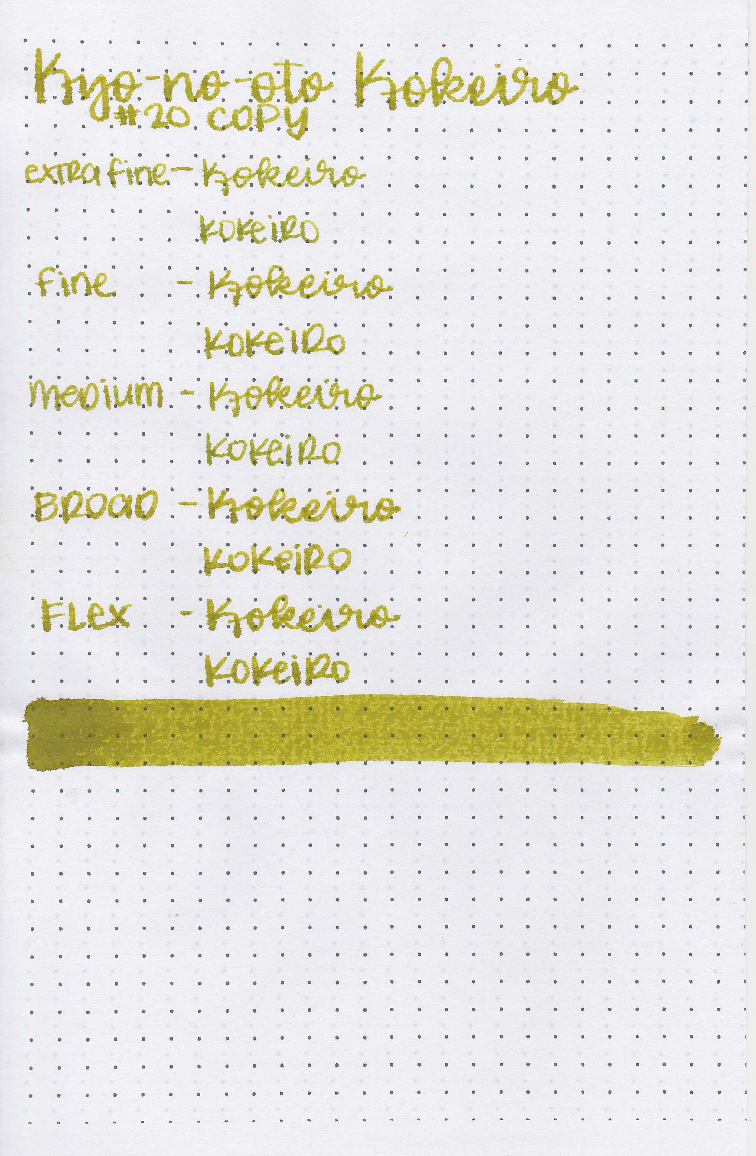
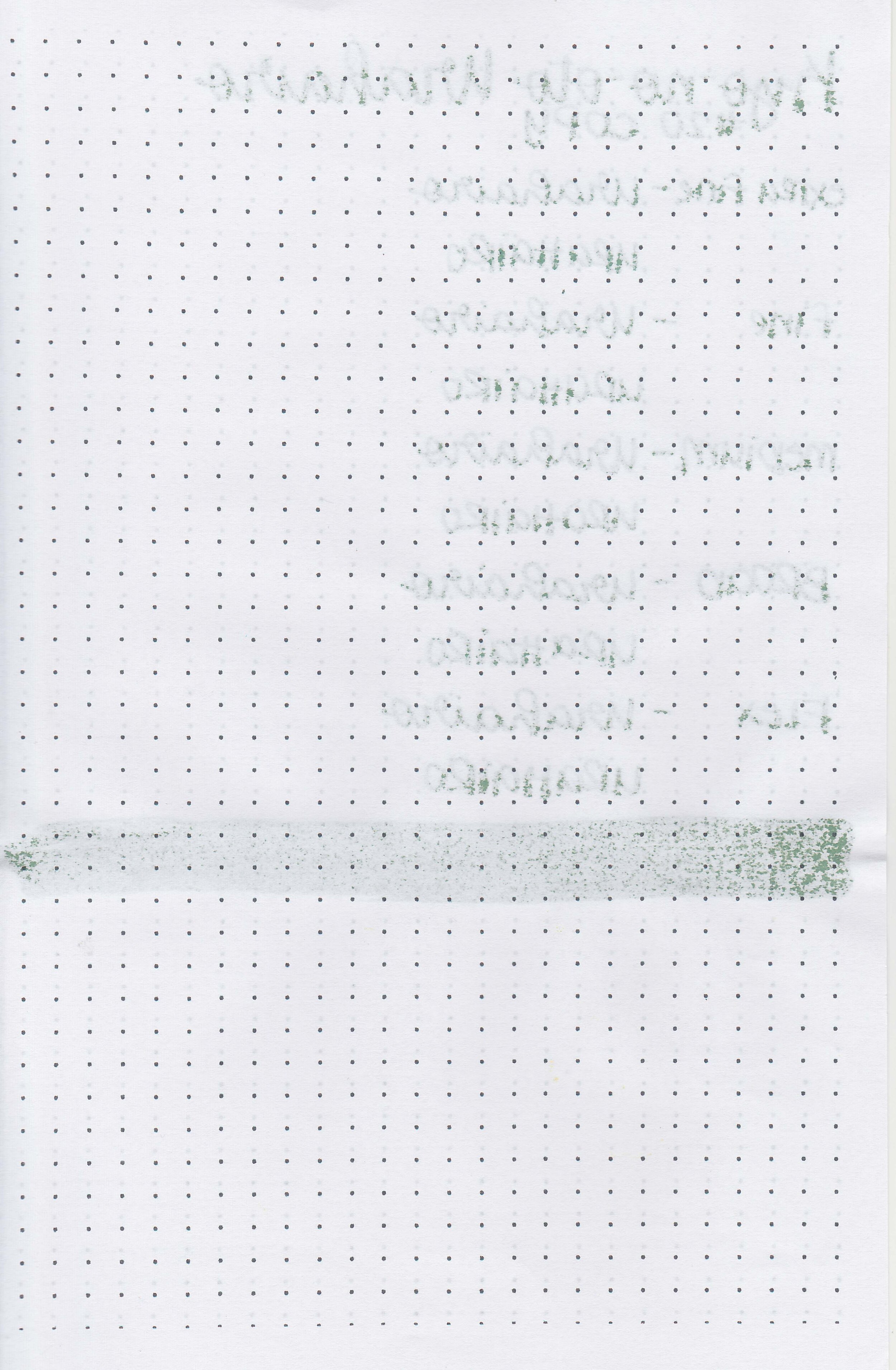
On 20 lb copy paper the ink had some feathering in all nib sizes and some bleeding in the flex nib.
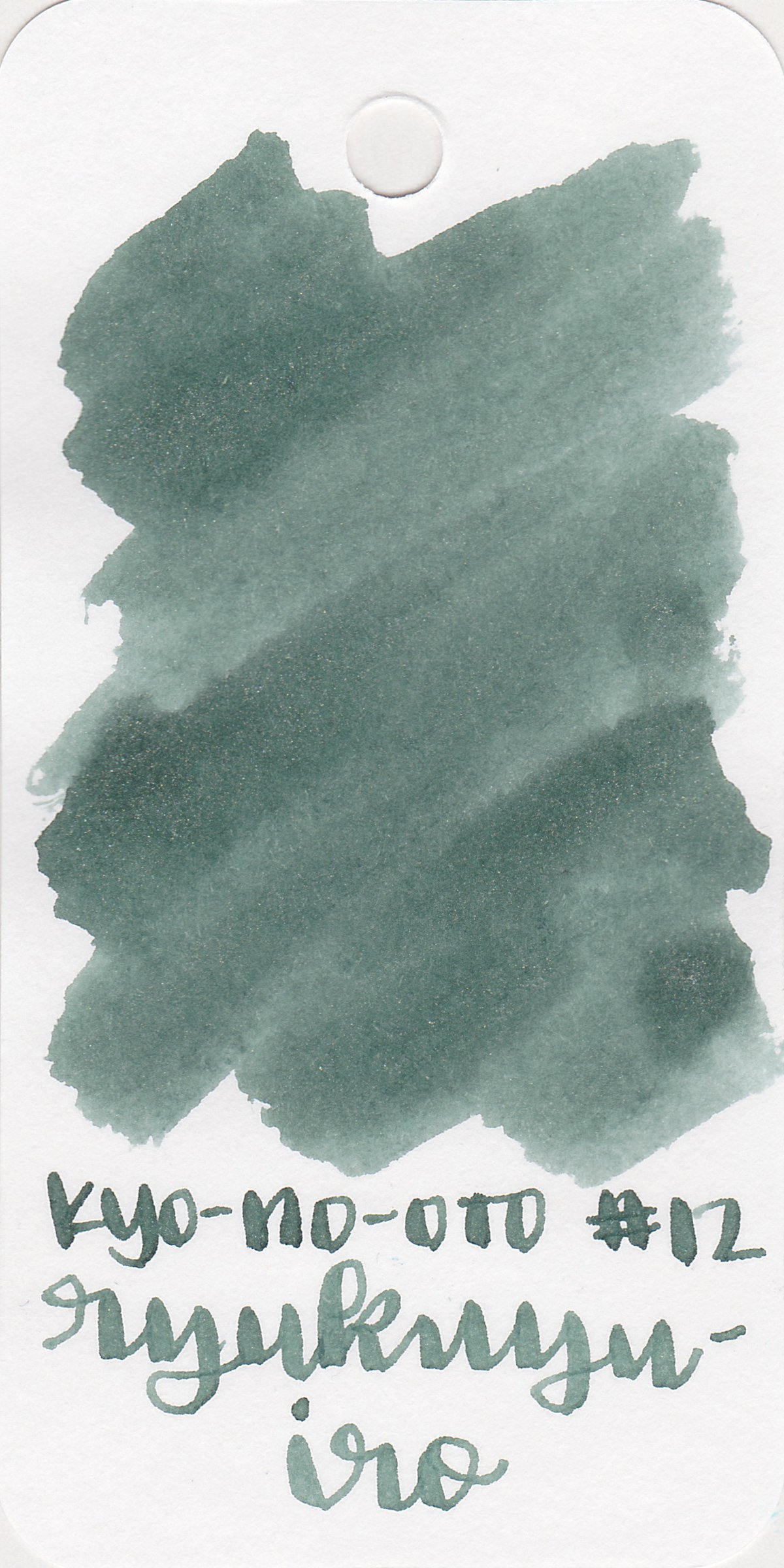
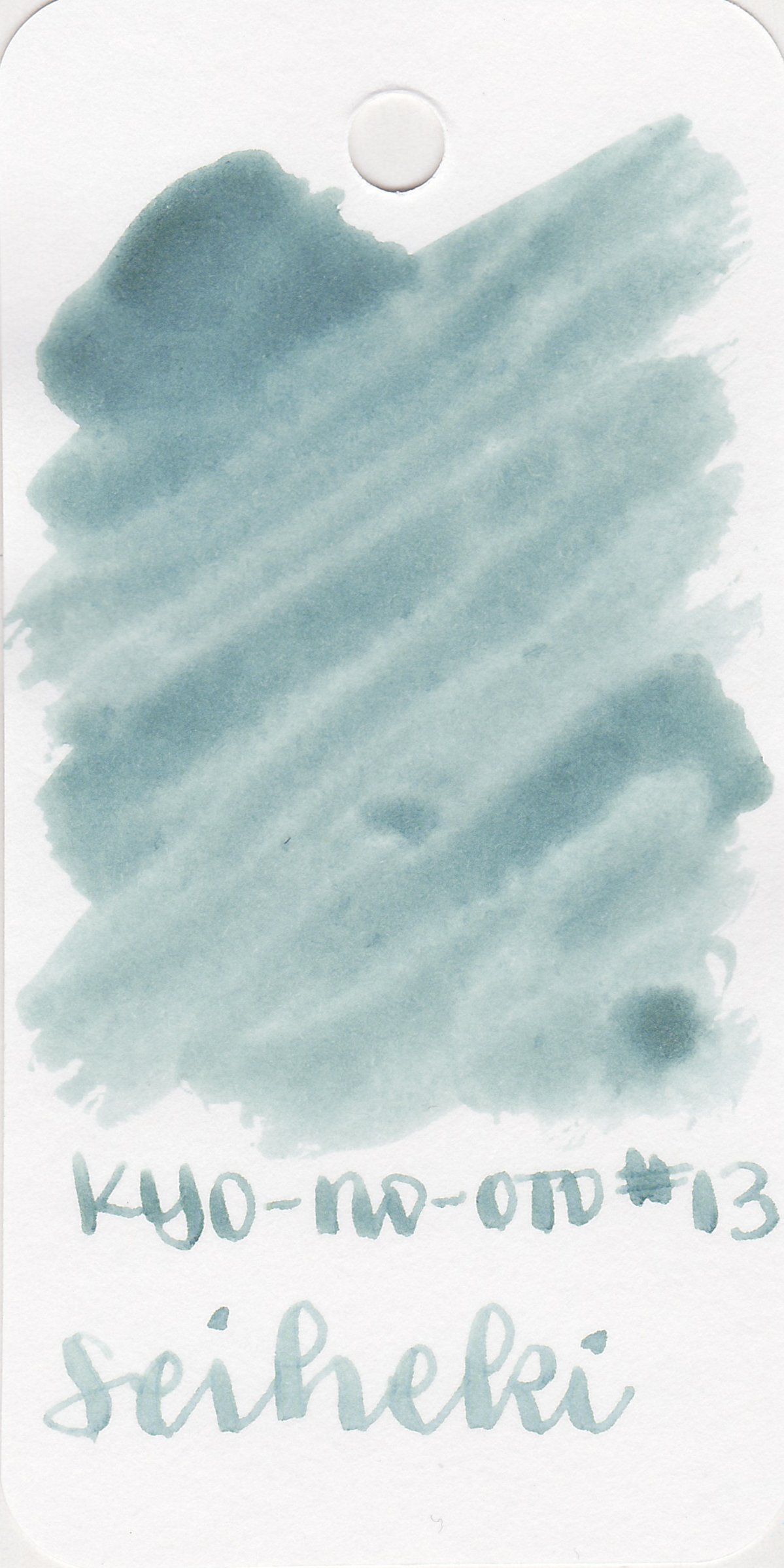
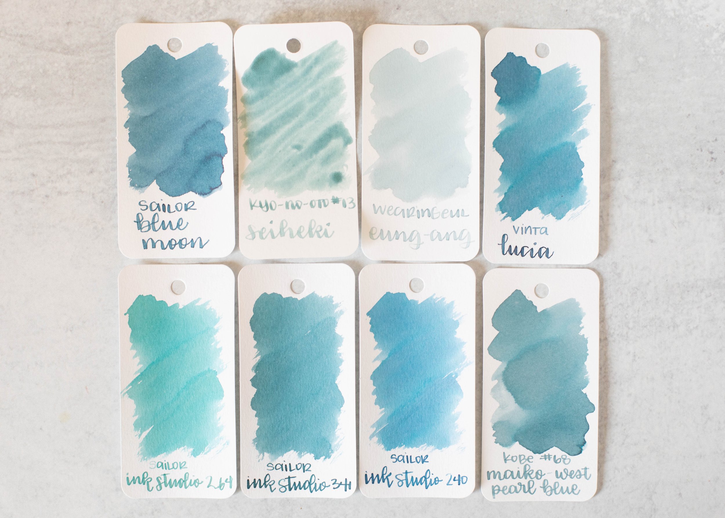
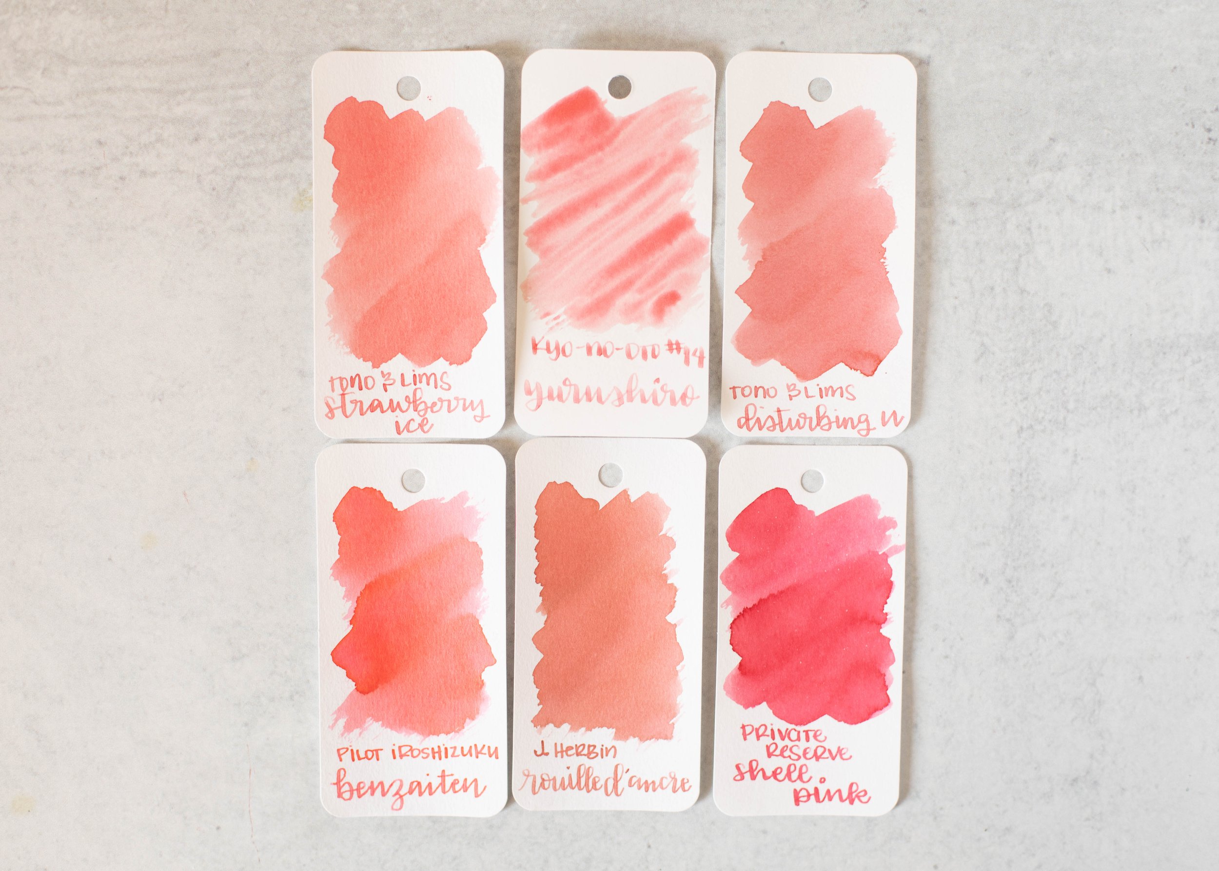
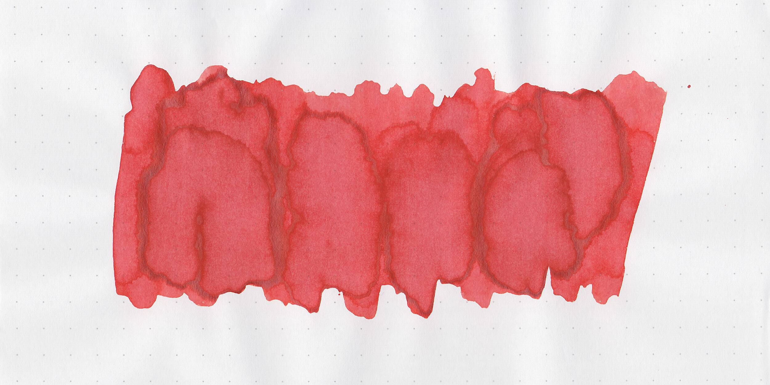
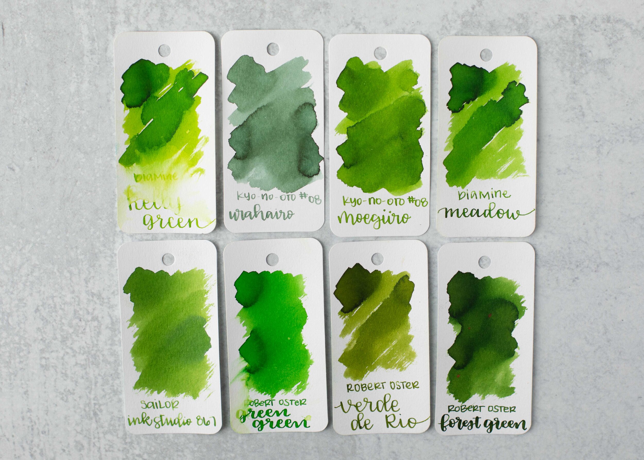
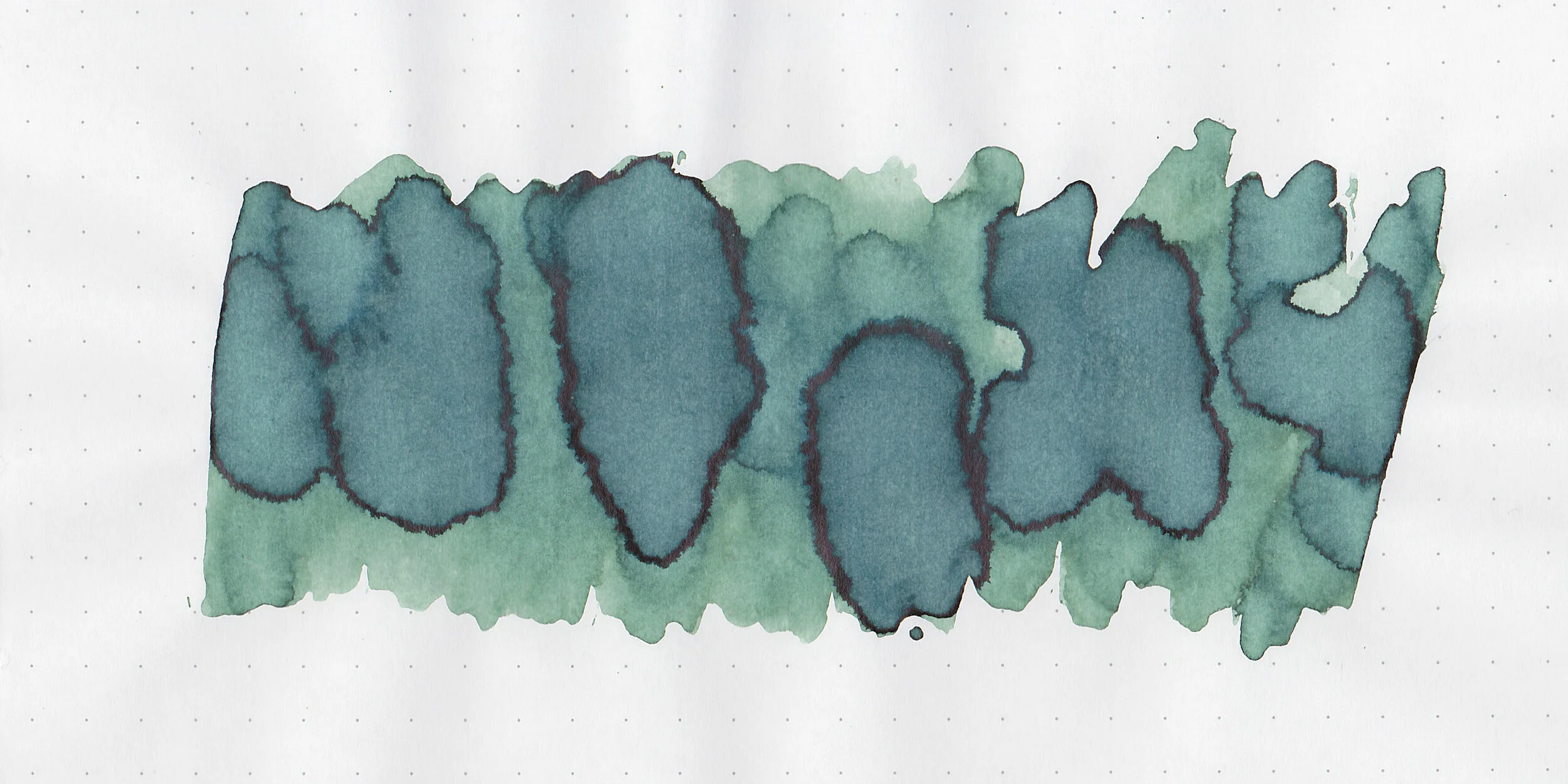
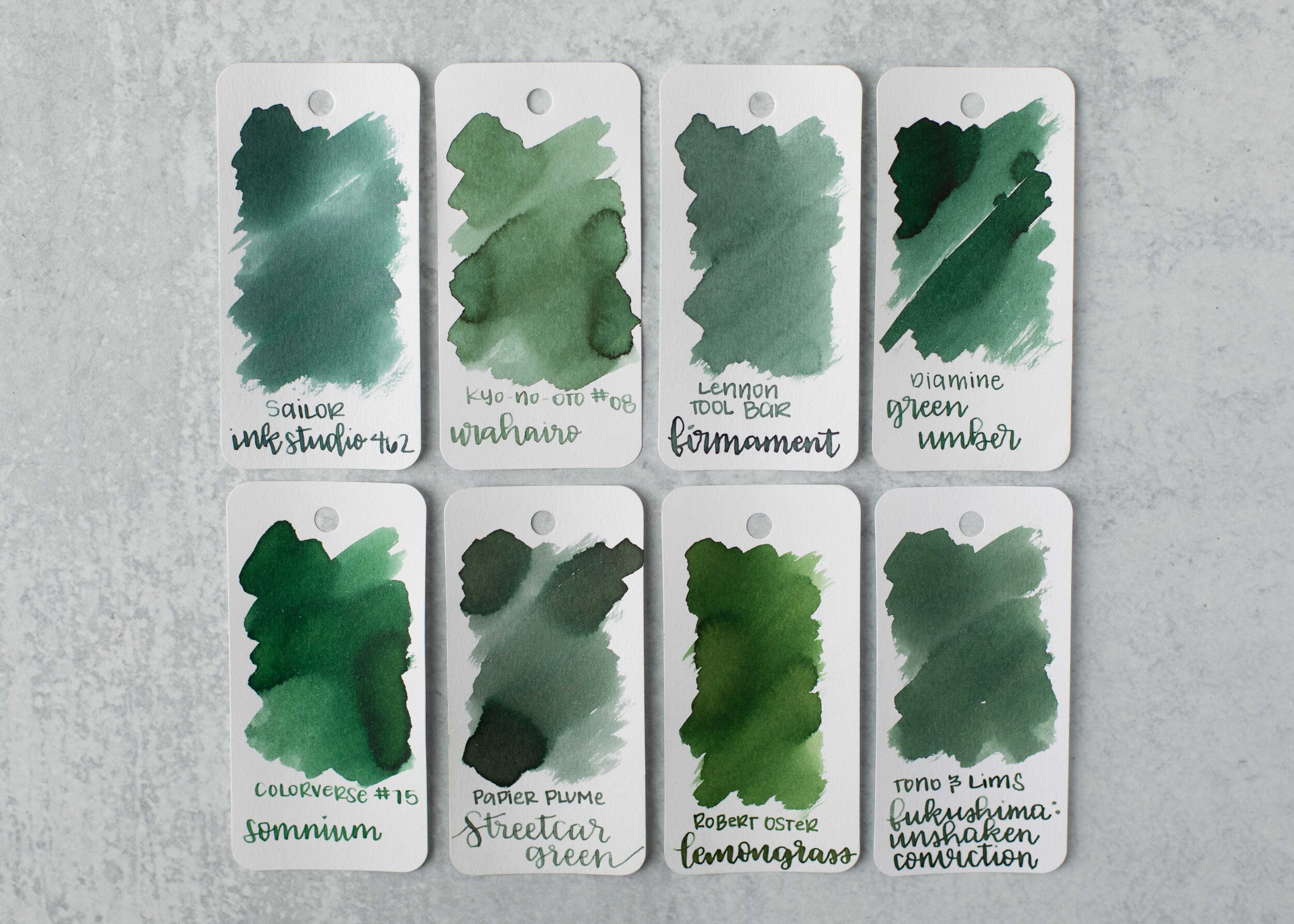
Comparison Swabs:

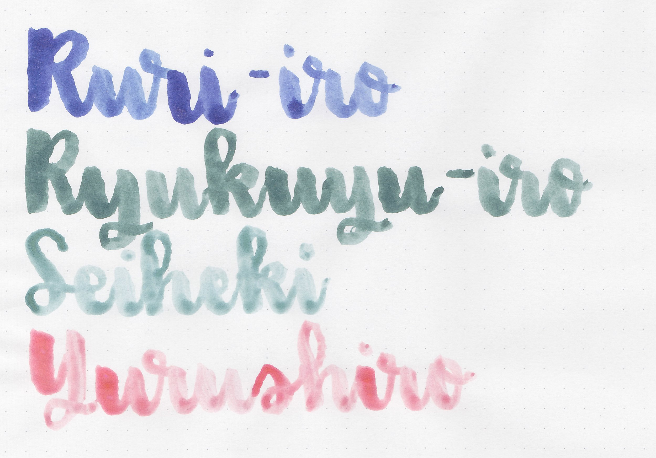
Ginkaisyoku is a little lighter than Nemosine Blue Snowball Nebula Twinkle. Click here to see the blue inks together.
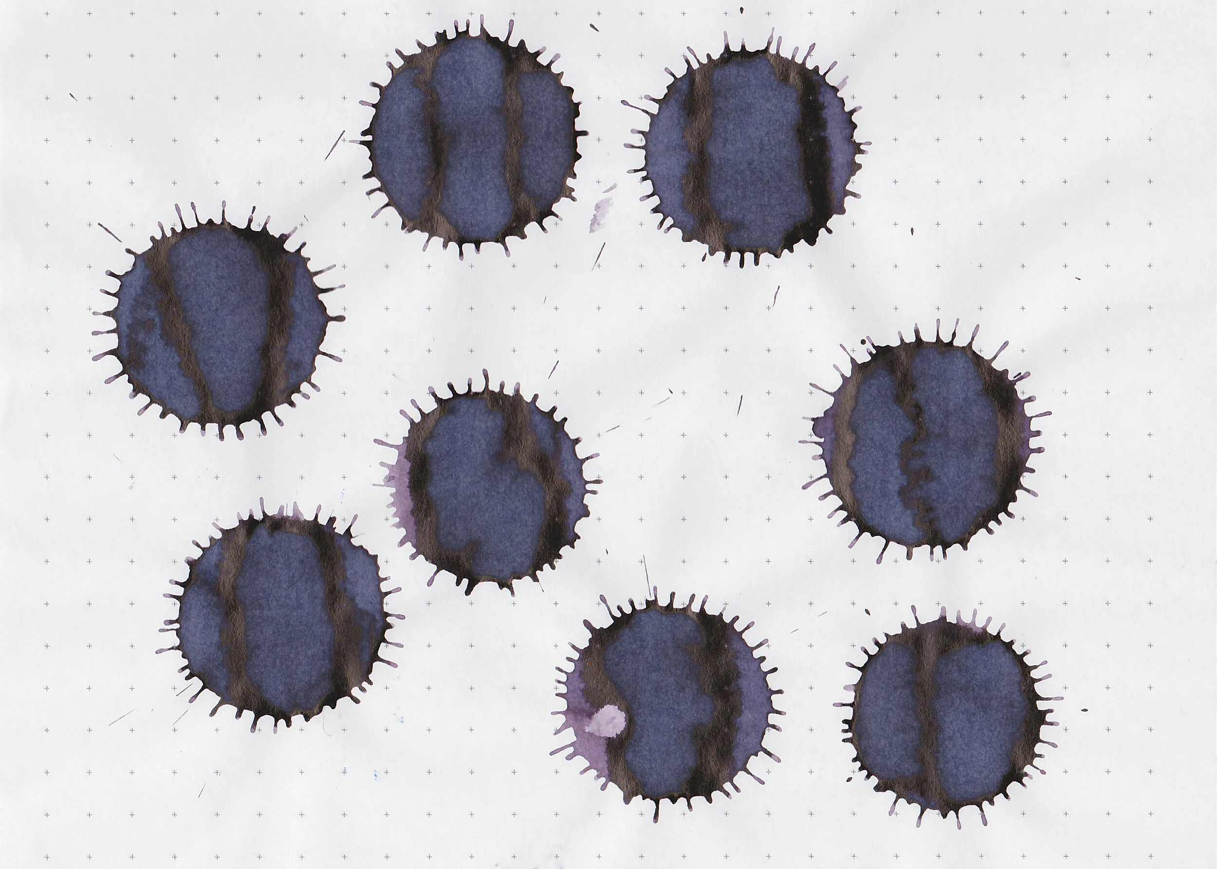
Longer Writing:

I used a Pilot Vanishing Point Black Ice with a medium nib on a Taroko Enigma notebook. The ink has a dry flow.
Overall, I like this ink-it’s an interesting color but it is very dry.
Thanks to all my Patrons! I couldn’t do these reviews without you! You can find my Patreon page here.
Disclaimer: All photos and opinions are my own. This page does not contain affiliate links and this post is not sponsored.