Ink Review #828: Vinta Maskara

vnt-maskara-2.jpg

We have almost made it through all the Vinta Pastel inks I have, and today’s is Violet Maskara 1890. I just realized I misspelled Maskara in the image above, but I’m out of ink so we’re gonna run with it. According to Vinta’s website, “The maskara festival was conceived in part due to the sugarcane crisis in Negros. 1890 was the year the Spaniards split Negros region into two: Negros Occidental and Negros Oriental. These regional divisions remain today.” Thanks to Vanness Pens for sending a sample over for review.

vnt-maskara-1.jpg

The color:

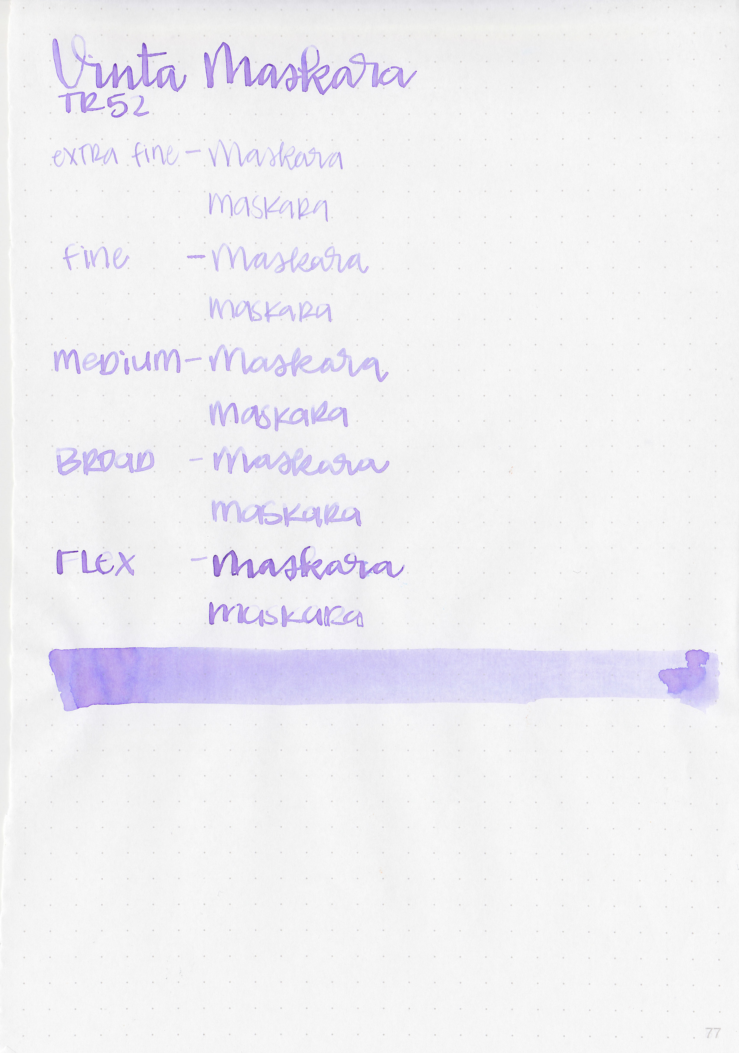
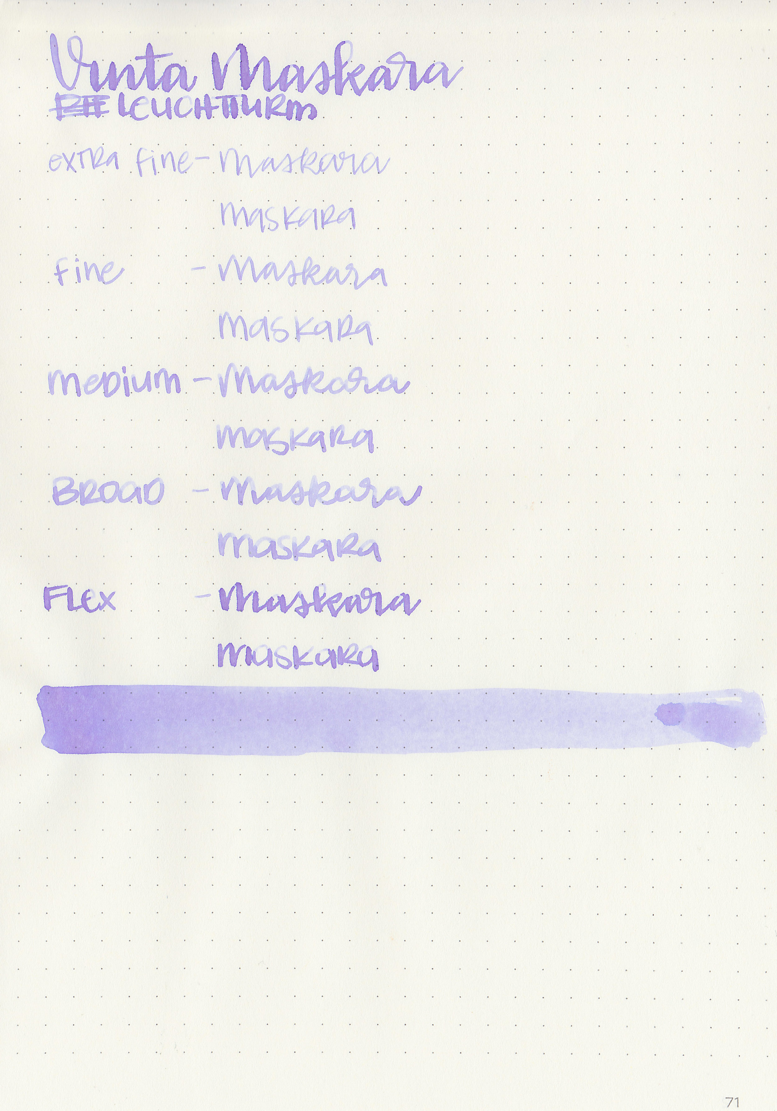
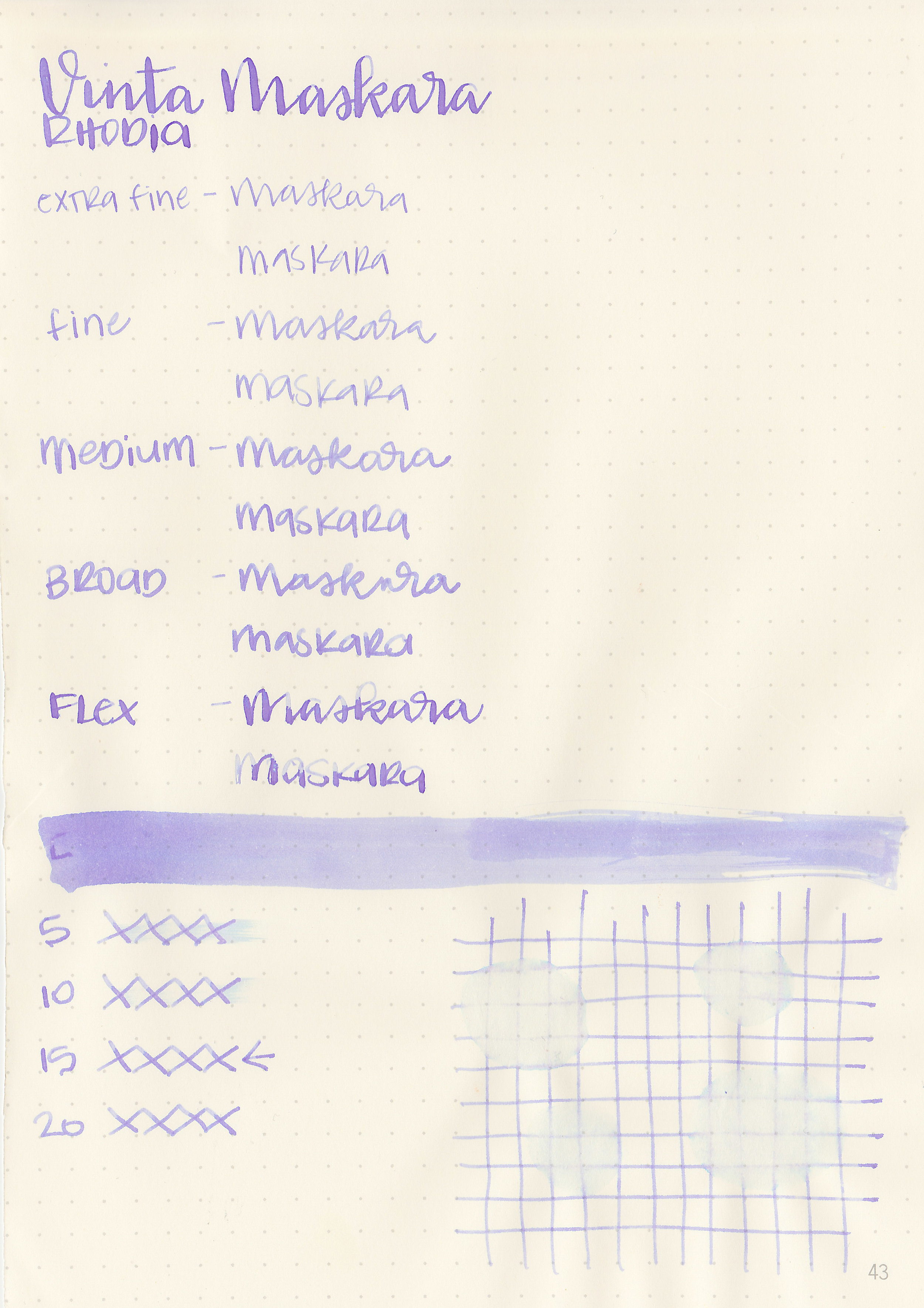
Maskara is a beautiful pale purple. It has an interesting blue undertone. When I first swabbed it I thought it was mislabeled because it’s blue when wet, but dries to a purple with hints of blue mixed in.

Swabs:

vnt-maskara-3.jpg

In large swabs on Tomoe River paper you can see bits of the blue undertone.

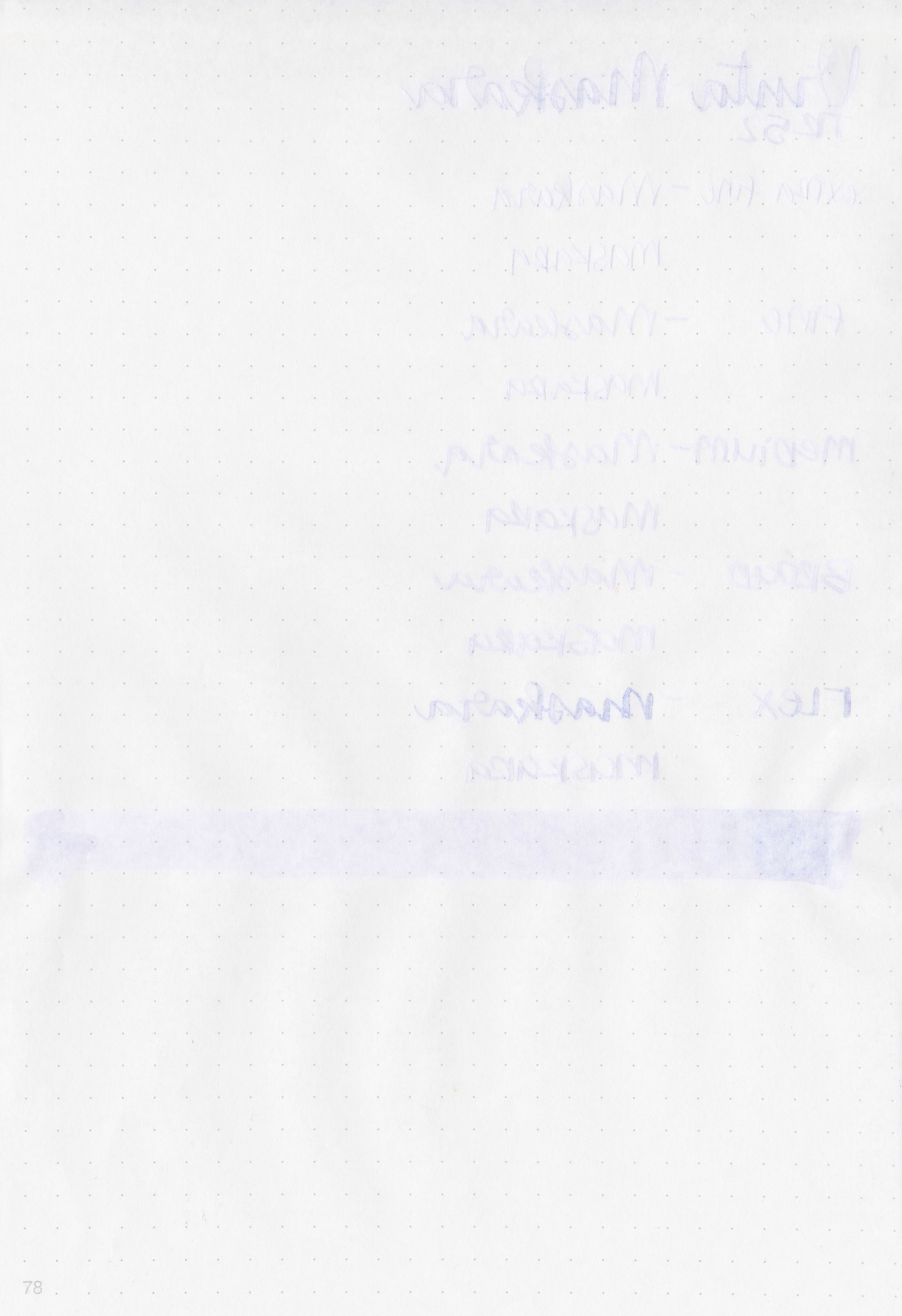
vnt-maskara-4.jpg

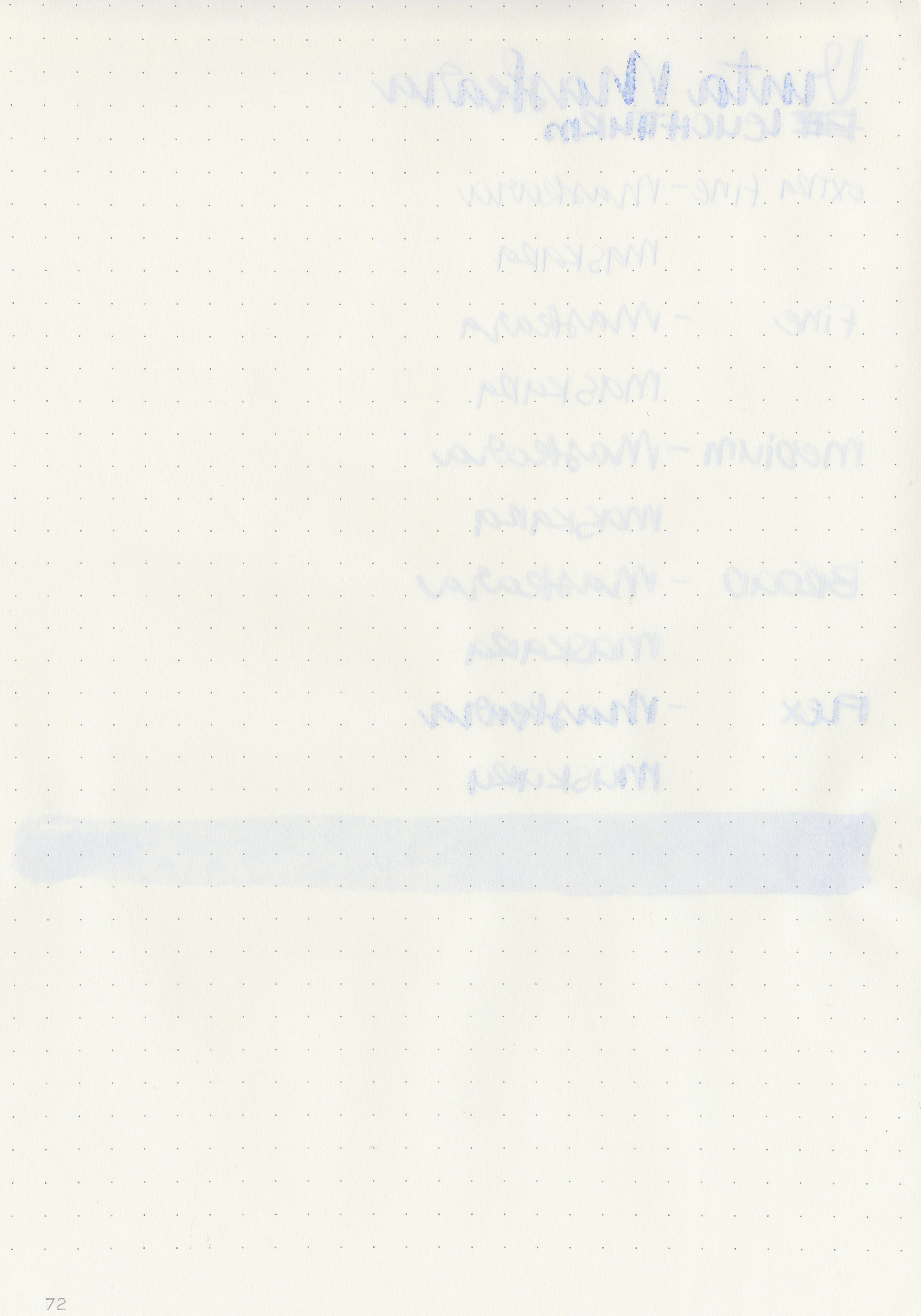
Writing samples:

Let's take a look at how the ink behaves on fountain pen friendly papers: Rhodia, Tomoe River, and Leuchtturm.

Dry time: 15 seconds

Water resistance: Low

Feathering: Low-there was some feathering in the flex nib on Rhodia and Leuchtturm

Show through: Medium

Bleeding: Low-there was some bleeding in the flex nib.

Other properties: medium shading, no sheen, and no shimmer.

On Staples 24 lb copy paper the ink feathered in all nib sizes and had a little bit of bleeding.

Comparison Swabs:

vnt-maskara-s-1.jpg

Maskara is similar to Pen Saijiki Fujifusa, but it’s just a tiny bit warmer. It’s warmer and lighter than Sailor Jentle Fuji-musume. Click here to see the Vinta inks together, and click here to see the purple inks together.

Longer Writing:

vnt-maskara-s-2.jpg

I used a Platinum 3776 Nice Lavande with a broad nib on Tomoe River paper. The ink had a slightly dry flow.

Overall, it’s a beautiful pale purple. This ink is light in most nibs, so I would stick to broad nibs or larger. Even in the Platinum broad nib I used above it’s still pretty light. If you don’t like pastel inks then I would pass on this one. I enjoy pastel inks so I like it, but I don’t need a full bottle of it.

Disclaimer: A sample of this ink was provided by Vanness Pens for the purpose of this review. All photos and opinions are my own. This page does not contain affiliate links, and this post is not sponsored in any way.

Ink Review #827: Vinta Lucia

vnt-lucia-2.jpg

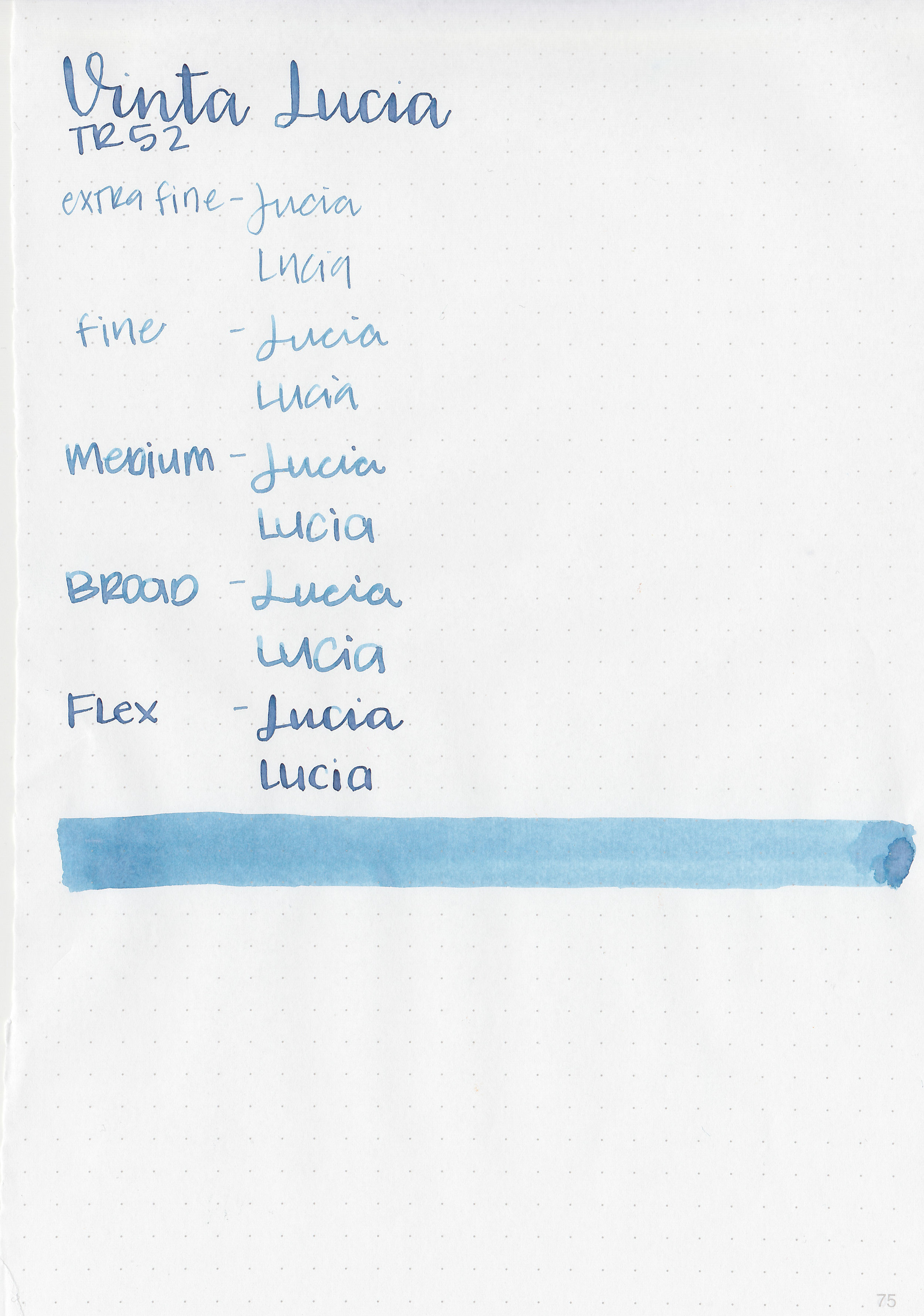
Vinta Deepwater Blue Lucia 1952 is another ink from the Pastels collection. According to Vinta’s website, “Dyesebel is one of the most important Filipino comic book characters in Philippine history. It was originally created by the Filipino illustrator Mars Ravelo. Lucia is the name of Dyesebel's mother. She was obsessed with collecting and gazing at artistic depictions of mermaids while she was pregnant, so the baby (Dyesebel) was born with what looked like a fishtail instead of legs. Dyesebel's first appearance in the comics was in 1952.” Thanks to Vanness Pens for sending a sample over for review.

vnt-lucia-1.jpg

The color:

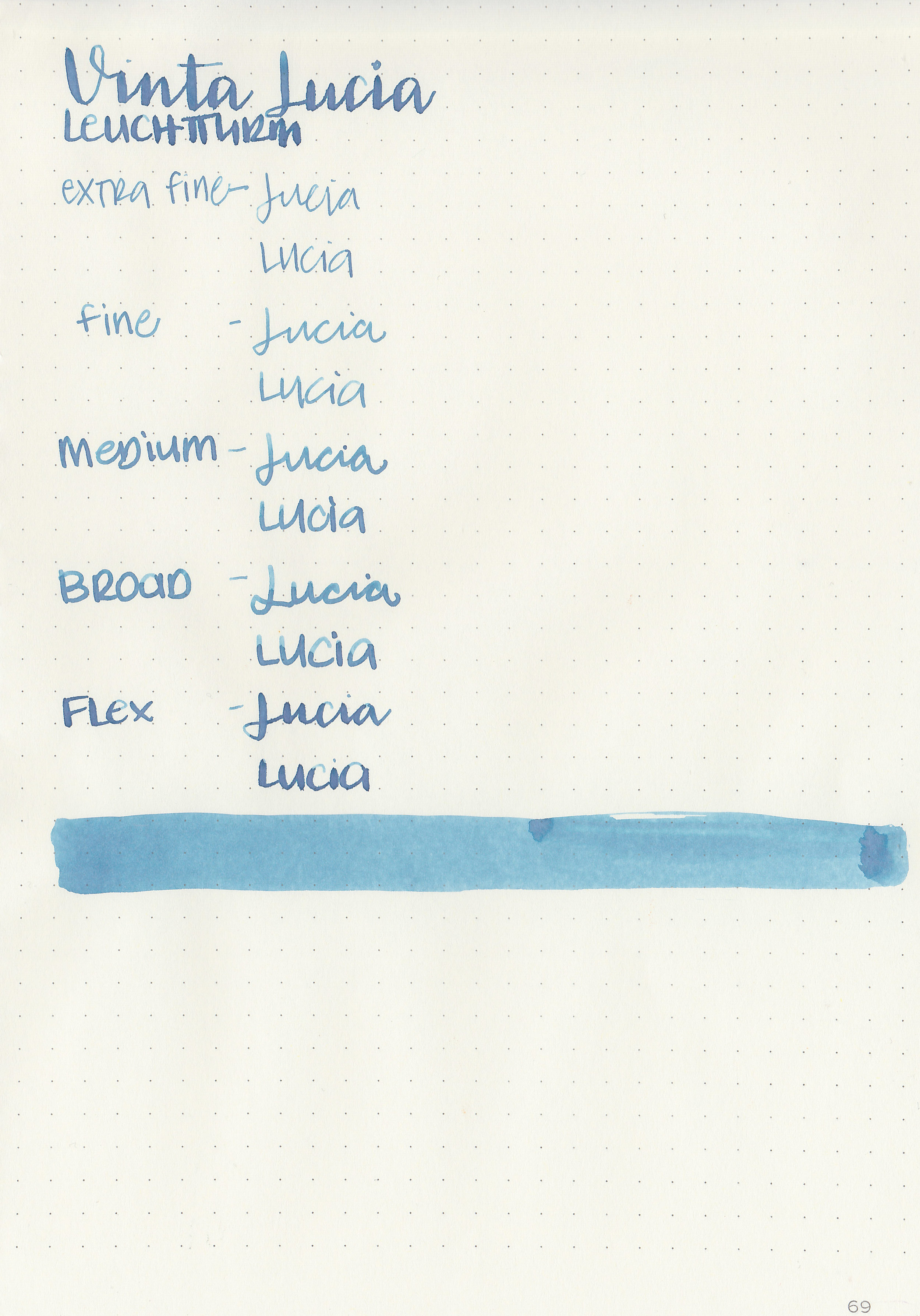
Lucia is a beautiful medium dusky blue. I love dusky blues and this one is gorgeous.

Swabs:

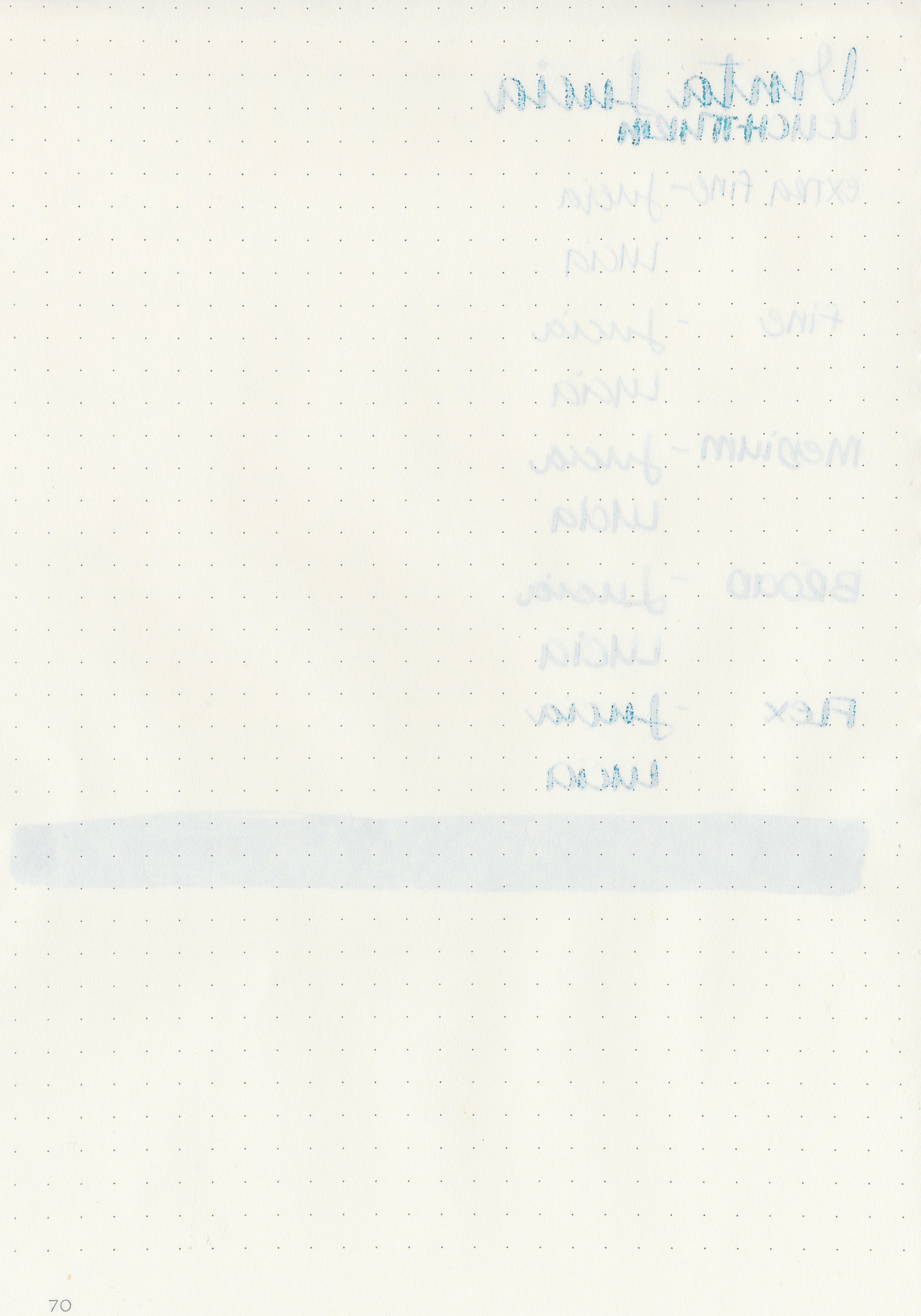
vnt-lucia-3.jpg

In large swabs on Tomoe River paper the ink shows off the pinkish undertone.

vnt-lucia-4.jpg

Writing samples:

Let's take a look at how the ink behaves on fountain pen friendly papers: Rhodia, Tomoe River, and Leuchtturm.

Dry time: 20 seconds

Water resistance: Low

Feathering: Low-there was some feathering in the flex nib on Rhodia and Leuchtturm

Show through: Medium

Bleeding: Low-there was some bleeding in the flex nib.

Other properties: medium shading, no sheen, and no shimmer.

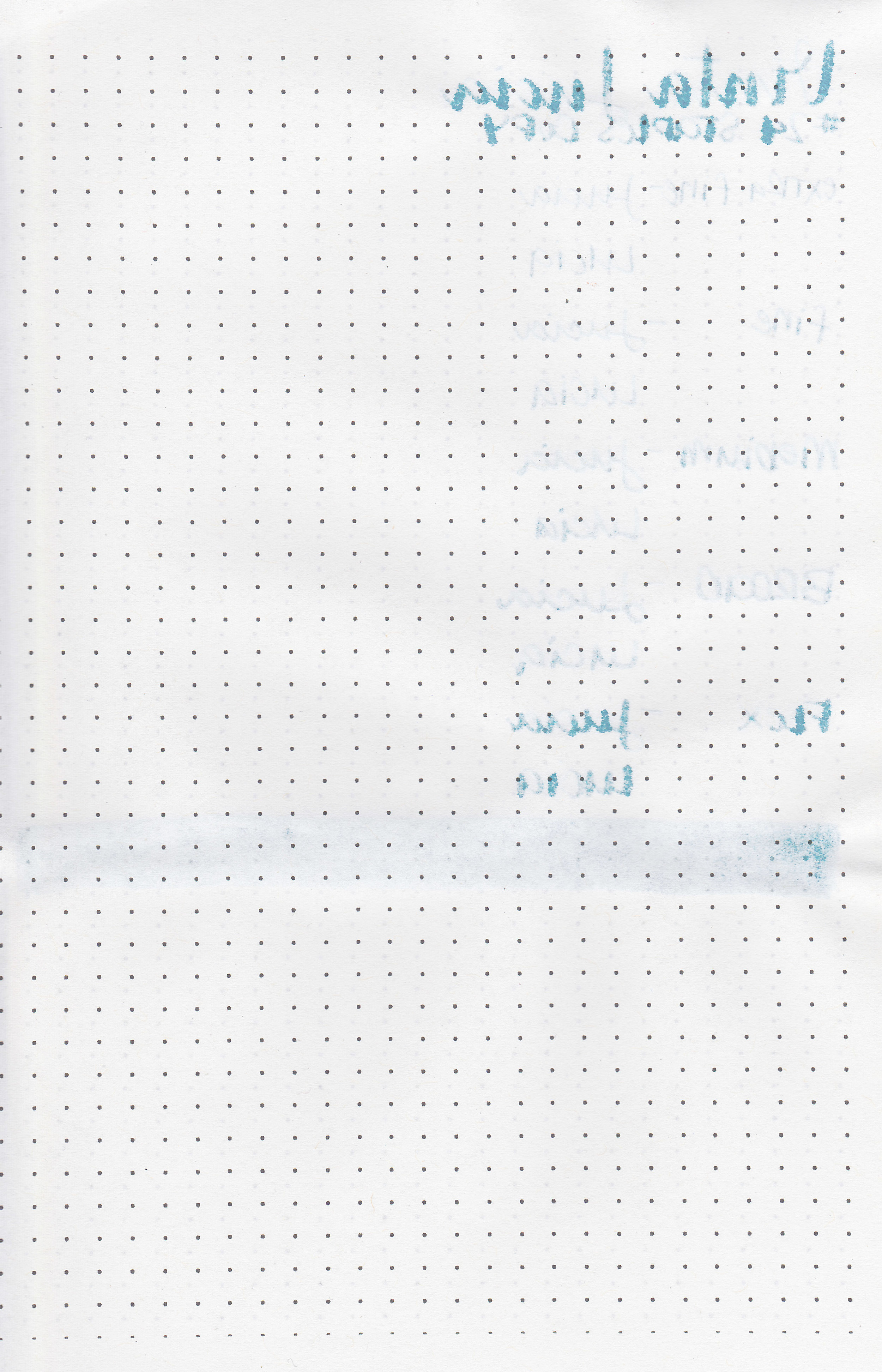
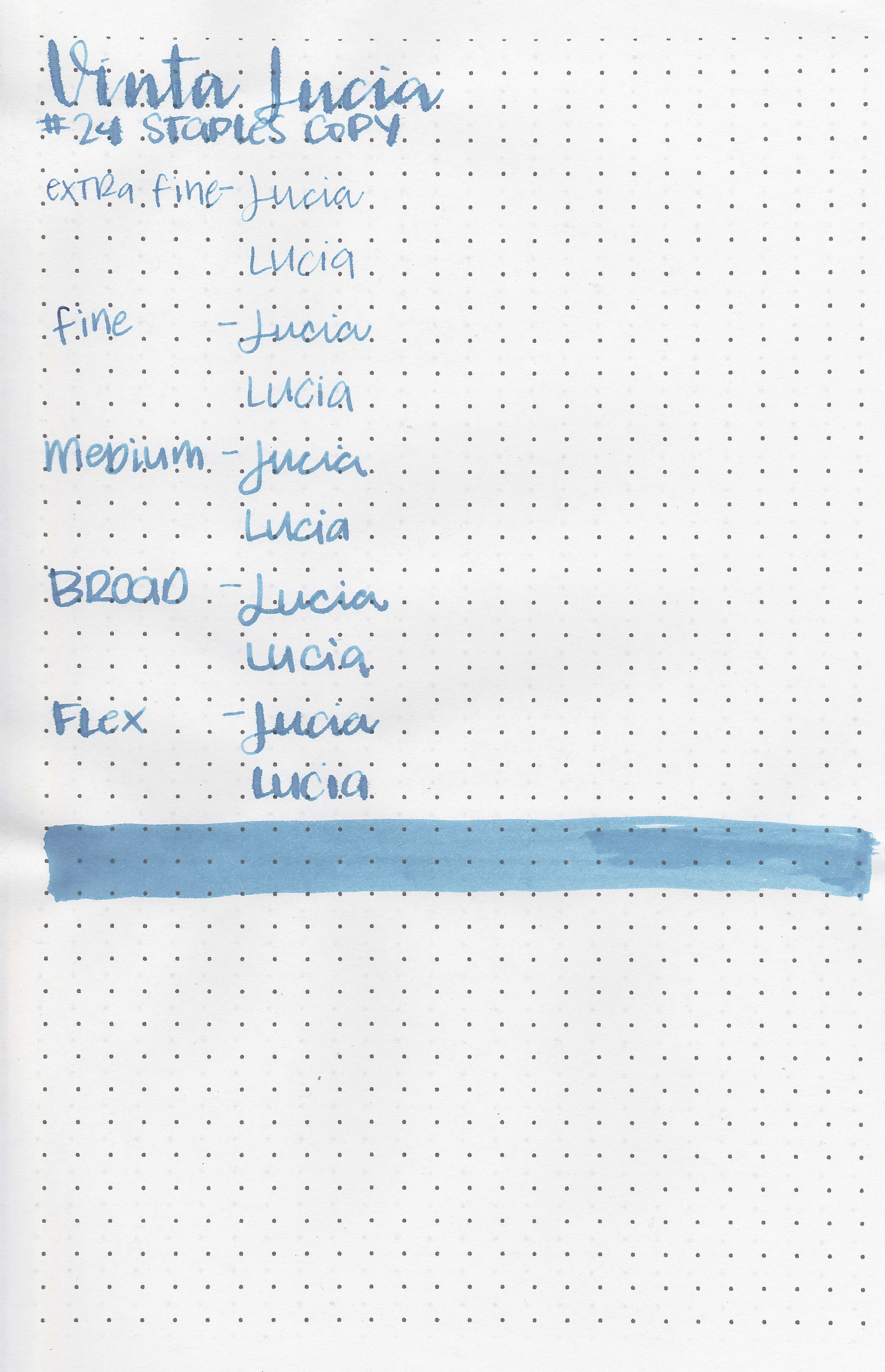
On Staples 24 lb copy paper the ink feathered in all nib sizes and had a little bit of bleeding.

Comparison Swabs:

vnt-lucia-s-1.jpg

Lucia is similar to Sailor Ink Studio 340, and is lighter than Robert Oster Evening Sapphire and Grey Seas. Click here to see the Vinta inks together, and click here to see the blue inks together.

Longer Writing:

vnt-lucia-s-2.jpg

I used a Pelikan M600 Turquoise with a broad nib on Tomoe River paper. The ink had an average flow.

Overall, I really enjoy this ink. Unlike other Vinta pastel inks I’ve tried, I found this ink readable even in an extra-fine nib. The color is beautiful and has some nice shading. I think I need to pick up a full bottle of this ink from Vanness Pens at the San Francisco Pen Show next week.

Disclaimer: A sample of this ink was provided by Vanness Pens for the purpose of this review. All photos and opinions are my own. This page does not contain affiliate links, and this post is not sponsored in any way.

Ink Review #826: Vinta Armada

vnt-armada-10.jpg

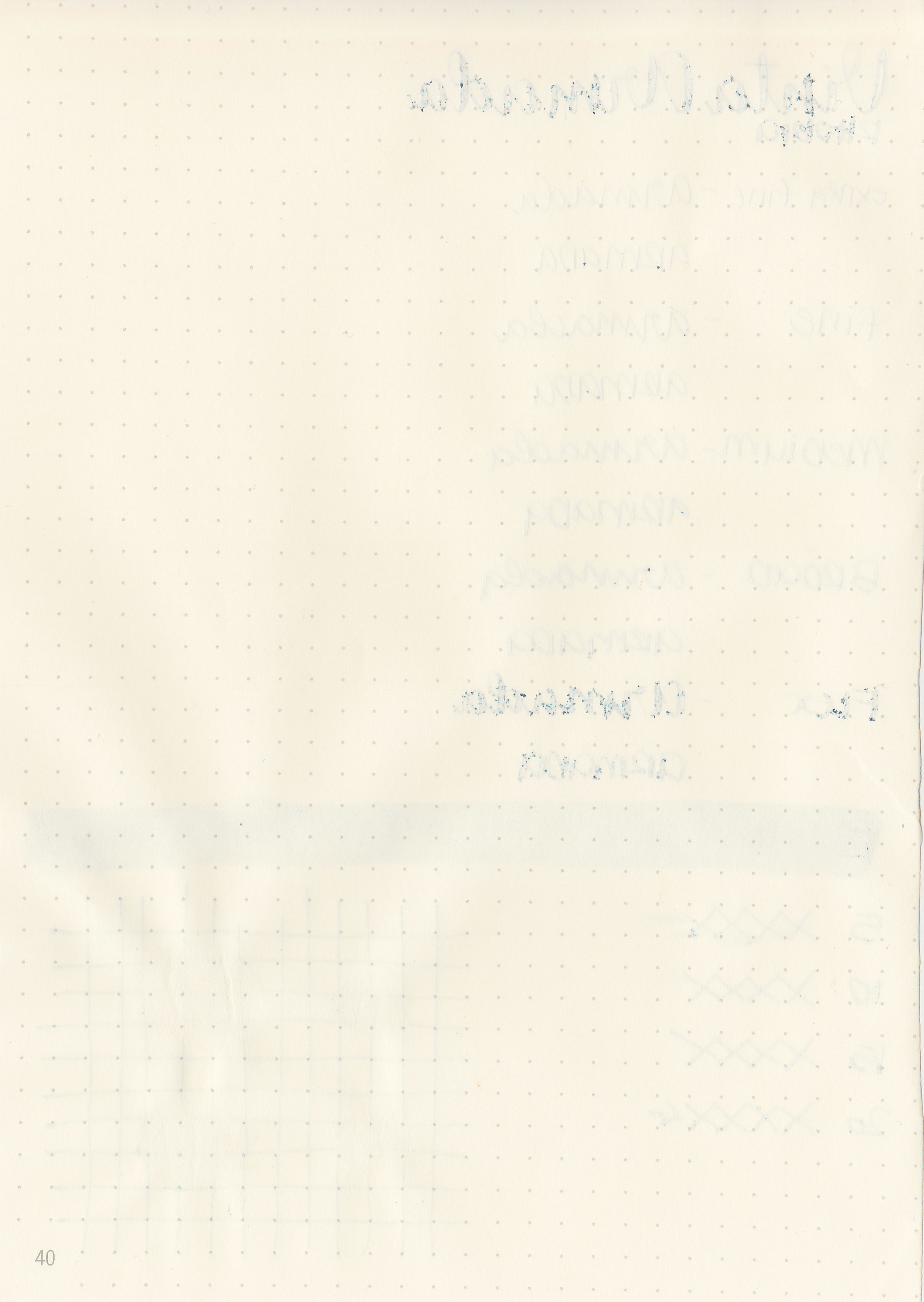
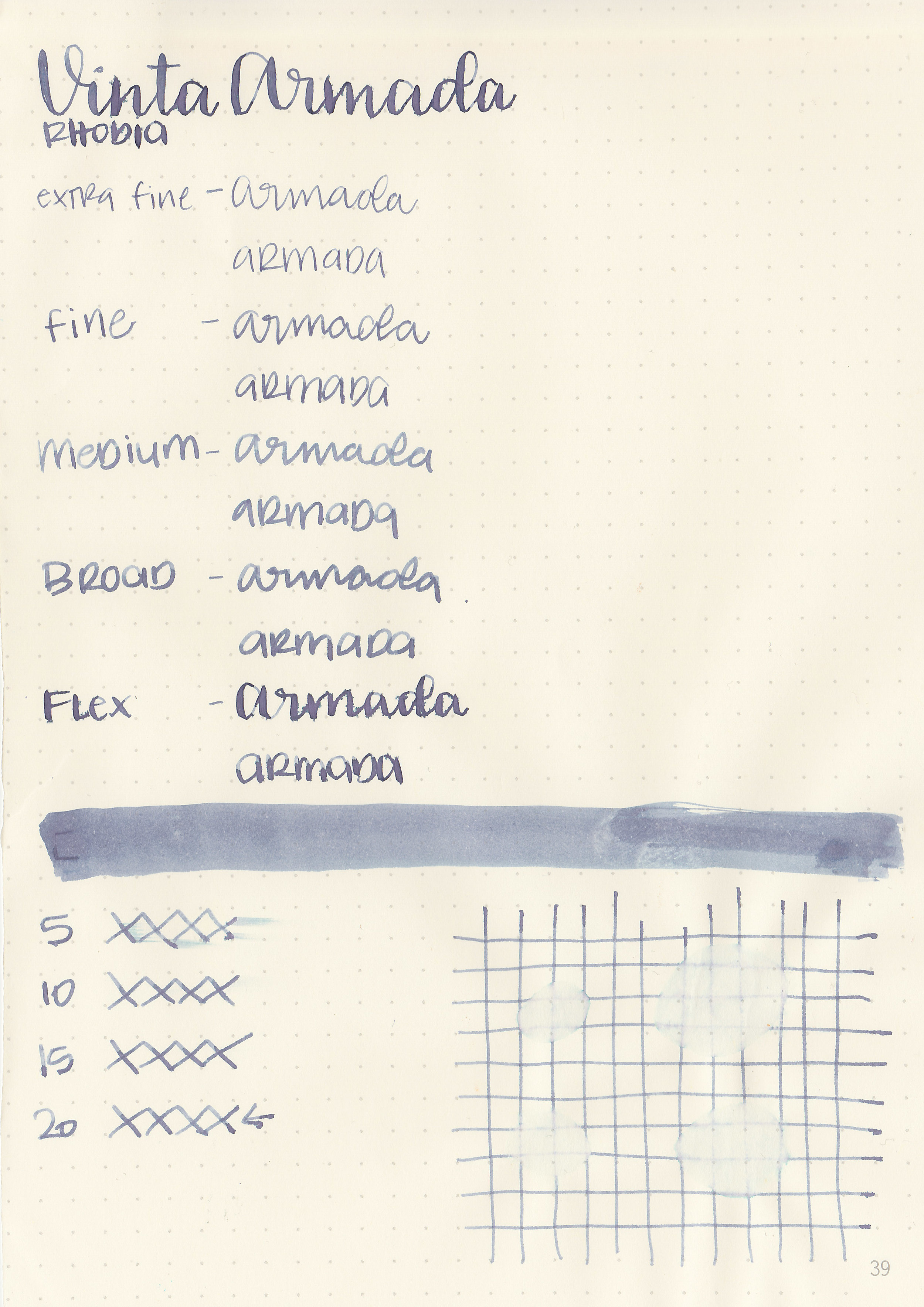
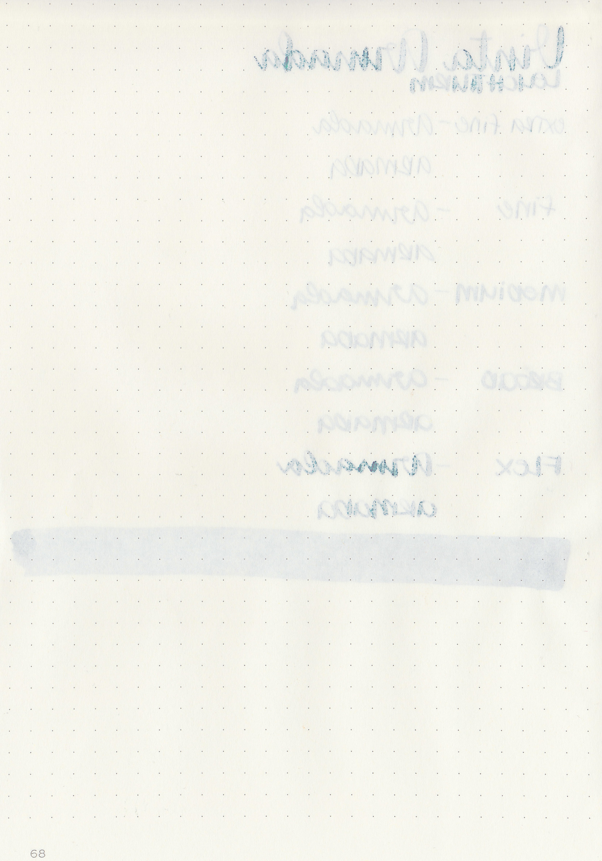
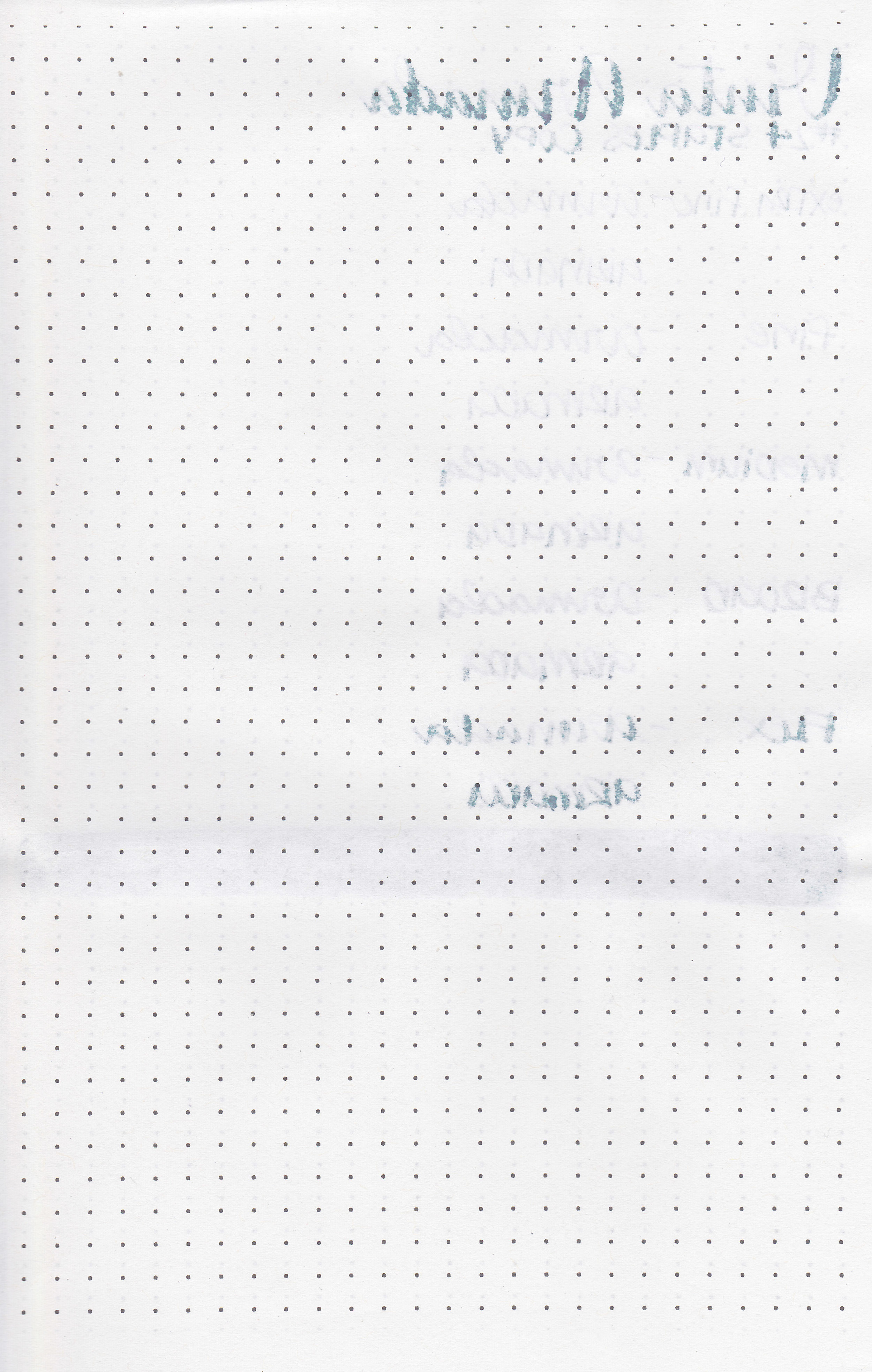
Vinta Aegean Armada 1944 from the Pastels collection is a really interesting color. It’s green when wet, then dries to a grey with a strong purple tone and a little bit of blue as well. According to Vinta’s website, “Armada is a fleet of warships. Throughout time, we've seen how the multitude of ships on sea can transform its color from grey to blue to everything in between. The biggest naval war in history is the Battle of Leyte in 1944.” Thanks to Vanness Pens for sending a sample in for review.

vnt-armada-9.jpg

The color:

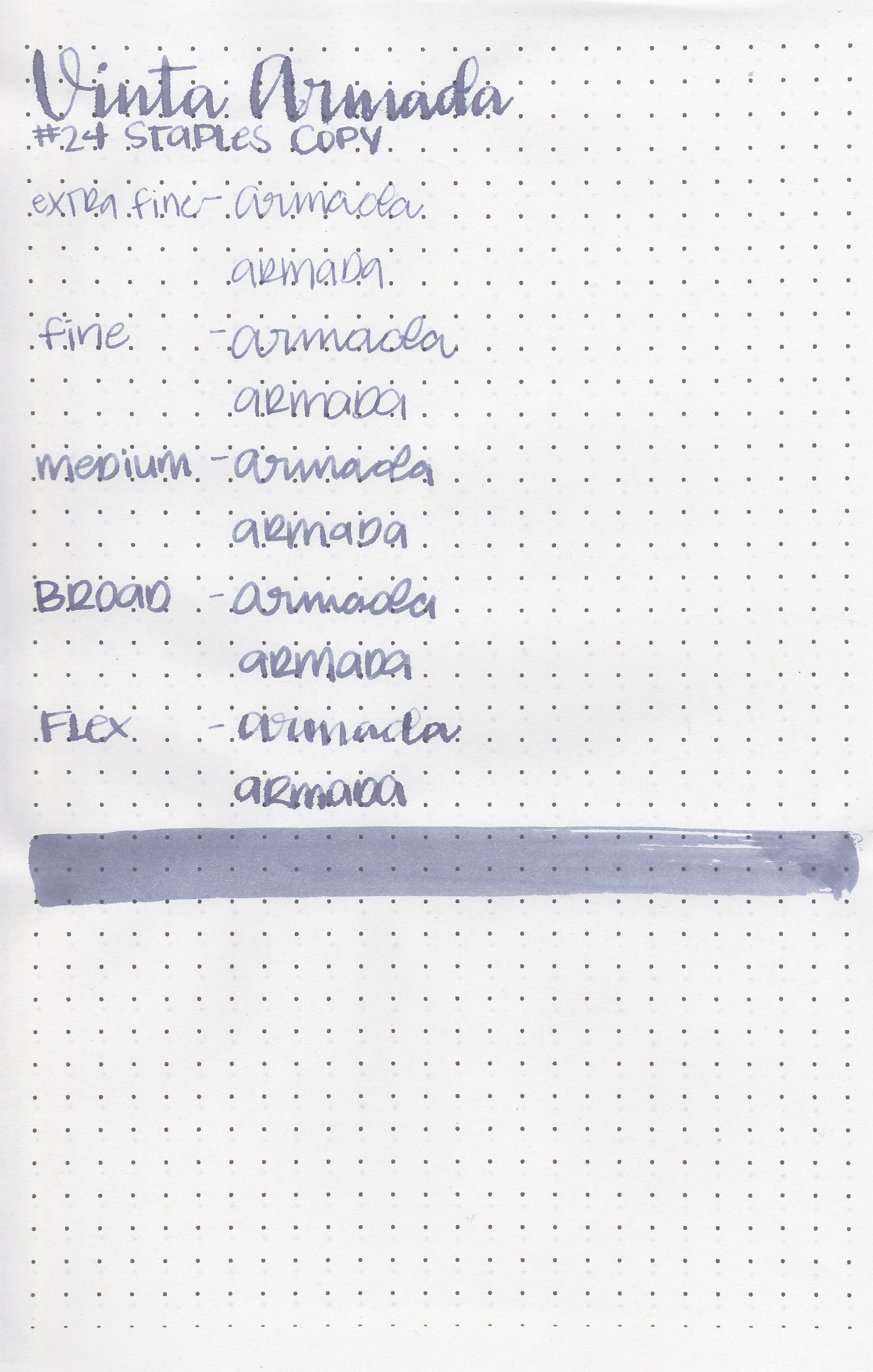
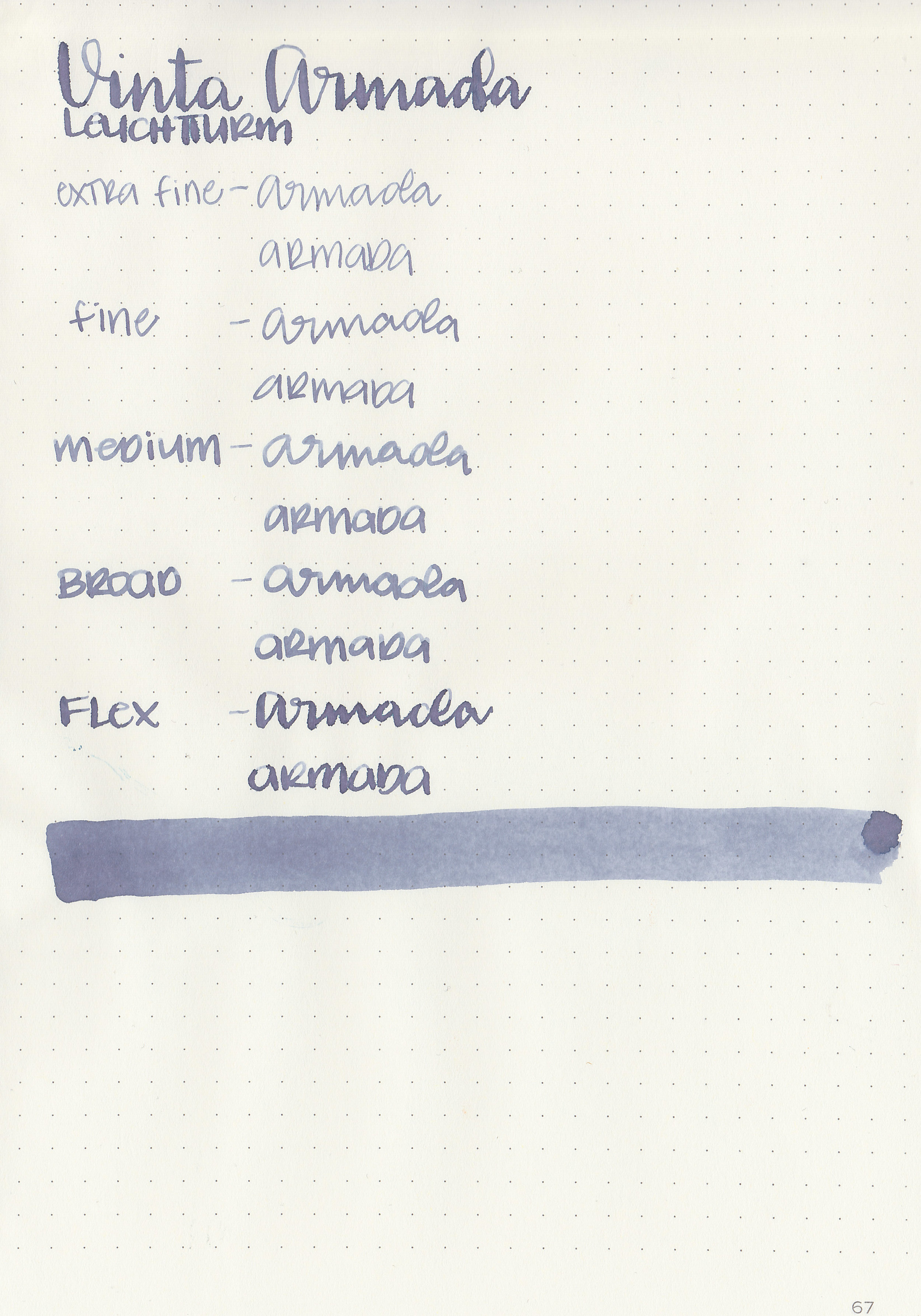
Armada is a greyish-purple. Depending on the lighting it can look more grey or purple.

Swabs:

vnt-armada-11.jpg

In large swabs on Tomoe River paper you mostly see the purple, not much grey.

vnt-armada-12.jpg

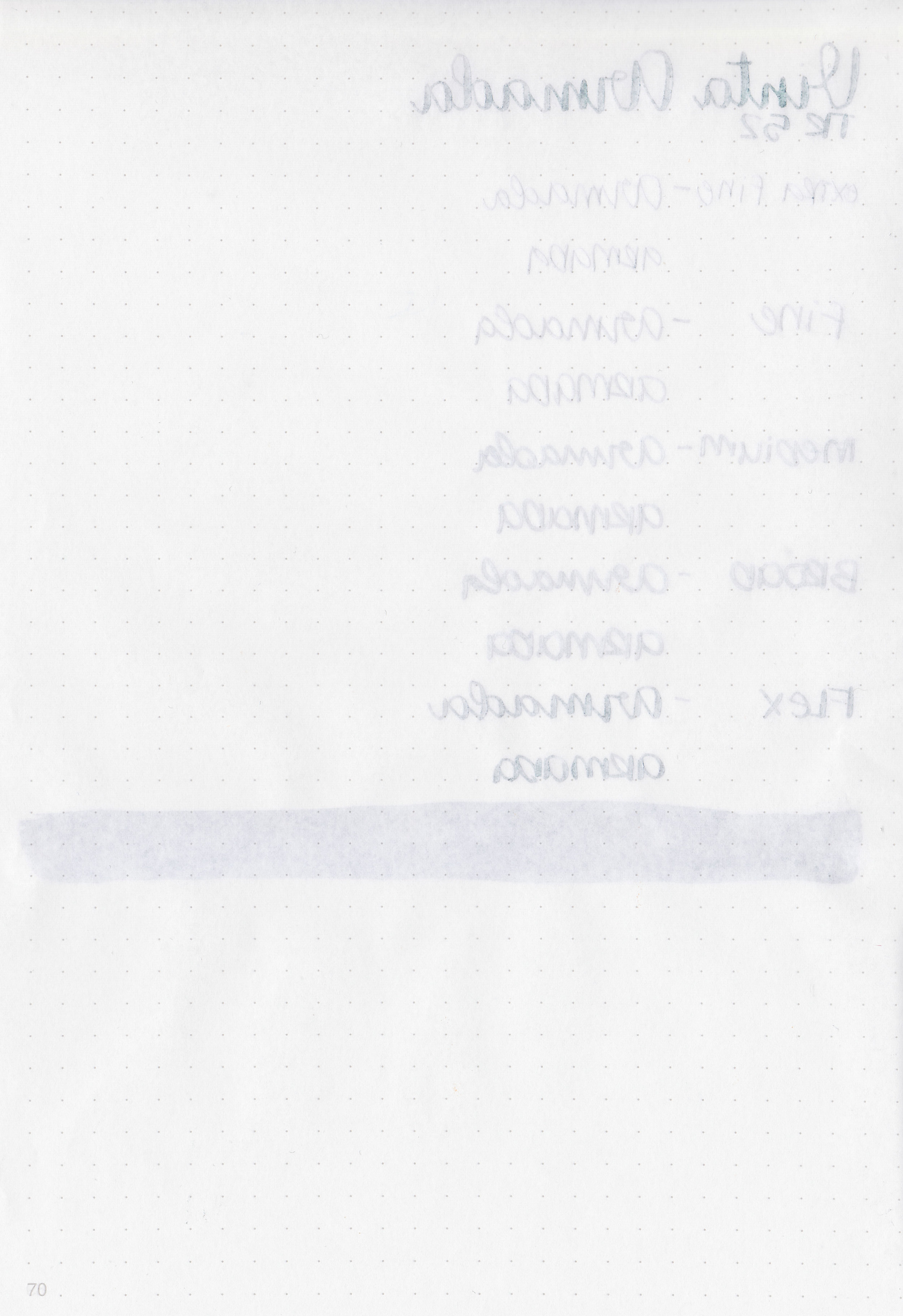
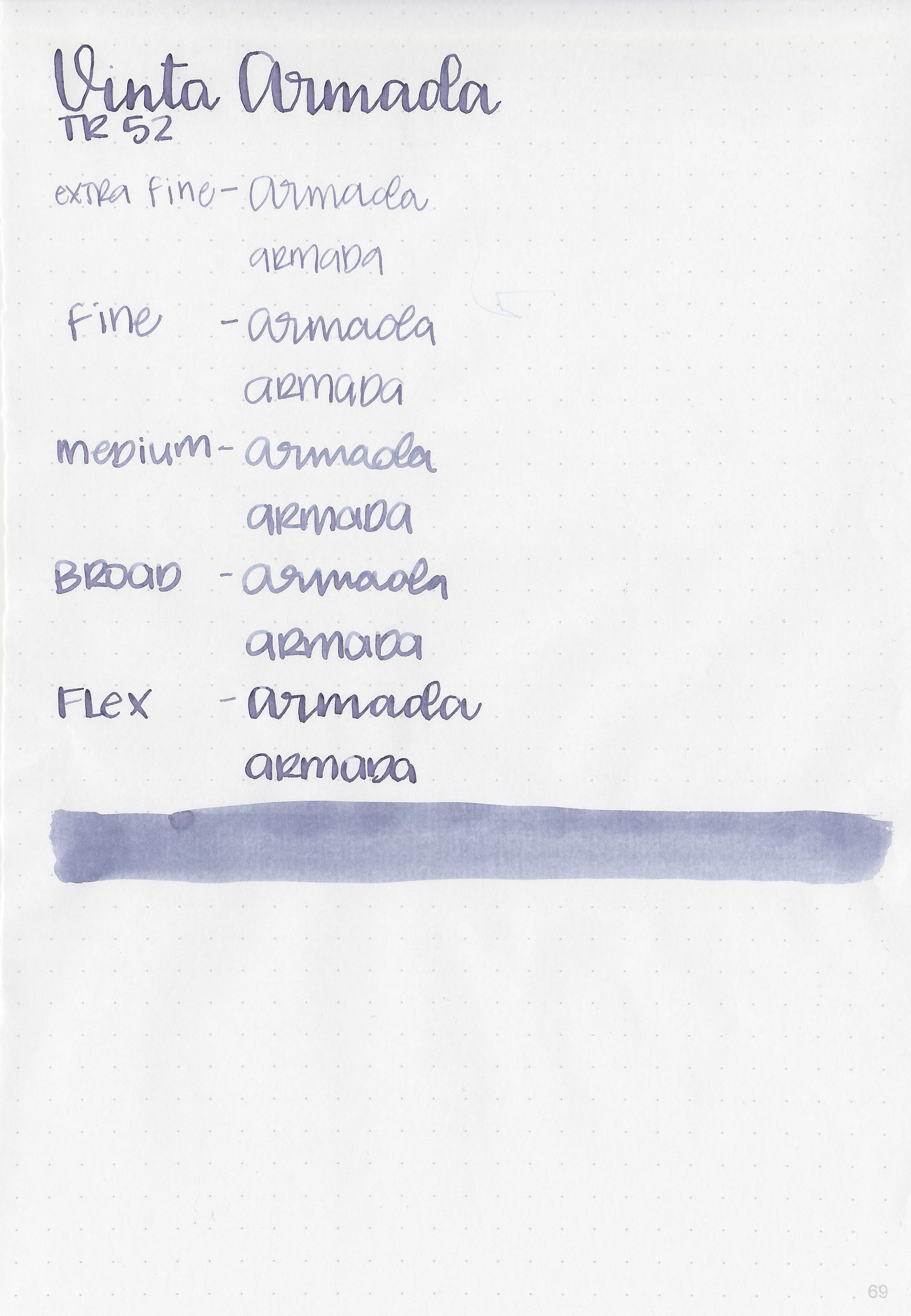
Writing samples:

Let's take a look at how the ink behaves on fountain pen friendly papers: Rhodia, Tomoe River, and Leuchtturm.

Dry time: 20 seconds

Water resistance: Low

Feathering: Low-there was some feathering in the flex nib on Rhodia and Leuchtturm

Show through: Medium

Bleeding: Low-there was some bleeding in the flex nib.

Other properties: medium shading, no sheen, and no shimmer.

On Staples 24 lb copy paper the ink feathered in all nib sizes and had a little bit of bleeding.

Comparison Swabs:

vnt-armada-s-1.jpg

Armada is similar to Colorverse Anti-matter, but it is a bit lighter. In writing it does remind me a bit of Sailor Ink Studio 123, but it has more blue than green in it. Click here to see the Vinta inks together, and click here to see the grey inks together.

Longer Writing:

vnt-armada-s-2.jpg

I used a Franklin-Christoph 45 Italian Ice with a medium nib on Tomoe River paper. The ink had a slightly dry flow.

Overall, from the Vinta pastel inks I’ve tried so far this one is the most useable. I love that the ink has so many undertones: purple, blue and green, as well as some pretty shading. I think I might need a full bottle of this ink just because the color is so interesting.

Disclaimer: A sample of this ink was provided by Vanness Pens for the purpose of this review. All photos and opinions are my own. This page does not contain affiliate links, and this post is not sponsored in any way.

Ink Review #825: Pelikan Edelstein Ruby

pe-ruby-2.jpg

Pelikan Edelstein Ruby is part of the Edelstein standard lineup, one I’ve been meaning to try for a long time. Thanks to Pen Chalet for sending a bottle over for review.

pe-ruby-1.jpg

The color:

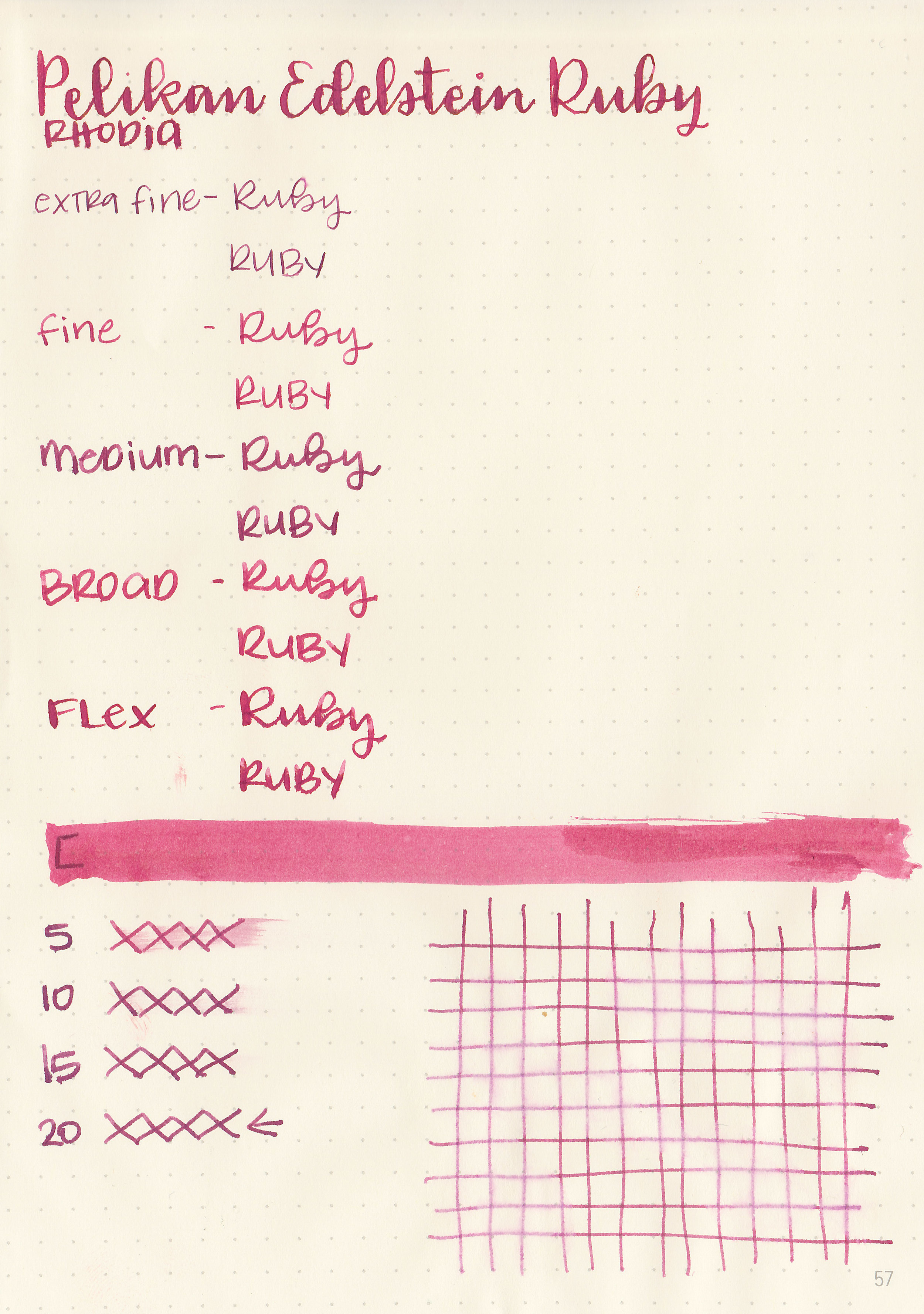
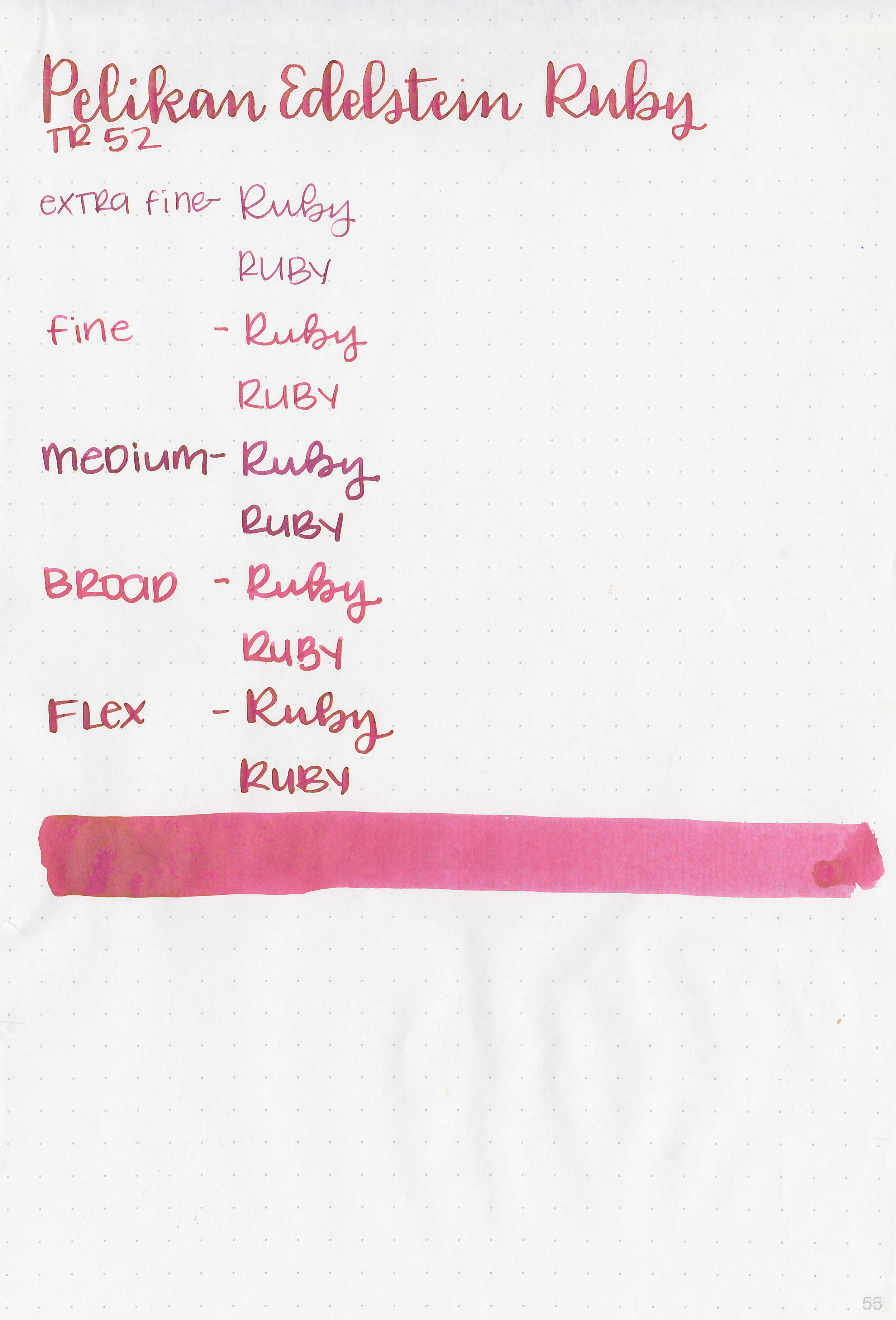
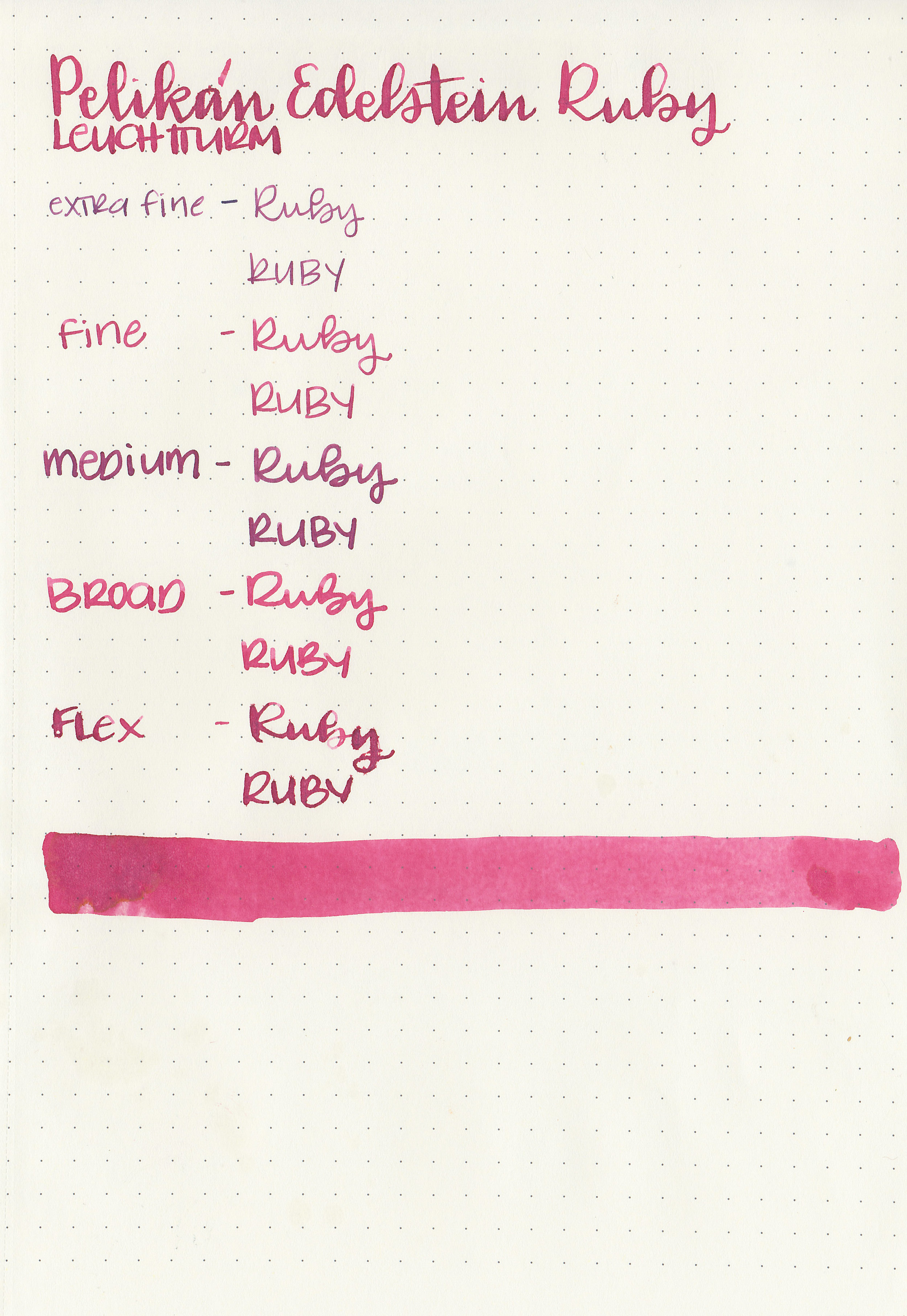
Ruby is a medium red with a slight pink tone.

Swabs:

pe-ruby-3.jpg

In large swabs on Tomoe River paper the ink turns brown where pooled, but it doesn’t actually sheen.

pe-ruby-4.jpg

Writing samples:

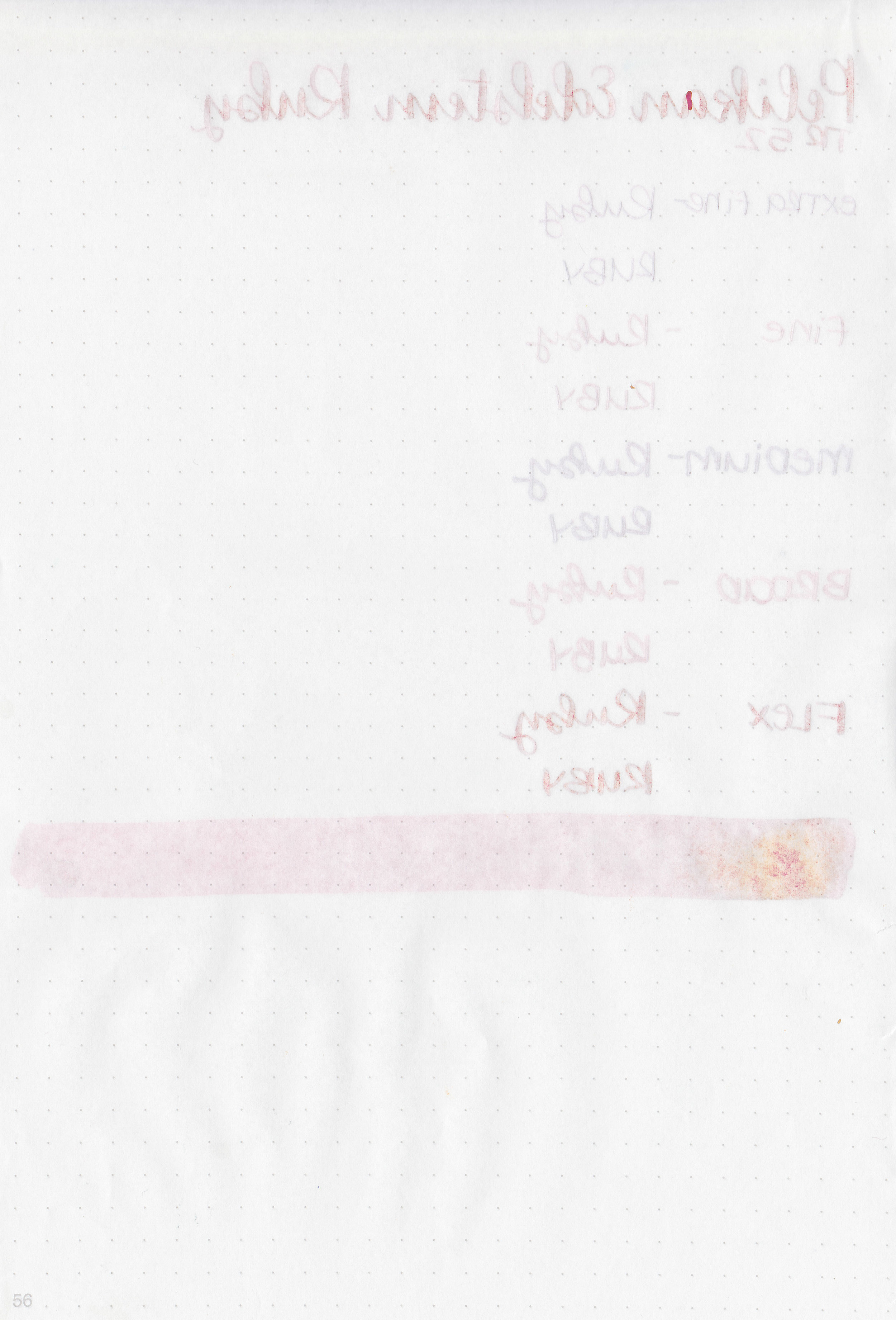
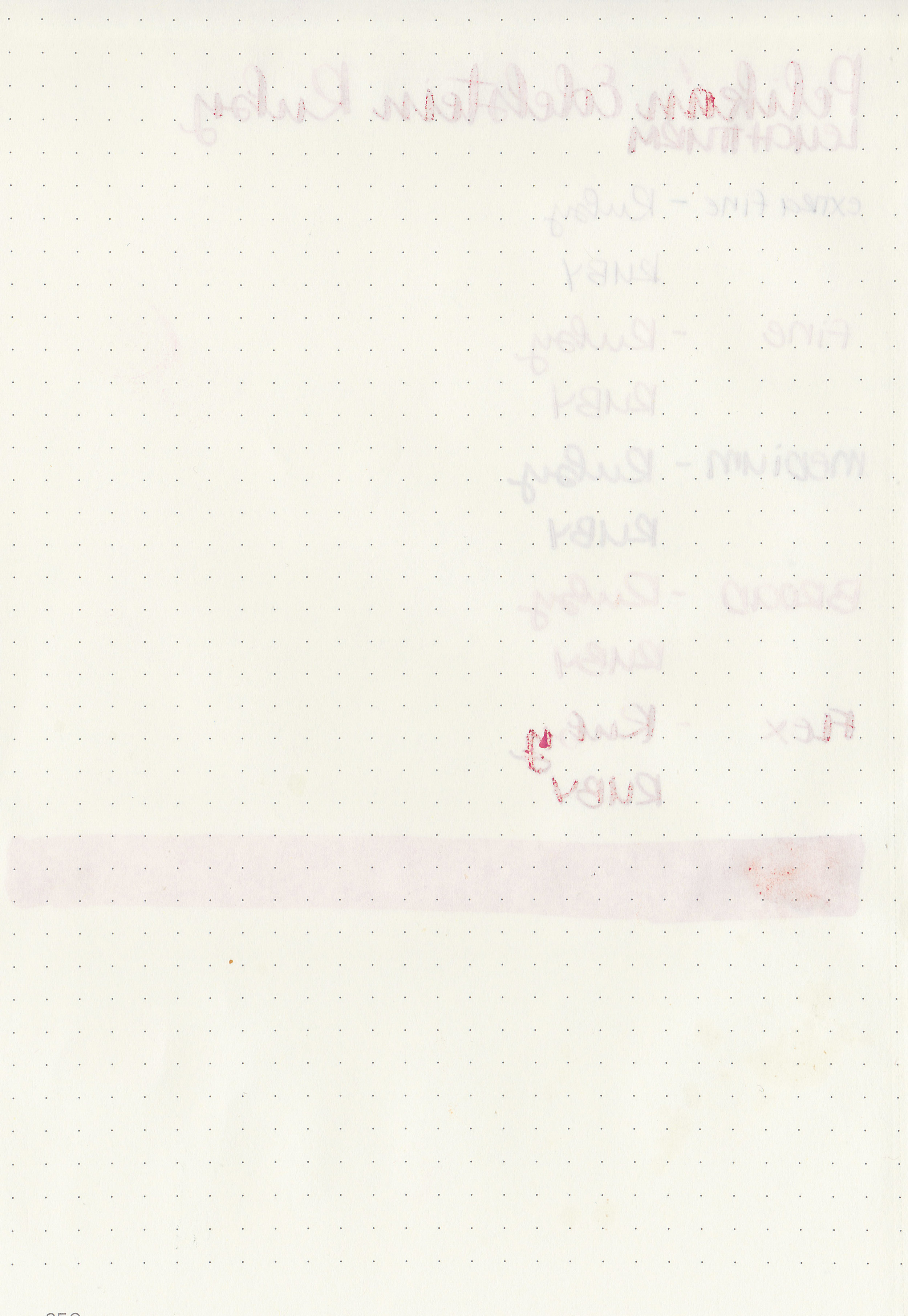
Let's take a look at how the ink behaves on fountain pen friendly papers: Rhodia, Tomoe River, and Leuchtturm.

Dry time: 20 seconds

Water resistance: Medium

Feathering: Low-there was some feathering in the flex nib on Rhodia.

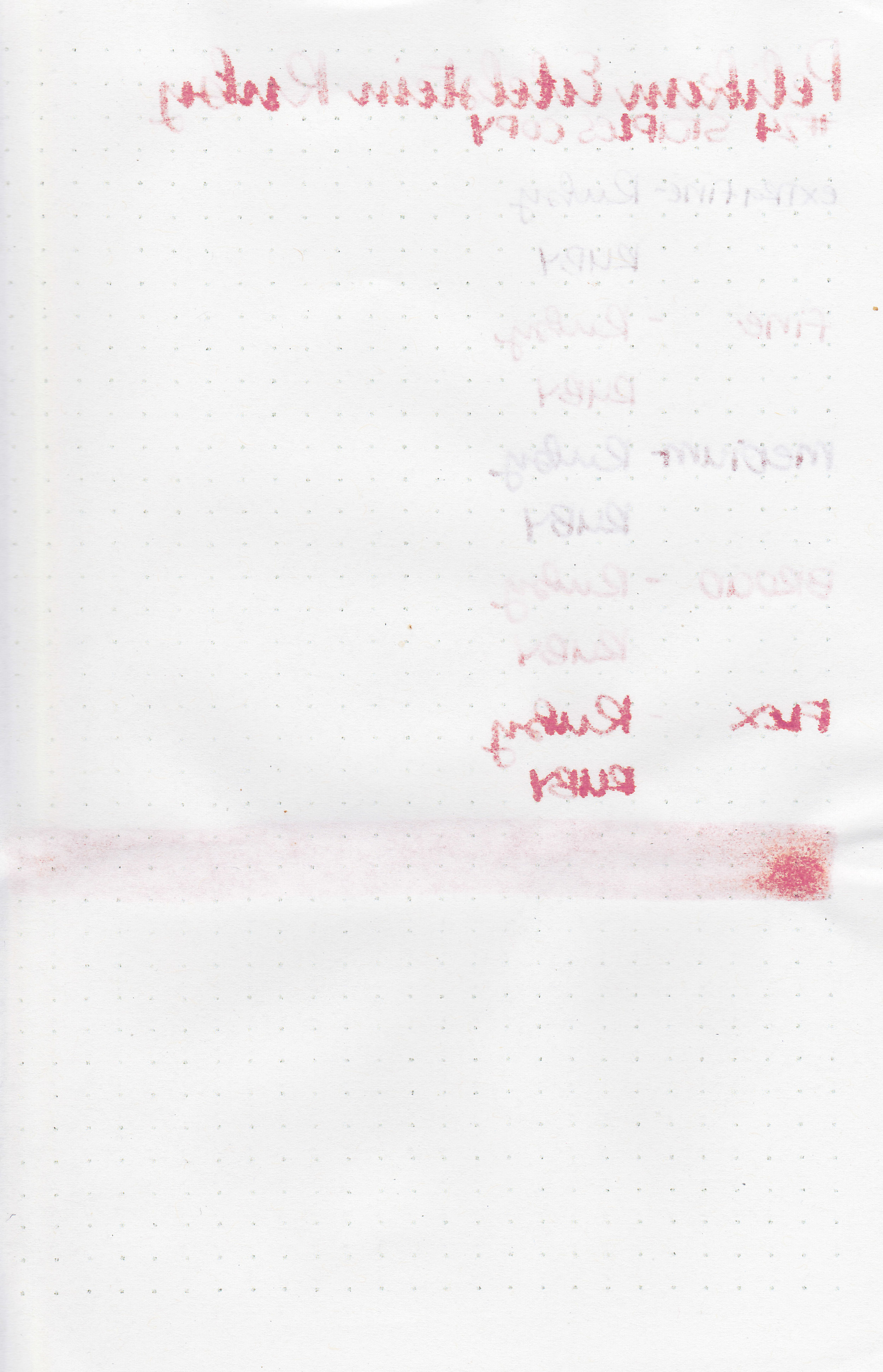
Show through: Medium

Bleeding: Low-there was some bleeding in the flex nib.

Other properties: low shading, no sheen, and no shimmer.

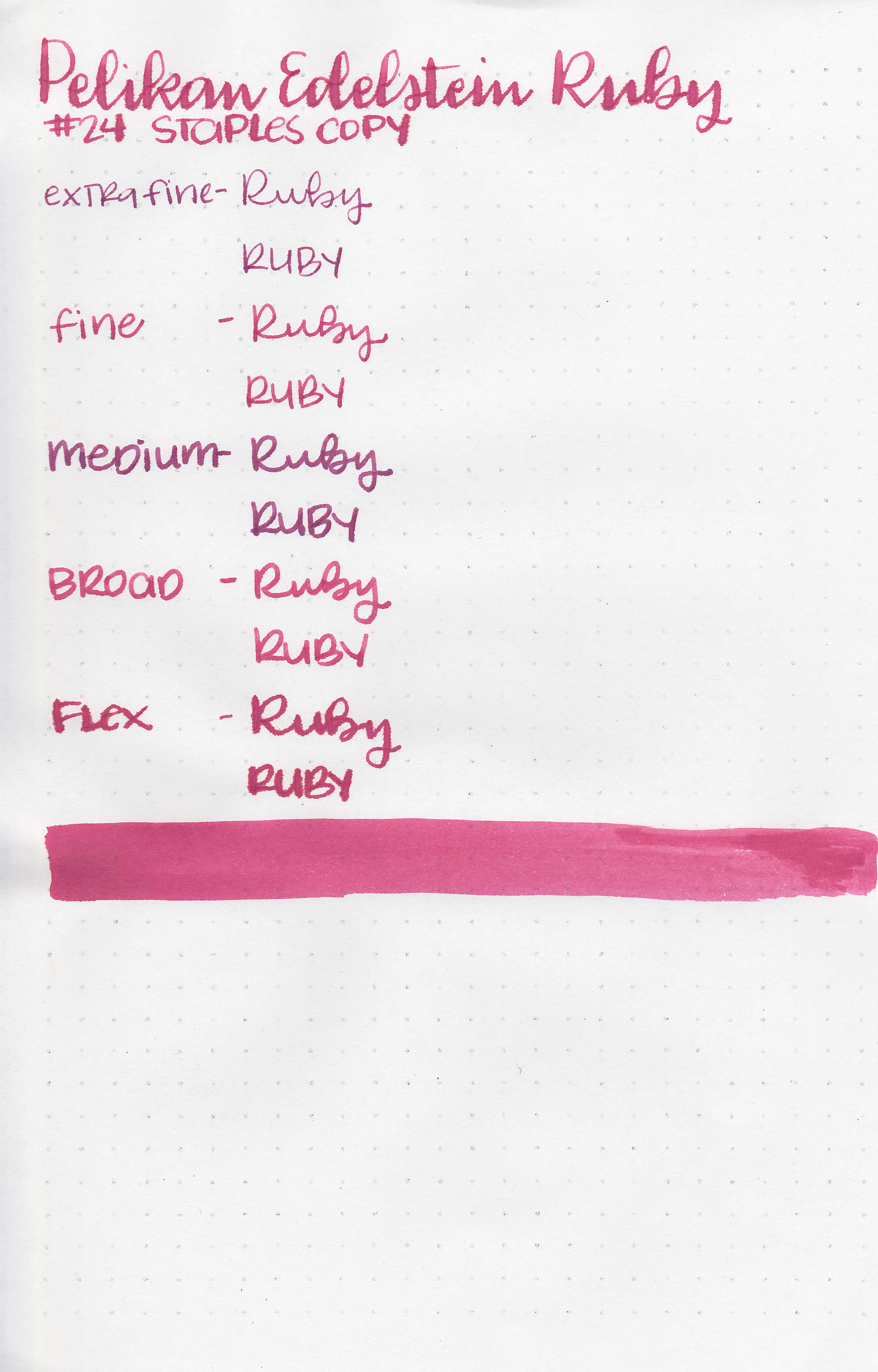
On Staples 24 lb copy paper the ink feathered in all nib sizes and had a little bit of bleeding.

Comparison Swabs:

pe-ruby-s-1.jpg

Ruby reminds me of Sailor Ink Studio 530. Click here to see the Pelikan inks together, and click here to see the red inks together.

Longer Writing:

pe-ruby-s-2.jpg

I used a Pilot Vanishing Point Crimson Sunrise with a broad nib on Midori MD. The ink had a slightly dry flow. After about 8 lines I primed the feed a bit because it just felt too dry.

Overall, I like the slight pink tone to it. It does have a bit more bleeding and feathering than I like, but I do enjoy the color. I need to get some of this year’s Pelikan Edelstein Star Ruby so I can see how it compares to Ruby.

Disclaimer: This ink was provided by Pen Chalet for the purpose of this review. All photos and opinions are my own. This page does contain affiliate links, but this post is not sponsored in any way.

Ink Review #824: Vinta Perya

vnt-perya-w-2.jpg

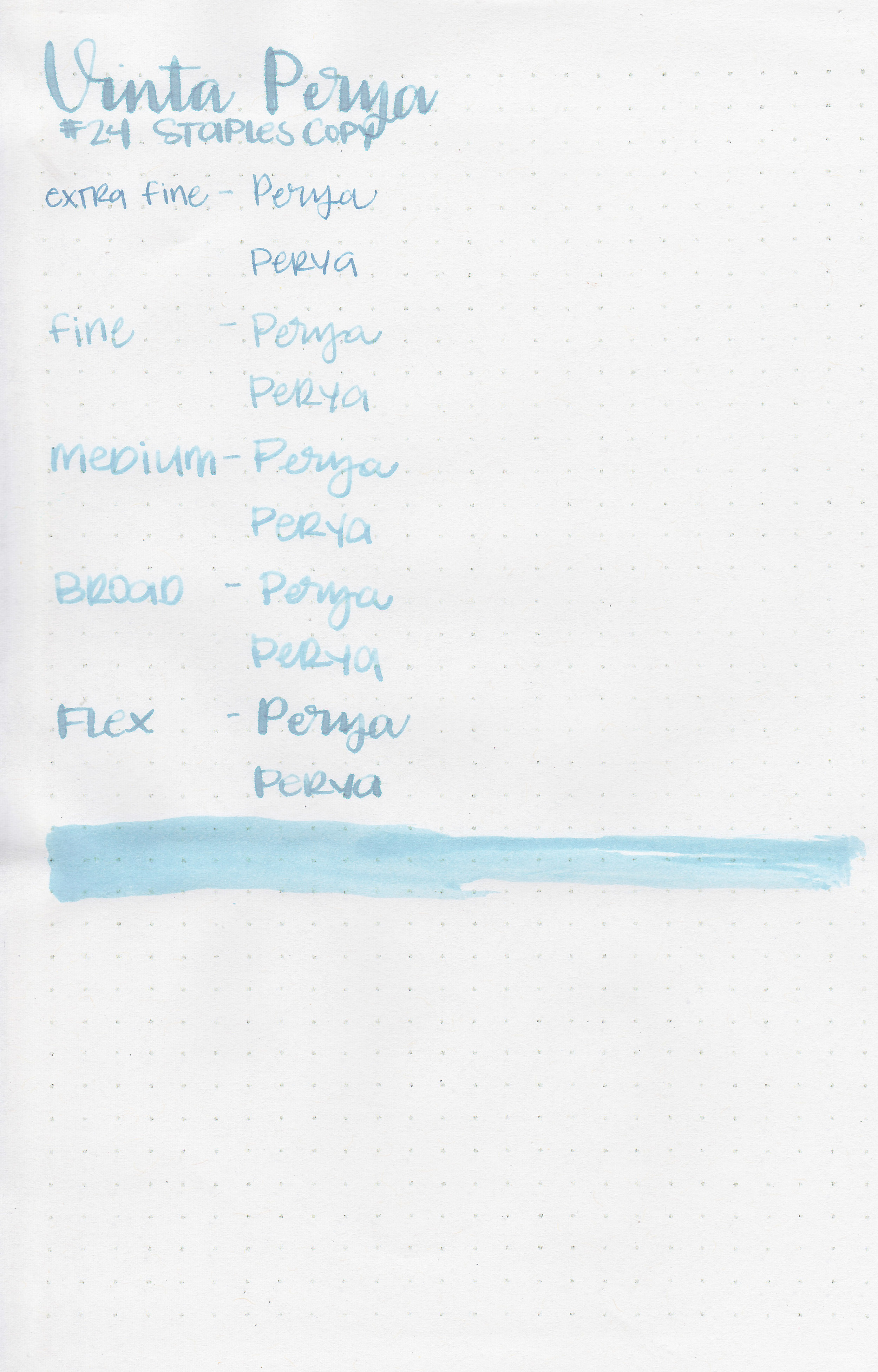
Vinta Blue Floss Perya 1820 is a pale, unsaturated blue, it belongs to Vinta’s Series 2 Pastel collection. According to Vinta’s website: “One of the most beautiful parks in Manila is Luneta Park built in 1820. It is now known as Rizal Park, named after the national hero of the Philippines, Jose Rizal. Very near the pier, many children and adults enjoy blue cotton candy as they stroll along the park.” Thanks to Vanness Pens for sending a sample over for review.

vnt-perya-w-1.jpg

The color:

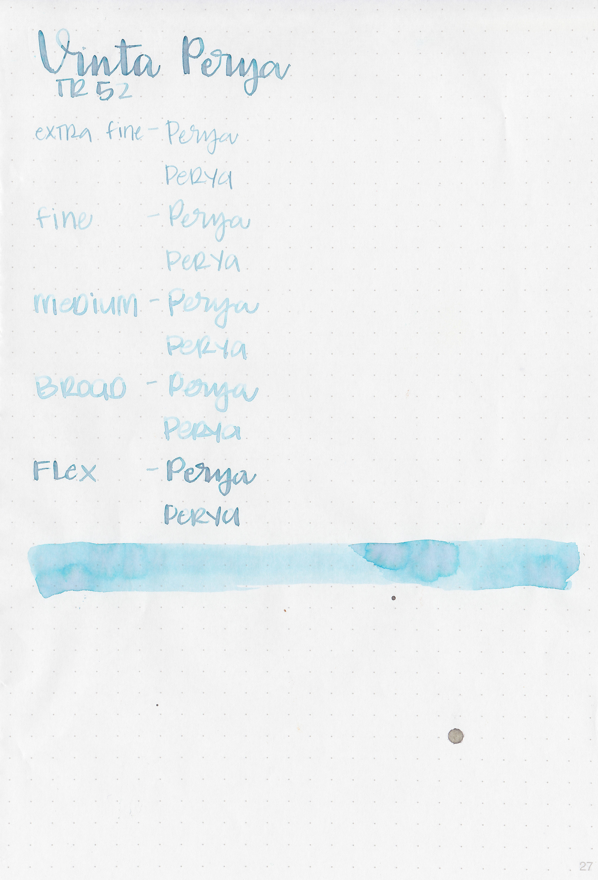
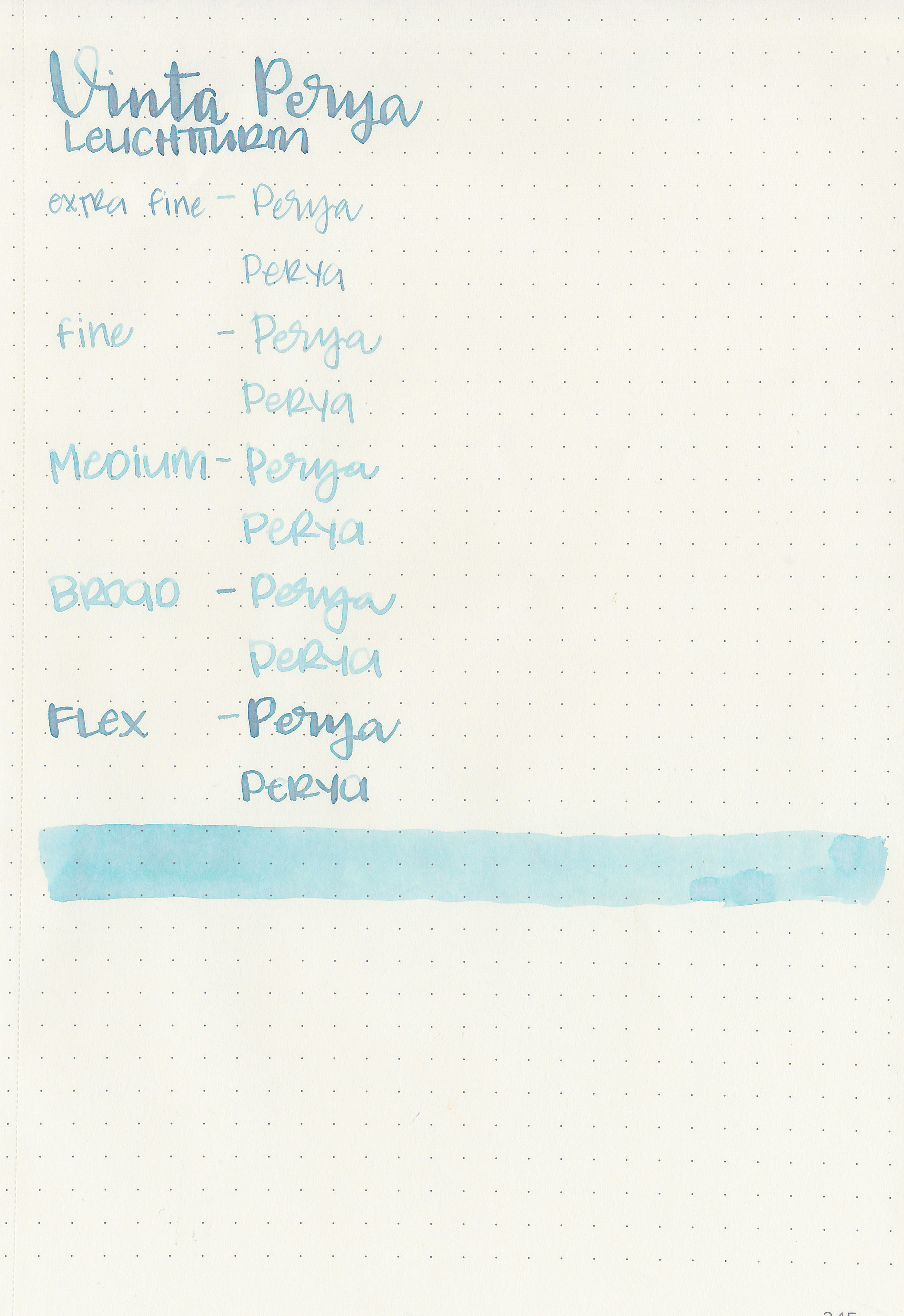
Perya is a light, almost baby blue. Depending on the paper, this ink shifts from blue to pink and green.

Swabs:

vnt-perya-w-3.jpg

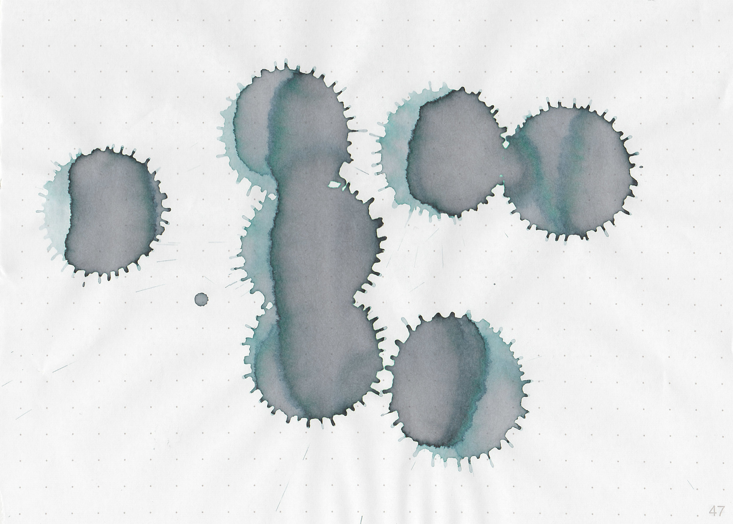
In large swabs on Tomoe River paper you can see the pinks and green undertones.

vnt-perya-w-4.jpg

Writing samples:

Let's take a look at how the ink behaves on fountain pen friendly papers: Rhodia, Tomoe River, and Leuchtturm.

Dry time: 10 seconds

Water resistance: Low

Feathering: Low-there was some feathering in the flex nib on Rhodia.

Show through: Medium

Bleeding: None

Other properties: medium shading, no sheen, and no shimmer. I love that the shading sometimes shifts colors in the same letter-blue at the top of the letter and pinkish-brown at the bottom, but you can only see this in the flex nib.

On Staples 24 lb copy paper the ink feathered in all nib sizes and had a little bit of bleeding.

Comparison Swabs:

vnt-perya-1.jpg

Perya is cooler than J Herbin Diabolo Menthe. Click here to see the blue inks together.

Longer Writing:

vnt-perya-2.jpg

I used a Edison Beaumont Unicorn with a fine nib on Tomoe River paper. The ink had a slightly dry flow. The ink is very pale, hard to read in most lighting.

Overall, it has some nice color shift, but you really only see it if you use a flex nib or huge swab. In writing it is very pale. Like Vinta Sirena that I reviewed yesterday, I would stick to broad or flex nibs with this ink, and even then it can still be rather pale. I was told on Instagram that the Series 2 Pastels are great for highlighting-Mildliner style, and I think it would be a great ink for that, but not great for everyday writing.

Disclaimer: A sample of this ink was provided by Vanness Pens for the purpose of this review. All photos and opinions are my own. This page does not contain affiliate links, and this post is not sponsored in any way.

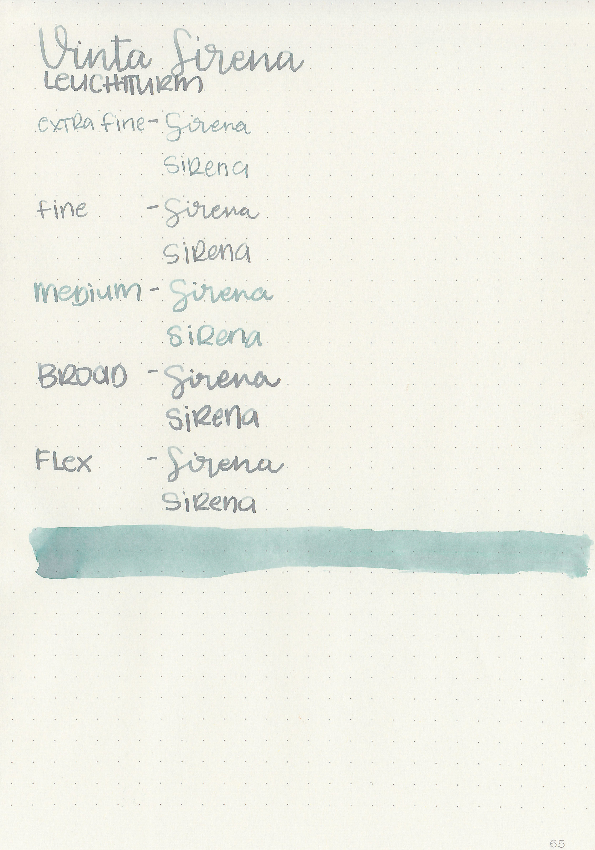
Ink Review #823: Vinta Sirena

vnt-sirena-w-2.jpg

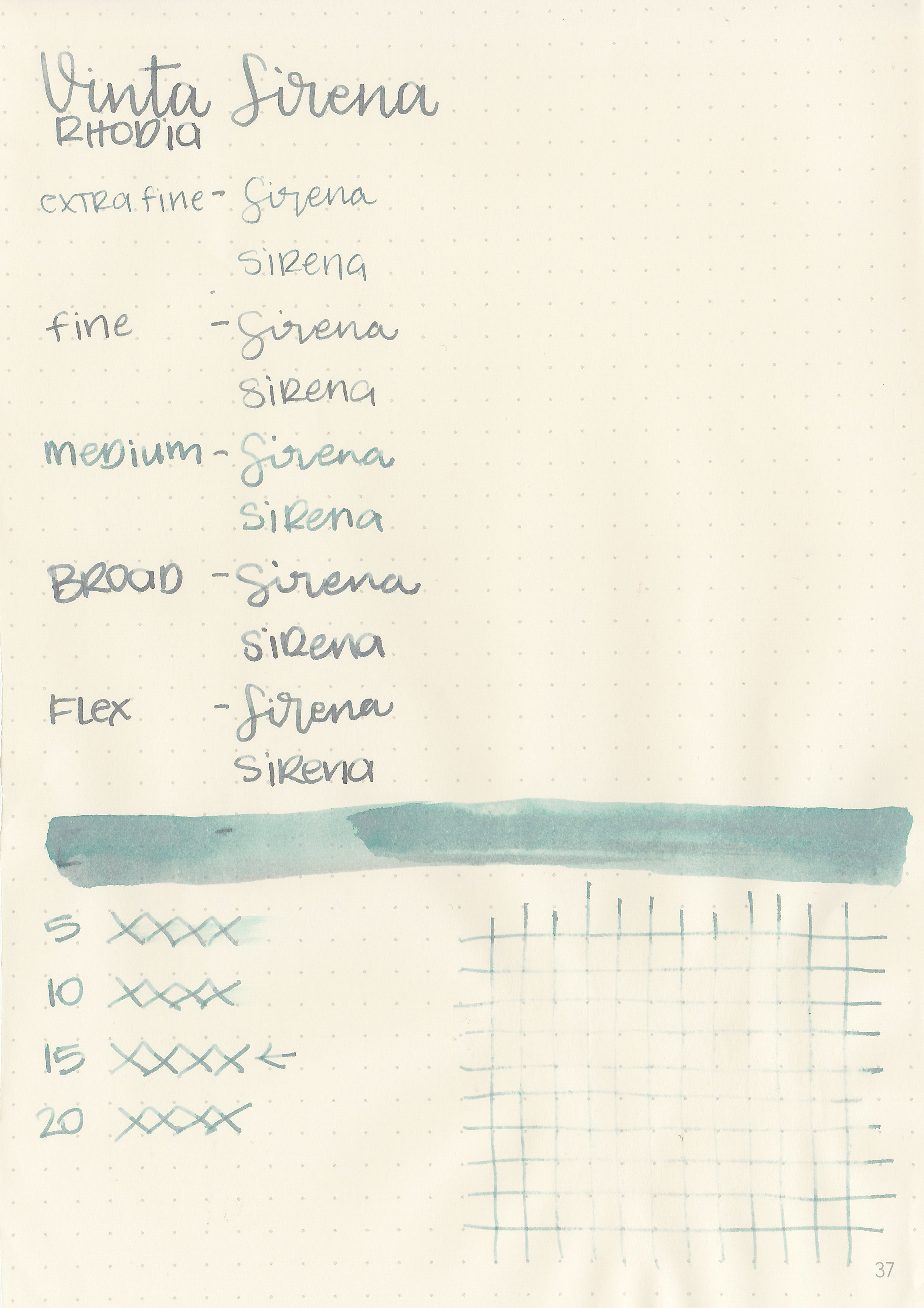
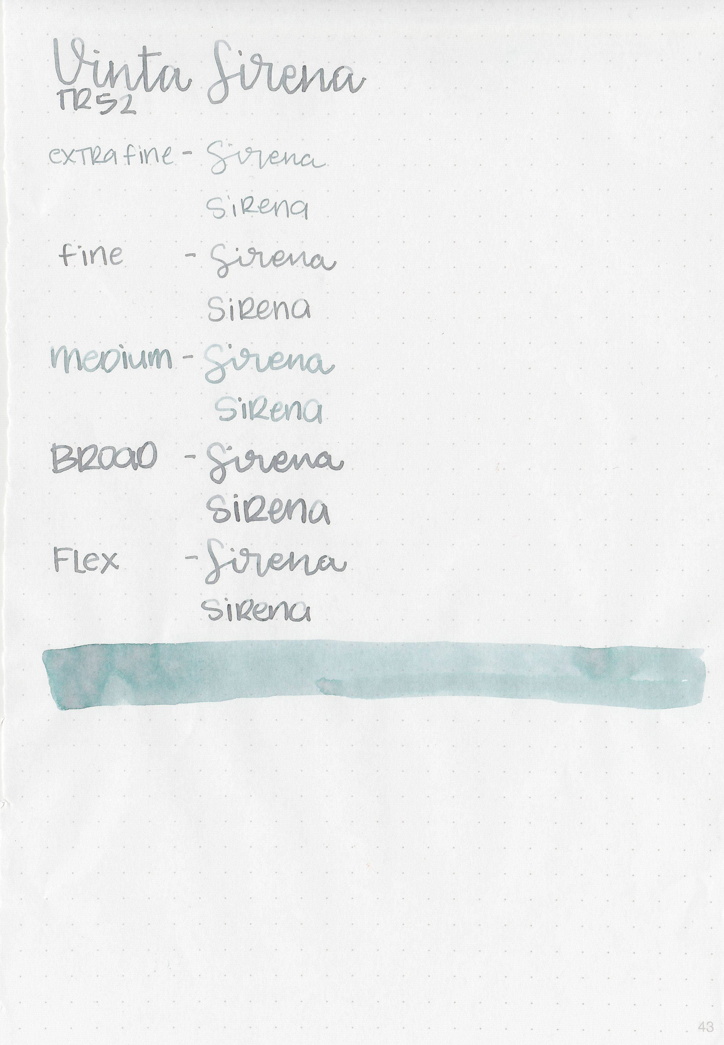
Recently Vanness Pens started carrying Vinta inks, which I’ve never tried before. They sent me some samples to try out, and the first one I tried is Vinta Mermaid Green Sirena 1952. I’ve shortened the name to simply Sirena for this review. According to Vinta’s website, “Sirena is an homage to Mars Ravelo's famous Filipino comics Dyesebel about a mermaid. It is one of the most popular local comics that was serialized in 1952. This beautiful mint green has undertones of grey and pink.”

vnt-sirena-w-1.jpg

The color:

Sirena is an unsaturated green, almost a pale cool tone green. I can imagine a mermaid this color, so the name is appropriate.

Swabs:

vnt-sirena-w-3.jpg

In large swabs on Tomoe River paper the ink shows off some of the pink/grey/brown undertones.

vnt-sirena-w-4.jpg

Writing samples:

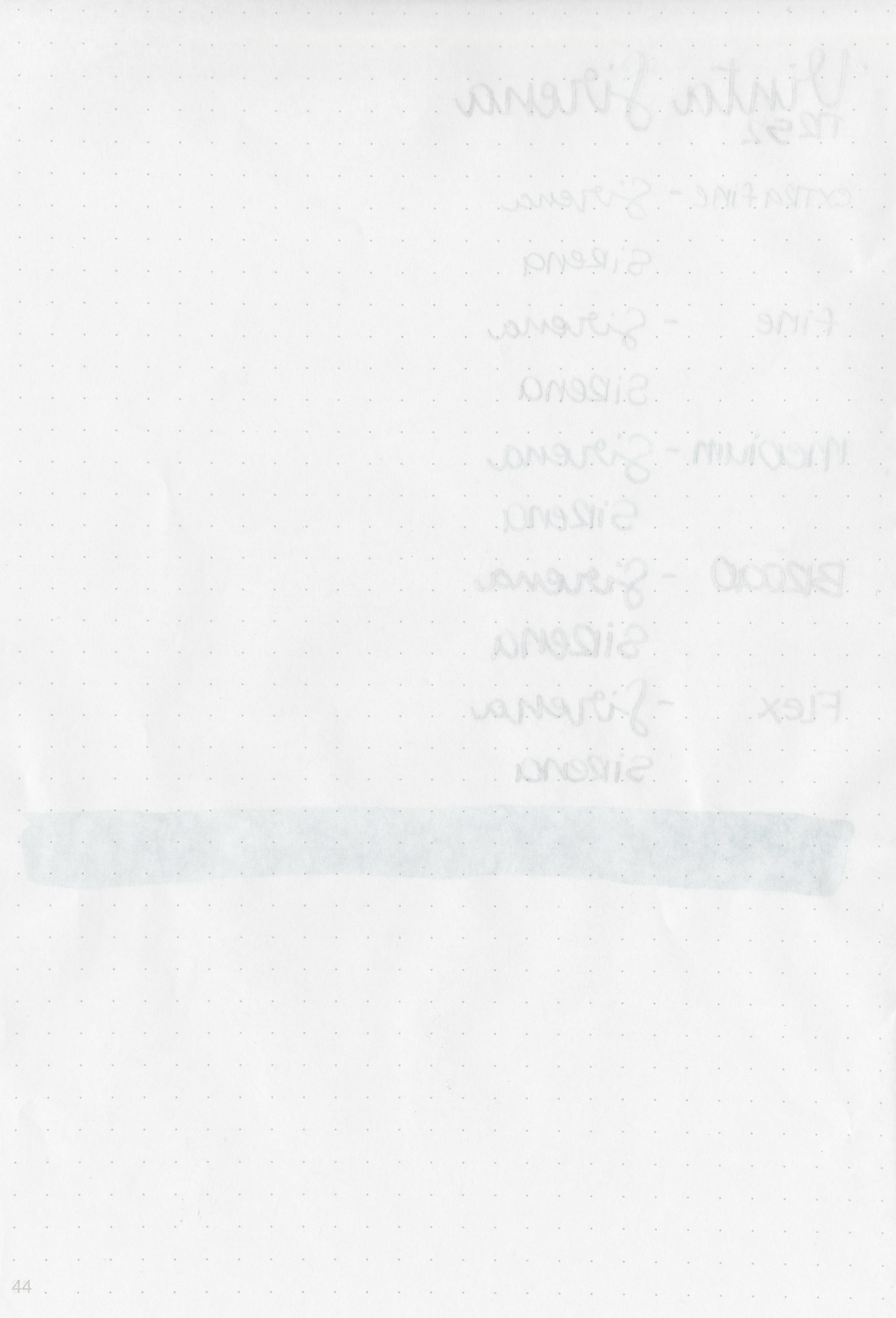
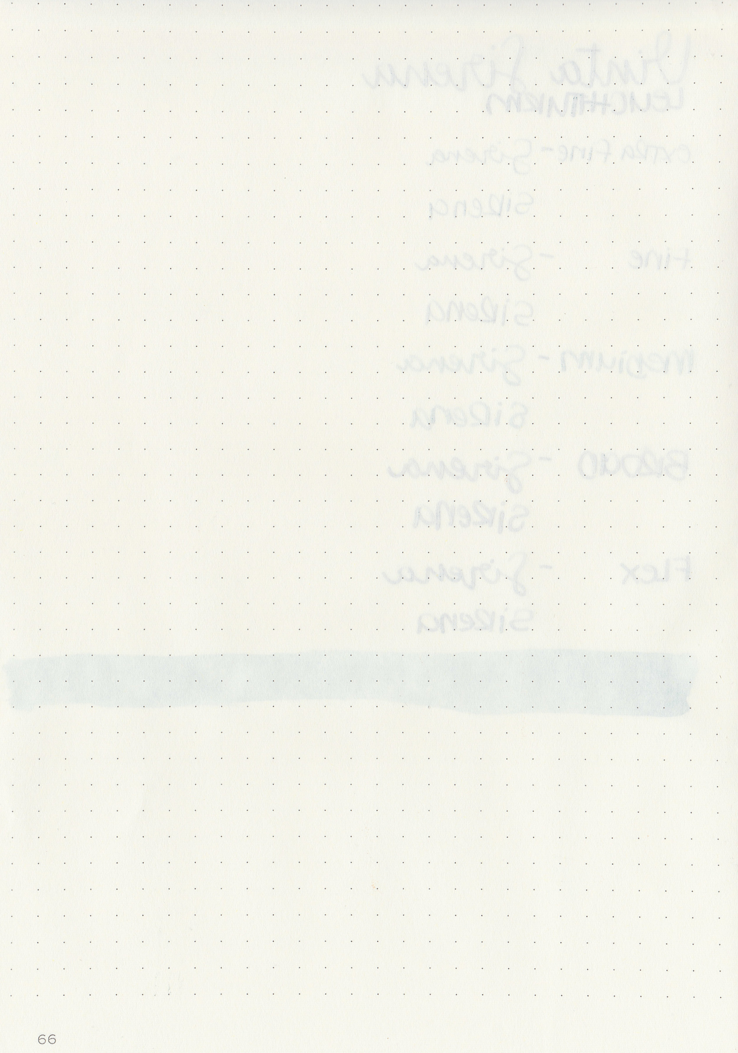
Let's take a look at how the ink behaves on fountain pen friendly papers: Rhodia, Tomoe River, and Leuchtturm.

Dry time: 15 seconds

Water resistance: Low

Feathering: None

Show through: Medium

Bleeding: None

Other properties: medium-high shading, no sheen, and no shimmer. I love that the shading sometimes shifts colors in the same letter-green at the top of the letter and pinkish-brown at the bottom.

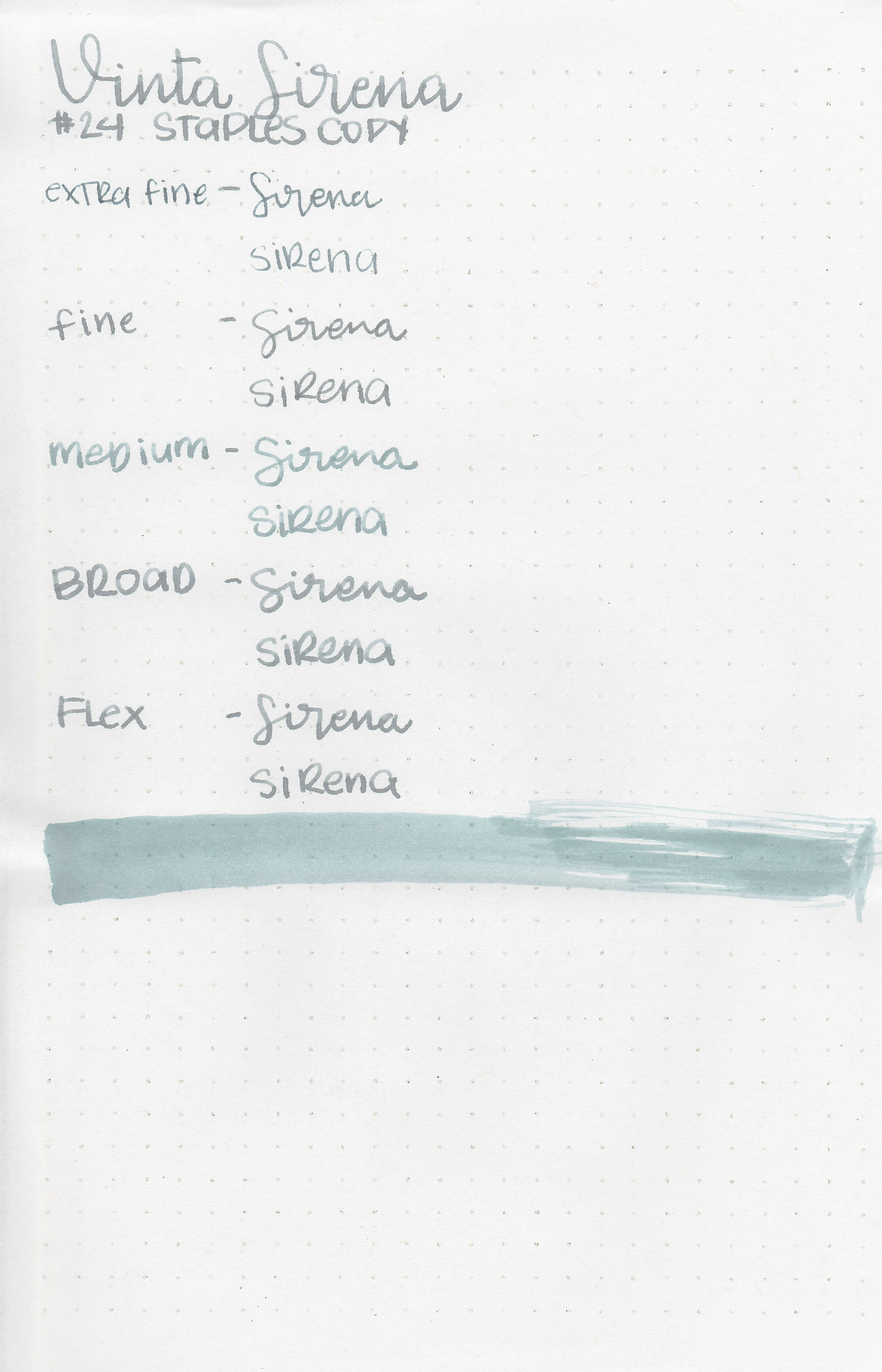
On Staples 24 lb copy paper the ink feathered in all nib sizes and had a little bit of bleeding.

Comparison Swabs:

vnt-sirena-2.jpg

Sirena shows off a lot of the brownish-pink undertone on the Col-o-ring paper. It looks very different from Sailor Ink Studio 162 which is more of a mint green. Papier Plume Streetcar Green is darker than Sirena. (L’Artisan Pastellier Olive has changed a lot over time. It used to be a lot more green and now it’s turned to a cool-tone brown. I think I need to update my review of it.) Click here to see the green inks together.

Longer Writing:

vnt-sirena-1.jpg

I used a Pilot Vanishing Point Galaxy with a medium nib on Tomoe River paper. The ink had a slightly dry flow. There is some nice shading, but because the ink is so light it’s hard to see.

Overall, I love that the color shifts between green, pink, brown and grey. It is very pale though, so I would stick to broad and flex nibs to make it readable. Even then it can still be rather pale. I enjoy pastel inks and love broader nibs, so I think I could make it work for me, but I don’t love this one as much as I thought I would.

Disclaimer: A sample of this ink was provided by Vanness Pens for the purpose of this review. All photos and opinions are my own. This page does not contain affiliate links, and this post is not sponsored in any way.
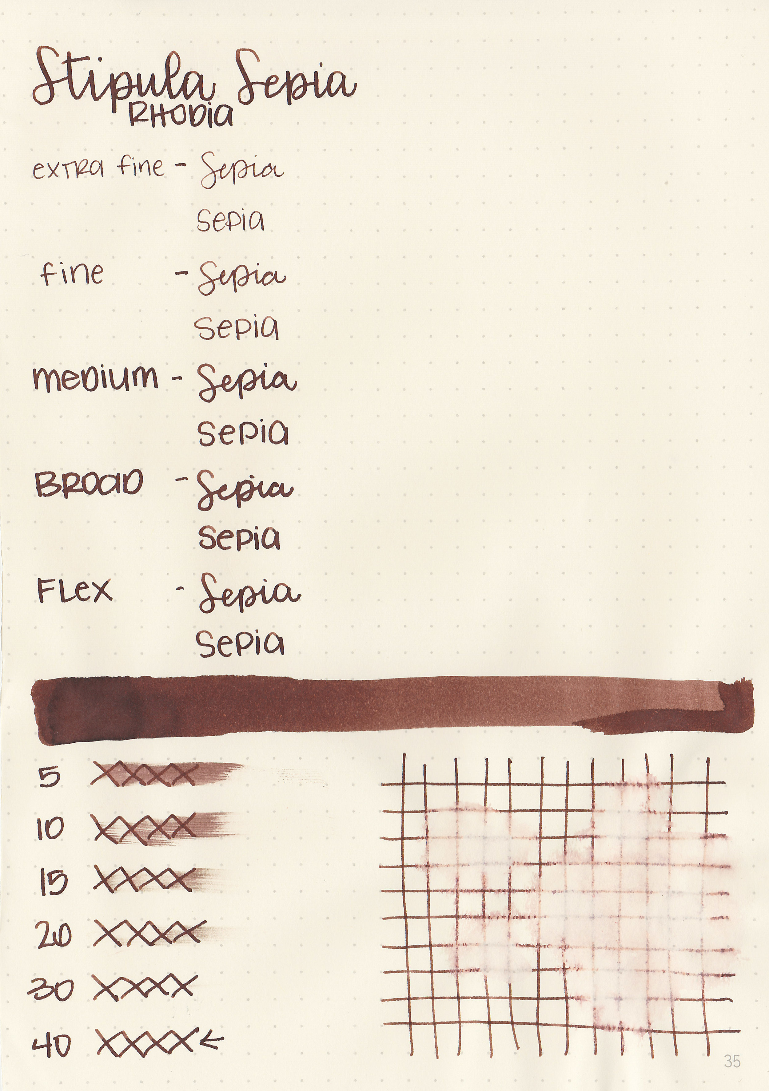
Ink Review #822: Stipula Sepia

stp-sepia-2.jpg

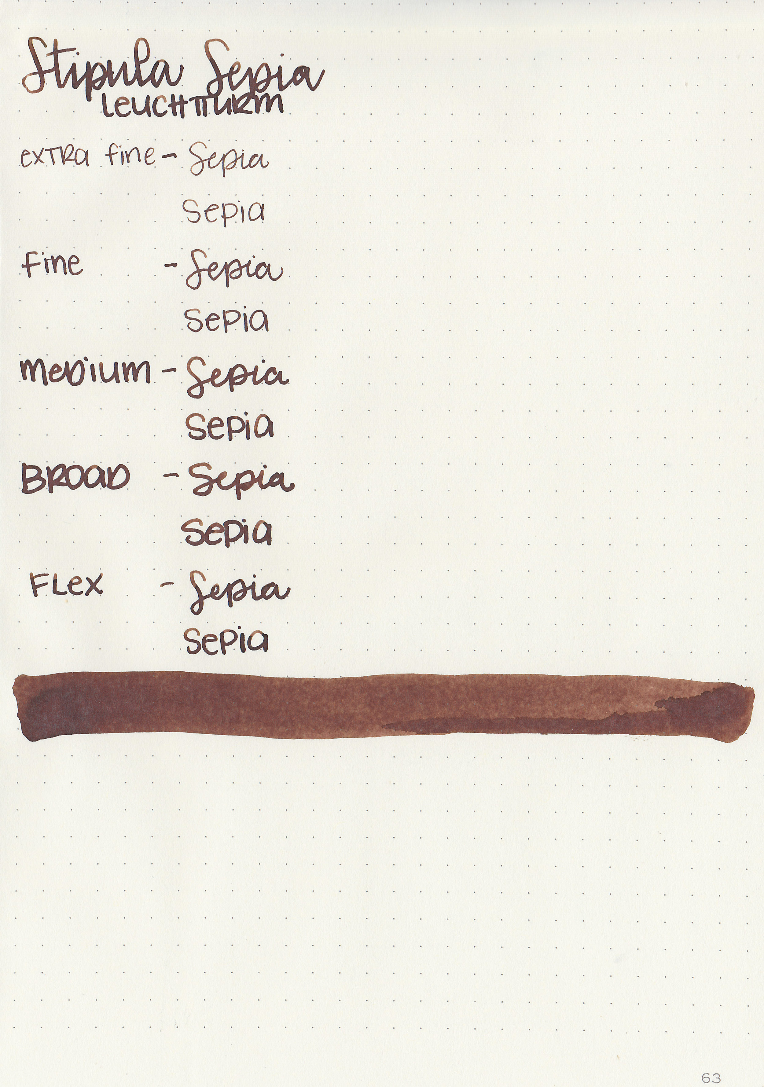
Yesterday I reviewed Cross Blue which was sent in by a reader, so today I decided to review another reader send-in, Stipula Sepia. Sepia is from the Calmo line, sometimes also referred to as Netto (I have no idea why!). These inks come in large 70ml bottles. You can find this ink for sale at Pen Chalet.

stp-sepia-1.jpg

The color:

Sepia is a medium, warm toned brown. It doesn’t quite look sepia to me, more of a warm brown.

Swabs:

stp-sepia-11.jpg

In large swabs on Tomoe River paper the ink looks so much cooler-toned than it does in writing.

stp-sepia-12.jpg

Writing samples:

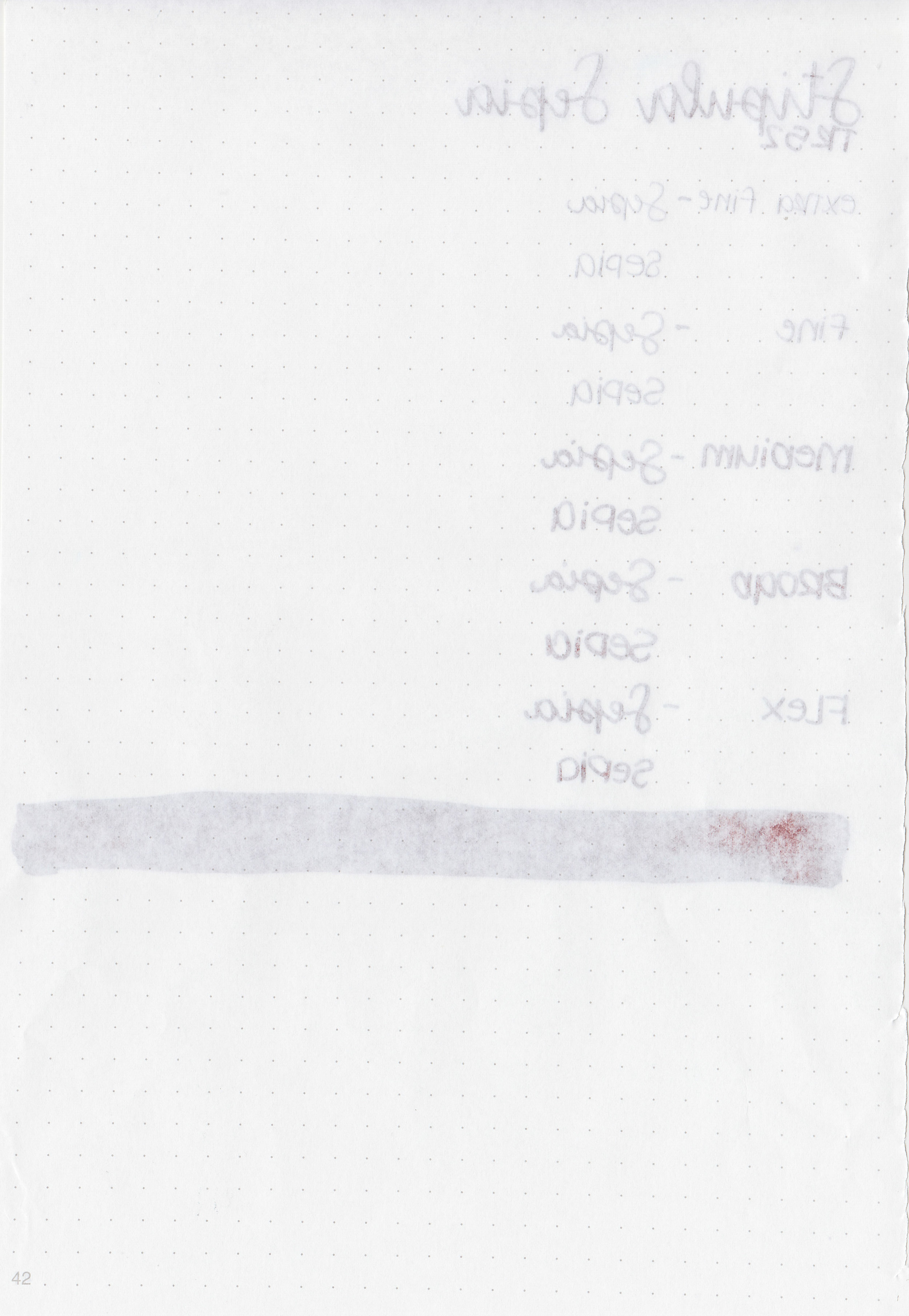
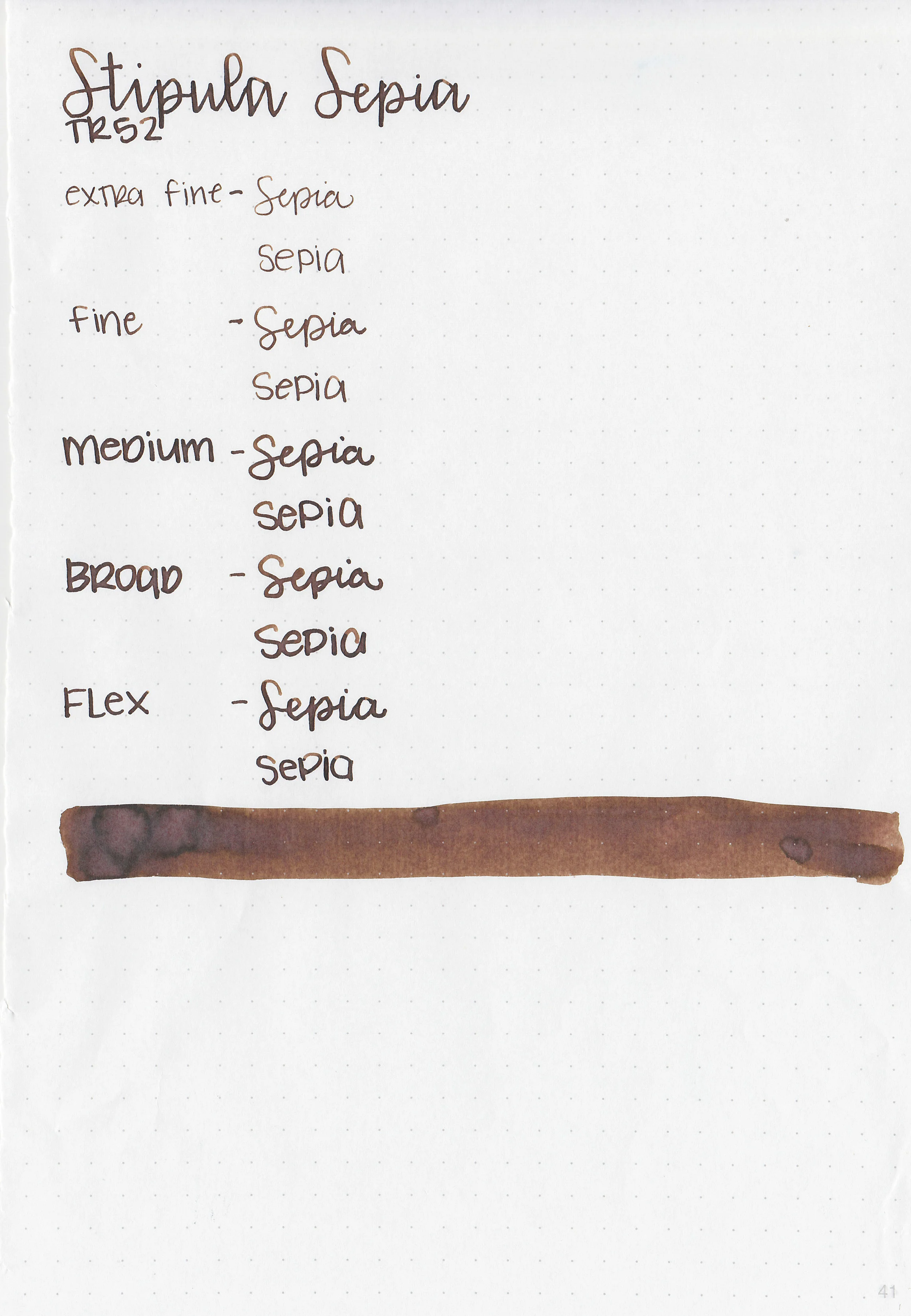
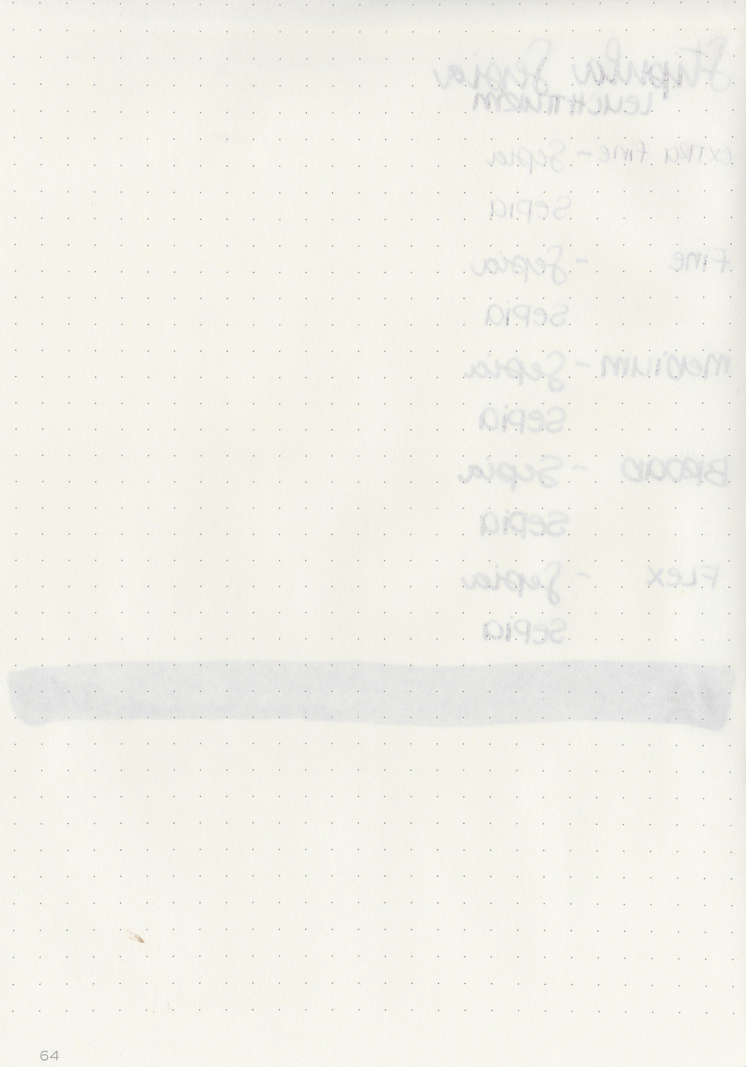
Let's take a look at how the ink behaves on fountain pen friendly papers: Rhodia, Tomoe River, and Leuchtturm.

Dry time: 40 seconds

Water resistance: Low

Feathering: None

Show through: Medium

Bleeding: None

Other properties: medium shading, no sheen, and no shimmer.

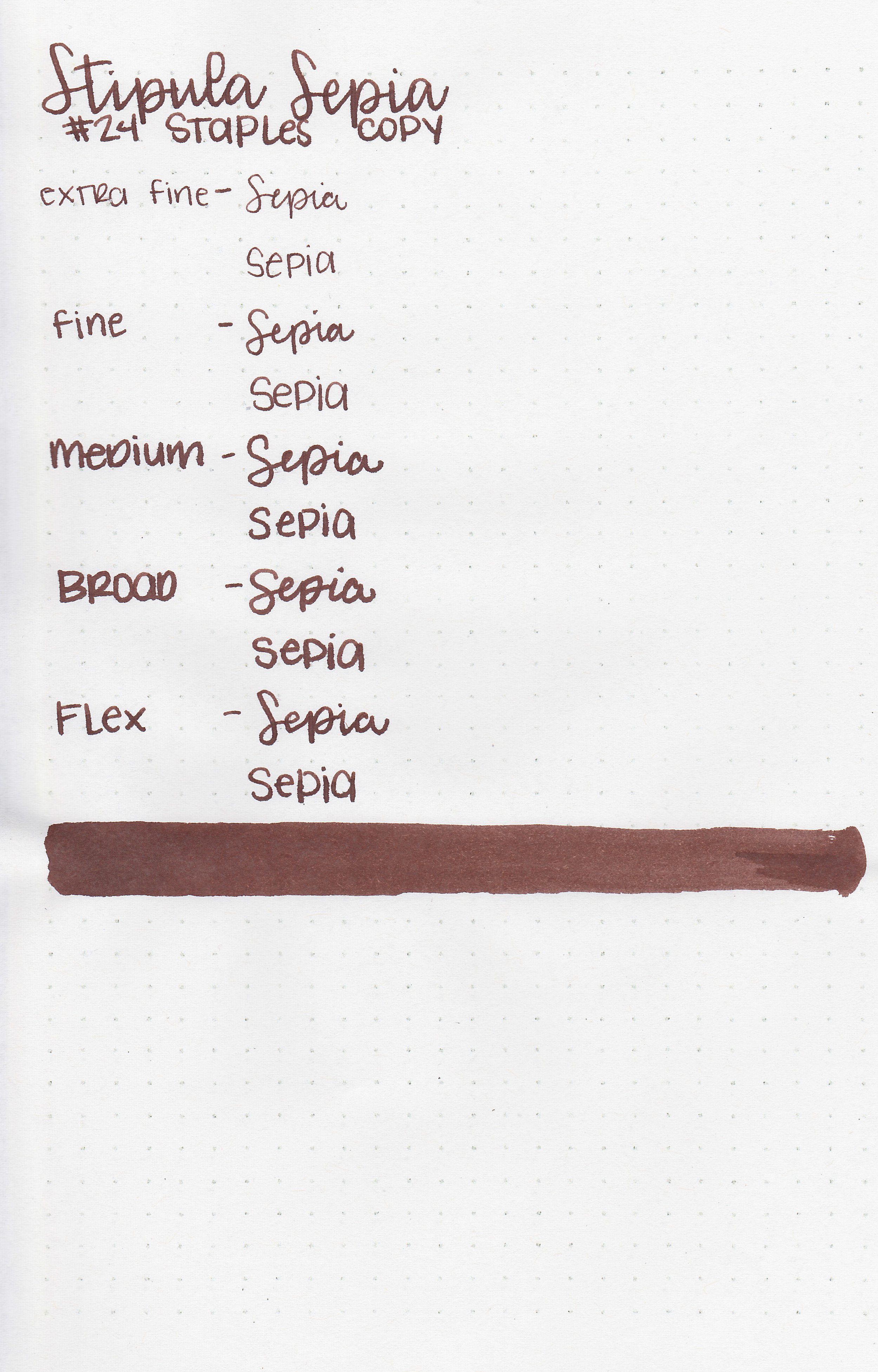
On Staples 24 lb copy paper the ink feathered and bled in all nib sizes.

Comparison Swabs:

stp-sepia-s-1.jpg

Sepia is similar to Robert Oster Aussie Brown. Click here to see the brown inks together.

Longer Writing:

stp-sepia-s-2.jpg

I used a Kaweco Al-sport red with a medium nib on Tomoe River paper. The ink had an average flow.

Overall, it’s a nice well-behaved ink. I don’t think the name is particularly well-fitting but that has nothing to do with its performance.

Disclaimer: A sample of this ink as provided by a reader for the purpose of this review. All photos and opinions are my own. This page does contain affiliate links, but this post is not sponsored in any way.
Ink Review #821: Cross Blue

css-blue-2.jpg

Every once in a while a reader will send me an ink to try, which allows me to play with some new ink. Recently a reader sent me Cross Blue to play with. You can find this ink at Vanness Pens.
css-blue-1.jpg

The color:

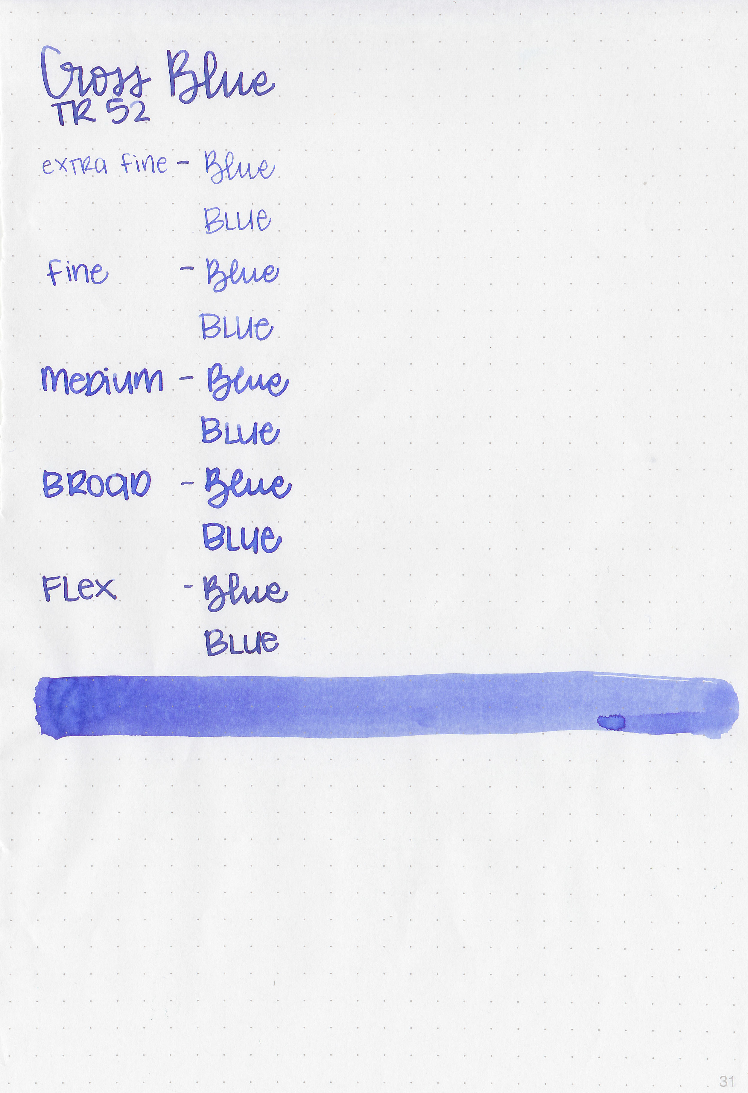
Blue is a medium blue that has just a bit of a purple undertone.

Swabs:

css-blue-3.jpg

In large swabs the ink looks so much prettier than it does in writing. A little bit of bronzy sheen and a pretty purple shade.

css-blue-4.jpg

Writing samples:

Let's take a look at how the ink behaves on fountain pen friendly papers: Rhodia, Tomoe River, and Leuchtturm.

Dry time: 30 seconds

Water resistance: Low

Feathering: None

Show through: Medium

Bleeding: None

Other properties: low shading, tiny sheen, and no shimmer. The sheen was only visible in large swabs on Tomoe River paper.

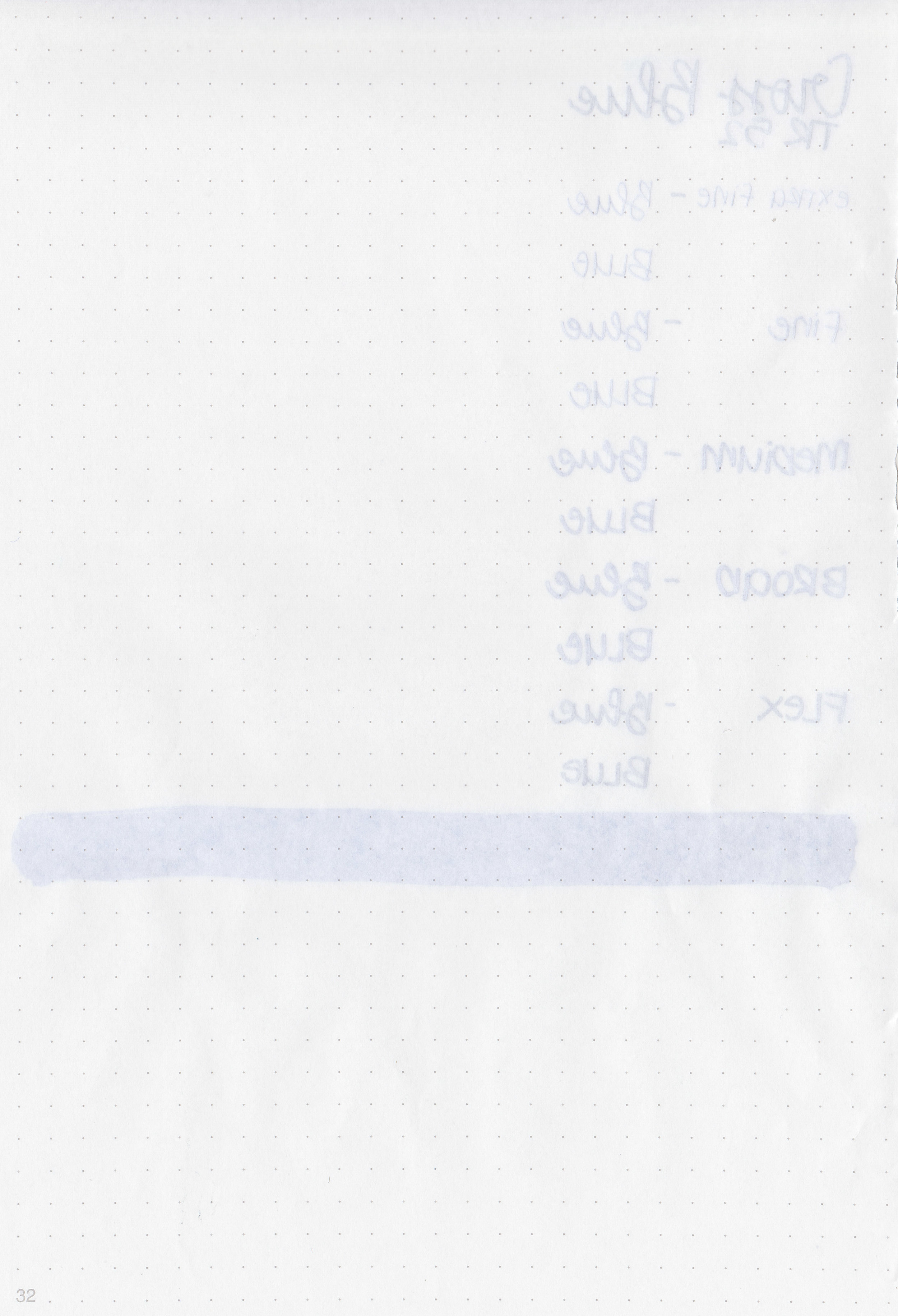
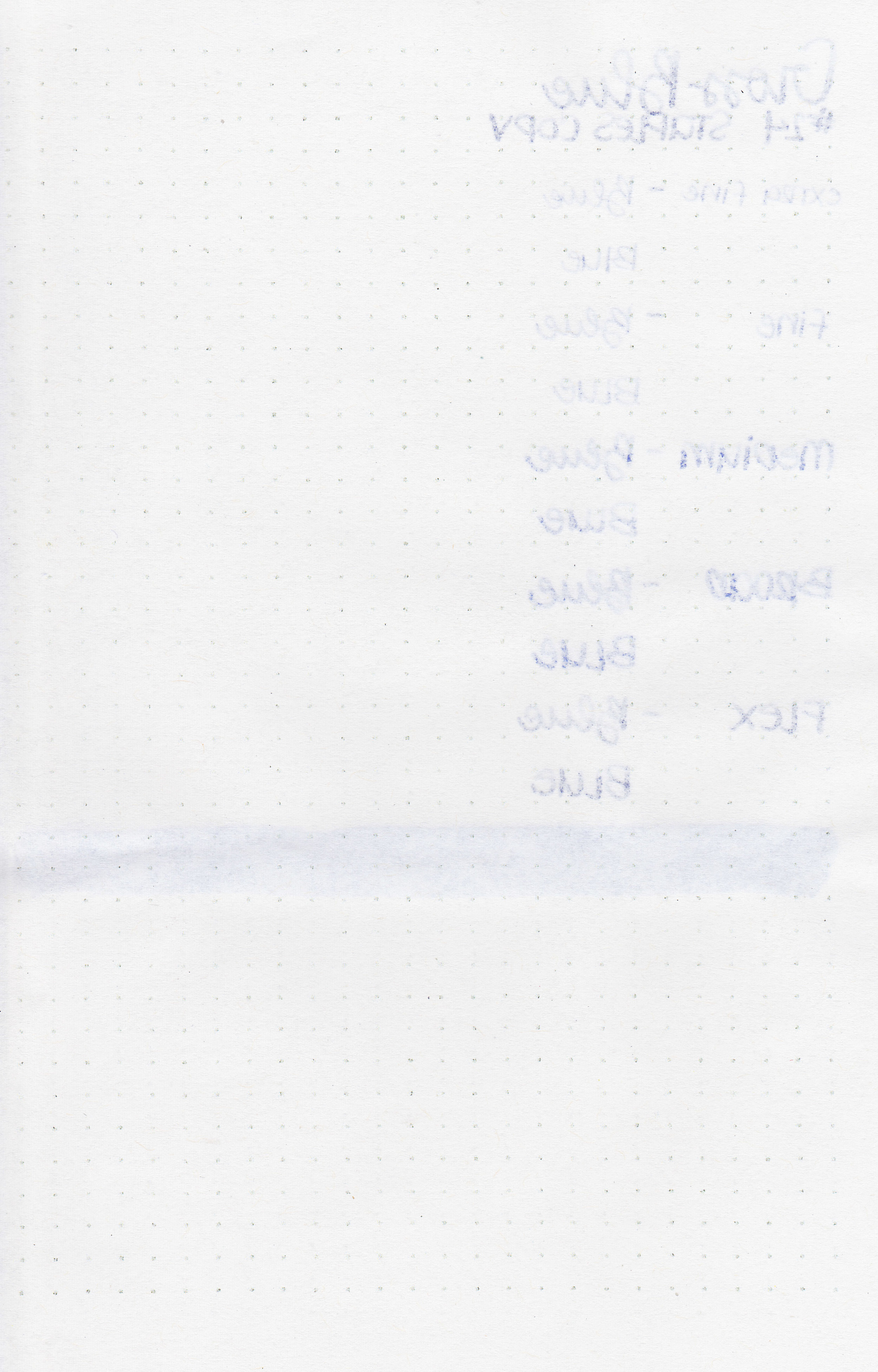
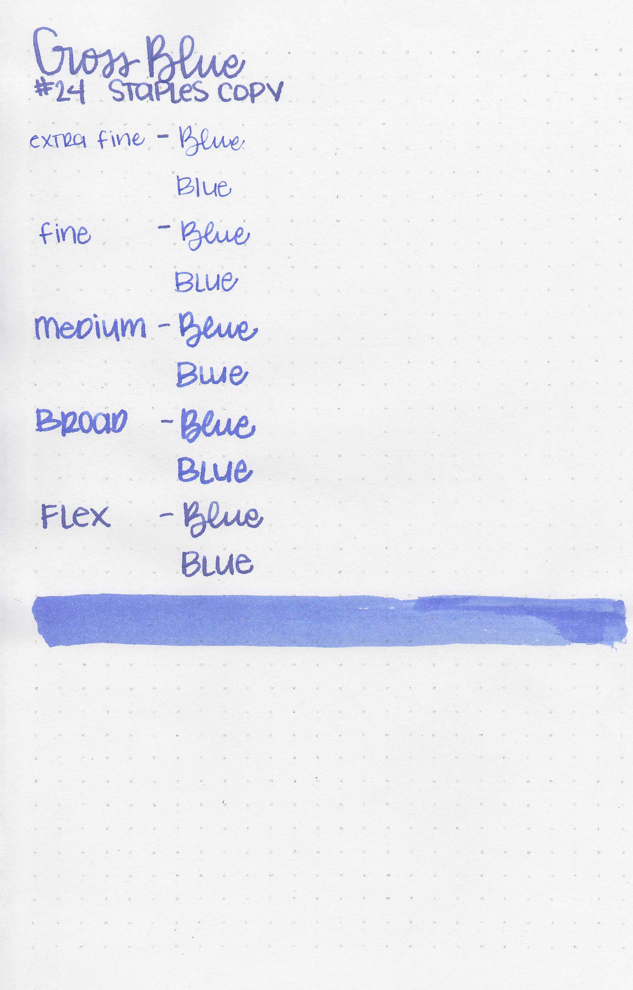
On Staples 24 lb copy paper the ink feathered and bled in all nib sizes.

Comparison Swabs:

css-blue-s-1.jpg

Cross Blue is pretty similar to Thornton’s Blue and Private Reserve Cosmic Cobalt. Click here to see the blue inks together.

Longer Writing:

css-blue-s-2.jpg

I used a Pelikan M600 Turquoise with a broad nib on Tomoe River paper. The ink had an average flow.

Overall, I think it’s a nice basic blue ink. I like the color, but it is similar to some other inks I already own.

Disclaimer: A sample of this ink as provided by a reader for the purpose of this review. All photos and opinions are my own. This page does contain affiliate links, but this post is not sponsored in any way.